 Sectioning the scrapbook page canvas out into columns or rows is a way to create homes for your page pieces–and to organize your story.
Our creative team shares their pages built with foundations of rows and columns here.
[hr]
Sian Fair says, “This page records a Fathers Day outing we took to see the visiting Tall Ships.”
“I used three roughly same-sized columns: I never line things up too neatly as I love a more casual look. I simply eyeball it. I thought columns were a perfect way to go here, to echo the masts of the Tall Ships and the strong vertical lines in the photos. I have a column for title and embellishments and one for journaling and one for photos. Although I don’t use this approach very often (my pages aren’t usually as organised as this!) I am pleased with the way this turned out and will be trying it again soon.”
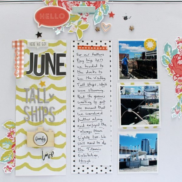
Tall Ships by Sian Fair | Supplies: Here We Go June by Sian Fair: Patterned Paper, Alpha, Flair, Chipboard pieces, Rubber Charms all from Felicity Jane. Wood Veneer: Heidi Swapp
Kelly Prang says, “I wanted to show how much our puppy has grown in the past year since he joined our family.”
“I decided to make a row with tiny photos to show Toby’s changes. I used a larger row for the title, journaling, and focal photos. Then I used empty ‘rows’ filled with patterned paper to create a background for the photos, title, and journaling. This was a fun way to house several photos on a page. I plan to use a similar strategy soon for a page with my son’s first days of school from kindergarten through 12th grade.”
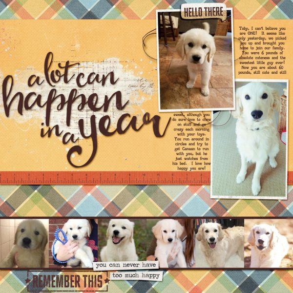
A Year with Toby by Kelly Prang | Supplies- simple scrapper- template #346; Just Jaimee- Storyteller September 2017- papers and elements; Lynne-Marie – Explore- wordart, Family- paint splatter, Resolute- wordart used as title; Lynn Grieveson- Splash of Summer- yellow paper; Simple Girl Scraps- Q&A plaid paper; NBK- Counting Threads- thread knot; Font- AA Typewriter
Kelly Sroka says, “We attended the local summer solstice celebration this year. It was a magical evening of fairies, dancers, and family fun.”
“I arranged my photographs into rows on the page to lead the eye through the layout. I varied the lengths of the rows by using different sizes of pictures. Since I included several busy photographs on the page, I placed them in rows so that the layout does not become too chaotic. Using rows is a great way to give structure to a page–I love the way the layout turned out. I will definitely use this design again!”
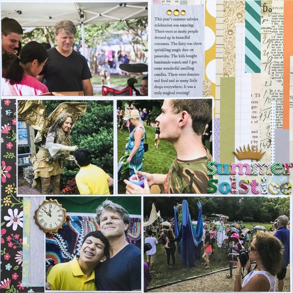
Summer Solstice by Kelly Sroka | Supplies: Patterned paper: Echo Park, Studio Calico, Bo Bunny; Jewels: Doodlebug Design; Chipboard die cuts: Echo Park; Letter stickers: American Crafts
Stefanie Semple says, “This layout documents a family get together but also the deeper story behind the significance of the baby blanket.”
“Here I created three equal-sized vertical columns. I wanted to house the photos of my daughter and my goddaughter together, the new baby boy, his prayer blanket, and me in the two outer columns. The center column houses embellishments and journaling cards. I love creating multi-photo layouts, and this technique allowed me to make one cohesive layout with photos from different occasions, but the same people at different times, or people within the same event, telling a variety of sub-stories of the same event.”
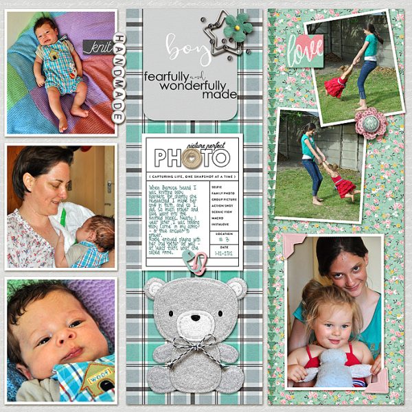
Handmade Knit by Stefanie Semple | Supplies: Chelle’s Creations: Fabulous Fifties (retired); The Digi Files 98 Feb 17 Sweet Love; Pink Reptile Designs: Hooked; In a Creative Bubble: In Review Cards
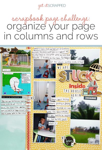
Christy Strickler says, “In 2004, my family experienced four hurricanes while living in Florida. This story documents the last one.”
“I worked with three columns here. One is blue and shows a few photos prior to the storm hitting. The other two columns are photos taken during the storm. One column shows pictures taken of the rain outside and the other shows my son. The columns enabled me to add a lot of photos to one page while keeping them organized. I mostly kept to the columns but I don’t worry if elements like journaling or photos slightly slip outside the invisible bourndary lines. I like how this approach lets me clearly tell a story in stages and will use this again for similar tales that show progression.”
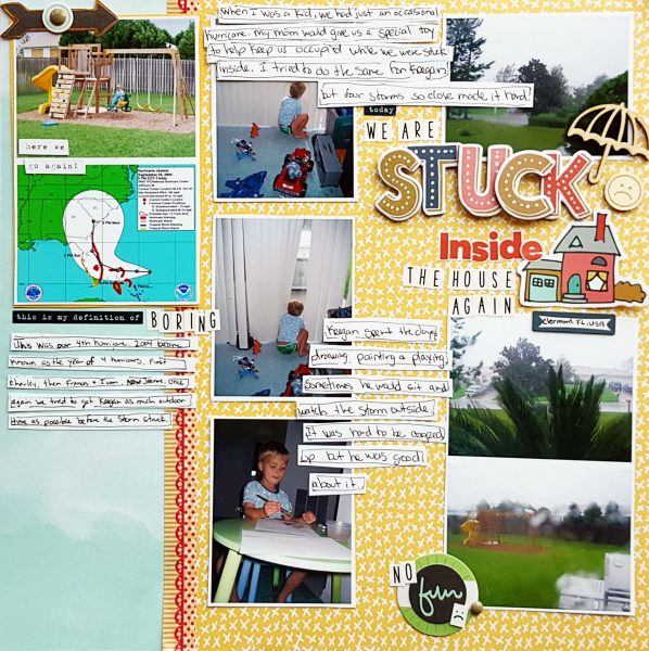
We Are Stuck Inside Again by Christy Strickler |Supplies Patterned Paper Simple Stories, Fancy Pants, Letters: Fancy Pants Evalicious; Die Cuts: Fancy Pants; Stickers: Cocoa daisy, Pretty Little Studio; Other: Tape, enamel dots
Jana Oliveira says, “My son loves water. This is one more page about places we’ve found in our new home in Washington state for him to play. It’s our first summer here and we are exploring options. The kit I used had torn pieces of paper that resembled columns. I took advantage of that and used it to divide my base into 3 parts: one side for a pictures and elements, another with some journaling and embellishments, and a third column in the middle to break things up and house my artsy flair with a blended painted picture.”
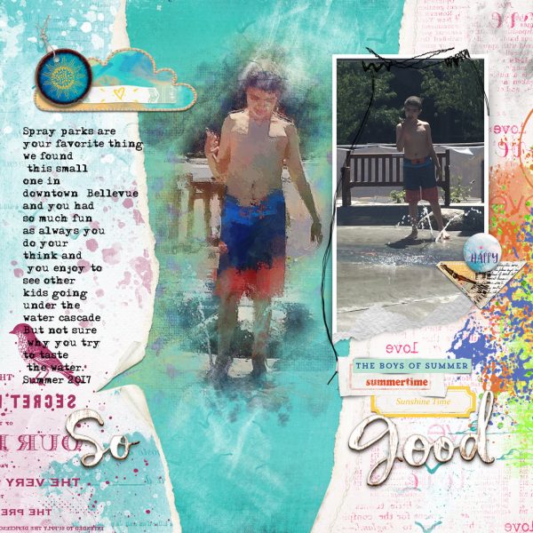
So Good by Jana Oliveira | Supplies: Lynn Grieveson bird seed kit, blues skies ahead. NBK Design : Simplicity kit frames, Art therapy collection watercolor blenders. Picture was edit in iColorama app.
Debbie Hodge says, “I love organizing my two-page layouts that have lots and lots of photos using rows and columns. This page is from a trip to Waco, Texas with my mom and oldest son. On the day recorded here we met up with Get It Scrapped Creative Team Member Ronnie Crowley! Of course, I took plenty of pics.”
“The two-page canvas has three groupings organized by columns. I say that even though if you’re counting columns, there are actually four columns. The first column has scenes of the market indoors and outdoors. The middle section–a grid of square photos–shows shots of the characters in my story: my mom, Ronnie, my son, and myself. The final section is where I’m looser about organization, arranging my title and journaling along with a few more photos.”
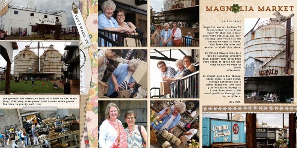
Magnolia Market by Debbie Hodge | Supplies: Per Diem, Blithe, Artifact by Sara Gleason; October Edgers by Amy Wolff; How Does Your Garden Grow by Allison Pennington; Urban Naturalist by Katie Pertiet; Wanderlust by Anita Designs; Wanderer By Celeste Knight; Dialogue by Gennifer Bursett; Bohemian Typewriter, Trend Rough Slab fonts

