 The Gestalt principle of continuance states that once the human eye starts following a line or path on the page, it will keep going until an object stops it or the line ends. A line can be a literal line (like a drip of ink or a line of stitching), or it can be an implied line (where elements are placed so that our brains connect the dots from element to element).
See how the Get It Scrapped Creative Team puts the Gestalt principle of Gestalt to work on their pages.
[hr]
Ronnie Crowley says, “Having just dropped my son at college I wanted to record my feelings while they were fresh.”
“I created lines on my page using a transition between the two papers I used. I then re-enforced the line with ribbon and stitching. With a bold title, the lines helped point to the photo as the focal point for the layout (which is always my goal). With such a bold title on the page, I wanted to make sure it didn’t grab center stage instead.
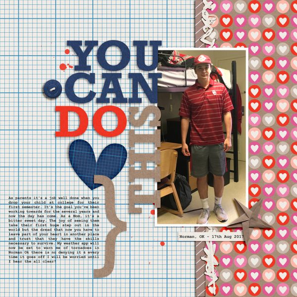
You Can Do This by Ronnie Crowley | Supplies: Meagan’s Creation – Survivor; Scrap with Liz – Big Title Template 6
Megan Blethen says, “We moved last year, and one day I was looking through toys stored in the new garage. I came across my oldest son’s birthday present from his grandma last year, a present we hadn’t been able to find at birthday time. I had packed it away in such an odd place! He was excited to open it and find out what it was.”
“The first line is literal with the patterned papers going from the top to the bottom of the layout. I have a second implied line of embellishments and photos. You zig zag down the page from embellishment to photos, embellishment to photos, until you reach the bottom of the page.”
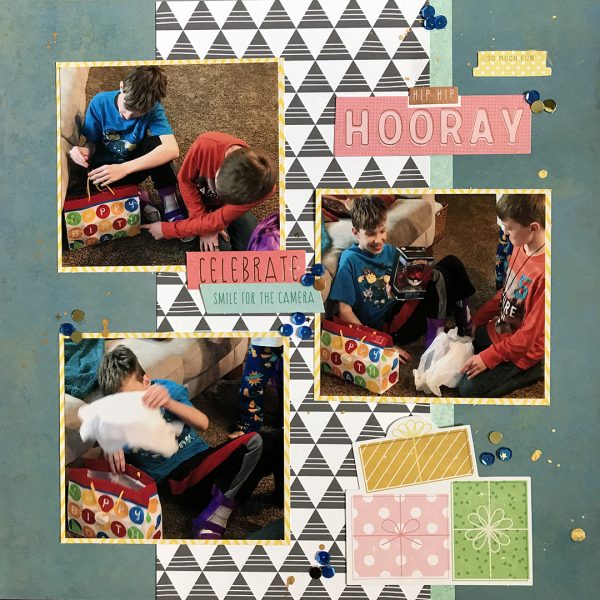
Hip Hip Hooray by Megan Blethen | Supplies: Patterned Papers: My Minds Eye Bohemia Backyard “Just Be You” Paisley Teal, Amy Tangerine Stitched ‘Box Pleat’, Crate Paper Maggie Holmes Bloom ‘Garden Party’ Embellishments: Pink Paislee Birthday Bash Ephemera, SpiegelMom Scraps Raspberry Daisy Dream Sequin Mix, Heidi Swapp Color Shine ‘Gold’
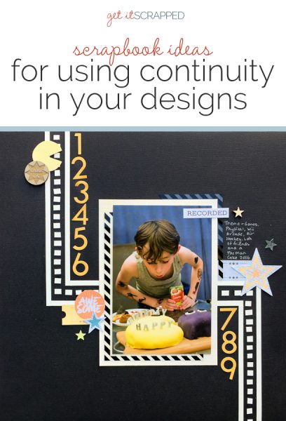
Kristy T. says, “This page documents my son’s 9th birthday party which had a games theme. All the boys all played different games, and he had a Pac Man shaped cake.”
“I created the lines on my page using strips of card stock and then cutting smaller pieces to replicate the visuals of the pac man game. The lines are literal and highly contrast with the dark background. The lines on my page lead the eye to my photograph, which is the focal point. I have supported my lines by creating other lines using numbers and keeping my embellishments close to my lines.”
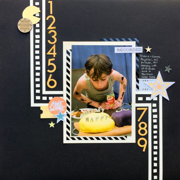
1,2,3,4,5,6,7,8,9 by Kristy T | Supplies: Cardstock – Bazzill, Artee; Patterned Paper – Bo Bunny; Chipboard – Dusky Attic; Wooden Shape – Studio Calico; Stickers – Cocoa Vanilla, Kaistercraft.
Jana Oliveira says, “My dog has changed a lot since our big move. A lot of anxiety and fear make it hard to find camp or a vet for him. Despite the headaches we are having with his anxiety, he is so peaceful when he dreams.”
“The line in my page is a literal one created with a clear straight line with a sequence of pictures. The lines of pictures and elements like ribbon, embroidery, and papers lead the eye to the bigger pictures blended in the background.”
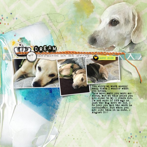
Cream by Jana Oliveira | Supplies: NBK Design: Intuitive Collection template week22,Art therapy watercolor blenders; Lynn Grieveson: Worn strips 1, woof, Little Butterfly wings: it’s my life papers; Pink Reptile: Easy Peasy,Dreams, Carpe Diem, Embroider.
Marcia Fortunato says, “I recently met up with one of my sons for a weekend of hiking, and this page is about a state natural area that we explored.”
“I wanted to lead the viewer in a specific order through the photos on my page, so in addition to the placement of the photos I used a line of boot prints. The lines lead from the edge of the page towards my son in the left photo, then to the top right photo, then down to the lower photo and off the page, suggesting that we meandered through the area and continued on. The line is implied since the boot prints actually break at each photo, but our minds tell us that they continue on to the next photo.”
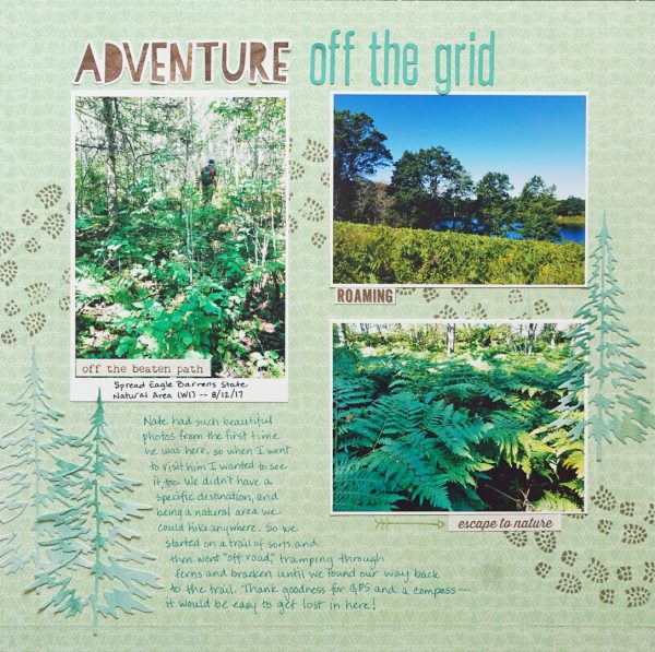
Adventure Off the Grid by Marcia Fortunato | Supplies: Patterned Paper: Simple Stories; Title: Simple Stories, Jillibean Soup; Footstep Stamp: Bo Bunny; Trees: Sizzix die, Royal Langnickel paper (hand-painted); Word stickers: Simple Stories; Arrow stamp: Cocoa Daisy; Inks: Hero Arts, Ali Edwards; Pen: LePen (Marvy Uchida).
Shanna Hystad says, “This story is about me trying to bribe my nephew and great niece to let me take a cute picture of them. I said I would let them pick two new little strawberries on the vine if they would smile nice and let me take their picture. (For some reason, my nephew does not like to have his picture taken). He said, I smile with my fancy face? I thought that was so cute.”
“My line here is more implied than literal. The eye starts on the page with the bold title at bottom left. From there, the photos and sequins move upward along a diagonal path.”
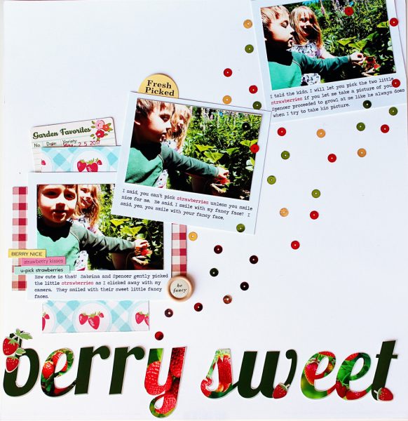
Berry Sweet by Shanna Hystad | Supplies: strawberry paper-Studio Calico, red gingham paper, strawberry stickers-Simple Stories, journal card, yellow sticker, word sticker-October Afternoon, wood button-Shimelle, word stickers-Jillibean soup, red, green and gold
sequins, Title-created in Adobe Elements.
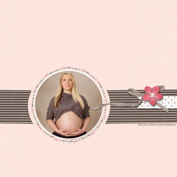
Deborah Wagner says, “My daughter loves to chew bubble gum. She came up with the silly idea to use bubble gum as a prop during her maternity photo shoot. We were giggling so hard it was difficult for her to blow a bubble!”
“While the striped band of paper breaks around the photo, the eye connects the two sides and follows the path they make. The flow of the ribbon, and banner placement emphasize my horizontal line.”
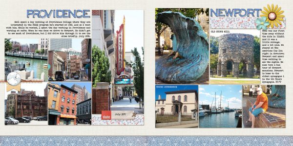
Debbie Hodge often uses this principle of continuance to connect the two sides of a double-page layout, running a band of paper across the two sides. Here, a narrow strip along the bottom of the layout unites the pages from two cities visited on a summer trip.

