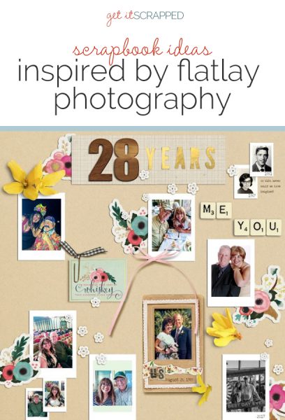
 Flatlay Photography is trending in social media and graphic design right now. This type of photography captures a collection of carefully curated and placed items and is often used to tell a brand’s story.
This week, our Creative Team is using flatlay photography as inspiration for their scrapbook page designs.
[hr]
Kelly Sroka says, “This page features photographs from a recent family night out. We out to dinner and to the bookstore and had a fabulous time together.”
“I knew I wanted to feature several pictures on my page, so I looked to this flat-lay photograph for design inspiration. I loved the simplicity of the design as well as the snapshot look of the photographs. I cut wide margins around my pictures to mimic the instant camera-look. I also kept the design of the page very simple, only using doilies and phrase stickers as embellishments.”
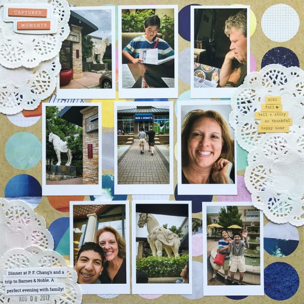
Captured Moments by Kelly Sroka | Supplies: Patterned paper: American Crafts; Chipboard die cut and phrase stickers: Pinkfresh Studio; Doilies: Prima
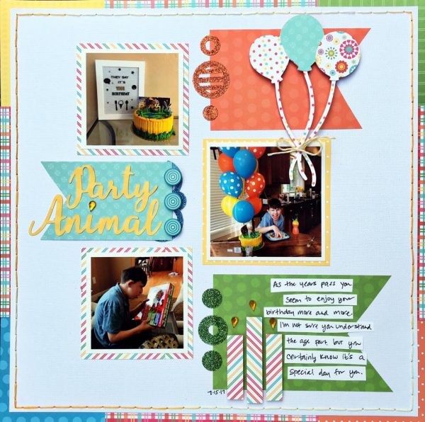
Devra Hunt says, “We celebrate our son’s birthday as much for our sake as his. Each year he seems to understand more and more that something special is happening.”
“I found design and color inspiration for my layout from a few examples. I was drawn to mixing a shape with my photos to create an ‘almost’ grid. The graming of my page with border also comes from flatlay inspiration pieces.”
Karen Poirier-Brode says, “This was a true challenge for me. I began with inspiration from an ad for Mood Fabrics. To tell the story of a relationship that I do not think even the two of us thought would last so long as we are very different folk I used photos from each of our childhoods, our wedding photo, a photo from 14 years ago (half-way to now) and more recent photos.”
“I managed to sneak in journaling though this type of layout tells the story primarily with the use of photos. The color scheme is a loose interpretation of my favorite one, primary colors. I used a scattering of flowers, lace and bows to help tell my marriage story since those work with a wedding theme. I used the black and white ribbon as a visual triangle to the black and white photos. I like how this works. It was a challenge to the mindset of always fastening things down on a page to the idea of just laying things down in an array and taking a photo. It’s fun to try something different!”
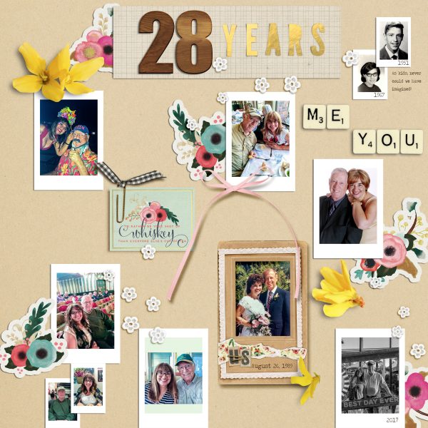
28 Years by Karen Poirier-Brode | Supplies: Kits – Swing Into Spring, Scrapbook Graphis, New Life Dreams Designs; Julep, GB, Pixels and Co, Font – traveling typewriter, wood numbers – Getting Artsy Fall, The Cluster Queen, Melissa Rickchick
Marcia Fortunato says, “I like to photograph the flowers blooming in my garden throughout the year, and looking at them all together on a scrapbook page just makes me happy. These are a few of the flowers blooming in July.”
“For displaying a collection of flower photos I like the simplicity of the flatlay photography trend. I was especially inspired by this photo. Like the inspiration photo, I used a collection of photos and just a few scattered flat embellishments.”
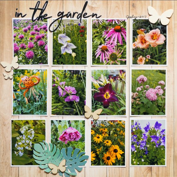
In the garden by Marcia Fortunato | Supplies: Patterned Paper: Echo Park; Title: Pinkfresh; Embellishments: Studio Calico, Crate Paper; Pen: LePen (Marvy Uchida).
Lynn Grieveson says, “When we were visiting family in Melbourne I spotted this wall and asked Daughter_Two to stand by it in front of it for a photo – but she looked at it and immediately did this!”
“I love the idea of looking down into the photo and I knew it would work really well for this pic. The use of leaves and flowers in flatlay photography led me to laying Australian foliage across the page. I love the clean, white and pretty look of most of the flaylay photography I found on Pinterest but I wanted to play up the urban, gritty references so I went with a concrete looking background paper. It was fun to add elements and journaling which added to the illusion of looking down.”
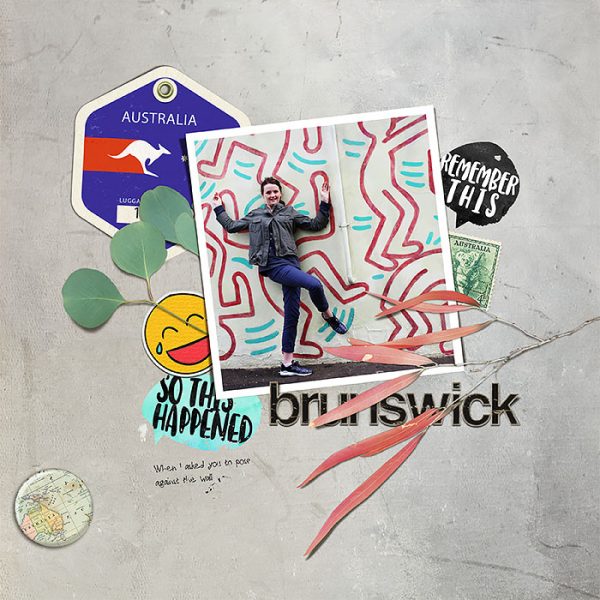
Brunswick by Lynn Grieveson | Supplies: Tough Stuff Papers, Alpha Jumble and Among the GumTrees Kit by Lynn Grieveson Designs, Smiley Elements and RoundtheWorld tags by Paula Kesslering, Summer Speech Bubbles by Just Jaimee, all from The Lilypad.
Kristy T. says, “Each year the school has a book week parade and the kids dress up as a favourite book character, so this page documents the costumes for this year.”
“I noticed that flat lay photography often shows collections, sometimes in loose grids and generally with a background that is neutral that doesn’t distract from the items being showcased. I took inspiration by using a grid with a white background and simple embellishments that supported my story.”
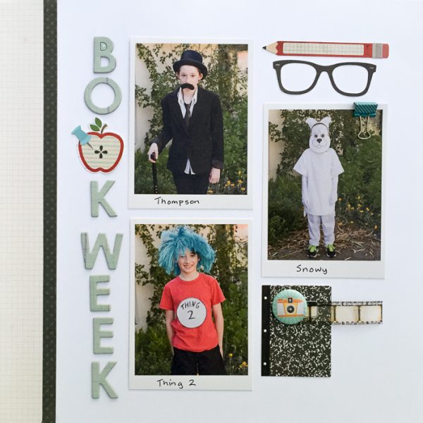
Book Week by Kristy T | Supplies: Cardstock – Artee, Bazzill; Patterned Paper – Simple Stories; Stickers – Simple Stories, Alphas – Studio Calico; Filmstrip – Tim Holtz; Flair – Cocoa Vanilla
Stefanie Semple says, “My daughter’s high school years are whooshing by and I want to create an album of her Grade 11 year that this cover is perfect for.”
“I created a layout that looks like a desktop with scrapbooking and stationery supplies scattered on it – a kind of work-in-progress look. I curated a variety of goodies, rather like my paper scrapbooking days and added some fabulous elements that have been photographed and digitized as though from above.”
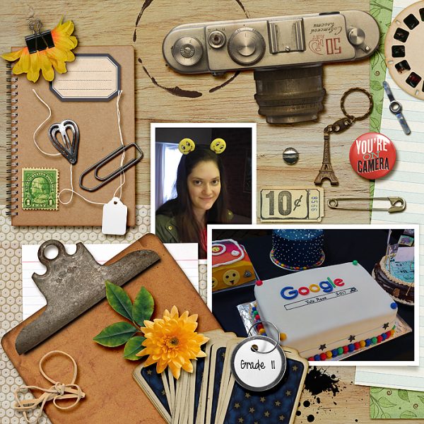
Grade 11 by Stefanie Semple | Supplies: Shabby Miss Jenn Designs: Making Memories; Karla Dudley: Patterned Vellum, Paper Garden Projects (retired): Floral paper; Chelle’s Creations (retired): Curled frames, Scotty Girl Designs (retired): Notepaper; Sabrina DuPre Designs: Desk Drawer; Wendy P Designs: yellow flower

