Repetition on the scrapbook page adds unity, balance, and flow. There can be a lot for a viewer to take in on a scrapbook page, and repeating elements will guide the eye. They can even reinforce a story theme or message.
There are many ways to create repetitions on the page, and we’re tackling four of them here:
- Repeat a photo.
- Repeat a shape or motif.
- Repeat colors.
- Repeat the use of particular embellishments (i.e. buttons, frames, etc).
CLICK ON THE IMAGE BELOW TO GET YOUR FREE PAGE GUIDE
Ronnie Crowley says, “My daughter recently got engaged, and I wanted to make a page to record this moment.”
“As a digital scrapbooker, I often repeat photos as part of the base of the layout. This seemed a perfect page for this approach. I find this technique helps support the story of the page and allows me to showcase that one picture I love.”
“Here I did this across a diagonal which helps with the flow of the page. With different crops on the images, it keeps the viewer’s interest — and it allows me to draw the viewer into the details of how my daughter and her fiance are looking at each other and the love they share.”
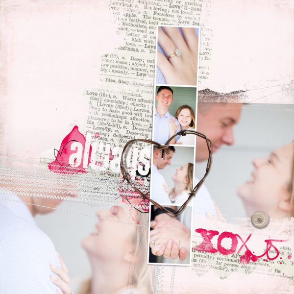
Always by Ronnie Crowley | Supplies: Anna Aspnes – Love WordTransfer No.1, Love WordArt No.4, Layered Template No. 61
Jana Oliveira says, “This is not the first layout that I let speak by itself. I have several layouts which I call “message layouts”. I let the digi supplies speak instead of journaling. It’s about affirming that yes my child is different but I won’t let people judge him because of his diagnosis. He is loved and he is just fine.”
“I repeated the picture used the same picture twice to convey my message. A way I found to make the same picture more interesting was to change their style so one is painted and one is black and white . The painted picture was done with an app called iColorama.”
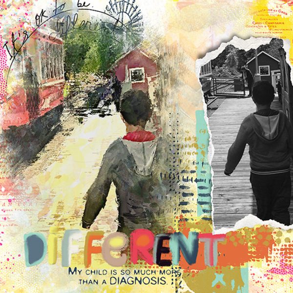
Different Is OK by Jana Oliveira | Lynn Grievenson: head in the cloud Dawn inkship: M3 april 17 add on, LIG kit. M3 mixed media club: June 17
Kristy T. says, “Most years I create a page as a memento of Mothers Day, so this is the page for 2017. It is interesting to look at the pages and see how we have changed.”
“The heart shape is a versatile motif and can be used in lots of ways, but it is especially great for using when documenting special relationships. We naturally associate a heart with love. For this page I used the hearts to create a shelf for my photographs to visually rest upon. I have used different shades of blue and pink, with a couple of neutral coloured hearts in a variety of textures, shapes and sizes to ensure that shelf is interesting but still tones with my photographs and my background. Overlapping the hearts unifies them into one line and adds significance to the hearts as they are all together. This gives the impression of an abundance of hearts and shows the love shared between us all. Adding some flowers adds a little variety and a different shape to my shelf without competing with the hearts.”
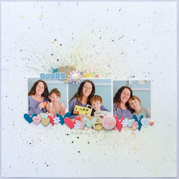
Smile by Kristy T | Supplies: Patterned Paper – American Crafts; Cardstock – Artee; Ink: Adirondack; Chipboard Hearts – Studio Calico; Wooden Hearts – Kaisercraft, Freckled Fawn; Canvas Heart – Unknown; Sequins: Teresa Collins; Flair: American Crafts; Resin Flower – Kaisercraft; Mists – Prima Bloom Sprays; Silver Thread; Pen; Washi Tape: Echo Park; Heart Gem – Simple Stories
Nicole Mackin says, “I recently came across a photo of my husband and me at my 10 year high school reunion. I decided to combine it with a recent photo of us at my 20 year high school reunion. I thought this would be a neat way to show passage of time.
“To signify time I included circular elements which include buttons, flair, stickers, and a more obvious time-themed motif-clocks. The variety of textures and colors of the circular elements adds interest, but definitely provides a consistent motif to the page.”
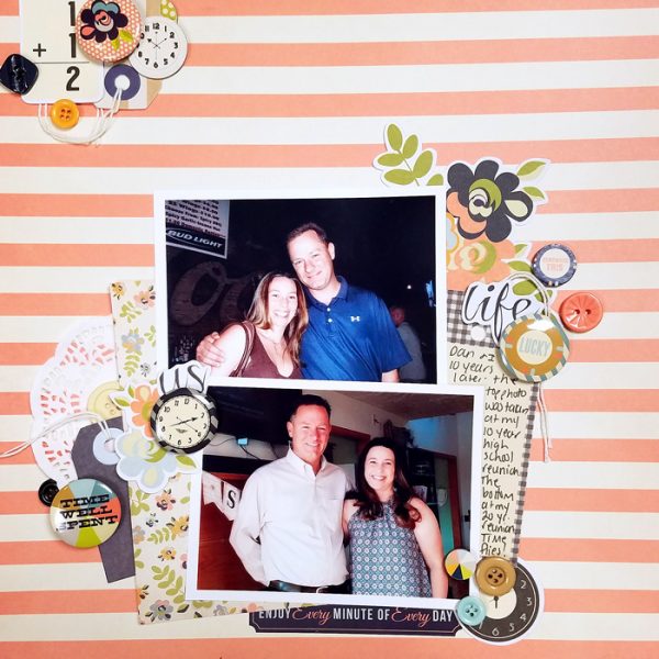
Us by Nicole Mackin | Supplies: Patterned Paper: Fancy Pants; Embellishments, Stickers, Tags: Fancy Pants. Doilies: The Paper Studio.
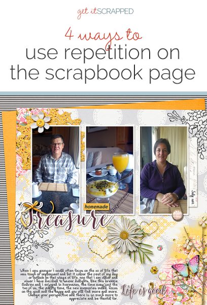
Stefanie Semple says, “This page records not only a breakfast I shared with my hubby on a recent weekend away, but also how my outlook on life has changed.”
“Yellow is a universal happy and sunny colour so I added touches of it to add that sparkle of happiness and to draw attention to the central photo. The central photo features our first course with yellow passionfruit topping and freshly squeezed orange juice.”
“I used a light grey on white background paper with black and white elements to set the scene. There are pops of yellow in a crocheted doily, button, ribbon and stitched hearts to move the eye through the design. Pink, turquoise and purple touches are added as accents in the artsy paint splatters.”
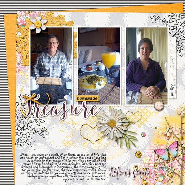
Treasure by Stefanie Semple | Supplies: Bakers gonna bake Bundle: Pink Reptile Designs, April kit: Lynn Grieveson Designs, Life in Color Elements: Etc by Danyale and Fiddle Dee Dee Designs: It’s all in the Details {Dressed Up} Template.
Kelly Sroka says, “On the Fourth of July this year, we had a picnic at a local park. This outing is a tradition for us. Each year the park, which is the site of a revolutionary war battle, hosts re-enactors and special events for the holiday. We have a lunch outdoors then walk around the park enjoying the sights. This year we had Chick-fil-A for our meal.”
“In order to reinforce the outdoor setting and summer feeling I wanted on my page, I repeated the use of nature- and summer-themed embellishments.”
“I created two embellishment clusters using two rectangular die cuts, a leaf die cut, a decorative brad, and a button. Each cluster has florals and words related to summer. Although each cluster is structured similarly, the variation in words, colors, and shapes keeps the design interesting.”
“The placement of the clusters draws the eye down through the page, first to the photographs, then to the title, and finally to the journaling. I also used repetition to give the entire layout interest and unity. I placed several yellow pearls on the yellow polka dots on the background patterned paper which gives texture to the page. The ombre effect in the background patterned paper is repeated in the word summer in the top embellishment cluster and in the letter stickers.”
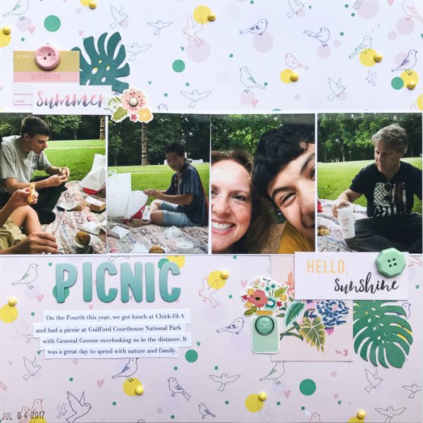
Picnic by Kelly Sroka | Supplies: Patterned paper: Pinkfresh Studio; Die cuts and buttons: Crate Paper; Pearls: Queen & Co; Brads: Simple Stories; Letter stickers: American Crafts

