Conventional design advice is that working with odd numbers, and especially threes, is a great way to make a solid looking design.
The eye likes things that come in threes. When you work with an odd number of items, you have the options for both symmetrical arrangements and asymmetrical. Line ’em up and you’ve got symmetry — pull two of them apart from one and you’ve got asymmmetry.
The layouts here break with that advice and design in two and fours: even numbers. See how our team has created solid designs based on these even numbers.
[hr]
Christy Strickler says, “This page is about how my foster cat got her name.”
“I felt that using twos and fours with my page would work well because I wanted to highlight of focal point of two photos.”
“I had four photos which I clustered into two groups. One is a group of three with the focal photo matted in white. The other cluster is a single photo. Both groups are slightly separated by white space.”
“I also worked with two large butterfly elements. Storywise, the buttefly to represents pixie wings which fit the name for our cat. One butterfly cluster has the title and the other the text.”
I used 2 triangles to draw the eye into the page. Many of the embellishments used within each cluster were used in groups of two as well. I also loosely bracketed the photos in with two strips of navy paper.”
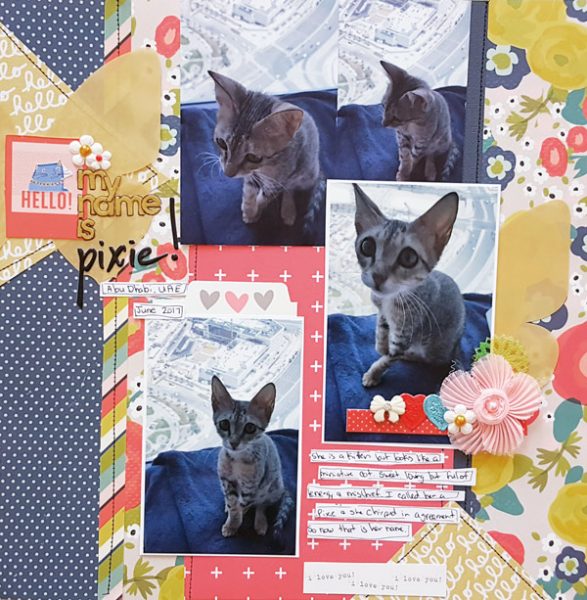
My Name Is Pixie By Christy Strickler |supplies Pattered Paper: Crate Paper, Fancy Pants; Letters: Simple Stories; Pinkfresh Studio; Sticker: Pink Paislee; Sequin,Resin: JBS Mercantile: Die Cuts: Cocoa Daisy; Other: Flowers
Stefanie Semple says, “The story here is of how my daughter is learning to drive, and neither she nor I want me to teach her.”
“I love multi-photo layouts, I try to balance taking photos with being in the moment and this means that sometimes I have fewer photos than I would like. Here, I balanced two larger photos with four smaller detail photos and driving signs to add context and fill the page.”
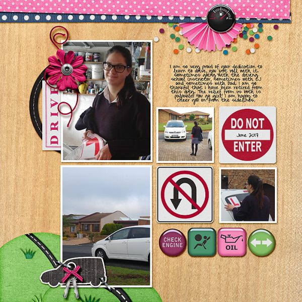
Learner Driver by Stefanie Semple. Meagan’s Creations & Juno Designs Collab: Behind the wheel, Allison Pennington: Wood be good 3 Papers.
Sian Fair says, “This page is about my contribution to Worldwide Knit In Public Day: I knitted on the museum steps but there weren’t a lot of people about!”
“A grid is an obvious way to include twos and fours on a page, but the strong lines of the steps and the stripes of my t-shirt in the photograph meant that it would have felt wrong to try any other kind of design. Thus, I have two rows of four, with four each of two kinds of squares.”
“A grid design can often look very formal. To avoid this on a fun page, I roughed up my edges, offset a square slightly, and added twine so that it looks as if it is hanging in the museum. Instead of grouping embellishments in odd numbers, I have a couple of groups of four, and I have four elements to my title.”
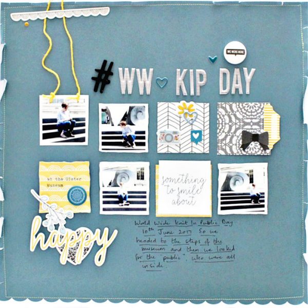
WWKIP Day by Sian Fair | Supplies: Patterned Paper, Felicity Jane; Alphas: Felicity Jane and American Crafts; Diecuts and puffy stickers: Felicity Jane
Devra Hunt says, “Cheerios are my son’s favorite food. He eats them with every meal. One day after finishing a box, I put the empty box on my sons head. He didn’t think it was funny until Dad did it too.”
“Using groupings of twos and fours on this page seemed like a natural fit. I took my cue from the photo first, since it features two people doing the same thing. The first two letters of the word Boys in the journal card share the same bold font. Adding the two paper dolls there creates another cluster of four. I used a cut file full of circles, representing the cheerios. I added two stickers in four places around the circle. Lastly, I embellished two corners of the page, which pushes the viewers eye towards the center.”
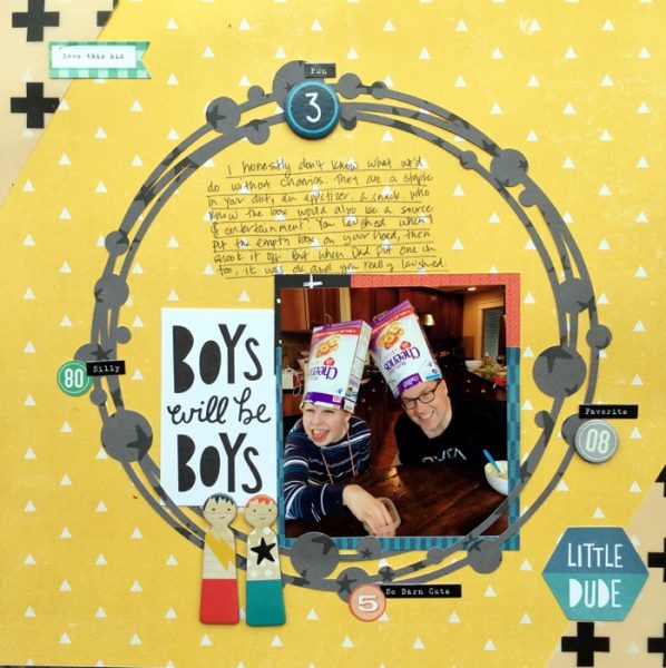
Boys Will Be Boys by Devra Hunt | Supplies: Patterned Paper, die cuts, chipboard, and stickers -Crate Paper, pen and adhesive-EK Success, electronic cut file Paper Issues, Silhouette
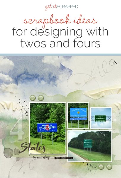
Terry Billman says, “This layout showcases four photos that represent the four states we traveled through in one day during our recent vacation.”
“With my blocked grid design, I’ve actually created the look of three columns across the page–even though there are four photos in the grouping.”
‘I kept the number of elements consistent with the number of photos, four brads grouped in twos. The large number four provides an entry point, and the epoxy brads at the top and bottom provide direction through the page. The two paint splatters placed diagonally through the page also provide direction, and are not distracting to the eye.”
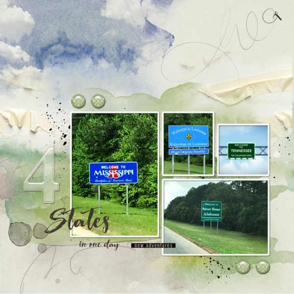
Four States created by Terry Billman| Anna Aspnes: Art Play Palette Explore, Art Play Palette Reflections, Art Play Palette Heartland, Acrylic Alpha Set 1; Sugar Plum Paperie: Life is an Adventure
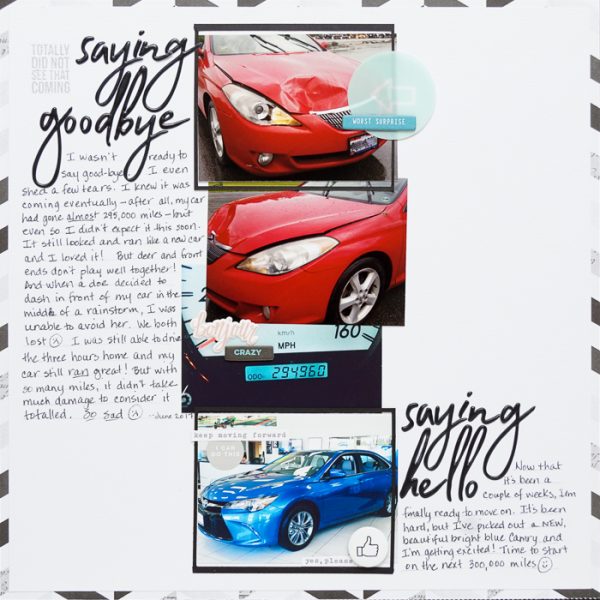
Marcia Fortunato says, “This layout tells the story of how difficult it was for me to unexpectedly need to say goodbye to my beloved car and purchase its replacement.”
“Since my story was about two cars, an old one and a new one, the idea of using twos and fours fit perfectly. I needed three photos of the old car to show its damage and high mileage, and I wanted to also include a photo of the new car that I am getting. Even though this gave an even number of photos, there are also groupings of threes as subsets – the three of the original car, and also three that are brighter colors with one almost black and white – which give that bit of interest that comes from using odd numbers. The photos are also staggered and appear to vary in size.”
“I repeated the use of pairs throughout my design – Saying Goodbye and Saying Hello – and established two areas of journaling, four embellishment areas with two elements in each. Embedded within these pairs, though, there is repetition with differences with the varied length of journaling and the differently colored word strips. Additionally, there are visual triangles with the three circles, a triangle of white embellishments, and three areas of blue in the embellishments and photos. These add dynamics and energy to the symmetrical even design.”

