The design elements and principles we often teach in our articles here are guidelines that you can use to build a solid and appealing design that tells a story.
Once you understand these rules, though, it’s time to break them purposefully and take advantage of the benefits that rule-breaking yields: moving out of your comfort zone actually builds design confidence and gives you surprising and fresh looks.
When you break design rules, there are basic guidelines to follow:
- be clear: If you’re going to break a rule, be clear that you’re breaking it. Don’t go halfway, and don’t leave any doubt about your intention.
- be purposeful: There should be a logic to why things are one way and not the other. Avoid making things different or placing things “just because.”
- be confident: Be decisive and convey confidence with your placements, contrasts and visual relationships.
- have fun: take this opportunity to have fun in your scrapbook page design.
Our Creative Team shows you just how they went about breaking design rules on their pages.
CLICK ON THE IMAGE BELOW TO SIGN UP FOR OUR EMAIL LIST AND GET YOUR FREE PAGE GUIDE
Kristy T. says, “This layout documents the beginning of a new phase of life for us and our daughter as we start to fill in paperwork and make preparations for her to start high school next year.”
“Often when creating pages with a upward vertical flow, the starting point is the lower left corner leading up the page. Here, though, I have placed my photo in the lower right corner very close to the edge of the page. We read left to right so this reversal is unexpected to us and breaks the rule. I have also left white space in the upper left corner, rather than add some elements to balance the design. In this way, the page feels slightly unfinished. This suits my story, though, which is about an unknown and exciting future. It shows the energy and excitement but also the uncertainty through the breaking of the rules.”
“To make this design work I created a colorful background to make the page interesting, even though there are very few elements on the page and a simple design. I like the result as it captures the feelings–but a part of me still wants to add elements to complete the vertical flow!”

Ready to Fly by Kristy T | Supplies: Cardstock – Artee; Paint – Dylusions; Stencil – Dylusions; Alphas -Prima; Cardboard Frames – Simple Stories; Metal Butterfly – Unknown; Paper – Simple Stories.
Ronnie Crowley says, “My son just graduated high school so I was excited to make a page to finish off his senior scrapbook.”
“The rule I broke was that advising a limit to the number of typefaces used. Instead, I made a statement with my quote by using multiple alphas to render it. I provided unity by using alphas which were colored similar to the colors found in the picture. Even with all these alphas, I was able to maintain the focus on the picture. If I had chosen a smaller picture then the quote would have become more of a focal point, which isn’t what I wanted. I prefer pages where the picture(s) are the focus.”

On Your Way by Ronnie Crowley | Supplies – Scrapbook Lady – Stunning Single, Mye De Leon – Old School; Alphas – Various.
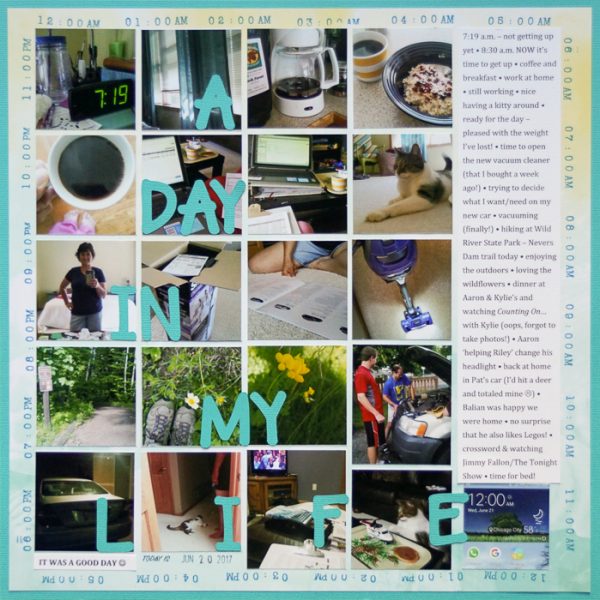
Marcia Fortunato says, “Earlier this month I participated in A Day in the Life with the Ali Edwards community, and I used those photos on this layout to record my day.”
“Because these were random photos from throughout an average day, I felt that I could break the rule that says that you must establish a focal point in your design. I did this by arranging my photos chronologically in a structured grid and by using a subtle title that is flat and spread out through the design.”
“Originally I had a mix of horizontal and vertical photos that I was trying to fit into a block design. However the look was too haphazard, and with no clear focal point the design was chaotic and difficult to follow. Cropping most of the photos into squares and arranging them into a grid brought order to the page and made it more visually appealing. The two photos that were left uncropped add just a bit of tension to the design. I like the results and think that in cases like this, ignoring the focal point rule works just fine.”

A Day In My Life by Marcia Fortunato | Supplies: Cardstock: American Crafts, Core’dinations; Patterned Paper: Pink Paislee; Title font: LW Wide Marker (Silhouette Design Store); Journaling font: Cambria; Stamps: Ali Edwards, Smash; Inks: Studio Calico, Ali Edwards.
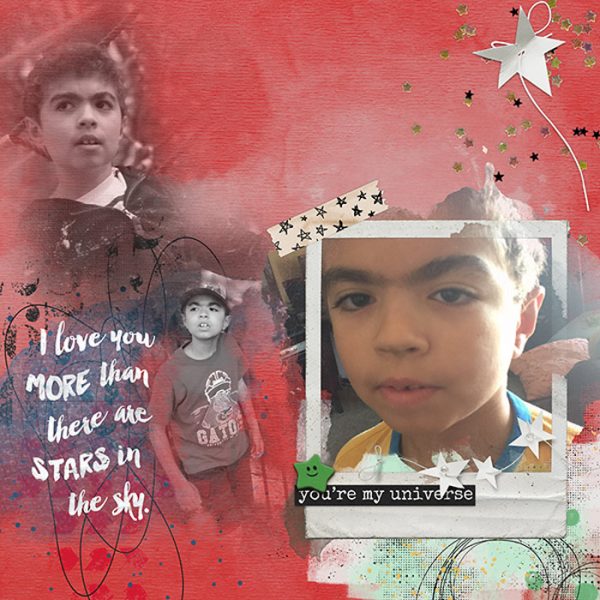
Jana Oliveira says, “I wanted to show different stages of my son’s life. I always like to document and compare. He’s growing so fast, I sometimes forget little details about when he was younger. The layouts help me realize small details in his face that are changing.”
“My objective was for the reader to look at all of the pictures and not just one. Sometimes a story needs more than one focal point. We don’t have to force ourselves to establish just one: we can break the rule. I did this by using three different pictures in different scenarios, some of him looking at the camera and others not, spreading them across the layout.”
“I’m always looking for ways to use more than one picture, and sometimes not having to worry about creating a focal point does help us to be freer in our creative process.”

You’re My Universe by Jana Oliveira | Supplies: NBK Design: Dear Dairy out of the box polaroid frames, Make a wish brushtool box. Jenn Barret: Space Cadet Kit.
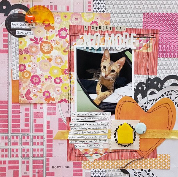
Christy Strickler says, “This is the story of how we found our foster cat. She had a rough start in life living outside in the city during the summer, enduring 100 plus degrees with her shoulder and leg broken. I wanted to show that transition from her rough outside life to stability.”
“I started by building an asymmetrical background with symmetry mixed in. I cut the base paper in half. One side is bright showing the street map while the other has grid design of triangles. Triangles symbolize change so this was the perfect paper.”
“I bracketed the photo with wood grain paper and then stitched a box around the photo two times. I played with pulling things out of balance in pairs. In some cases I pulled color from one side in small amounts on the other.”
“There is a lot of symbolism in this page with the outside represented by the street paper, sun and floral papers. The inside is represented with the house and doilies. Pink represents love and warmth while the black represents the bad things that happened to her. Wood grain represents her stability. Playing with the rules of symmetry helped me to reinforce the symbolism within the story. I also feel it helped me to unify so many different elements onto one page.”

Street Cat No More By Christy Strickler |Supplies Patterned Paper: Basic Grey, Pink Paislee, Studio Calico;Letters: Freckled Fawn, Glitz Designs; Resin: Cocoa Daisy. Freckled Fawn; Vellum: Studio Calico; Doily: Wilton,other; Ribbon


