 The popularity of educational play is on the rise. Homeshooling is becoming more common, new innovative STEAM toys (STEAM=Science, Technology, Engineering, Art, and Math) are filling the shelves of big box toy stores, and now instead of playrooms people are beginning to incorporate “learning spaces” within their homes.
These spaces often have a clean, organized look, but at the same time they utilize elements that aim to engage the senses. This includes bright colors, strong use of shapes and motifs, and a variety of textures.
Our team used the look and feel of these “learning spaces” as inspiration for their pages here, looking to create an overall design that is clean and organized but that also engages the senses in a similar way. For a closer look at these learning spaces check out our INSPO: LEARNING SPACES pinboard.
[hr]
Kelly Sroka says, “We have been a homeschooling family for over ten years. During this time, books have been an indispensable part of my children’s learning. We have books everywhere! My children have always had bookshelves in their rooms to house their current schoolbooks, supplies, and library books. As much as I attempted to keep these learning spaces clean, they invariably became messy as the kids worked on their assignments.”
“I used these learning spaces from our home as inspiration for this page about my kids. The photographs are from Easter Day. My kids had gotten sidewalk chalk in their Easter baskets, a yearly tradition at our house. They went out Easter morning to decorate our front walk and I snapped these pictures.”
“The design of the page is a messy shelf with books aligned on it. The shelf has many layers of patterned paper and random embellishments, just like the bookshelves in our homes which have a few shelves and assorted school supplies tucked here and there. There are a few books arranged neatly on the shelf, like the photographs that are aligned along the top of the patterned paper. Using inspiration from the learning spaces in our homes helped me create this layout that shows off my pictures while grounding them to the page.”
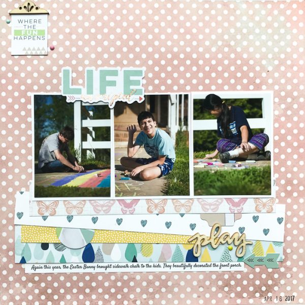
Life Unscripted by Kelly Sroka | Supplies: Patterned Papers: Authentique, Pink Paislee, Shimelle, Webster’s Pages; Die Cuts: Pinkfresh Studio; Wood Veneer: Freckled Fawn; Enamel Dots: Basic Grey, Carta Bella
Devra Hunt says, “My son was so sick he wouldn’t leave my side for two days. Most 14 year olds wouldn’t be caught cuddling with Mom. I decided that I was ok with him not realizing this social normalcy for someone his age. I took comfort knowing that he knew he needed me.”
“I was drawn to the combination of neutrals with color in the inspiration pieces. The other thing I noticed about this style were was walls filled with a hodgepodge of items. I took the idea of the walls in the rooms as the main idea of my page. First, the paper I chose is paint brush strokes, like a child’s work of art. I placed several different types of frames on the paper, filling them with a variety of embellishments that pertained to my story. The result is an organized variety of shape, color and texture to engage the senses, and the viewer.”
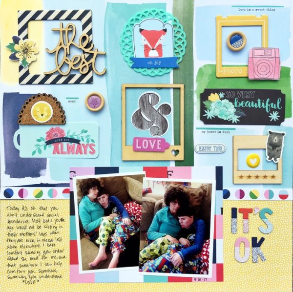
It’s OK by Devra Hunt | Supplies: Patterned paper-Shimelle, wood pieces and cork, Freckled Fawn, Shimelle, die cuts, alphas-Shimelle stickers-Shimelle and Freckled Fawn, felt doily-Freckled Fawn, pen and adhesive-EK Success
Marcia Fortunato says, “This scrapbook page showcases photos of many wildflowers that I’ve taken while hiking this spring.”
“Looking through photos of learning spaces, I was drawn to the rooms that were lined with bookshelves displaying books and other learning materials. I had been wanting to create a scrapbook layout that showed and labeled the wildflowers I’ve photographed, in a way that would be a sort of reference page to identify the flowers. Using the bookshelves as inspiration, I figured I could organize many photos and label the groupings.”
“I created the look of shelves on my paper using strips of a wood print paper backed with a light grey cardstock to give it a “shadow” and more dimension. I then set my small photos onto the shelves and wrote the labels using a light ink to keep the look light and airy. Because my photos already added a lot of color, I decided to use plain white cardstock as my background “wall.” In this way, I was able to fit thirty photos onto my two-page layout and yet maintain the clean, organized look portrayed in the learning spaces.”
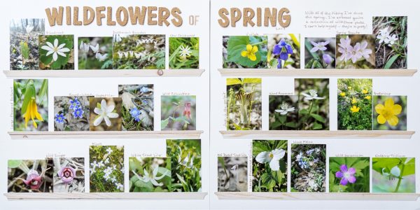
Wildflowers of Spring by Marcia Fortunato | Supplies: Cardstock: American Crafts; Patterned Paper: The Paper Studio; Letters: Thickers (American Crafts), Simple Stories; Pen: Distress Pen (Ranger/Tim Holtz).
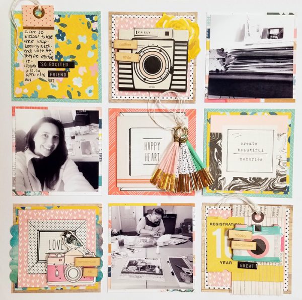
Nicole Mackin says, “This page is about the last scrapbooking getaway I had with my best friend. Because many learning spaces have order mixed with a variety of textures, colors, and sizes, I incorporated these concepts in a grid style layout. The grid provides the order, but each individual square holds a variety of textures to include paper, puffy stickers, fringe, chipboard, wood veneer, and twine. The black-and-white photos bring order, but the variety of colors and patterns engage the eye. They are mixed in a way to benefit the overall look of the layout. And then each individual square is its own separate piece, providing a couple different dimensions to the visual experience.”

