 On a well-designed scrapbook page, the different pieces have varying levels of importance–and you impart that visually.
Of course one piece will be the most important, “focal point” that catches the eye first and serve as the point of entry into the page. If you don’t have a focal point, the viewer doesn’t know where to start. Make a page that explores one of the following ways to emphasize your focal point on the scrapbook page:
- Size
- Color
- Value
- Placement
CLICK ON THE IMAGE BELOW TO SIGN UP FOR OUR EMAIL LIST AND GET YOUR FREE PAGE GUIDE
1. Establish emphasis with size.
Making something large is a great way to call attention to it. But you can also draw attention something by making it a lot smaller than the other elements. It’s the difference in size that matters.
Ronnie Crowley says, “My son has played varsity basketball all four years of high school and this was his very last game.”
“I showcased a picture that shows the effort he puts into the game. To create emphasis, I enlarged the one picture take up the majority of the space on the page. You can see the tendons in his hands and when I print it at 12 by 12 the picture will really draw the person into the action on the court. When I scrapbook sports I often use this approach as it makes the player appear larger than life as they take up so much of the page.”
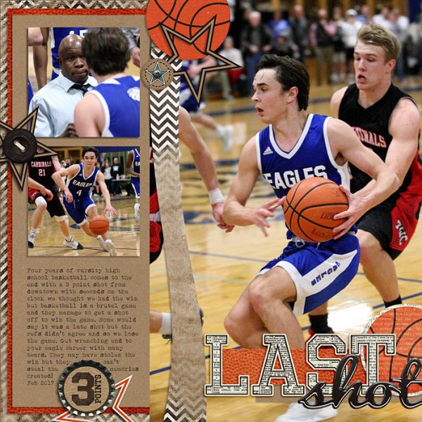
Last Shot by Ronnie Crowley | Supplies – Libby Pritchett – Cutting down the nets, April Lisa – Paper Pieces 10
Stefanie Semple says, “My daughter and I made Easter Egg nests using a recipe from Pinterest with interesting results.”
“The engaging photo of my daughter stirring the ingredients is the focal point: it is the largest item on the layout, and the cluster visually anchoring it also has the largest embellishment pieces. It stands out because of the high contrast with the lighter patterned paper background. One more thing that makes it stand out is its separation from the rest of the page pieces.”
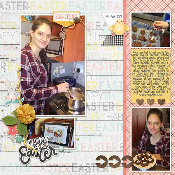
Happy Easter by Stefanie Semple | Supplies: Just Jaimee: Hop (2017 April Story Teller Add-on kit), LJS Designs: Photo Focus 2017 April Basics.
2. Establish emphasis with color.
Certain colors are natural attention grabbers-especially white, intense colors (like yellow or pink), but also more saturated colors (like purple or red).
Meggan Blethen says, “I had these cute photos of my son at an amusement park. They don’t have huge stories behind them so I wanted them to stand out and to draw your eyes right in. In order to do that I found some crumpled up paper in my stash and glued it to the background. I used a white background paper to help the color behind the photos pop.”
“Using color as my emphasis brings your eye to my photos, which is what I want the focus of this layout to be.”
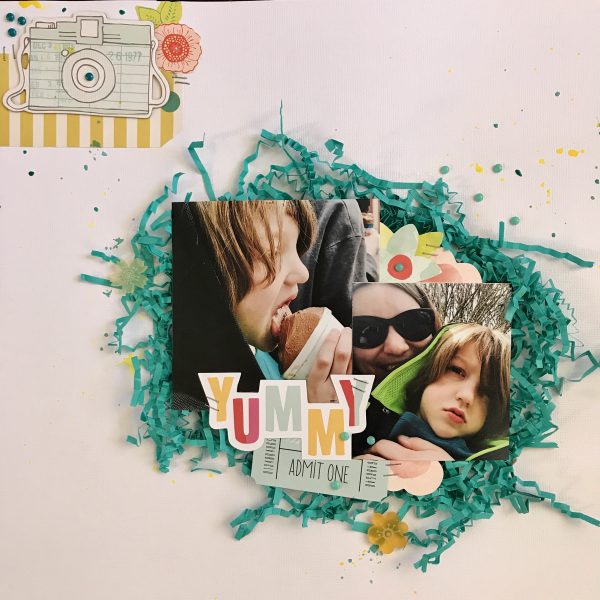
Yummy by Meggan Blethen | Supplies: Paper~ American Crafts White Textured Cardstock, Embellishments~ Dear Lizzy ‘Fine & Dandy’ Ephemera, Echo Park ‘Just Be You’ Ephemera, Dear Lizzy Printed Chipboard shapes, American Crafts ‘Everyday’ die cuts, Close to my Heart enamel dots, Shimmerz Paints Colorings ‘Well Blue Me Down’ & ‘No Yoking’.
3. Establish emphasis with value.
Brighter colors draw the eye before the darker colors. However, be careful not to use too much contrast in your image or else the rest of the image will receive no attention.
Christy Strickler says, “On a trip to Disney World we visited the Swiss Family Robinson Treehouse. I wanted my focal point to be the close up photo of my husband and son together.”
“I separated this focal-point photo and a smaller photo of us in the treehouse from photos of us on the ground and climbing. I clustered the title and journaling around my focal photo to make that block larger. I divided the patterned paper in half, placing the ground photos on it and on the lower side with arrows pointing up. The focal photo is in the brighter half of the page. Much of the patterned paper has triangles on it which point upward. My goal was to have the eye enter the page at the ground level and move upward.”
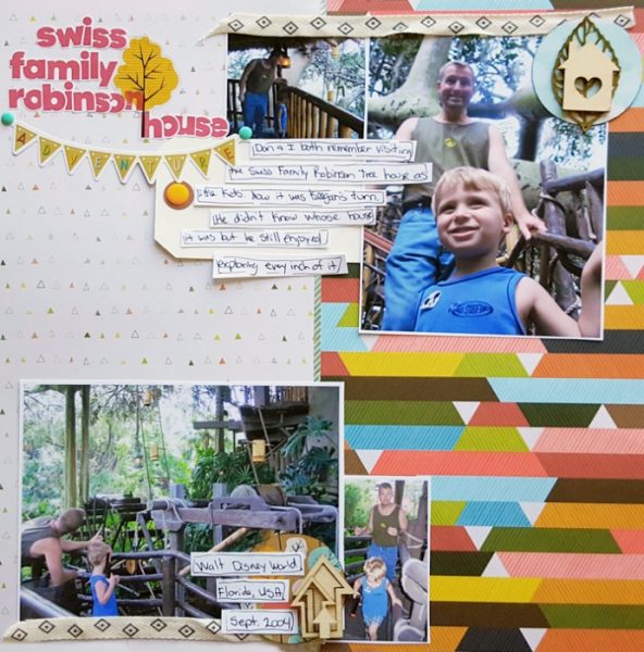
Swiss Family Robinson Treehouse Adventure by Christy Strickler |Supplies Patterned Paper Pink Paislee, Shimelle; Letters: Evalicious; Stickers: Shimelle; Wood Veneer, Metal: Freckled Fawn; Other: Tape, Ribbon
4. Establish emphasis with placement.
Where you place an item can affect whether or not the viewer is drawn to it. When you separate something spatially it grabs the eye. Items placed in the center of the design will also have a natural draw.
Deborah Wagner says, “A friend took this beautiful photo of her son at the beach and asked me to scrapbook it for her. I used the rule of thirds when deciding where to place my photo. The rule states that your page should be divided into nine equal squares, with two horizontal lines intersecting two vertical lines. The points of interest on your layout should be where two lines intersect. Placing elements and focal point where the lines intersect create balance and a visually pleasing design.”
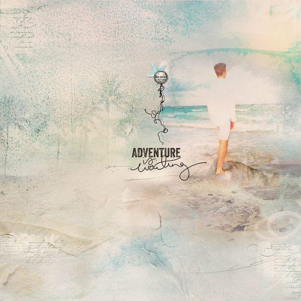
Adventure is Waiting by Deborah Wagner | Supplies: Anna Aspnes – Art Play Palette Getaway, Art Play Palette Salty Living, Art Play Palette Sea Life, Art Play Palette Serenity, Art Play Palette Explore, Outdoors Word Art 2, Urban Threads, Life’s Little Words Transfers 1
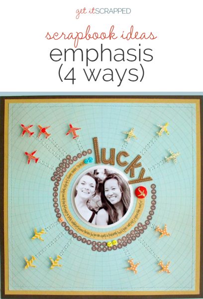
Kelly Purkey says, “I started with the background patterned paper and let it inspire the design of the page, cropping my photo to a circle and placing it at page center. I worked my way out with other elements. Everything was added to reinforce the photo as focal point.”
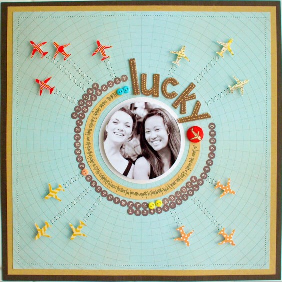
Lucky by Kelly Purkey | Supplies: Cardstock – American Crafts. Patterned paper – Studio Calico, American; Crafts. Stickers – My Mind’s Eye, American Crafts. Buttons – Basic Grey. Pen – American Crafts; Punch – EK Success. Other – Thread

