When you juxtapose elements that aren’t usually shown together, the viewer is not only interested, they are curious and maybe uneasy. There’s something off and they want to figure out what and why.
This approach is one to use occasionally and with consideration to get an eye-catching look. Be sure, though, that your juxtapositions are in service of your story.
We presented the Get It Scrapped Creative Team with a very specific “juxtapositions” assignment. We asked them to look at the 20+ “style” boards in the Get It Scrapped Pinterest Collection and find two to combine in their storytelling. As you look at their pages below, you’ll find that the Pinterest Boards that inspired them are linked so that you can get a look at the inspiring image collections.
[hr]
Christy Strickler says, “The story here is of how, after we visited a museum, we stopped in the coffee shop for a sweet treat.”
“I blended a Vintage Modern Style with a Simple Linear Style. I say “vintage modern” because the background paper here reminds me of the old Reader’s Digest book covers my Grandmother had on her bookshelf. The design also lends itself to an artsy feel which is perfect for telling the story of a coffee shop with upcycled furniture inside of an art museum.”
“I focused on two specific pins from the simple linear style board. The first helped me define the flow of the page. I placed the photos with a block extending outward in much the same way that the lines extended outward from the image of the lady. The second pinned image helped me to mute the pattern and organize the chaos. I liked how there was a vellum like sheet over a busy background with simple text place on it. Embellishing was kept to a minimum.”
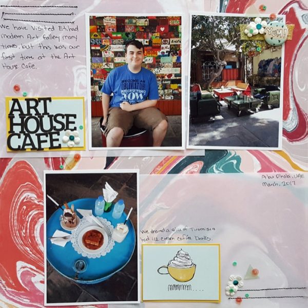
Art House Cafe by Christy Strickler | Supplies Patterned Paper: Cocoa Daisy, Pink Paislee; Letters: Lilybee Designs; Flair: Cocoa Daisy;FLowers: Recollections; Other: Vellum, Sequins
Marcia Fortuanto says, “The onset of spring brings with it so much work cleaning out my flower beds, so I created this layout with before and after pictures together to remind me that the hard work pays off.”
I worked with the Curated Style, which incorporates botanicals and natural history illustrations and feels very earthy. It’s combined with the Flat Style, in which everything on the page lays very flat and elements are separated from one another in a very streamlined, often graphic, look.”
“In order to merge these two styles, I started with the natural and botanical elements typical of the Curated Style as embellishments since these support the outdoor spring theme of my page. I incorporated the Flat Style in the way that my elements are organized on the layout. Rather than using embellishment clusters as I typically might, I instead laid them out across the bottom of my page, grouping them in a way that a curator might record them and in much the same way as I am trying to organize my flower beds at this time of year.”
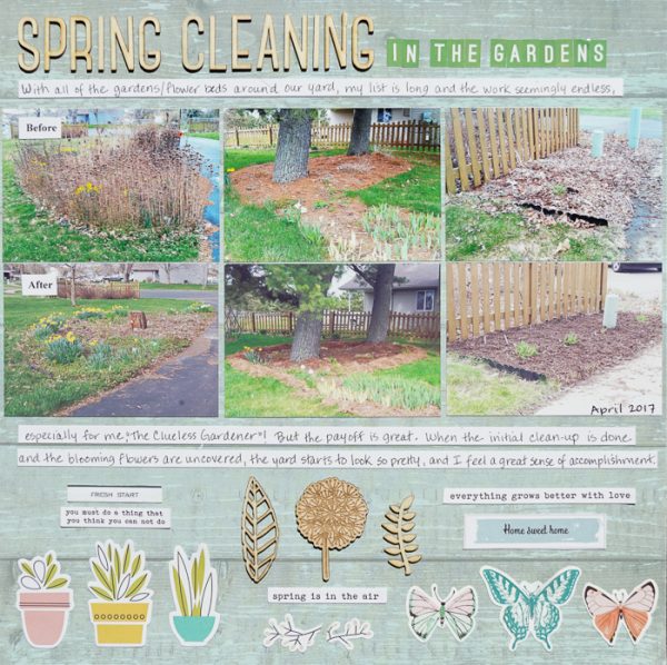
Spring Cleaning by Marcia Fortunato | Supplies: Patterned Paper: Simple Stories; Cardstock: The Paper Studio; Letters: Studio Calico, Pretty Little Studio; Embellishments: Simple Stories, Crate Paper/Maggie Holmes, Cocoa Daisy, Studio Calico, Pinkfresh Studio, Bella Blvd; Pen: Precision Pen (American Crafts).
Stefanie Semple says, “My husband loves airplanes and has been fascinated with them since boyhood. He loves tracking the planes on his ipad via an app, called flight radar. This obsession comes into its own when someone we know is flying somewhere.”
“I used two contrasting styles Normcore and English Countryside as inspiration for my page. I started with a woodgrain background (English Countryside) and then layered clean rectangles of tone on tone greys (Normcore). The flowers and miniprint florals work to connect with the floral pattern in our bedding (English Countryside) and then the stamps and spots of red create visual triangles while adding to the air travel theme.”
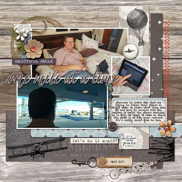
One Mile at a Time: Stefanie Semple. Anita Designs: Natural & Family Treasures, Kimeric Kreations: As time goes by jewel pins & A Great Adventure
Kelly Sroka says, “I love spring when everything begins to grow again on our farm. During this season, I take many pictures to record the wonder of spring. One of my favorite ways to take photographs is with the Hipstamatic app on my iPhone. I can choose from a variety of lens types and film styles to create beautifully filtered pictures. To begin this layout, I turned to inspiration from the Style:Filtered Pinterest board at Get It Scrapped. This style reminded me of the 1970s, so I layered papers with a retro look underneath my photographs.”
“The pictures on my page are quite bold and the patterned papers are somewhat busy. In order to contrast with this element of my page, I turned to inspiration from the Style:Industrial Pinterest board. This style is stark and sleek with lots of black and white. I used a plain white background with a touch of black on each side to contrast with the vivid photo block. By using these contrasting styles, I was able to create a page that has visual interest, contrast, and allows my photographs to be the focal point of the page.”
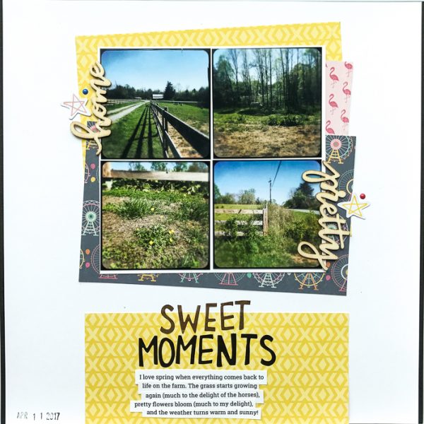
Sweet Moments by Kelly Sroka | Supplies: Cardstock: Bazzill; Patterned Paper: Echo Park; Wood Veneer Words: Freckled Fawn; Die Cuts: Pinkfresh Studio; Enamel Dots: Carta Bella; Letter Stickers: Crate Paper
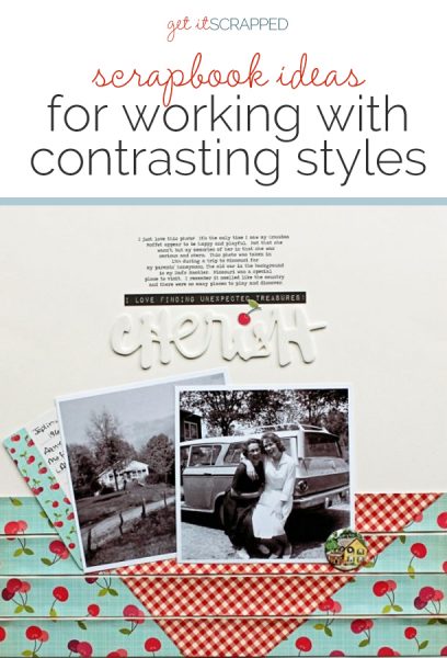
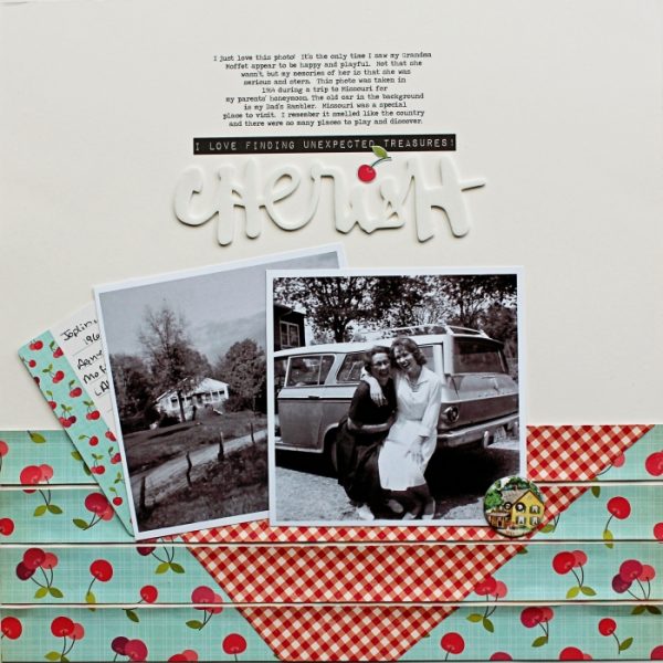
Shanna Hystad say, “My page is about the photo I found of my Mom and Grandma laughing and being silly. What a treasure this was since I had only remembered my Grandma as being a serious woman.”
“I worked with the Normcore and Provincial Picnic styles. I had never heard of Normcore but what I have learned is that “less is more” and the “ordinary is the extraordinary.” I used black-and-white photos and kept the top part of my layout simple and in neutral colors. The bottom of the layout highlights the Provincial Picnic style. Although these photos were not taken in France, they were taken in the country which is one of the reasons I chose them. I used a gingham patterned paper that is perfect for a picnic. The cherry paper reminded me of a tablecloth my Mom used to have. I placed the paper on a slant to simulate a tablecloth pattern.”

