 One of the easiest ways to draw attention to your title is to create tension within its type. Something as simple as a tweak to case, color, or placement with in your scrapbook page title can really intrigue the viewer – but remember we don’t want to create tension without purpose!
If you’re going to make a certain word a different color or substitute a motif for a letter in your title, you want to choose a word or shape that has relevance to your story.
See how our team has taken one of these approaches to creating tension with their title rendering:
- highlight a word or letters in the title by rendering in a different color.
- use a meaningful motif or shape in place of one of title characters.
- emphasize one word or letter by rendering it in a larger size.
- render one word or letter in a different font to emphasize or tweak meaning.
CLICK ON THE IMAGE BELOW TO SIGN UP FOR OUR EMAIL LIST AND GET YOUR FREE PAGE GUIDE
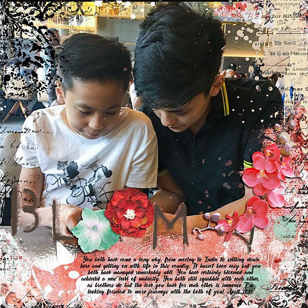
Audrey Tan says, “This page is about my boys who have spent their teenage lives in a new country and having to adapt to a new lifestyle. They have done well and are literally growing up.”
“Although it’s not perfect, they have adjusted well and have bloomed! I’ve made use of the title ‘Bloom’ and added two flowers within the title to portray how they are like flowers, blooming in the face of change.”
Devra Hunt says, “There was a day last summer when everything went wrong. Instead of the fun, outdoor day I had planned, one thing happened after another, and the day spiraled out of control.”
“The title of my page–‘life isn’t always rainbows and unicorns’–is my way of mixing real life with a little bit of trendy humor. The lowercase, white letters are eye-catching against the black paper and appear to have a serious feel. Using the colorful letters over the trendy motifs is equally as impactful, but in a less serious way.”
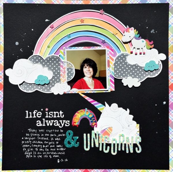
Life Isn’t Always Rainbow and Unicorns by Devra Hunt | Supples: Cardstock-Paper Accent, Bazzill. Patterned Paper-Lawn Fawn, Doodlebug Design, Stickers-Doodlebug Design, Alphas-Bella Blvd, American Crafts, paint-dylusions, pen-Souffle, chipboard-Freckled Fawn, Die cut-Paper Issues, Silhouette
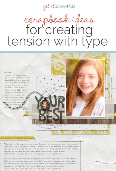
Kelly Prang says, “My daughter is finishing elementary school and heading to middle school in the next few months. I wanted to give her some advice about life as she is growing up.”
“The title ‘Your Best’ is the title of the song I’ve quoted at the bottom of the page, and it is a reference to wanting my daughter to be Her Best, not to worry about being THE best. I want her to be secure in her self-identity and feel confident in her life choices as she enters teenage-hood and the crazy world of middle and high school.”
“To create tension, I replaced the letter ‘O’ in the title with a miniature locket frame with a small photo of my sweet daughter when she was in kindergarten. This is to help her remember who she is and to be her best self.”

Your Best by Kelly Prang | Supplies: Allison Pennington- Sieze- papers and elements, Mighty-twine, More Smarter- locket frame, Respendent- white background paper; Font: FZM Old Typewriter. Song lyrics- “Your Best” by Claire Guerreso as shown on the tv show Nashville and sung by Lennon and Maisie Stella (playing Maddie and Daphne Conrad)
Deborah Wagner says, “This is a photo of my friend’s son. He was playing cowboy on a summer day at their cabin, and she got this adorable photo of him. I used a Western-style font for the word “cowboy” and then I used a lasso to replace the ‘O.’ The rope makes my title pop and emphasizes the cowboy theme. I grounded the rope with a mustache flair. The mustache was the perfect finishing touch, completing my visual triangle of black & white and replicating the mustache Jake is wearing in the photo.”
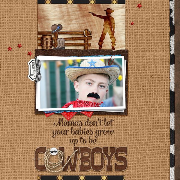
Don’t Let Your Babies Grow Up To Be Cowboys by Deborah Wagner|Supplies: Amber Shaw & Studio Flergs – Magical Frontier; Danyale – Cowboys Chase The Boys; Mommyish – Spring Has Come Template; Anna Aspnes: Torn & Tattered Paper Templates 2; Studio Digilicious: Comic Book Hero; Laura Passage – Daily Slice of Life; Katie Pertiet – Clipped Stacks 6
Megan Blethen says, “My son Jonas has been asking me to make a layout about him. He was playing one of his favorite games the other day and I took a few pictures of him playing. He loves video games and I knew I’d want the layout to be about that subject.”
“The title of the layout is an introduction to who he is, My name is JONAS. This layout is about him and what he likes right now so I thought the title was perfect. I actually used 2 different approaches to create tension in my title. I wanted his name to stand out so I picked a larger alpha in all caps and I also made it a different color than the smaller alpha.”
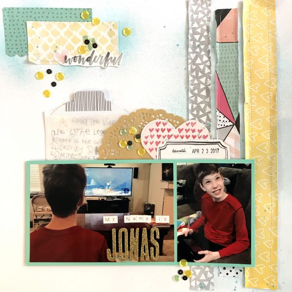
My Name Is Jonas by Megan Blethen | Supplies: Paper; Close to My Heart White cardstock, Amy Tangerine Stitched ‘Loom’, Amy Tangerine Stitched ‘Meadow’, Bazzil Basics Mint cardstock Embellishments; Project Life stitched embellishments. American Crafts Kraft doily, SpiegelMom Scraps Sequins, American Crafts Thickers ‘Fitzgerald’ in gold, Tiny Alpha stickers by Teresa Collins, Shimmerz Paints ‘Well Blue Me Down’ spray mist.

