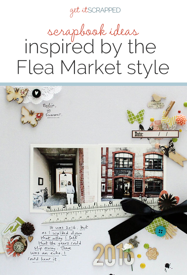
 The “flea market” decor style is an eclectic one, often including a curated collection of pieces that are seemingly unrelated, each with their own story, and yet combining to tell a bigger, single story.
This style incorporates objects one might find at a flea market: vintage pieces, second-hand belongings, or antique collectibles. These items often have contrasting patterns, unique textures and stylings, and even a worn or old look to them.
See the stories and designs our creative team have made using this complex and charming style.
CLICK ON THE IMAGE BELOW TO SIGN UP FOR OUR EMAIL LIST AND GET YOUR FREE PAGE GUIDE
Christy Strickler says, “The story here is of my son and how he was very cautious about goats after one was a bit aggressive with him at a petting zoo. He was not thrilled that a goat took his bread when visiting a friend’s farm.”
“I had vintage ephemera featuring goats that was perfect for this page. Using the flea market style allowed me to mix old with new for a vintage fresh feel. I used some items that felt older due to their color or pattern and then added pops of brighter blue, green and light orange to make it feel more energetic.”
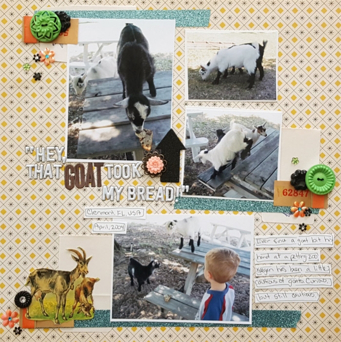
Hey, That Goat Took my Bread!” by Christy Strickler |Supplies Patterned Paper: Sassafrass; Letters: Evalicious,October Afternoon; Buttons: JBS Mercantile, Other: Vintage Ephemera; Die Cuts, Resin: Freckled Fawn; Other: tape and brads
Deborah Wagner says, “This is my daughter, granddaughter, and me dressed up as angels for Halloween.”
“The flea market style seemed the perfect choice to give my page the old-fashioned tone I wanted. To give a timeworn appearance to the photo, I appplied digital actions. My clusters were created with jeweled flowers, beads, feathers, and lace: all the baubles you might find at a flea market. The white and pink feathers, flowers, and wings tell the story of our angelic day. The black elements and brushes were added to represent Halloween, and provide contrast.”
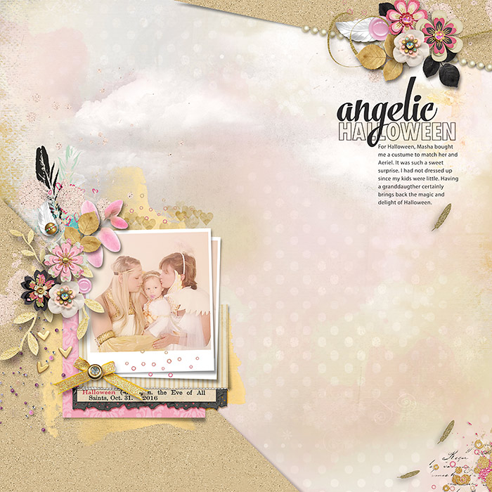
Angelic Halloween by Deborah Wagner|Supplies: HeartStrings – Harvest Sunset #1, Oh Come All Ye Faithful; Studio Flergs – Je t’aime; Feli – Santa Claus Is Coming to Town; Allison Pennington – Joyeaux Trinkets; Katie Pertiet – Vintage Blendable Fairies, Ad Inspiration 3-16-13, Winter Peony; CBD – Oh Dear Me; KimB – Salty Kisses; Mommyish – Spring is in The Air, Cherished; Kelleigh Ratzlaff – Love You Today; Daniellle Angebretson – Little Things, Le Tres Ame; NBK – Precious
Sian Fair says, “This page is about some of the old buildings we explored in Berlin. Every window I looked up to seemed to me telling me a different story from its past.This particular tenement building had been converted into chic shops selling all kinds of things: a very fancy kind of flea market. But, more than that, I liked the idea of the history behind the building being represented by a collection of ‘Granny’s attic’ type embellishments.”
“To get the look going, I first of all turned to my scrap basket, which has a little bit of everything left over from previous projects. Then I found a lovely little packet of punched shapes and bits and pieces sent by a friend. Anyone who has ever taken part in an embellishment swap could make a page like this! I chose a white background to keep my page looking fresh and modern, and I added a big black bow to ground all the tiny pieces. I deliberately left the date sticker blank because the whole page is about going backwards and forwards in time.”
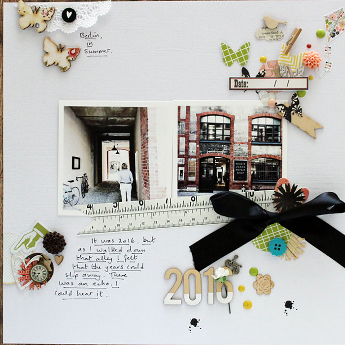
2016 by Sian Fair Everything except the alpha (which is from Felicity Jane) has come from my scrap stash. The tape measure is a piece of wrapping paper, the ribbon was wrapped around a kit. Ink splat stamp by Gossamer Blue.
Kelly Prang says, “A friend of mine loves photography, and her daughter is an amazing dancer. They went out for a photo shoot to capture some images of her in her costumes for one year’s version of the Nutcracker put on by her dance company. I loved this capture and wanted to make a page using it.”
“Growing up, I took dance classes, and remember loving the costumes, makeup, bright stage lights, and audiences at performances. I wanted to create a page with a layered, busy feel to tie into the feeling of waiting backstage all crowded together in a small space for our cue to perform. I also spent many weekends wandering through flea markets with my family. One thing I always loved to look at were vintage papers, ephemera, and photos that were for sale at one particular booth. So, as I set out to make a page in the flea market style, I decided to use layers upon layers, with vintage looking ephemera and ribbon, string, and sewing.”
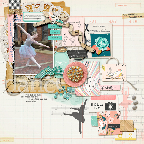
Dance by Kelly Prang | Supplies: Font- AA Alphabet; AC Digitals: Maggie Holmes: Gather- papers and elements; AC Digitals: Maggie Holmes: Bloom-mason jar, tickets;AC Digitals: Maggie Homes: Confetti- musical background stamp; Paula Kesselring: Autumnal Day- elements; Paula Kesselring- Black and White Only- doily and pearls; Paula Kesselring- Let’s Go Fishing- sequins; Sabrina Dupre- Summer- paint, string, ribbon and crepe paper floral piece; Tracy Martin- Dec. 2016- straight pin; C.D- Affirmations- messy stitches; Heather Joyce- everybody say love- template VogueSweetheart- Templatedance (flea market style)
Kelly Sroka says, “Recently I replaced old bookcases in my family room with two antique pieces I found at a local consignment store. I immediately fell in love with these pieces at the store and could not wait to have them in my home. I used the flea market style to document this new furniture because both pieces are different yet both are going into my home. The pieces also have histories that bring a flea market feel into my home.”
“To design my page, I chose papers and embellishments that looked vintage and antique, used and worn. The papers have vintage floral patterns. To accent the photographs, I used a kraft bag, cork stickers, tulle, and a doily–all of which give the page an antique look. As a final touch, I distressed the edges of the patterned papers to give them a worn feel.”
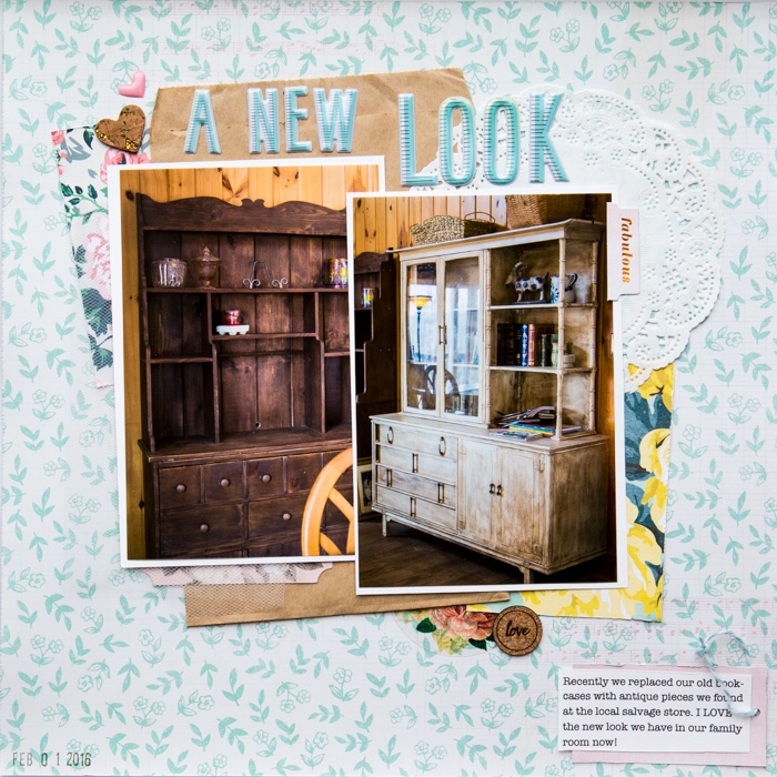
A New Look by Kelly Sroka | Supplies: Patterned Papers: Crate Paper; Cork Circle, Enamel Heart, Fabric, Bag and Twine: Citrus Twist Kits; Die Cuts and Cork Heart: Pink Paislee; Letter Stickers: American Crafts

