 The Nordic Christmas style–something you’d see in storybook illustrations by Jan Brett–include:
- natural pine and spruce woods
- rich textures, including felt, knit fabric, and stitching
- winter floral elements like pine branches and pine cones
- neutral whites, creams, browns with hits of red and blue and green
- repeating motifs of snowflakes, reindeer, and pine trees
The Get It Scrapped Creative Team has used this style for their own holiday pages here.
[hr]
Shanna Hystad says, “This story is about the live musical performance of It’s a Wonderful Life that we recently saw in Branson, MO. This happens to be my favorite Christmas movie and I was so excited to see it.”
“The Nordic style was a great fit with its cozy, winter, outdoor feeling. I evoked the style by using wood elements, a deer silhouette, tree branch and background paper with a wood print. The red and white colors of the style are in the patterned papers, and the snowflake motif decorates the page.”
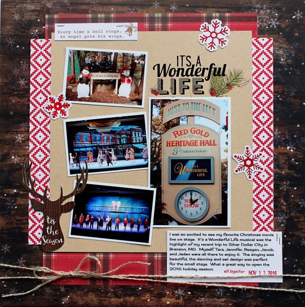
It’s a Wonderful Life by Shanna Hystad | Supplies: Paper-Echo Park-I Love Christmas, BoBunny-Sleigh Ride, October Afternoon-December Story, Tag-October Afternoon December Story, Stamp-Dear Lizzy, Deer Silhouette-October Afternoon, Snowflakes-Simple Stories-Claus & Co., Digital Elements-Title-Katie Pertiet-Christmas Word Art, Tree Branch-Katie Pertiet-Seasons Finest Scatters.
Sian Fair says, “This page is about a cross-stitch project my mum passed on to me to finish–and about how I’m not sure I’m up to the task!
“As the cross stitch project features Scandinavian style motifs, with a deer and hearts, and because it is done in black and white, a design with the classic Nordic red and white scheme works well. I included natural wood alhpas and embellishments and a white background. I added a tiny floral print at the last minute to lift everything: it all looked a little flat without it.”
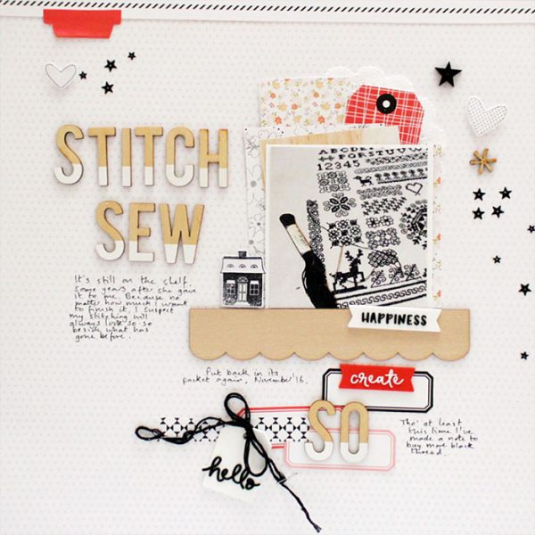
Stitch Sew So by Sian Fair | Supplies: Stitch Sew So by Sian Fair: Patterned Paper, alpha, stars, wood veneer, tags and rubber charms all by Felicity Jane. Stamp: Gossamer Blue
Lynn Greiveson says, “This photos is of my daughter’s first Christmas, so it’s a very special photo even if not the best quality. Although we celebrate Christmas in summer, the colors in the photo–with my mother’s white Christmas tree behind us–work well with a traditional Nordic style. Plus, I love the traditional, classic Christmas feel of the style.”
“The reindeer motif appears here not just in the actual reindeer element, but also on the patterned papers. The papers feature small repeated patterns which is another staple of the Nordic style. I used classic Nordic red with a pale, cool blue for a vintage mood. Finally, elements in light, natural wood finish this Nordic-styled page.”
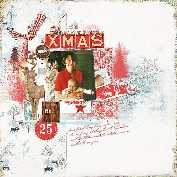
Christmas No. 1 by Lynn Grieveson | Supplies: The Sparkly Season Elements by Pink Reptile Designs, Xmas Eve Alpha by Paula Kesselring, Nordland Kit by Lynn Grieveson, Nordland Transfers by Lynn Grieveson, Starry Woods Kit by Lynn Grieveson, Vinter Kit by Lynn Grieveson (all from The Lilypad); Fonts: Jellyka Gare du Chambord, Crash Numbering
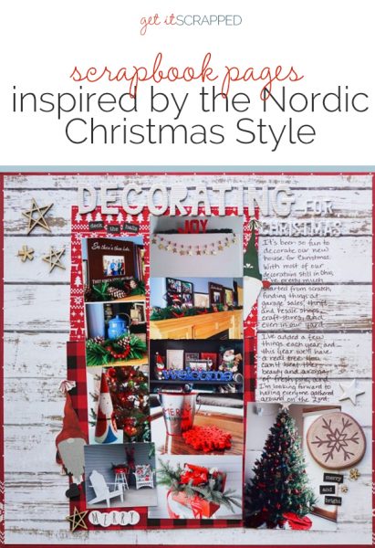
Marcia Fortunato says, “This layout is about my renewed enthusiasm for decorating my home for Christmas and shows a variety of last year’s decorations. Growing up in a home and area where a Scandinavian heritage was predominant, I have always loved the Nordic style. Since buying a home in a similar community, I am able to sprinkle that design throughout my house, particularly at Christmas time, and I’ve done that on this page, too.
“My first inclination was to go crazy with Nordic motifs of red hearts, dala horses, and candles, since I love them so much. But my photos were quite busy and already had a lot of red and motifs of trees and reindeer and snowflakes. Thus, I opted to use the colors and textures that are so prevalent in Nordic design: a background of white-washed wood; red, white, and silver colors; cozy fabric-patterned papers like checked flannel and knit sweaters; and accents in natural wood. I added a touch of sparkle in my title and a few embellishments. I kept the motifs to a minimum, using only stars and a couple of subtle Tomtes (pixies) peeking out from behind my photos.”
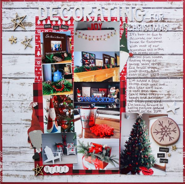
Decorating For Christmas by Marcia Fortunato | Supplies: Patterned Papers: Bo Bunny, American Crafts, Studio Calico; Letters: Thickers (American Crafts), Evalicious, Target; Stars: Studio Calico, Ali Edwards; Word stickers: Authentique; Other Embellishments: Bo Bunny, Target; Pen: Precision Pen (American Crafts).
Betsy Sammarco says, ” This is a story of the day my boys claimed Santa was at the ball field watching them take batting practice. The story is a memory without a photo, so I used a vintage print of Santa to help illustrate it.
“Since this is not only a Santa story, but a baseball story, too, I thought the red, white and stitching associated with both the Nordic style and with baseball would work wonderfully together. Stitching is a big part of Nordic style and I stitched around my main photo and journaling block in bright red thread. Felt and fabric also play a big part in Nordic style and since I had felt snowflakes in my stash, they were a fitting addition to the layout. My main graphic image was printed on a white canvas material to get fabric-like texture into the layout.”
“I was stuck on how to bring subtle attention to my small title and looked to the simple lines of a Nordic wreath to help me with this. Tucking the simple wreath under the photo, journaling, and title was just enough to bring a bit of emphasis to the title.”
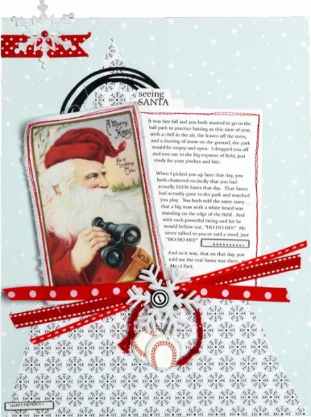
Seeing Santa by Betsy Sammarco | Supplies: Patterned Paper: Felicity Jane; Graphic Santa image: TheGraphicsFairy.blogspot.com; Canvas paper: Creative Imaginations; Felt Snowflakes: CreativeImpressions; 3-D Baseball stickers: Recollections; Labels: 7Gypsies; button: Felicity Jane; Ribbons: miscellaneous and Felicity Jane; Yarn: Felicity Jane; Roller Stamp: Amy Tangerine; Ball chain: miscellaneous; Doodled circle cut file: For You by Kristen Magee
Terry Billman says, “My grand daughter was in awe looking at the twinkling lights and decorations on the Christmas tree in these photos.”
“The Nordic style works with simple designs, often featuring evergreen branches, pinecones, and reindeer. Natural elements and textures are a part of it. Here, a sweet and simplistic Nordic design puts the focus on the charming photo of Brenna. Textures and shades of white sprinkled with splashes of gold, and a banner add homespun festivity. Evergreens, pinecones, berries, and a tree branch incorporate nature . Splashes of gold and warm digital “glows” contribute to the understated warmth and beauty of the layout.”
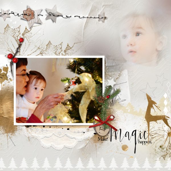
Make Magic Happen by Terry Billlman | Supplies: Anna Aspnes: Art Play Palette Christmas Magic, MultiMedia Stars 2, MultiMedia Branches 6, Platinum Paint 1, Christmas Trees 1, MutiMedia Winter 1, Holiday Word Art Mix 1; Katie Pertiet: Holiday Foliage 3
Kristy T. says, “We try to go to Carols by Candlelight as part of our Christmas traditions. These photographs are from when we took our children to the carols at the beach where I always used to go with my mum.”
“The nordic theme was a good fit for my page, as the night was chilly, the colors in the photographs suited the style, and the photos included cute snowman cupcakes!”
“I live in Australia so I have to take any chance to be able to use snow-themed elements, even if the light colours in the background are sand rather than snow. I used the Nordic style by including a white background, using cool-toned light grey and pale blue papers and mists as well as blue-and-white Christmas tree washi tape. The embellishments are coloured to tone with the whites, blues and greys or left as-is for a rustic look. Different textures were created with iridescent paint, the shine of the brad and the distressed edges of the paper mimic the idea of snow.”
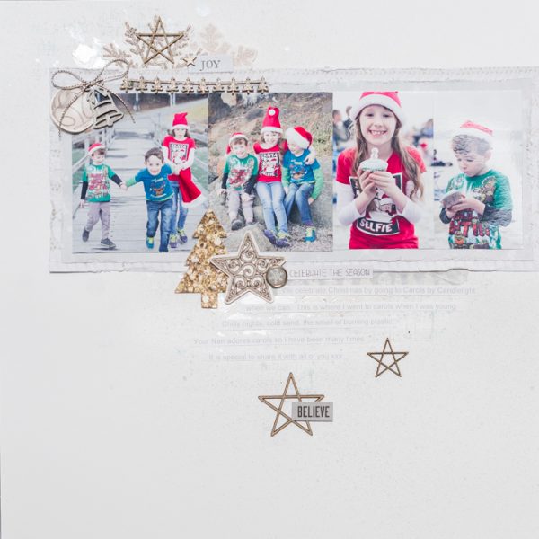
Celebrate the Season by Kristy T | Supplies: Cardstock – Artee; Collectables: Kaisercraft; Chipboard – Dusty Attic; Wooden Shape: Kaisercraft; Paint : Iridescent Medium; Mist: Prima; Washi Tape: Teresa Collins; Brad: Echo Park.
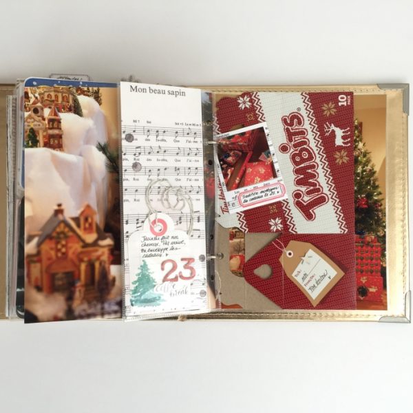
Marie-Pierre Capistran says, “This is day 23 of my 2015 December Daily album. On that day, my husband joined my daughters and me at my parents’ house in Canada, and we went for donuts and coffee together. I picked up an extra empty donut box which looked like a nordic sweater with its red and white colors, sweater-knit print, and motifs of snowflakes and reindeer to use in my December daily album.”
“To go along with the nordic style of the empty donut box, I kept my color scheme to red and white and added just a little bit of green and silver. I didn’t want to cover the box because I wanted the design and the name of the shop to show. I framed my two small photos, adhered them back to back and attached them to the top ring of the album. For the journaling, I added a small 2″x8″ pocket. I used a paper that was white with subtle black motifs, and I added a simple tag with a white and silver string to note the things we did that day. The small size of the box and the pocket let the previous and next pages show and it adds more Christmas feel to the very simple layout.”

