For many scrapbookers, working with and including patterned papers on our pages is a great part of the fun and satisfaction. Patterned paper can also be used to create solid design and storytelling on the page.
See how the Get It Scrapped Creative Team uses it on these pages to:
- create emphasis
- direct the eye, and
- organize page elements
[hr]
Kelly Sroka says, “My children love to play games on their phones–sometimes they even play against each other! Their latest favorite is Minecraft. This page documents a specific evening when they were all playing together. I quickly snapped photographs of them as they were gaming.”
“I knew I wanted to use 4″x6″ close-up pictures on the page, so I chose patterned papers that didn’t compete with the large block of photos. I used three different patterns to reflect the theme of the page and to give a home to each element.”
“The grey lined paper has a cool, tech-y feel and houses my photos. The orange floral paper at the top adds just a bit of contrast to the grey paper and holds my title. The light blue polka-dot paper at the bottom is fun pattern that allows space for my journaling.”
“I also used the three different papers as a repetition of the three photos of three children, and to allow the story to unfold for the viewer who spends spends just a few seconds reading the title in the small strip of paper at the top. Then the eye moves to the photos on a larger piece of paper which gives breathing room to the photos and and a pause to take in the photos and reflect on the emotions of the subjects. Finally, the reader moves down the page to the final section of patterned paper to take in the journaling.”
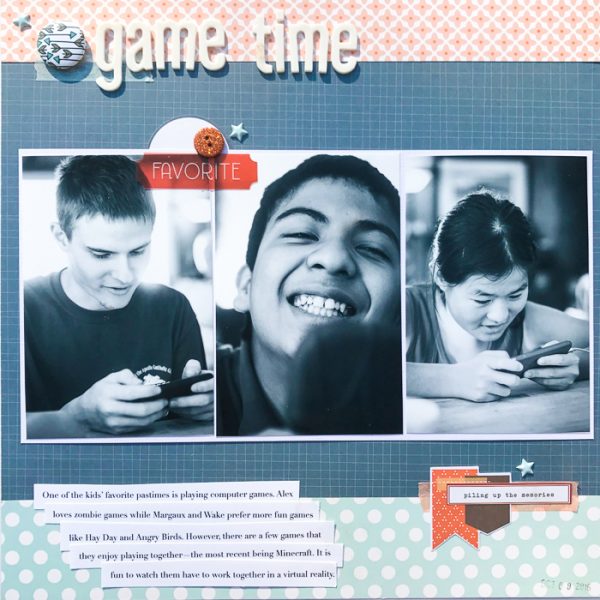
Game Time by Kelly Sroka | Supplies: Patterned Papers: Simple Stories and Pebbles; Puffy Stickers: Twine & Ink; Flair: Pretty Little Studio; Button: Queen & Co; Die Cuts: Simple Stories; Letter Stickers: American Crafts; Washi Tape: Cocoa Daisy
Ronnie Crowley says, “The page is a reflective one made after I attended a conference in New York for business women. It is about becoming my own hero.”
“The sunburst pattern emphasizes the photo placed at its center. The symmetry of the pattern creates stability–but I cropped my photo unexpectedly with my face off center. I journaled the message to myself in the open space of the photo to add tension and interest. All of this supports the message of the page which is about me needing to step-up and be my own hero.”
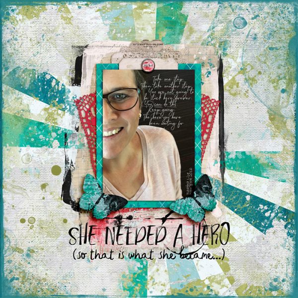
She Needed a Hero by Ronnie Crowley | Supplies: Get It Scrapped – Scrapbook Coach 1 template 1; Angie Young Designs – Be Your Own Hero
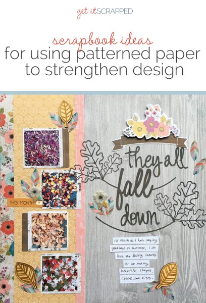
Devra Hunt says, “My neighborhood is surrounded by trees. This year as the leaves were falling, I noticed all of their beautiful shapes, sizes and colors.”
“I used patterned paper here to create emphasis in three ways: First, the woodgrain paper speaks to the trees and leaves. Second, the floral print and multi-color leaves also support the outdoor theme and repeat the variety of colors in my photos. Lastly, the small bit of arrow print repeats the direction and movement of the leaves falling. The photos are small and could have easily been overwhelmed by product. Grouping these patterned paper together brings unity to the page while still highlighting the photos.”
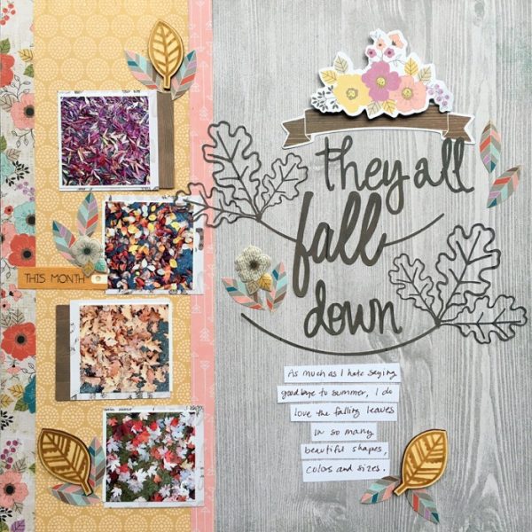
They All Fall Down by Devra Hunt | Supplies: Patterned Paper- Pink Paislee, Simple Stories, die cuts, puffy stickers-Pink Paislee, wood pieces, sticker-Freckled Fawn, die cut Design-Stacie Dietz for Paper Issues, Silhouette, pen-EK Success, Adhesive-EK Success, Scotch, Scrapbook
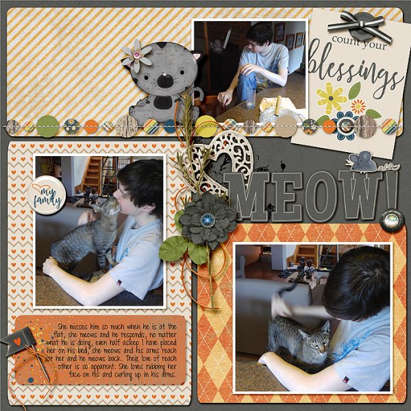
Stefanie Semple says, “My son is very attached to Cleo, one of our cats, and she is just as passionate about him. This layout details their relationship and responses to each other.”
“The top patterned paper is a stripe that leads the eye in the same direction as my son’s eyes–looking to the cat as soon as she meowed. The second photo shows her rubbing her face all over his and I chose a heart filled paper to represent their affection. The third photo shows my son stroking her, and I chose a diamond-filled pattern to stop the viewer’s eye right there. The three sections house the three photos and allow them to be seen in their own right.”
Karen Poirier-Brode says, “At the time I made this page, the leaves were just beginning to change colors. I went through my fall photos of last year, and the one of my son with grandkids and friends on Halloween made me smile: my granddaughters favor joyful characters, not the scary or frightening ones, for their costumes. The colorful leaves and costumes became my story.”
“I used several coordinated, fall-themed patterned papers with their many colors to support my story and photos. The papers are placed in a radiating half-burst, with the center below my focal point photo and leading the eye to it. With all the color and pattern in the paper, the page needs little in the way of embellishment, though I was able to incorporate a lot of delightful bits.”
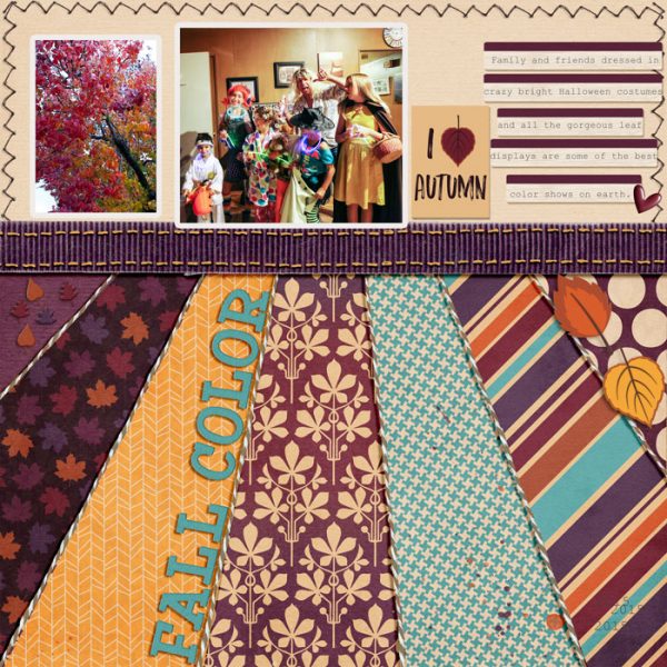
Autumn by Karen Poirier-Brode | supplies: kit – The Digi Files Digilicious Cozy Autumn, zigzag stitching – Mommyish, twine – Pixels & Co. Naughty Christmas (recolored), template – oomph & polish | Lisa Dickinson, GIS MSD “Scrapbook Like” Templates
Debbie Hodge says “These are a few shots I took right before we left my Mom’s house after a visit this summer. Leavings used to be difficult for my oldest son–he would cry as we got in the car. Now they’re hard for my 10-year-old nephew who usually stays overnight and helps me pack up in the morning. I love this snapshot of a routine that is always changing over the years.”
“I frequently use patterned paper blocks to set up compartments and speed my work as I’ve done here. There’s one block one for title and journaling, one for the focal-point photo, and one for smaller supporting photos. This is a design I use A LOT. The paper below the journaling and title is a fun one, and I cropped it to have the disappearing road and its perspective lines pointing to the title.”
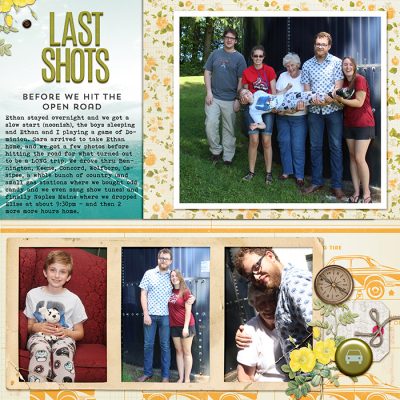
Last Shots by Debbie Hodge | Supplies: Worn & Well Loved Frames by Dawn Inskip; Open Road by Crate Paper; Going Away by Katie Pertiet; Going Places by Rebecca Wagler; Sept Storyteller Alpha; Brad Bonanza by Pattie Knox; Bohemian Typewriter, Trend Slab fonts

