
 Every once in a while, you might make a scrapbook page that is more about a BIG IDEA or an overriding theme than about a particular situation or story?
When you do make this kind of page, tap into associations and convey that idea visually. See how our team has done that on these pages.
[hr]
Kelly Sroka says, “My daughter has recently begun giving my goddaughter horse riding lessons. I love the fact that my daughter is passing on all of her knowledge to a new rider. This page conveys the idea of using learned knowledge and experience to teach someone else–the student becoming the teacher.”
“To show this idea on my page, I used bright colors to represent youth and newness on a solid white background that is like a blank canvas. I also used butterflies and flowers to show growth and change, as the teacher grows into her new position and the student begins to soak up new knowledge. The patterned papers and embellishments gather underneath and around the photograph, but grow outward onto the blank background as knowledge and insight is gained by both the student and the teacher.”

Passing It On by Kelly Sroka | Supplies: Cardstock: American Crafts; Patterned Papers: We R Memory Keepers and Simple Stories; Brads: Simple Stories; Tags and Die Cut: Pretty Little Studio; Pearls: Doodlebug Design; Letter Stickers: American Crafts; Stickers: We R Memory Keepers; Frame: Pinkfresh Studio
Nicole Mackin says, “This is a photo of a speaker that my family went to listen to in a nearby Church. The idea I was trying to convey with this layout was that of taking pain and suffering and turning it into something positive, which is a huge part of her story.”
“I used the colors and designs of the papers to symbolize different parts of this amazing woman’s life. Bold black and white signify her emergence from pure ‘darkness’ to ‘light.’ Paint-splattered paper symbolizes the ‘mess’ that her life had been, and the gold heart paper symbolizes how she had taken that mess and pain and turned it into love (caring for the homeless after she had been there herself). I used a variety of cards, words, and rub ons to signify various parts of her testimony and message. I added the flowers to symbolize her kindness as she answered questions from our kids, which is what she is doing in this photo.”

Journey by Nicole Mackin | Supplies: Cardstock: Paper Studio; Patterned Paper: Jen Hadfield, My Minds Eye; Vellum: Paper Studio; Ephemera: Jen Hadfield; Tag: Teresa Collins; Transparency: My Minds Eye, Transparent Stickers: Pink Paislee; Rub Ons: My Minds Eye; Glimmer Mist: Heidi Swapp; Brad: Teresa Collins.
Jana Oliveira says, “This layout is about the day I went to a meeting with my son, representatives of our school district, and my lawyer. I took a picture of my in the reflection and me holding all paper work to take to the meeting. It was important to me to include my reflection and the hard times we are having: like a mirrorred image, they are subject to change.”
My association was with the spirit of not giving up on things can look good from the outside but in reality these are very upsetting times. The shapes with varying blending modes show the many aspects of me in this moment. The layout is not dark, though, because it’s not about anger but rather light–because I believe we will win the case. This design seemed perfect to convey contrast and light–and I didn’t need a lot of elements, because my journaling and the shapes convey the ideas.”

She Stood By Jana Oliveira| Supplies: Designs by Syndee: Geometric Templates; The Lillypad Collab: After the rain
Christy Strickler says, “This page highlights the end of our time in Nassau and the beginning of a new chapter of our life in the UAE, a pivotal moment in our lives that will also show a transition within our family scrapbook album. This page is meant to show our final hours in Nassau and, at the same time, a push forward into our future.”
“To represent movement, I used patterned paper with arrows and airplanes, with the airplanes facing upward on the paper. To represent Nassau, I chose a tropical leaf print and pineapples. All of the patterns were busy together, and I used cream and craft cardstock to provide separation between the prints.”
“The colors of the cardstock remind me of the colors of sand which could represent both the beaches of the islands and the sands of the desert. The main title is on the lower left side of the page, while the subtitle is diagonal on the upper right. The subtitle is on a flag pointing off the page to the right. The title and subtitle placement signifies us flying up and away from Nassau. I added sparkle to the subtitle to show how excited we were. Color played a subtle role with the blue, green and yellow representing the Bahamas and red, orange and gold representing Abu Dhabi. I used a few travel-themed products to highlight our travel, including a small map sticker on which I drew our flight path.”

Our Final Hours in Nassau by Christy Strickler |Supplies Cardstock: Bazzill; Patterned Paper: Pink Paislee, Authentique; Letters : American crafts, Basic Grey, Jillibean Soup; Stickers: Heide Swapp, October Afternoon; Wood Veneer: PinkFresh Studio; Chipboard: PinkFresh Studio, October Afternoon; Other: Glitter Glue, Die Cuts
Stefanie Semple says, “Our oldest has a girlfriend, and this is exciting for us, as we seek to welcome her while trying to respect their fledgling relationship.”
“There are six blocks of patterned papers indicating an addition to our family of five and tree branches to denote the family tree. A variety of textures-wood grain, lace, and cardboard–indicate that each of us are different with our own quirks and personalities. Family is changing and evolving as we age and they grow up. The papers form a foundation, the tree branches add diagonal draw and the flowers create a visual triangle with their pops of contrasting color.”

Family by Stefanie Semple. KimB Designs: The Spice of Life, Standing Tall Papers and Just Family Wordart, Kimeric Kreations: Memory Keeping Vintage, CharmBox Studio’s Resize for web action (retired), One Little Bird Design’s Drop Shadows.
Marie-Pierre Capistran says, “My goal with this layout was to show that my daughter, although she is very young and small, thinks like a big girl. It was her birthday this summer and we were moving overseas so for several months and her dad was separated from us. When I asked her what she wanted for her birthday, she said that she wanted us 4 to stand all together, at the same place and holding hands.”
“I found the patterned paper with “Together Is My Favorite Place to Be” in my stash and thought it would be perfect because it’s carrying the idea of what she was saying. I added quotation marks to convey the idea of her saying it. I loved that the script was huge!”
“Small photos of my daughter make the saying stand out even more! I used 3 photos: one family photo we took the day we left the USA, one photo of my 2 daughters together the day we arrived in our new country, and, finally, one photo of our family on her birthday. I used the number 6 and I also spelled the number six, to put more emphasis on her age. I added the word family that I framed with hearts. I finally added sticker words saying “together,” “remember where you come from,” and “from the heart,” which reinforce the idea of what she’d said being so heartfelt. I added speech bubbles because what she said was the important part of the story.”

Together by Marie-Pierre Capistran | Supplies: Paper: Pretty Little Studio, Studio Calico; Velum: Pretty little Studio; Clear acetate: Pretty Little Studio; Die Cuts: Pretty Little Studio; Word Stickers: Pretty Little Studio; Flair buttons: Pretty Little Studio; Cork embellishment: Citrus Twist Kits; Paperclips: Dear Lizzy; Foam quotation marks: American Crafts; Doily: from my stash; Twine: Citrus Twist Kits.
Debbie Hodge says, “My Mom is moving closer to selling the farm she’s lived on for over 50 years, the farm that was my Dad’s livelihood and which is all of us have loved very much. This change is understandable and probably needed. Here I wanted to give a sense of how the place is evidencing the kinds of changes that precede such a big move.”
“The work of telling this story is done primarily with photos, three photos of the setting that illustrate how things aren’t what they once were–and that show how my my mom continues to be a careful and loving steward of this place even in the face of change. The photos show both new elements–the barn quilt, a new cat, and a new horse–and old elements–the barn and silos as they age along with the house still looking beautiful as it always has.”
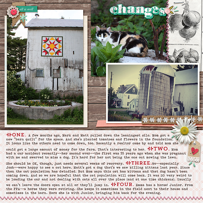
Changes by Debbie Hodge | Supplies: How Does Your Garden Grow Kit & Alpha by Allison Pennington; Blithe by Sara Gleason; Glitter Threads by Lynn Grieveson; Stringbats by Kim Jensen; Bohemian Typewriter, Trend Rough Slab, Trend Rough Dingbats fonts
