On scrapbook pages, “white space” refers to an area devoid of photos, embellishments, journaling, and title, and there are many good reasons for incorporating this space into your pages.
This white space provides a resting point for the eye and breathing room for the viewer taking in your photos and journaling. White space on scrapbook pages is not always white. It can be any color—it can even be patterned paper.
Today, our team is making pages in which that white space really is white. This tre white space works for four reasons:
1. WHITE is clean. When your canvas is a clean white space, the elements you place within that space tend to stand out. White brightens the canvas and makes the colors you use appear more vivid.
2. WHITE is simple. A white background can impart elegance and class to your layouts while simplifying the design process and making it easier for viewers to take in the important parts of the story and design.
3. WHITE is trendy. Simply White was Benjamin Moore’s 2016 Color of the Year, and white is huge in fashion and home décor right now. We’ve even seen an increased popularity of ALL-WHITE weddings in 2016.
4. WHITE is powerful. White space can have a substantial visual weight and impact on the page. When you break into a white background with page elements, you have the opportunity to create powerful contrasts, alignments and silhouettes in your design.
[hr]
Marcia Fortunato says, “This layout showcases a photo of one of my favorite garden areas in my yard, and the journaling tells why I like these flowers so much.”
“I love this photo of the Black-eyed Susans in my yard, and I wanted it to stand out on my layout. Although I typically use a patterned background, in this case I knew that a clean white background would provide the contrast between the background and the bright yellow flowers in the photo that I was trying to achieve, and this would allow the photo to shine. I used only a few light embellishments and left the background clean and clutter-free.”
“By using this approach I was able to keep the focus clearly on the photo. The white background framed by a narrow mat of bright floral patterned paper make the layout bright and cheery, which is how I feel when I see these flowers.”
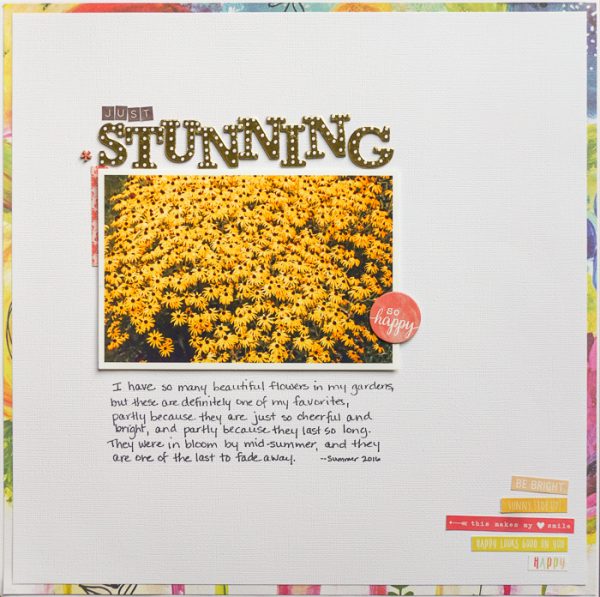
Just Stunning by Marcia Fortunato | Supplies: Cardstock: American Crafts; Patterned Paper: Fancy Pants Designs; Letters: Jillibean Soup, Thickers (American Crafts); Embellishments: Shimelle (American Crafts), Simple Stories; Pen: LePen (Marvy).
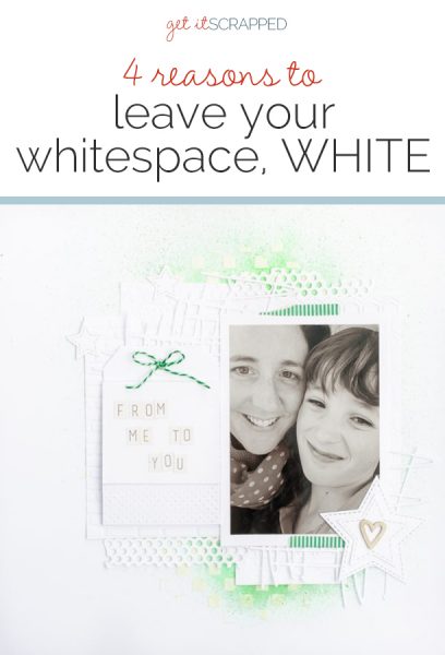
Kristy T says, “I created this page to write of my hopes and encouragement for my son into the future. I am creating a page for each of my children with the things I would want them to know if something ever happened to me and I couldn’t tell them in person.”
“I used lots of white layers and created white space around my photo because I wanted the photograph to be prominent and to give the page a timeless feel. I used touches of green, as it’s my son’s favorite color and injects energy into the page without taking away from the important words inside the pocket. By using lots of textures and different shapes, even though the page is predominantly white, it is still visually interesting. It is so easy to create a striking page that is unified using white plus one other color.”
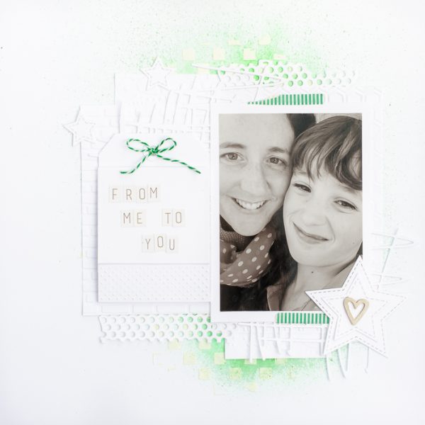
From me to you by Kristy T | Supplies: Card: Artee; Embossing Folders: Kaisercraft; Dies: Kaisercraft, Couture Creations, Tim Holtz; Washi Tape: Unknown; Wooden heart: Unknown; Twine: Websters Pages; Alphas: Teresa Collins; Stencil: Prima; Spray: Prima Bloom Spray; Gesso
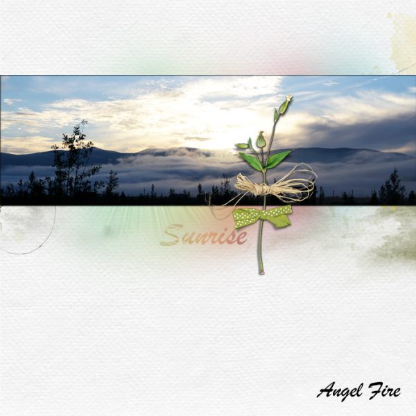
Terry Billman says, “I captured many photos of the sunrise in the mountains during a recent visit to Angel Fire, New Mexico.”
“A simple design, minimal embellishing, and a clean white background allow this photo to take center stage. White is natural and creates contrast with colorful photos or bright colors. Digital glows behind the photo accentuate the hues in the photo and add visual emphasis to it.”
“When using a simple design effect, I tend to use simple photos, rather than complex images with a lot going on, that mirror the same feel as the overall design.”
Nicole Mackin says, “This is a super adorable photo I caught of two of our baby kittens. Using a mostly white background kept this layout simple so that the focus would squarely be on the two sweet faces in the photo. The white also pulls out the bits of white in each kitten, so it works great design-wise to lead your eye to the photo.”
“While I kept all layers and embellishments just around the photo, I was still able to add color and dimension with the thin mat, small layers, and items like the chipboard pieces, brad, and pop-dotted circle tag. The colors I used pulled out the colors of the kittens, continuing to add to the focus on the photo. They also contrast nicely with the white background, making the entire cluster pop.”
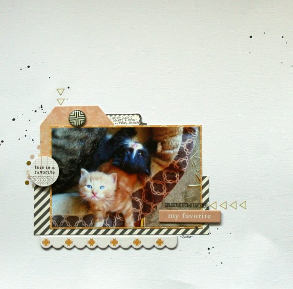
My Favorite by Nicole Mackin | Cardstock: Colorbok; Patterned Paper: Teresa Collins; Tags: Teresa Collins; Chipboard: Teresa Collins; Tab Sticker; Teresa Collins; Clear Stickers: Pink Paislee; Brad: Teresa Collins; Rubons: Teresa Collins; Color Shine: Heidi Swapp.
Shanna Hystad says, “As I watched my niece and nephew play the game Mother May I it reminded me of the different childhood games that we used to play. Although I don’t have any photos of my siblings and I playing those games, I am able to capture the stories and photos of the next generation.”
“I love white space in my scrapbook designs. Too many elements can be distracting. By leaving white space on the left side of my page, it draws your eyes to the photos and story. Although I do have several embellishments on the page, it still looks clean and simple.”
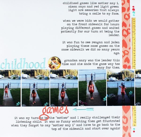
Childhood Games by Shanna Hystad | Supplies: Alphas-Basic Grey-Chipboard Button-Jenni Bowlin, Arrow-Fancy Pants, Enamel Dots-Simple Stories, Paper Strips-Studio Calico
Cynthia T. says, “I am more of an element hoarder than a paper lover, so I use white backgrounds a lot and for many different reasons, one of the most important being that they have the power to make the elements have an impact on the page – elements that would get lost when layered onto of colorful patterned papers.”
“On this page about my changing relationship with my daughter, the absence of color in my background allows the eye to focus on my image and text, while balancing the strength of my photo and elements. The clean feeling of white suggests the possibility of a new start, which is also a powerful thing.”
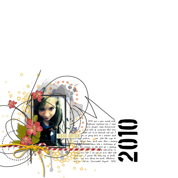
2010: Remembering by Cynthia T | Supplies: Etc by Danyale: Messy Bun Day Kit, journaling font is Dear Theo and numbers Boston Traffic.
Karen Poirier-Brode says, “The challenge of leaving white space white was perfect for this postcard from the Wurzburg Residence and Court Garden. The “White Hall” built in the 1740’s is an early architectural use of white space to rest the eye. The hall separates the staircase with its glorious colorful frescoed ceiling by Tiepolo from the gold, agate and violet splendor of the Imperial Hall.”
“I wanted to echo the story of this room decorated by Antonio Bossi. It looks like a wedding cake with ornate stucco work in white against a slightly grey tinted white base. As in the room, I used small amounts of gold and black accents and the brown of natural wood. I repeated the herringbone of the parquet floor in the silver mesh. I limited my journaling to the place and date of my visit done in gold pen as I plan for this page to be a part of a travel album about my entire trip.”
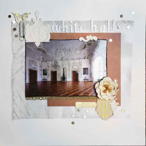
White Hall by Karen Poirier-Brode | Supplies: 6”paper and journal spot – Kaisercraft, Up, Up and Away, artisan elements – Pink Paislee, alpha – Pink Paislee Fashion Script, flower – Prima, black cord – American Crafts, butterfly paperclip – Pink Paisley Hope Chest, accent pen – Sakura – clear star Gellyroll, gray flecked white card stock, mesh, gold elements – stash
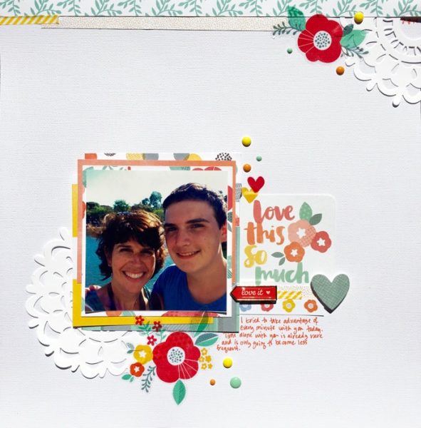
Devra Hunt says, “I’m realizing that the older my son gets, the less time I get to spend with him. Spending a day at Disneyland with my son reminded me to enjoy every moment with him.”
“By using a simple design on a white background, there are no visual distractions. The bright colored product surrounding the photo, combined with the white background, creates great contrast, ensuring the photo remains the focus of the page.”

