 We’ve been spotting crayon and crayon techniques in home decor and crafty tutorials–especially those canvases with the melted crayon running down them!
With the kids headed back to school maybe it’s time to pick up their crayons for yourself–or if you don’t have kids in the home, grab a box from your office supply while they’re stocked up. We’ve collected ideas for crayon techniques for you on our pinboards, and our team shows you how they use crayon techniques.
[hr]
Kelly Sroka says, “I loved to color when I was younger. I always had a big box of crayons and several coloring books on hand. When I saw the new Distress Crayons from Tim Holtz, I was intrigued–crayons for grown-up scrapbookers! I purchased a couple of the crayons and began to experiment.”
“Since my style of scrapbooking is clean and simple, using these crayons at first seemed overwhelming. I decided to use a very simple technique as my first step in using this new product–creating a background. I swirled the crayons onto a piece of cardstock then used a water brush to blend the colors. The drawing on the background suits this page well–it further enhances the theme of a playful summer party.”
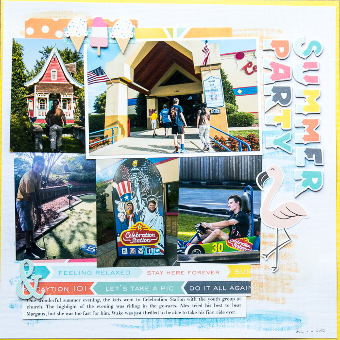
Summer Party by Kelly Sroka | Supplies: Cardstock: American Crafts; Patterned Paper: Echo Park, Simple Stories; Wood Shapes: Freckled Fawn; Letter Stickers: Echo Park; Die Cut: Imaginisce; Crayons: Ranger
Betsy Sammarco says, “This layout tells the story of a bouquet of flowers my son had hidden from me in his room. This happened 13 years ago and I’m so glad I took a photo! Since this page is about a child, I wanted a whimsical look, but didn’t want it to be too cutesy. The imperfect embossing patterns and mixing of the watercolors bring a whimsical, but pretty focus to my page.”
“To get this look I used a white crayon, embossing folders, and watercolors to get a whimsical, but pretty look to my punched shapes. I knew white crayon could act as a resist with watercolors, but didn’t want to draw with the white crayon myself. I wanted to use patterns already available and looked to my embossing folders to do so.”
To get a similar look use the following steps:
1. Use an embossing folder with a pattern you want to recreate and place a piece of white cardstock over the raised side of the folder. I used a textured cardstock by Nicole because was a lighter weight cardstock and would be easier to work with.
2. Break off about a 1-1/2 inch piece of white crayon and peel away the crayon’s paper covering.
3. Holding the crayon on its side, rub over the cardstock with a bit of force. Holding the crayon on the side allows you to cover more surface area and only picks up the raised portions of the folder. If you tilt the folder/paper in the light, you can see the pattern taking shape. Go over the pattern multiple times until the crayon has covered the pattern fully.
4. Paint over the cardstock using watercolors and the magic begins to happen! To remove any curls and warping to your cardstock, dry with a heat gun and place wax paper and a heavy book on top of the paper while it’s still damp.
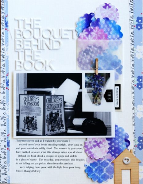
The Bouquet Behind the Book by Betsy Sammarco | Supplies: Cardstock: Nicole; Patterned Paper: Felicity Jane; Wood veneer and clothespin: Felicity Jane; Alpha stickers: Seven Paper by Studio Calico; Puffy stickers and label by Felicity Jane; Glassine bag by unknown; Embossing folders by Cricut Cuttlebug and Lifestyle Crafts; Watercolors by unknown; Punches by EK Success and Fiskars; Crayon by Crayola.
Christy Strickler says, “I used an encaustic iron to melt white crayon wax. I was then able to spread it over a stencil (make sure the stencil is designed for use with encaustic tools and hot wax or it will melt) and create a wax design to use as a resist. I painted over the dried wax design with watercolor paint. I loved the way the wax provides subtle texture and allows me to incorporate trendy watercolor elements into my design.”
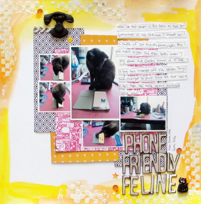
Phone Friendly Feline by Christy Strickler: Cardstock: Bazzill; Letters: American Crafts; Patterned Paper: Seven Paper Company; Ceramic Phone: Frog Dog Studio; Stencil: The Crafter’s Workshop;Other: bead,sequins, water colors, wax crayon, encaustic brush/iron kit
Marcia Fortunato says, “This layout is about my family’s first outing on our new “water toy” which my daughters-in-law have dubbed The Princess Palace.”
“I wanted a whimsical look for my layout so I sketched a simple scene on white cardstock using crayons and used this as a resist for watercolor paint similar to the second technique in this article about crayon techniques by Alisa Burke. I drew my scene on the cardstock, pressing fairly hard to get the crayon as solid as possible. Then I used a diluted wash of watercolor paint to form the lake and diluted it further for the sky. I let it dry on its own and pressed it flat under a stack of heavy books.”

The Princess Palace by Marcia Fortunato | Supplies: Cardstock: Neenah; Patterned Paper: Cocoa Daisy; Crayons: Crayola; Watercolor paint: Royal Langnickel; Letters: Simple Stories, Amy Tangerine Thickers (American Crafts); Embellishments: Fancy Pants, Pinkfresh Studio, Simple Stories; Pen: Sharpie.
Beat It!I SpyUsing Crayons – The Princess Palace (Marcia)Scrapbooking On The GoCrossout/Blackout Poem– 1st Day of 7th Grade
Kristy T says, “This page documents the gift of the ‘I Spy’ quilt, which is a much loved quilt in our family.”
“I wanted to echo the quilt in the design of my page, so I used a mix of techniques with crayons and also patterned papers to get this effect. I used the distress crayons (orange and green) with stencils by coloring onto paper, layering the stencil then removing some of the crayon by rubbing with a baby wipe. This works because distress crayons are reactive with water. I colored the purple flower through a stencil and used it as a resist, painting blue glimmer spray over the top. I colored the ‘Love’ heart using a pink crayon and lightly heated with a heat gun to melt the crayon into the wood grain for a slightly distressed look. I used a clouds and stars embossing folder, then on the reverse side used crayons to add color to the kraft cardstock so it toned with the other papers on my page.”
“I was free to be able to play with a few techniques on papers before adhering to my page without worrying about ruining the final product, by using the small pieces of paper and the grid-style design.”
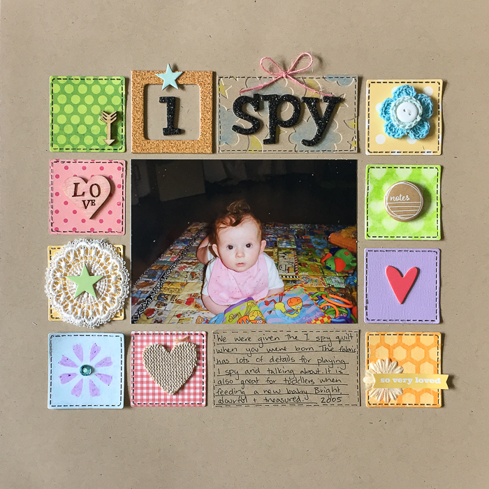
I Spy by Kristy T| Supplies: Cardstock – Bazzill; Patterned Paper – My Mind’s Eye, Carta Bella; Lace – Prima; Crayons – Crayola, Texta, Distress Crayons; Wood Icons – Kaiercraft; Frame: Simple Stories; Alpha: American Crafts; Chipboard Shapes – Studio Calico; Tin Pin: Echo Park; Fabric Heart: October Afternoon; Twine: American Crafts; Embossing Folder: Echo Park; Crochet Flower: Unknown.
Devra Hunt says, “It doesn’t matter how much time passes between visits, when these cousins are together, it’s like no time has passed at all. I caught them being silly as they usually are.”
“I decided to make my own ombre background so I could make custom colored shapes with my die cut machine. For the waves, I used 4 colors of blue crayons, binding them together with a rubber band. Putting them flat against the paper, I colored in an angled back and forth motion across half of the paper. I repeated the process using different colors for the sun and clouds.”
“I wanted the waves, clouds and sun to have some texture, simulating movement. creating my own color helped me achieve what I wanted.”
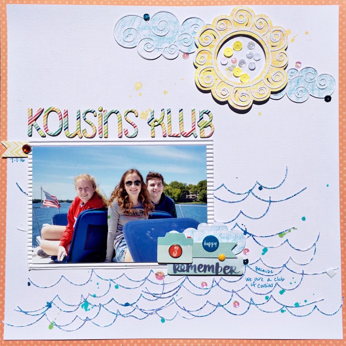
Kousins Klub by Devra Hunt | Supplies: Cardstock & Alpha-American Crafts, Patterned Paper-BoBunny, pre-made die cuts-Echo Park, Amy Tangerine, Stickers-Fancy Pants, sequins-Studio Calico, Doodlebug Design, bling-Echo Park, enamel dot-Freckled Fawn, Crayons-Crayola, Wave Die Cut design-The Cut Shoppe, Clouds and sun die cuts by Silhouette, pen-PaperMate, Adhesive-EK Success, Recollections
Megan Blethen says, “For this page I wanted to focus on the love between my dog and me. I’ve been wanting to use the newish Tim Holtz Distressed Crayons, and this was the perfect layout for them.”
“At first I thought maybe I’d color with the crayons across the page and then use water to blend into the paper, but when I colored on the background, I decided I really loved the look of the crayons without the water. I placed the photo on top, and it worked out great! I wanted the crayons to be a landing spot for my photo, just visible as a foundation behind the photo and not taking up all the space in the background. This puts the emphasis be on the photo with the technique in support of that.”
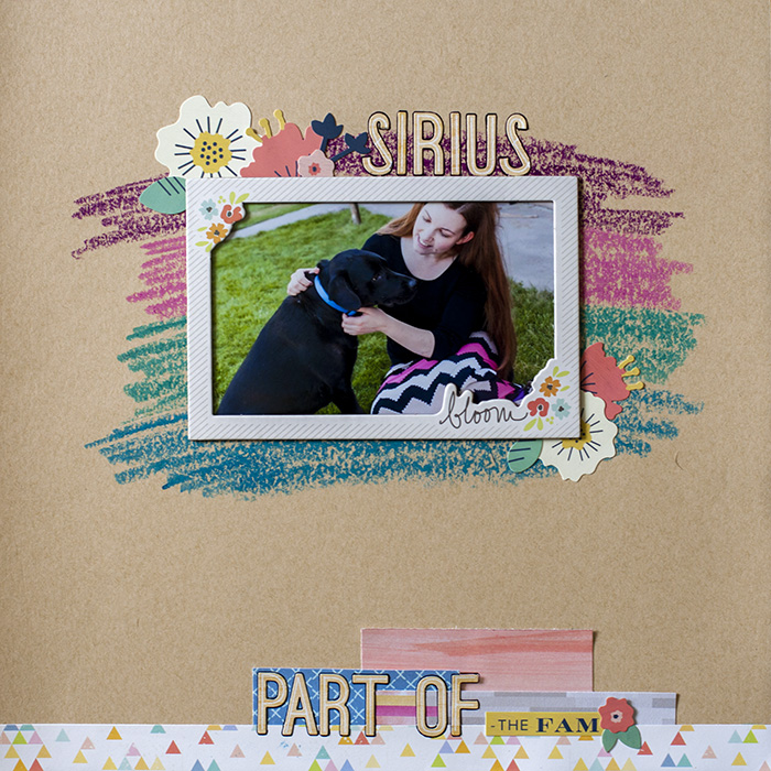
Sirius: Part of the Fam by Megan Blethen | Supplies: Paper, Citrus Twist Kits exclusive paper ‘Happy Place’, American Crafts Kraft Cardstock, Pink Paislee ‘Fancy Free’; Embellishments, We R Memory Keepers ‘Honey, I’m Home’ Accent Stickers, Cocoa Vanilla Studio ‘Totally Rad’ Alpha stickers, Mixed Media Products, Tim Holtz Distress Crayons

