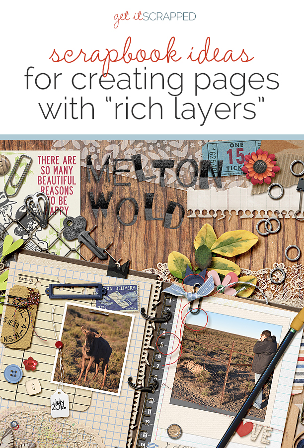
Scrapbook page layering has a number of design and storytelling benefits:
1. Layering adds visual interest
2. Layering adds texture and dimension
3. Layering allows you to shape interesting white space
4. Layering gives you the opportunity to incorporate meaningful
images and motifs
5. Layering lets you reveal your personal style
6. Layering is a way to to have fun and play with interesting
patterns, textures, and images
See the many ways the Get It Scrapped Creative Team has added “rich layers” to their scrapbook pages.
[hr]
Sian Fair says, “This page records the boots my daughter received as a birthday present.”
“Recently I’ve been experimenting with adding gelatos to my pages: here I applied gesso over an old schoolbook page and then put it through my typewriter to add journaling before layering on a little color and stamping. I wanted a subtle effect to enforce the idea of my daughter, at eighteen, being in between school and the next stage..it’s still there in the background. As I don’t have a 12″ x 12″ printer I have been enjoying using a smaller size canvas so that I can combine crisp, typewritten journaling with messy paint layers.”
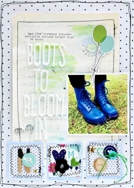
Boots To Bloom In by Sian Fair | Supplies: Patterned Paper: Fancy Pants; Alpha: American Crafts, Fancy Pants; Wood Veneer and Acrylic Shape: Gossamer Blue; Diecuts: Fancy Pants, Simple Stories; Stamps: Cocoa Daisy
Audrey Tan says, “This page showcases a photo from a shoot I did with my best friends. I see them once a year–whenever I visit Singapore–and we hang out and have fun.”
“I filled the background here with digital transfers and overlays, and I clustered and layered my photo with many embellishments. I felt the rich layers worked with this photo because my friends are artistic and that’s was how I met them: through scrapbooking. One of them is an expert at layering with the physical stash so this is my tribute to her–in a digital version!”
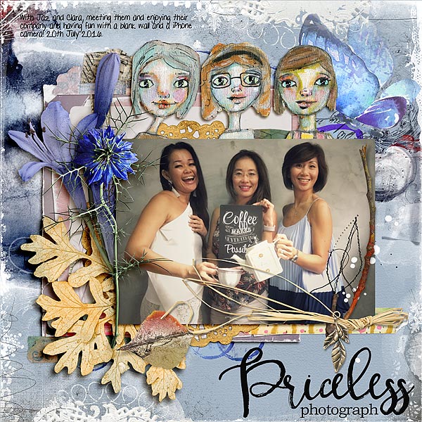
Priceless by Audrey Tan | Supplies: Anna Aspnes: ArtPlay Palette Noble, MultiMedia Branches No5, Remember WordArt No1, Doily Edge Overlays No1,
Oscraps Collaboration Posh; Crafty Button Designs: Wallflower ArtDoll, Mixed Media Art Tape Vol1; Rebecca Mcmeen: Mendi; Font: Pea Gretchie Print
Marcia Fortunato says, “We have a fairly large yard with several garden areas, all planted by our homes’ previous owner. This layout is about the perennial garden along the side of our house which is particularly colorful at this time of year, despite the fact that I haven’t spent much time caring for it. I just love its easy beauty.”
“I knew I wanted a base layer that had loose stripes of color to mimic the waves of color in my garden. I used Distress Stains and Hero Arts ink daubers, both of which give saturated colors, and I painted stripes of color on white cardstock. I felt that it needed a frame, so I mounted it on the black and white flowered patterned paper, but to further tie the two together I colored in a few of the flowers. On top of the inked paper I stamped flowers in black to mimic the patterned paper and hand-drew stems and leaves, then I covered the entire piece with vellum to tone it down. To keep the focus on the photos I mounted them on hand-painted watercolor paper.”
“I wanted to use colored letter stickers for the word color in my title, but I was having trouble finding letters that stood out enough from the background. I discovered that I could use these pink letters by layering them on top of similar black letters. This kept them from blending in. I finished with a few simple supporting embellishments as my last layer.
The layered look works well for this layout because it mimics the layers of flowers and colors in my garden. I like the colorful background because it reminds me of the waves of color that struck me when I first saw this garden after it bloomed. The watercolored paper echoes the green leaves and grass and the blue sky.”
“When you are creating layers, if you end up with a layer that is just too bold and overpowers the rest of your layout, try to find something that can be layered on top of it to tone it down and bring it into harmony with the other elements. This could be vellum, as I used, a thin layer of white paint, ink, or gesso, or other layers of paints, mists, or inks using a mask.”
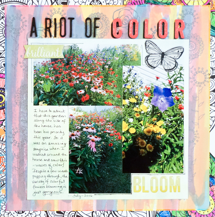
A Riot of Color by Marcia Fortunato | Supplies: Patterned Paper: Cocoa Daisy; Cardstock: Bazzill; Watercolor paper: Strathmore; Vellum: The Paper Studio; Letters: Thickers (American Crafts), Target; Inks: Distress Stains (Ranger), Hero Arts ink daubers, Studio G; Watercolors: Mr. Huey (Studio Calico); Embellishments: Thickers (American Crafts), Shimelle (American Crafts); Stamps: Cocoa Daisy; Pens: Staedtler.
Stefanie Semple says, “I though this would make an awesome photo book cover for a short winter break we took recently.”
“I started with a wood grain paper that looks like a table top, then added a journal with bits and pieces overflowing, and scattered around goodies that one might find on a desk. Flowers, natural elements and some vellum layers complete the messy desktop look. This cover serves to give a glimpse of our trip and hopefully makes one want to delve deeper into the pages. I love digital mess, it is so much easier to clean up.”
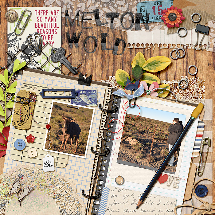
MeltonWold by Stefanie Semple. Kimeric Kreations: A Little Bit Country and Journal Templates; Studio Basic Designs: Addicted to lists; Alison Penningtons: Wood Be Good{papers}; Chelles Creations:Letters from Home {retired}; Edeline Marta : Written {retired}; Akizo Designs: Stitch and Shadow Alpha; geniaBeana : A Whimsical Heart {retired}; Karla Noel: Vellum Essentials 3&4; Sabrina DuPreez: Desk Drawer
Nicole Mackin says, “Since I had already scrapbooked our experience of going to Phantom of the Opera, I used this leftover photo to document the girls and me getting all dressed up.”
“I used items in my layers that would reflect the concept of getting dressed up ‘fancy’ as well as the atmosphere of the beautiful theater we were at. The glitter, gold, and florals throughout the larger and smaller layers accomplish this. One tip for creating rich layers is to pull items of different sizes, colors, and textures that help tell the story and work them in under and around each other until you have a finished and balanced look. I also like to put adhesive in the middle of my loose items at first and when I know I am done tucking things in, I fully adhere them down.”
“I wanted my layers to reflect fancy and feminine, so I used pink and a couple different florals and mixed them with the bold black and white striped background which pulled out the colors of our dresses. I used a lot of hearts to signify the love I was feeling sharing the experience with my girls, gold to bring in the fancy aspect, and included a variety of textures to add interest to the page such as the acetate pieces and a white vellum bag to pull in some softness and delicacy, the glitter and shiny gold pieces to reflect the fancy theme, and the washi, cork, and puffy stickers to add dimension and detail.”
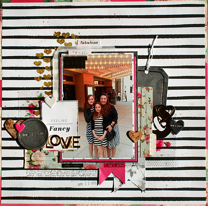
So Fancy by Nicole Mackin | Patterned Paper: Pink Paislee; File Folder: Pink Paislee; Acetate: Pink Paislee; Vellum Bag: The Paper Studio; Glitter Paste: Bo Bunny; Heart Stencil: American Crafts (Shimelle); Embellishments: Pink Paislee; Twine: Target; Washi: Pink Paislee; Gold Lame Color Shine: Heidi Swapp.
Kelly Prang says, “This page is about our annual tradition of having a cousin photo shoot. We live about 13 hours drive from all of my kids cousins, so usually only get to see them once a year. I wanted to make sure that the kids all know how much family really does matter.”
“I used wood veneer, a vellum doily, measuring tape, ephemera, tags, paper strips, stamping, string and a flair. My tip is to have vellum and punched holes or shapes to help give a glimpse of another layer. I scrap digitally, so don’t have to worry about adhesive but I do Like to keep things realistic and not have a dimensional element with something flat covering part of it. The multiple layers help convey the idea that we are all better when we come together- and different strengths and weaknesses are balanced out when we are with our family.”
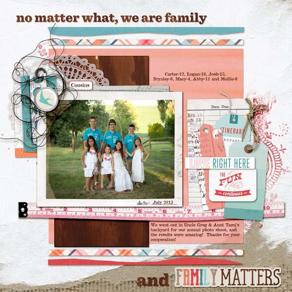
Family Matters by Kelly Prang| Supplies- Font:Attic; Ali Edwards:Root- digital stamps; Allison Pennington: Bright- paper, All Together Now-paper, Built for Two- measuring tape, Jump for Joy-paper, More Smarter- library card and paper piece; Amanda Yi Design: Home is Where We Are- wordart; Karla Dudley: Bermuda Triangle- wordart; Deena Rutter: Bermuda Triangle- wordart; Tracy Martin: Summer-tag; One Little Bird: At Weeks End-paper, Going Places-Tag; Studio Basic: Obsession- tag; Sara Gleason: Alder-brad; Valorie Wibbens: Sprinkles 29- thread, For Like Ever- paper; We Are Storytellers: Lilypad Collab- frames, doily; Pink Reptile Designs: One of a Kind- paper pieces; Rebecca Wagler: Going Places- tickets; Ju Kneipp: Truly Madly Deeply- paint splat; Katie Pertiet: email inspiration freebie- paisley paint doodle

