 This lesson from Celeste Smith first appeared as a part of the membership class “Oomph and Polish.” For that class and many more, join us.
As a beginning digital scrapbooker, I didn’t understand or see the value of shadows. Actually, I was quite intimidated by them and rarely used them. I look back at those pages and realize that I shouldn’t have been. Shadows add great polish and oomph to digital pages. If you misuse them or don’t use them, your layouts will look flat and somewhat dull or even somehow “off.”
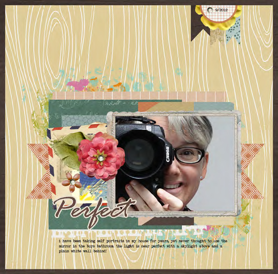
Unshadowed: You can see that the different layers get a little lost and the edges of the papers and elements are fading into the items behind them. Adding shadows will help those elements and papers pop!
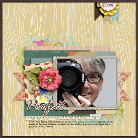
Shadowed: Here you can see that by adding shadows, I’ve added dimension and depth to my page. I really can’t imagine not incorporating them into my scrapbooking workflow now!
Understanding the Basics of the Drop Shadow Dialogue Box in Photoshop
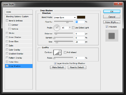
I’ll start with a brief explanation of the parts of the Drop Shadow Dialog box in Photoshop. This is a great way to get started learning about shadows!
The Blend Mode allows you to blend the shadow into the background in different ways (Multiply, Overlay, etc.). The default setting is Multiply, I prefer Linear Burn. Linear Burn makes your shadow a little darker, but it takes into account all the colors in your background layer.
The Color Box located to the right of the Blend Mode is where you can select the color of the shadow. I use #2c1901 for my shadows because that is what Peppermint Granberg taught me. That color is a deep dark orange, it almost looks black. Some scrapbookers use the color of the layer underneath and then just darken it considerably.
The Opacity is how dark or light your shadow will appear on your layout. This will vary greatly depending on many things.
For one thing, the blend mode greatly affects the opacity you will choose. The paper behind the element you are shadowing will also effect how dark the shadow appears. The key to opacity is to play with the slider until it looks good to you. When shadowing with linear burn, I tend to keep my opacity in the 30s or 40s depending on the paper. On a light background, I might even go up to the 50s or 60s.
The Angle option of your drop shadow will determine the direction it falls when the Distance is set to 1 pixel or higher. If the Distance is set to 0, the shadow will spread equally around the layer’s contents. As you can see in the image, the default shadow angle is +120 degrees. However, I always set my shadow at +45 degrees. You can select the angle as you wish, just keep it consistent through your page.
The Distance determines how far up from the page you want your element to appear. This will vary according to the element. When shadowing paper, your distance will be a small number. When shadowing a bulkier item like a flower or ribbon, your distance would be a greater number.
Spread allows you to make the shadow thicker/denser. I never adjust this and just leave it at zero.
The Size is how big or small the drop shadow will be on each side of the object. The size basically determines how sharp or blended your shadow edges will be. If you bring your size down to zero, the edges will be sharp and hard. Alternately, increasing the size softens the edges of the shadow.
Simplify Your Digital Scrapbook Page Shadows with Layer Styles
Shadowing is an art, and I will admit it’s an art that I far from excel at, that’s why I love using shadow layer styles!
Shadow Layer Styles are shadow settings that have been set up for you. A set of them might include different styles for paper, buttons,
stitching, and other scrapbook page elements.
You can pick up a basic set of styles for free.
This is a great way to get started shadowing and see if styles are for you:
- Flergs has a free set of shadow styles and a quick tutorial on how they work.
- Mommyish Designs also has a free sampler of shadow styles available.
- Krystal Hartley offers another free set. This set is what I started with. Krystal has a light hand with shadows and I used these almost exclusively until I bought a couple sets.
For minimal cost, you can pick up a set or two that have more options.
Peppermint Granberg and Jenn Barrette both offer amazing shadow style sets. These sets include many different styles for different elements
on your pages. The two sets work together really well as both sets have the light hitting at the same 45 degree angle. I use these styles on almost all of my pages.
Installing layer styles is a fairly easy process.
For a step-by-step process on installing layers styles on Photoshop CS2+ and PSE 4+, check out this guide by Wendyzine Scraps, Installing Styles in Photoshop and Photoshop Elements.
Using the layer styles is even easier!
Just highlight the layer you want to shadow in the Layer Palette, and then click on the style you wish to apply in the Style Palette. Simple as that!
Dig Deeper with More Digital Shadowing Tips and Tricks
Once you get comfortable with basic drop shadows and using styles, take some time and poke around the web. There is a lot to learn about warping and smudging shadows to make them more realistic. Below I’ve included several tips and tricks for you to think about as you dive deeper into the world of digital shadows.
- When working with a layer that is on a lighter colored layer, you might want to try lightening up the color of your shadow.
- You can select multiple layers in your Layers palette and click on a shadow style to apply the style to all of the layers at once. Also, you can right click on a layer, copy the layer style then select another layer (or multiple layers) and paste it on to that layer.
- Be aware of the angle of the light that falls on pre-shadowed items and/or items like epoxies with a shadow on top. Try to match the angle with the angle you choose for the shadows on the page.
- Not everything needs a shadow. For instance, paint and ink splatters and text do not need a shadow.
- Keep the size of the shadow proportional for the size of the object.
- The bigger the space between the object and its shadow, the lighter the shadow will be (the shadow for a piece of paper placed directly on top of another paper will be darker and less opaque than a button or flowers).
- Play with the blend mode. Using the color burn mode when applying a shadow to acrylic works best.
- When you print your layouts, the shadows are not going to be as noticeable. You may want to do a test print before ordering a bunch of layouts; just to be sure you are happy with the end result printed.
More ideas from the GIS Team…
Below are more tips and tricks from the Get It Scrapped Creative Team.
Ronnie Crowley says, “This page is about how a picture can take you surprise and make you miss someone who is no longer with you.”
“As a scrapbook who previously was a paper scrapbooker, I try my best to shadow my pages realistically. Even on pages which couldn’t be created in paper, such as this one. I think it’s important to make my shadows work as they would in paper. Ninty percent of the time I use premade shadows. I have several sets that I like particular shadows from and I’m happy to mix and match them.”
“What you need to be careful of are pre-shadowed items. The frame in this layout had a shadow on left side of the frame which had it curving up off the page. As I had placed a cluster at this point this didn’t work so I unlinked the shadow from the frame and used the warp tool to tweak the shadow so it looks like the frame is warped back down towards the page.”
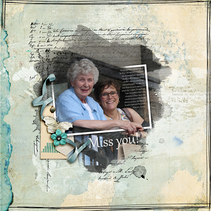
Miss You by Ronnie Crowley | Supplies: Little Lamm Co – Anthology; Genniffer Bursett – Endless summer; Washi tags; Jay Day Studio – My life right now; Studio Manu – The beauty of life; Incanto – Framed masks
[hr]
Kelly Prang says, “This page is just about the simple pleasures of enjoying time at the beach- the surf, sun and sand. My son was body-boarding and having a great time on our trip to a beach on the Gulf of Mexico for Fall Break back in October 2014.”
“As for my digital shadowing style, I tend to be fairly realistic and minimalist with my digital shadowing. I start with shadow styles (One Little Bird has some basic shadow styles that are amazing!), then tweak a few places to add interest.
I place shadows on their own layer, warp and puppet warp the shadow layer, change its opacity and blending mode until it looks right to me. I would advise anyone who is wanting to improve their digital shadows to look at lots of paper layouts. Check out how the shadows naturally look. I like to peruse Studio Calico and Big Picture Classes galleries to get ideas for how to add interest to my shadowing. Then, play. If you like something, try to recreate it. Write down your steps and do that look again. The best way to learn is by playing, then practicing!”
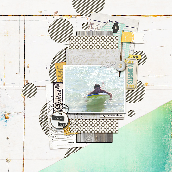
Beach Days by Kelly Prang| Supplies: lynn Grieveson:Blue Skies Ahead- papers; One Little Bird: One for the Album-paper, Shadow styles, Pedal Pusher- tickets, Fresh-flag, Forever Young- Wordart; Allison Pennington: More Smarter- Library card, Wood Be Good- wood paper; J Barrette: That’s Life- party game card; Paislee Press: Summer Manifesto- tag and word art, Epic- word art; Etc By Danyale: Cold Outside- paper; Dani Mogstad: tag- photos ephemera; Pink Reptile Design: Bring on the Weekend- wrinkled paper; TMD: More Than- map paper; Create Wings Design: Stitching; Sugarplum Paperie: On the Brightside- word art; Just Jaimee: Spring Freebie- ticket and staple; MIchelle Underland: That was Yesterday- Hangtag; Happy Box: On the Brightside- button
[hr]
Deborah Wagner says”Last summer, my sister and I toured Vietnam. This is one of the many gorgeous places we visited, Cat Cat Falls in Sapa. The longer I digital scrap, the more I love fussing with my shadows. As I work on a page, I add one of the many drop shadow styles I have purchased over the years. When my layout is nearly finished, I start tweaking my shadows. Since I work in Photoshop, I put the shadows on their own layer. Here some of my tips/techniques:
- I use the smudge tool most often when working with my shadows. I bring the shadows further out to make an element look like it’s lifting off the page. If an element is being tucked under something, like the tag on the right side of the frame, I smudge the shadow inward so it looks as if the tag is flattening as it tucks under the frame.
- I often make two shadows for an element, as I did here with the banner and the tag. After duplicating the element, I put a different shadow on each layer and mask away the unwanted parts. With the tag, I wanted the string to be floating above the frame so it needed a larger shadow with less opacity then the tag. I applied the same technique on the little green banner because I wanted the upper part of the banner to be held down by the brad; and the lower part to be floating upward.
- To make your shadowing more realistic in clusters, try putting larger shadows with a lower opacity on the top elements; increasing the opacity and lowering the size as you work downward through the cluster.
- There are many fun ways to work with your shadows. The warp tool, and the wave filter can give you great effects, too. Each layout requires different shadowing techniques. Soon you will find yourself addicted to shadow play!
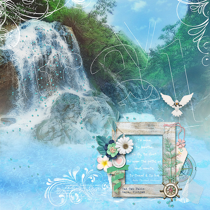
Cat Cat Falls by Deborah Wagner|Supplies: Anna Aspnes – TimeLine Brush Set, Big Words Travel No.1; Alison Pennington – Anchored; Lynn Grieveson – Deep End; LJS Designs – For The Love of Peace; Stolen Moments Designs – O Captain; KimB – Destination Escape, The Road Ahead, Fish On, Hippie Go Lucky, Salty Kisses, Precious Beginnings; Sabrina’s Creations – 25 Days of Christmas; Katie Pertiet – Travel Clusters No.3
I hope these tips help you get started on shadowing your layouts and motivate you to learn more about shadows and get started customizing your own
shadows more!

