 What do you do when you don’t have the right scrapbook page elements to illustrate your story? Tweak the products you do have so that they are better supports!
The Get It Scrapped Creative team shows you how they’ve modifed scrapbook products for their own photos and stories.
[hr]
Deborah Wagner says, “We had many photos of my granddaughter’s 1st birthday party. I wanted to scrapbook all the photos on one page because they were taken in low light, and most were out of focus. I thought if I kept the photos small and used a lot of celebratory elements, the poor quality wouldn’t be as apparent.”
“I loved this digital scrapbooking background paper, but it did not have openings for the photos. The frames were drawn on the black paper. To make openings for my photos, I used the Photoshop Magic Wand tool to select the area within each doodled frame. Once selected, I deleted the inside of the frame.”
“To make some of the frames pop off the background, I use the Magic Wand tool to select a particular frame, and then I duplicated that selection. Once the frames were on their own layers, I could apply layer styles to them individually. I used gold, silver, glitter and jelly styles. To add more sparkle and interest, I applied the same layer styles to many of the elements on my page.”
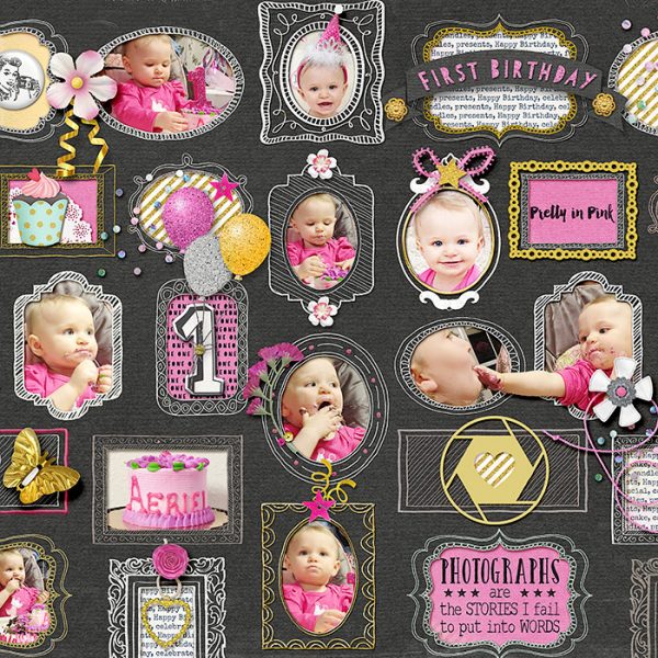
1st Birthday by Deborah Wagner|Supplies: Kim B – Make A Wish, A Little Focus, Free Spirited, Hello Sweet Pea, Field of Dreams, Live Laugh Play; Kim Jenson – Stapled Sequins No. 2; Linda Sattergast – Gold & Silver Styles, Mommyish – Glitter Styles, Jelly & Epoxy Styles
Christy Strickler says,”On this page I wanted to document how this little kitten came into our lives and seized our hearts.”
“I often have stickers and die cut cards with word art on them that just don’t fit what I need. I created the title here by customizing a vellum card that originally said “Seize the Day” by fussy cuttting the letter E on the bottom part of the card and layering tape below it and then cover some of the wording next to it. I added letter stickers to make my own title block. The puffy sticker in the upper cluster originally said ‘Hello Sunshine.’ I cut a banner out of scrap cardstock and glued it over the word sunshine, then layered items around the banner to keep it from looking too generic.”
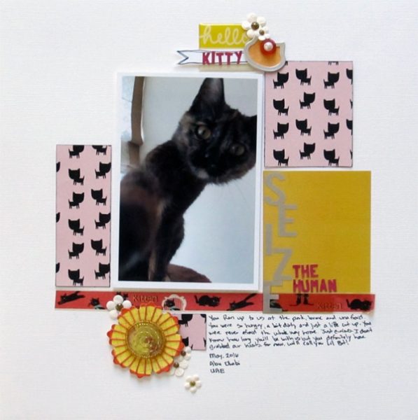
Sieze the Human by Christy Strickler Supplies: Die cuts cards: Seven Paper; Vellum, Stickers: PinkFresh Studio; Letters: Basic Grey; Flowers: Sassafrass, Recollections; Other: Tape
Summer Christiansen says, “This page is about my daughter not liking tea as much as she thought.”
“Sometimes I really like the paper from a kit but find it too busy for my style. Cutting it into simple shapes let me use it, though. I made circles, hearts and a large round base for the ‘tea time’ word art. I love being able to beautiful patterned paperns in more ways than as a background.”
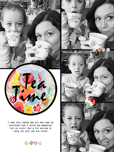
Tea Time by Summer Christiansen | Supplies: Picframe app for iPhone, and Nancie Rowe-Janitz M3 for April.
Karen Poirier-Brode says, “This LO is another page documenting the fun my niece and I had when visiting Las Vegas in 2013. I highlighted one of the photos with a custom embellishment that echoes the Paris hotel Eiffel Tower and hot air balloon. I used a chipboard image of the Eiffel Tower which I colored with midnight blue ink and I added a bright blue charm. A sticker frame, a piece of packaging and a flower complete the embellishment. Prima flowers and handcrafted flowers made with a die and accented with pearl centers and confetti cut from the triangles in the paper complete the embellishments.”
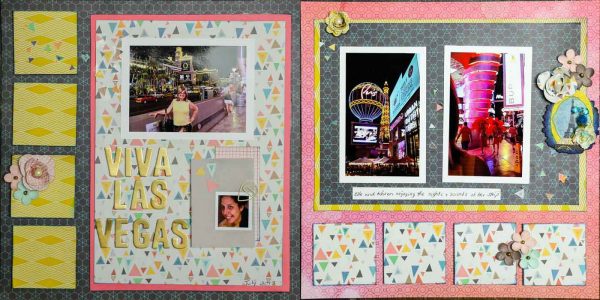
Viva Las Vegas by Karen Poirier-Brode | Supplies: Julie Nutting Belle Vie-chipboard, Prima LadyBird-frame sticker, Quick Quotes-Ink, Prima-charm, Sizzix-flower die, pearls-courtesy It’s All About the Scrapbook, Prima flowers, paper, paper clip and alphas-stash
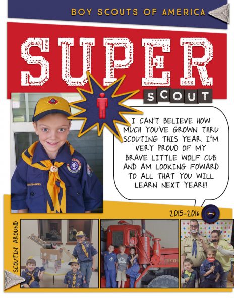
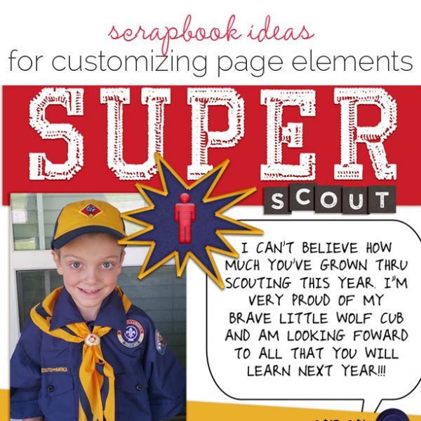
Amy Kingsford says, “This page is about my son’s first year in scouting.”
“To bring in more details from my story and reinforce my scouting theme I turned what was once a flat digital sticker into my very own super scout badge using a Photoshop action by Mommyish Designs called Patched Up. I love how realistic it looks and that I was able to make something that went with my story so perfectly!”

