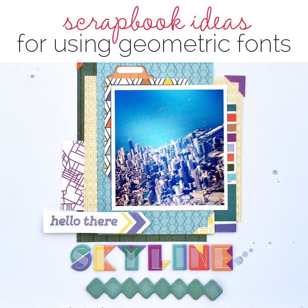
 Geometric-styled fonts are trendy, but they aren’t always easy to use within a design. The Get It Scrapped Creative Team shares approaches for getting striking looks with these type treatments and shares their best tips for working with them here.
[hr]
Kristy T says, “This page documents the graduation of my son to a bigger bike with pedals and learning to ride. I used the geometric font for part of my title as it reminded me a little of the spokes on the wheels of the bike and the black and white font worked well in contrast with the other elements on my page.”
“My tip for using geometric fonts is to use them in combination with other fonts to create an interesting look for your titles.”
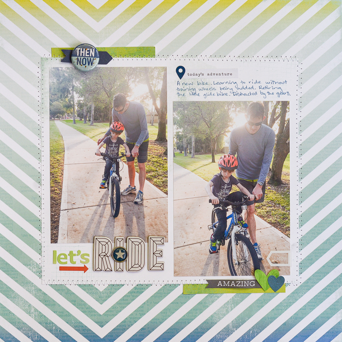
Let’s Ride by Kristy T| Supplies: Patterned Paper: Heidi Swapp; Alphas: American Crafts – Details, Kaisercraft; Stickers: Carta Bella, Simple Stories; Paper Ephemera: Kaisercraft; October Afternoon; Bradz: Simple Stories; Tin Pin: Simple Stories; Pens: Distress Marker, Copic Marker.
[hr]
Kelly Prang says, “After taking photos of my daughter on her 11th birthday, I found the baby photo of her and was struck by how much she had changed or bloomed–and, also, how much she has stayed the same.”
“I used the free font Anders for the title on my page as I liked the geometric look and felt that is was a nice counter to the circular background cut-out and layered floral embellishments. I balanced the strong lines of the Anders typeface with a curvy font called Ariadne Script for the sub-title. In order to help the title flow together, I nestled the script alongside of the geometric font and gave the geometric font a style to help it look like it was made from chipboard or fabric material. I grounded the title with a vellum cloud to give it a home while still keeping a soft airy look.”
“My tips for using geometric fonts are to: use contrast, ground the font, and mix straight simple lines with curves for visual interest.”
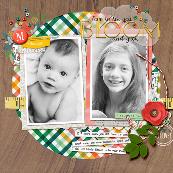
Bloom by Kelly Prang| Memory Pocket Monthly- May 2016- Bloom kit (from the-Lilypad) with add-ons from Allison Pennington- Blossom paper, and Valorie Wibbens-Printies- tabs; Rebecca Young- I’ll Be There for You collab- vellum cloud; One Little Bird- Forever Young-tape measure, Troublemaker- rectangular doily, Suncatcher-word art, shadow styles; Sahlin Studio- Fresh- twine; Keye Winiecki- Paper Mat- always; Sara Gleason- Alder- washi tape; Allison Pennington- I’ll Be There for You- paper strips for journaling; Fonts- Anders, Ariadne Script, AA Typewriter
[hr]
Christy Strickler says, “This page shows our kittens exploring my son’s Little People City.”
“After looking through a few geometric fonts for inspiration, I decided to handletter my own typeface. To do this yourself, first draw the font in pencil. Once you are satisfied with the way it looks, carefully trace it with a pen or marker. I like geometric fonts, but I think they work best with bright, bold, modern papers and embellishments.”
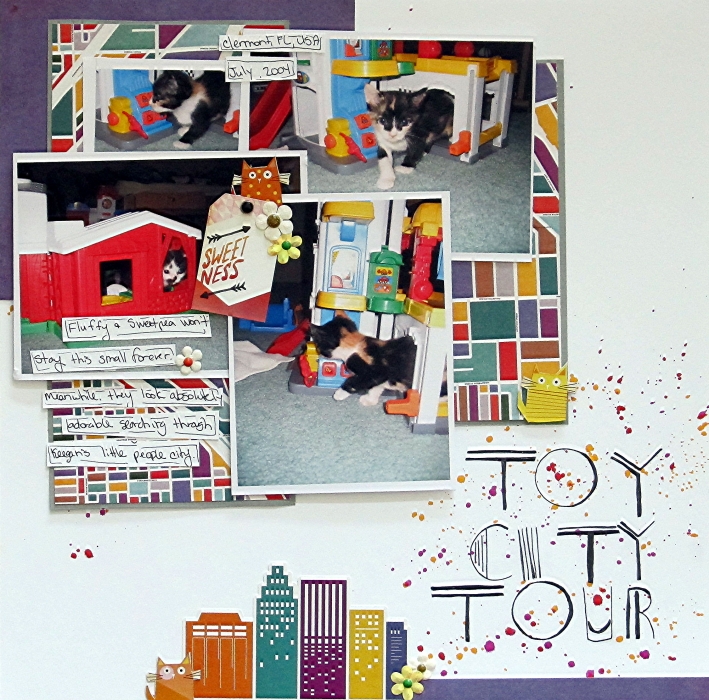
Toy City Tour by Christy Strickler |Supplies Cardstock: Bazzill; Patterned Paper, Stickers, Tag: Basic Grey; Pen: Scripto; Flowers: Recollections; Enamel Dots: My Mind’s Eye; Other: Chipboard, Sequins
[hr]
Ronnie Crowley says, “It’s spring here in Texas and this page is about the crazy stuff we do to my son’s car to save it from hail! I used a brand new font to me called “Baron” for the title. I chose it because I liked the ‘o’. For some reason it said muffler to me–especially when I used a digital Photoshop action to make it look like metal. The title dominates the page, and, as a result, I kept the embellishments to a minimum.”
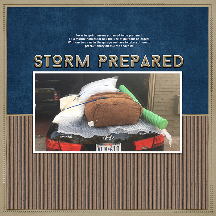
Storm Prepared by Ronnie Crowley | Supplies: Kristen Aagard – Page Border Stitches; Connie Prince – Batter Swing; Chelle Creations – Fall Semester_paper 01; Lynn Grieveson – Color blocked it; Mommyish – You’re a Natural, Style #149; Fonts – Baron and Building
[hr]
Devra Hunt says, “This photo represents the love I have for Chicago, my adopted city. The story is about my life while living there for nearly 20 years after moving on a whim.”
“I used an Art Deco style font. I edited the photo with a vintage filter. The two styles complement each other. The font is bold and can draw a lot of attention. I worked it into the design of the page so it is visible, but not overwhelming.”

Skyline by Devra Hunt | Supplies: Cardstock-American Crafts, Patterned Paper, chipboard, stickers, die cuts and font-Basic Grey, wood piece-Studio Calico, mist-Heidi Swapp, pen and adhesive-EK Success

