 Arranging photos, journaling, titlework and embellishments onto your canvas is one of the primary tasks of making a scrapbook page. That task gets tougher when you’ve got lots of journaling. Check out these six ways to make room for your journaling.
[hr]
1. Use “newspaper-style” columns.
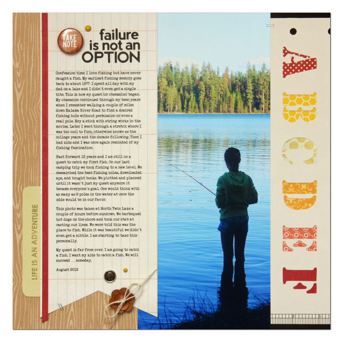
Summer Fullerton says, “This layout is the story of my inability to fish. It has become a slight obsession of mine, and during our last camping trip we pulled out all the stops, and we still couldn’t get a nibble.”
“I don’t often make single-photo layouts–unless my layout is story driven. This layout falls into this category. By typing my journaling I was able to select a font and size it to fit my available space. This layout is designed around the large journaling block. I wasn’t completely sold on the idea of using a large photo until I went to lay all my pieces in place.”
[hr]
Put journaling in multiple spots.
Devra Hunt says, “The day we arrived in our new home, I expected our son to be confused and upset. Instead, I found him curious about his new surroundings and content to have his things around him.”
“This layout tells this story as a whole, but each photo has its own story. I used journal spots around the page to tell details about some of the photos.”
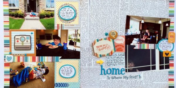
Home Is Where My Stuff Is by Devra Hunt | Supplies: Patterned Papers, stickers, chipboard-Basic Grey, flair-Fancy Pants, Freckled Fawn, Acrylic shapes, journal spots-Freckled Fawn, alphas-American Crafts, Basic Grey, pen and adhesive-EK Success, sketch inspired by-Scrapbook Generation
[hr]
Journal on top of your photos.
Kelly Prang says, “I found photos of each of my children as babies and wanted to document their cute little baby faces. I converted the top two photos to black-and-white to match the bottom photo, which was taken with black-and-white film.”
“To document which child was in each photo, along with ages and photo dates, I added the text directly to the photos, themselves.”
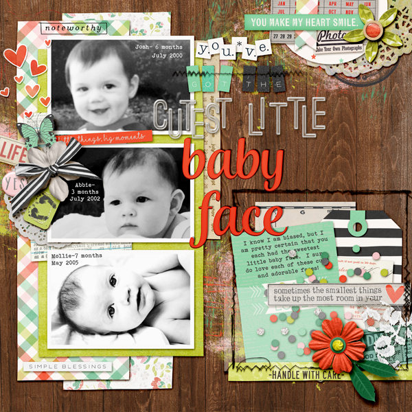
You’ve got the cutest little baby face by Kelly Prang| Supplies: Scrapbook Coach 10 for Get it Scrapped-template; Digi Scrap Parade collaboration for February 2016- Its the Little Things- papers and elements; Memory Pocket Monthly- Lili- Daily Life Stamps; Allison Pennington- Charm- elements; Charmed- alpha- white square alpha; Grow- Alpha: green/black square alpha; Viewpoint- Val Wibbens-acrylic alpha; Dani Mogstad- ephemera, ticket; Ju Kneipp- My Sunshine- lace butterfly, Truly Madly Deeply- paper bits; Tracy Martin- Sugartown-doily; CC-Bluebird-library card; L. Murphy-Lifetime-stamp; Vinnie Pierce- The Rise-stamp; M. Bennett-In the Garden Digi Scrap Parade- wooden paper; Gina Miller- Sewing Table- stitches; Fonts: Andalusia (title)and Bohemian Typewriter (journaling)
[hr]
Layer pages of text over top of one another.
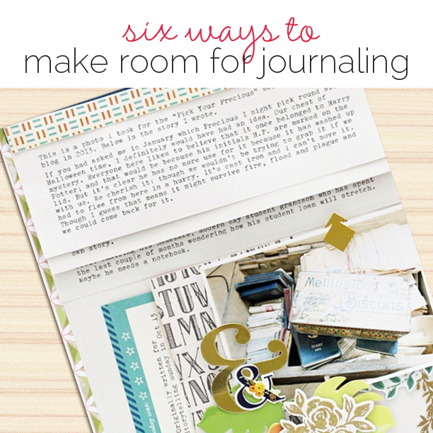
Sian Fair says, “This is a page about our family treasure chest and the old account books I found inside it.”
“I had so much text to include, I decided the only way I could fit it in would be to layer pages of text one over the other, three times, as if to mimic decorative folds of patterned paper.”
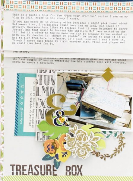
Treasure Box by Sian Fair | Supplies: Treasure Box by Sian Fair Patterned Paper: Basic Grey, Shimelle for American Crafts; Alpha: simple Stories; Journaling card: Gossamer Blue; Clear Sticker: Crate Paper; Diecuts and stickers: Jen Hadfield, Crate Paper
[hr]
5. Use text paths to create a specific space and shape for your journaling.
Stefanie Semple says, “This page is about our trip to Bird Island – a nature excursion of note.”
“I started my layout with a template, which allowed me to use a large photo as a background and a second detailed photo surrounded by a text path and minimal embellishing to give an overview of our outing. A text path can be made in Photoshop–and there are plenty of these paths to buy in digital scrapbooking stores. This page is shaped in a spiral.”
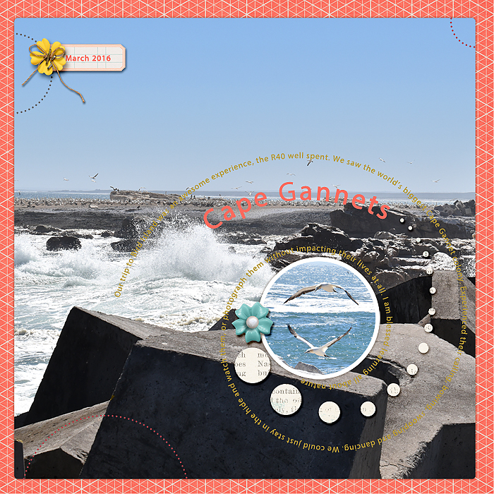
Cape Gannets by Stefanie Semple. Sara Gleason: Stated; Joey Lynn Designs: Template Tuesday No 33; One Little Bird Shadow Styles; Charmbox Studios: Resize for web action
[hr]
6. Journal around the edge of your page.
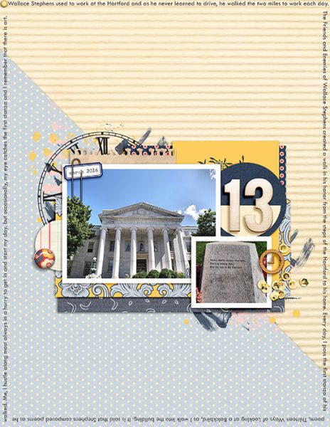
Celeste Smith says, “As I walk into work each morning, I pass the beginning of the Wallace Stephens Walk, and I’ve scrapbooked that view here.”
“To record the story I placed all of my journaling around the edges of the page. There is a lot more room along the edge than you might imagine. I also appreciate how it leaves lots of white space near my photo grouping.”

