
 Is it possible to do more than SEE and TOUCH a scrap – book page?
Could your viewer hear it, too? And could they feel more than the photos on the page? Could they have a sense of how the wind in the photos or the hug described in the journaling feels?
When you create a page that inspires the viewer to consider a smell or taste, a touch or a sound, you’ve involved them at a deeper level than when they’re simply looking. You’re bringing them closer to the experience you’ve recorded.
[hr]
Kristy T says, “This page tells the story of the time I dashed out of the house to chase the Mr. Whippy van but also represents many childhood memories for me and my children of eating ice creams.”
“I wanted to create a page with the sense of ice-cream dripping down the page as that is a big part of the experience of eating ice cream cones. To create the drips I used paints with a lot of liquid such as the distress paints and fluid acrylic paints. The fluid acrylic also give some more texture to the page. The thick acrylic paint was use with the stencil to dry on acetate and also just dries on a craft sheet. This gives extra texture and the control of placing your splatters wherever you want on the page.”

Worth the Chase by Kristy T| Supplies: Alphas: Websters Pages, American Crafts, Chipboard: October Afternoon; Cardstock: Artee, Bazzill; Paints: Distress Paints, Dina Wakely, Jo Sonya; Washi Tape: Echo Park; Stencil: Tim Holz layering stencil.
[hr]
Deborah Wagner says, “This is a page about my sons and our dogs taking a nap.”
“Our golden retriever, Brady, had the softest fur and loved to cuddle. It can be difficult to illustrate the sense of touch in a digital scrapbook page. To represent the soft, cuddliness of Brady’s fur, I used fabric textures, a fur style on the title, and warm colors (with pops of navy blue for contrast). To finish, I merged the layers; and applied a soft and dreamy action to the layout.”

Fur Pillows by Deborah Wagner|Supplies: Scotty Girl – Stitched Grids No. 4; KimB – Charming, Love Fur-Ever; Lynn Grieveson – Woof; Mommyish – Furry Styles & Brushes; Little Lamm & Co. – Starry Starry Night; Anna Aspnes – Fabric Textures No. 1; Pixels & Co. – In Good Company; Linda Sattergast – Enhance Photos Fast Actions
[hr]
Katie Scott says, “My daughter and I took a month-long road trip of the Atlantic Coast and visited many places I knew when I was growing up. I was delighted that my daughter’s new favorite food of plain spaghetti was my old favorite. This made me feel that I was having a nostalgic and new experience all at the same time.”
“I used a big close-up of the plain spaghetti with grated cheese to evoke the taste of this comfort food. I used older looking paper and embellishments to illustrate the nostalgia of the old places that we were visiting and the big bright journaling card to represent that we were creating new experiences.”

Just Plain Old Spaghetti by Katie Scott | Supplies: Kaiser Kraft – patterned papers; American Crafts, Studio Calico, Sassafrass – letter stickers; Basic Grey, Studio Calico – sticker embellishments; Me and My Big Ideas – journaling card.
[hr]
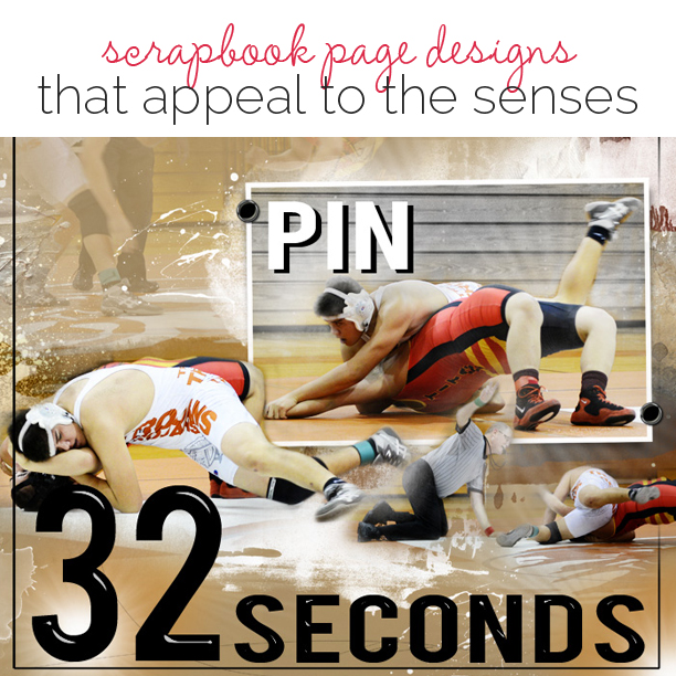
Terry Billman says, “This layout is about my nephew, Jayden, pinning his opponent in thirty-two seconds.”
“Here are the many ways I appeal to the senses on this page:”
- Words have the power to convey the sense of time. The title, 32 Seconds, in big bold black letters, communicates how quickly my nephew pinned his opponent.
- The design and placement of the photos trigger the sense of movement. The blended photo in the background shows the beginning stance. The series of photos across the bottom moves through the take down, Jayden taking control, a near fall, and ultimately the pin.
- Fotoglows are used to highlight the main focal photo and the lower right photo to show the intensity of Jayden’s strength.
- The photo of the referee with his hand raised ready to slap the mat for a pin visually creates the sense of sound. Can’t you hear the crowd screaming and cheering for Jayden?

32 Seconds created by Terry Billlman| Anna Aspnes: Art Play Palette Autumn Rust, Warm Glows 6, FotoGlows 4, Artsy Layered Template 182: Patti Knox: Brad Bonanza
[hr]
Devra Hunt says, “My husband is an audiophile. He is always playing music, as well as playing with his records and equipment.”
“In this page I am appealing to the sense of hearing. I began with photos of some of our music. To enhance the sense of music, I used musical themed embellishments, such as the notes, washi tape, and title.”

Put the Needle On the Record by Devra Hunt | Supplies: Cardstock-The Paper Company, Patterned Paper-Pink Paislee, Washi Tape-Recollections, Tape Works, Wood pieces-Studio Calico, Ink-Colorbox, VersaMagic, Stickers-Simple Stories, Alphas-Webster’s Pages, October Afternoon, Thickers by American Crafts, pen-Uniball, mist-Heidi Swapp, Dylusions Sketch-Designed by Amy Coose.
[hr]
Summer Christiansen says, “This page is about my Generalized Anxiety Disorder. I wanted to create a sense of anxiety on the page. I used word art, dark colored paper and a maze overlay with descriptive words following different paths of the maze. My intention was to create a sense of feeling trapped in the same cycle of emotions. The suns in the corners help portray feelings of hope and light even in the darkness.”

Anxiety by Summer Christiansen | Supplies by Sulu Digital Designs
