 The design principle of contrast tells us that there should be obvious visual differences between the elements on your page. What’s more, contrasts will draw the viewer’s eye and add interest and variety.
Check out a short video lesson on contrast below and then see how our Creative Team incorporated contrast into their own pages.
This video lesson comes from “Design Principles for the Scrapbook Page” which is a part of a Get It Scrapped Membership. We are doubling down on stepping up our design skills at the membership with the newest class “Confident Designer.” Click here to become a member today.
[hr]
Devra Hunt says, “My Dad is a great cook, especially with the BBQ. In this photo, he was giving my husband a few grilling tips.”
“The colors in the photo are very bright, and I wanted them to stand out. To get great contrast, I chose a dark navy as the foundation for the bright colors in the photo and in the patterned papers.”
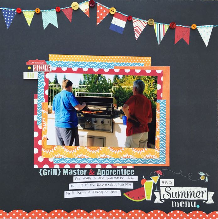
{Grill}master & Apprentice by Devra Hunt | Supplies: Patterned Paper, stickers, alphas-Fancy Pants, twine-Doodlebug Design, buttons-Hancock Fabrics, enamel dots-My Minds Eye, pen-Sakura, adhesive-EK Success, Recollections
[hr]
Deborah Wagner says, “This is a photo of my darling granddaughter at 10 months old.”
“On this page, the eye goes to first to the photo in the center and the title because of the contrast in values: those areas are darker than the rest of the page. Contrast can be overdone. Choose carefully. If everything contrasts highly with everything else you end up with competing elements, and the reader won’t know where to look first.”
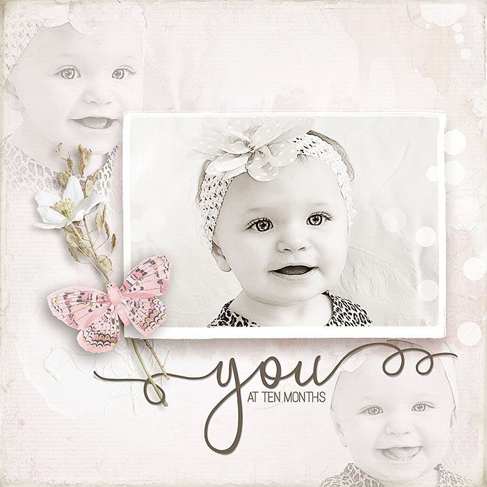
You At Ten Months by Deborah Wagner | Supplies: Studio Rosie Posie: BlendedTemplate; KimB – Sweet Pea, Yesterday Once More; Lynn Grieves – Beckie Worn Solids; Anna Aspnes – Art Play Posy
[hr]
Christy Strickler says, “Whenever you move to a new country, it takes time to get all of the utilities set up. This pages tells the story of how, for several weeks, we had no internet and had to go to local cafes for the free WiFi.”
“To tell the story, I divided my journaling into two parts: the problem and the solution. I used bright bold color on a white patterned paper to show our problem. On the solution side, I used gentle blue tones on black to support the journaling about our solution. Tape runs around the photo creating a box or frame but also adding to the flow of the design.”
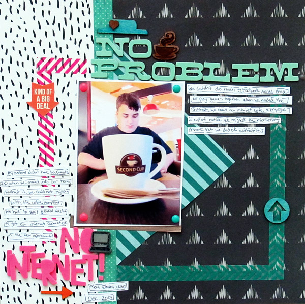
No Internet No Problem by Christy Strickler |Supplies Patterned Paper, Letters: American Crafts; Stickers: Jillibean Soup; Wood Veneer: ColorCast Designs, Studio Calico;Mist: Ranger, Heidi Swapp; Other Tape, Enamel Dots, Button
[hr]
Ronnie Crowley says, “My daughter’s first text from her skiing trip was ‘I hate skiing,’ and the jounaling here (from her second text to me) tells the story of her one and only descent down the mountain.”
“I used one large focal-point photograph to contrast and with smaller supporting photos. There’s more contrast in the title, with two typefaces: one all a serif rendered in all upper case and the other a bold script.”
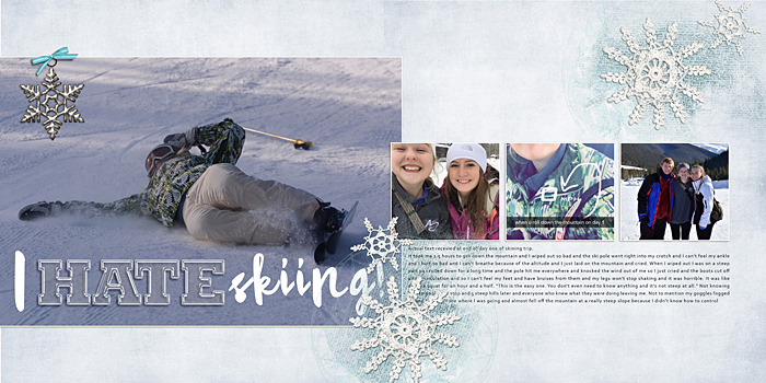
I Hate Skiing by Ronnie Crowley | Supplies: Kim Jensen – Me Right Now; Chelle Creations – Winter thrills; Lynn Grieveson -Nordland transfers; Snow in January; Sabrina’s Creations – Book plate
[hr]
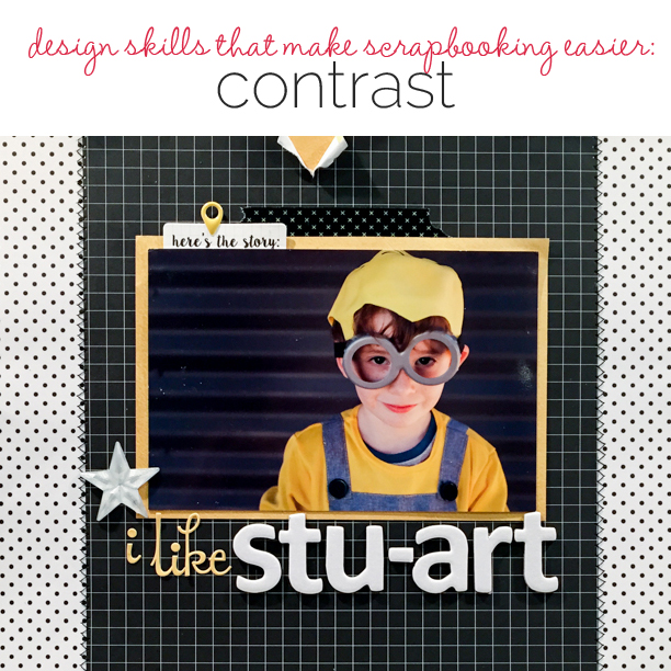
Kristy T says, “My page is about my son’s love of silly things and his favourite minion, Stuart, which he pronounces Stu-art. I used a color scheme of black, white, and one color (here yellow). The pops of yellow add great contrast and move the eye around my page. The color in the photograph and the high contrast of the white letters on the black background create the page focal point.”
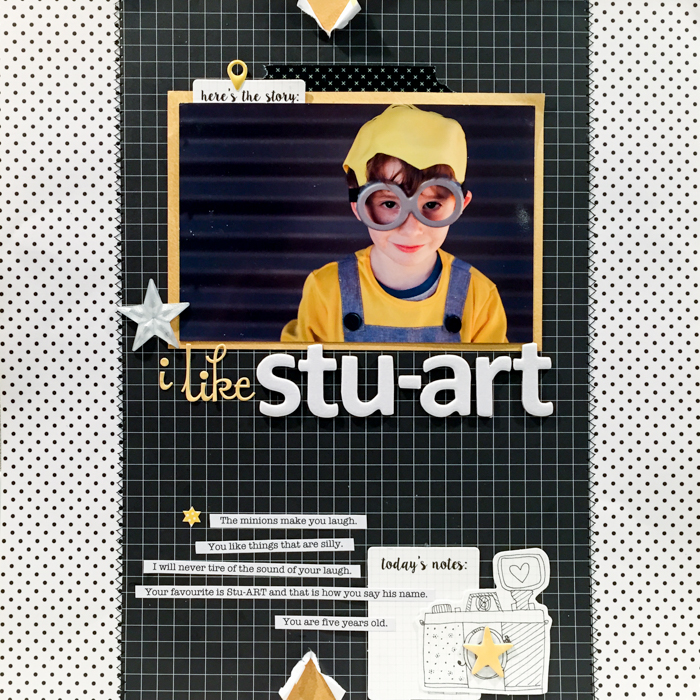
I like Stuart by Kristy T| Supplies: Patterned Paper: Kaisercraft; Collectables: Kaisercraft: Alphas: October Afternoon, Chipboard: October Afternoon; Stickers: Simple Stories, Echo Park; Washi Tape: Unknown.
[hr]
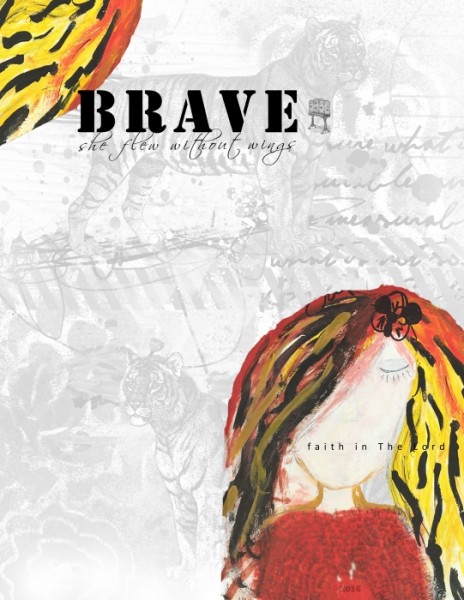
Summer Christiansen says, “This is an art journal page about my one little word for 2016, brave. I originally had painted it in my physical art journal but decided to scan and extract so I could use it digitally.”
“I used a small colorful element with contrasting type (in the top left corner) and created white space in between my large, colorful focal point (with colors that tie in) in the bottom left.”

