 We are taking scrapbook page inspiration from a current web design trend which is the use of full-width images on the home page referred to as “hero headers.”
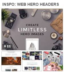 Two common approaches to hero header designs that we’re lifting are:
- Use a full width image that has text (usually white) overlaid and often centered. The text sometimes goes right over a major part of the picture. Sometimes the photos are darkened up for contrast.
- Put the text in the midst of a collage of items — often place around like on a desktop.[hr]
Christy Strickler says, “I was told that rain was rare in Abu Dhabi, so I was thrilled to experience it shortly after we moved. Rainy Weather is my favorite weather.”
“I wanted to make a full0width image but I don’t have a wide-format printer. I chose one main photo ( a raindrop in the window) in 4″ x 6″ size, and then added two 3″ x 4″ supporting photos, placing them in a band across the page. The photos are supposed to be the main focus of the page, so I kept the embellishments light. I added two strips of white cardstock underneath and above the photo band along with simple strips of thin black tape. The image with the rain drop is my main hero image. I added the title to it along with two strips of paper with the date and location. These strips remind me of the navigation buttons on the headers. I also placed two embellishments at a diagonal around the image to help bring the focus to it.”

Rain in Abu Dhabi by Christy Strickler |Supplies Cardstock: Bazzill; Letters, Flair: Basic Grey; Wood Veneer: Studio Calico; Mist: Hiedi Swapp; Tape: Amy Tangerine
[hr]
Terry Billman say, “This page is about the excitement and travel experience of our trip from Texas to Hawaii to visit our daughter and her family.”
“I was inspired to make a page with strong, classy, attractive, mysterious, and inviting features. I took this photo in flight from Los Angeles to Hawaii. I used the photo on the entire canvas and framed it with the white stroke around the perimeter of the page. Digital fotoglows add dimension and light to the layout, and they highlight the title. The title was created with two different fonts and a gradient overlay. Depth was achieved by using a gradient overlay, a drop shadow and bevel applied to Places.”
[hr]
Marcia Fortunato says “This layout celebrates the arrival of my new granddaughter.”
“As soon as I saw this web design I knew I could use it as inspiration for a scrapbook page. The items scattered around the web page made me think of piles of photos laying on my desk. I chose my favorite photos of my new granddaughter and scattered them around all four sides of my layout, allowing some to hang over the edges which I later trimmed off. I was then able to place my title and her birth statistics in the center of the page. Small embellishments scattered about soften hard edges and add to the celebratory tone.”
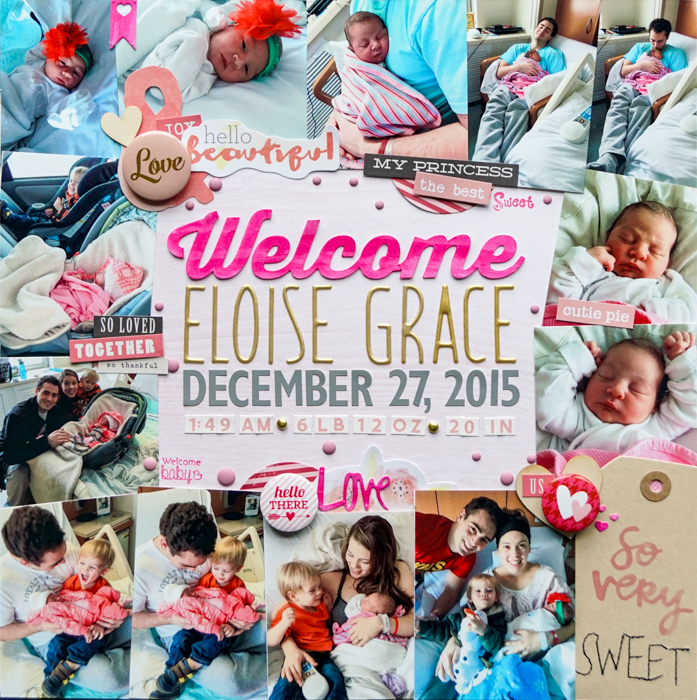
Welcome Eloise Grace by Marcia Fortunato | Supplies: Patterned Paper: Life.Love.Paper; Letters: Silhouette cut (Thirsty Script font, Strathmore mixed media paper, Distress Stain by Ranger), Dear Lizzy Thickers (American Crafts), Jenni Bowlin Studio, October Afternoon; Embellishments: Flair – Fancy Pants, Recollections; Words – My Mind’s Eye, Crate Paper, Dear Lizzy (American Crafts), Spellbinders dies; Tag – Amy Tangerine (American Crafts); Wood veneer – Big Picture; Enamel dots – Eyelet Outlet; Stamps and ink – Studio G.
[hr]
Heather Awsumb says, “This page is about my decision to leave my job at the end of 2015 and the really nice going away party that was held by my team.”
“I used inspiration from website headers in my design and a full-width photo with my title layered over top. I applied a light shadow effect to the title so that it would look like letter stickers”
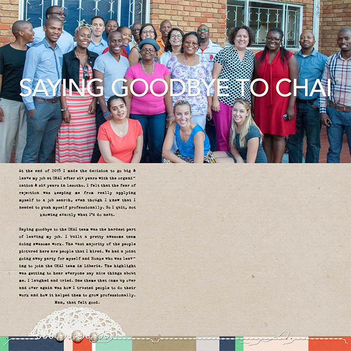
Saying Goodbye to CHAI by Heather Awsumb | Sanguine by Sara Gleason; Cabana, Day Tripper by One Little Bird; Assorted Messy Stitches White No 5 by Katie Pertiet
[hr]
Marie-Pierre Capistran says, “The story of this page is that we hadn’t expected snow for our trip to Canada at Christmas, and when it did start to snow, we bought my daughters snow gear and took full advantage of the snow before we flew back home.”
“I was inspired by the very large and bold headers on various websites. I wanted a font that would stand out so I went with School Book New for the title. I wrote on my photo before printing it. For my text, because of the rather busy background, I went with a simple and easy font to read: Arial. I added only one simple embellishment at the very bottom of my page so that it wouldn’t distract from the design work at the top of the page.”
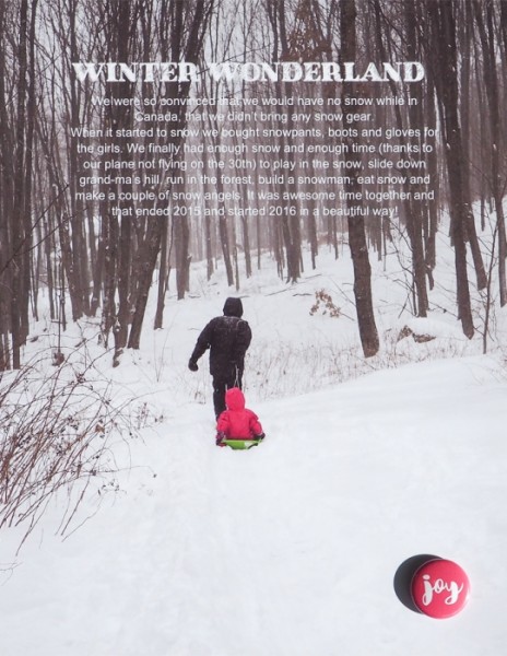
Winter Wonderland by Marie-Pierre Capistran | Supplies: Photo paper: Canon; Font: School Book New, Arial; Flair: Pretty little Studio.
[hr]
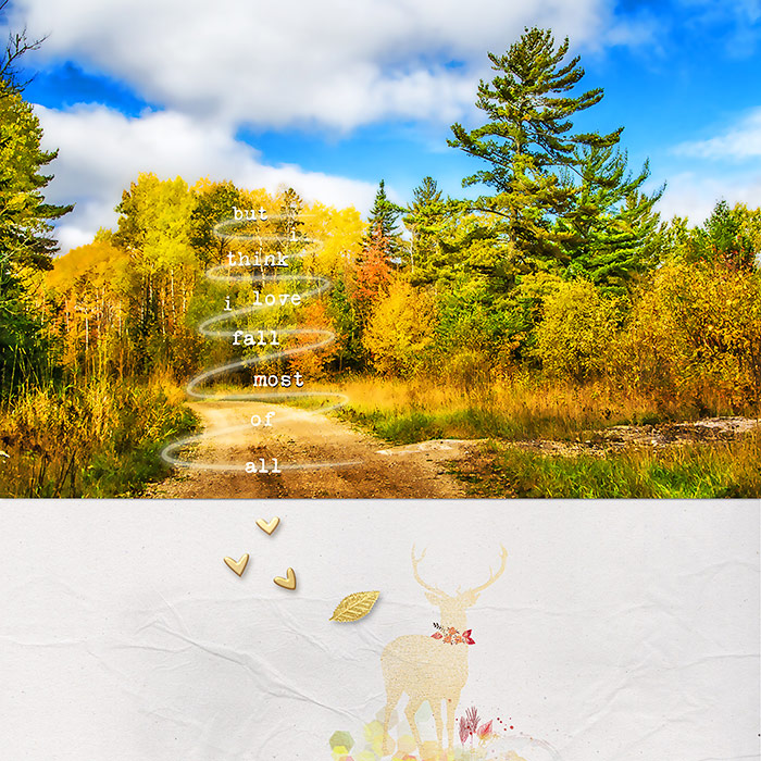
Deborah Wagner says “My friend’s mother took this photo on a girls’ trip to northern Minnesota. We had great fun, and Marsha captured autumn beautifully.”
“I often use web headers as inspiration because I love big photo layouts. Web headers are usually simple, clean and classic. I built my page using the
same principles, keeping embellishments to a minimum.”


