 The design principle of alignment tells us to consciously place each element on a layout with a consideration for its relation to other elements on the page. Using alignments, you can create visual connections between elements, even if they are not next to one another. Check out a short video lesson on alignment below and then see how our Creative Team incorporated alignments into their own pages.
This video lesson comes from “Design Principles for the Scrapbook Page” which is a part of a Get It Scrapped Membership. We’ll be doubling down on stepping up our design skills at the membership starting January 18, 2016 with a new class, “The Confident Designer.” Click here to become a member today.
[hr]
[hr]
Sue Althouse says, “This page is about our visit to a historic home just outside Akron, Ohio.”
“I created a strong vertical axis with my portrait photos, patterned paper and journaling, separating the design into two columns. The title and embellishments break outside the lines to add variety and interest, while the overlapping ampersand unites the two sides.”

My Turn by Sue Althouse | Supplies: Cardstock: Bazzill; Patterned Paper: Cocoa Daisy, Elle’s Studio, Fancy Pants; Alphabets: American Crafts; Die Cuts: Fancy Pants; Enamel Dots: Doodlebug; Photo Corners: Scrapbook Adhesives
[hr]
Deborah Wagner says, “My sister, niece and I visited Machu Picchu while in Peru. It was such an amazing place. If it’s not on your bucket list, add it!”
“This page has a center alignment. Usually center alignments are used for formal occasions, but the organic shape of the masked photo on the right keeps the layout from being overly formal. Once you understand alignment, it is fun to bend the rules a bit.”
“Whatever alignment you use choose, your main concern when creating a layout is always to keep the focus on your photo(s). Besides that, you want to be able to look at a layout and have your eyes flow from each row of elements to the next without having to search for a place to rest. The bottom line is: You want to be able to look at a layout with ease. When your eyes see a cluttered layout, your eyes don’t know where to start. When your elements are lined up along a line, your eyes are able to follow the elements from left to right and top to bottom. If things are lined up correctly, the eyes won’t need to search for the beginning of the next line of elements, whether it be your journaling, photos or embellishments.”
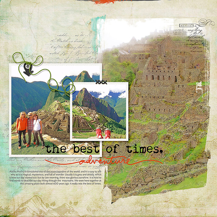
Adventure by Deborah Wagner|Supplies: KimB – Charming; Ali Edwards – Leaving On A Jet Plane; Cottage Arts – Travel Soul 2; Creashens – Goodness; Anna Aspnes – Life’s Little Word Transfers No. 1; Kim Jenson – String Bats 10, Amanda Yi – Home Is Where We Are; Katie Pertiet – Far Away Fairy Land, Destination Ledgers No. 3, Blendable Mix No. 1
[hr]
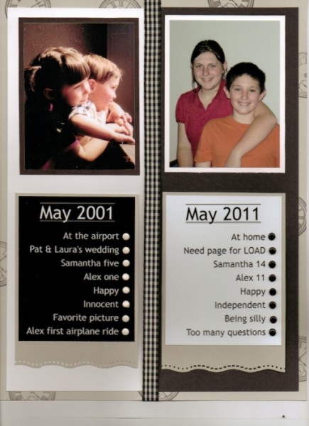
Jennifer Kellogg says, “This page shows my kids in moments 10 years apart. It’s a classic then-and-now layout. A vertical center line works very well with this type of layout.”
“The alignment in this layout is strong – right down the center – with contrasting black and white cardstock. I chose to left align both text boxes. This adds a little variety and design “tension” to the page.”
[hr]
Kelly Prang says, “I used a timeline to show the changes of my children over the past 11 years, with photos of them at Christmas time.”
“A timeline is the basis of the photo alignment here, with each photo having an outline with arrow pointing to the date on the timeline. I mixed up the orientations and shapes of the photos for a bit more interest.”
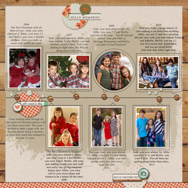
Christmas Past by Kelly Prang | Supplies: Amy Martin- Timelines 2: Template; One Little Bird- Memory Collector: elements and papers, Shadow Styles- shadow like me, cut-out like me; Sahlin Studio- Fresh- woodgrain paper; Just Jaimee- Storyteller Luka- woodgrain washi tape. Fonts: Rex Bold, Times New Roman, Georgia (numbers)
[hr]
Gretchen Henninger says, “This layout captures my favorite memories from hikes I took in Dutchess County, New York last fall.”
“I created a strong vertical line on the left one third of the page and aligned my photos against this line. To add interest, I mixed up the size and orientation of my photos. I also aligned my title along the horizontal edges of the largest landscape photo, adding a strong horizontal line to the page as well.”
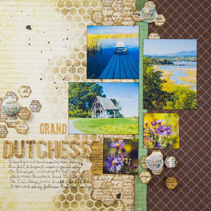
Grand Dutchess by Gretchen Henninger | Supplies: Paper: Pink Paislee (365 Degrees), Crata Bella (Moments & Memories), Authentique (Spectrum II), Bo Bunny (Star Crossed); Alphas: October Afternoon (Daily Flash), Bo Bunny; Stencil: The Crafter’s Workshop; Ink: Tim Holtz Distress Ink (ground espresso); Flair: A Flair for Buttons
[hr]
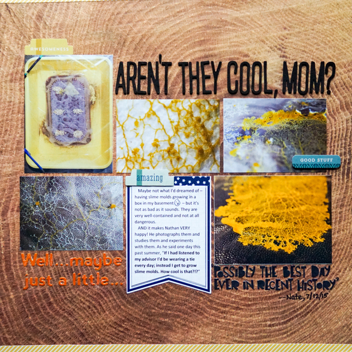
Marcia Fortunato says, “This layout is about one of my sons’ excitement in studying and growing slime molds (a rather fascinating organism normally found in the woods), including parts of a conversation we had last summer.”
“Because I had photos that varied slightly in size, I aligned the photos and journal block along a horizontal axis. Each row is centered along that horizontal line. I filled in the empty spaces with parts of the story. Small tabs break the alignment just slightly to add interest.”

