 The latest Get It Scrapped Membership class–Scrapbook Coach #21–includes four video lessons walking students through the making of four “top heavy” designs.
A “top heavy” design uses elements with substantial visual weight at the top of the canvas–something that doesn’t seem intuitive for getting balance. There are, though, ways to support a top-heavy design, and our team shares their approaches here.
[hr]
Kelly Prang says, “My sister-in-law showed me these cute photos of her and her pup, and I knew they needed to be scrapped. They are from Halloween and show the costumes she made for herself and Oliver.”
“I divided the page visually into thirds, with most of the weight in the top 3rd. I used lots of white with only a few pops of red since the photos had so much red for a page that’s playful, light and bright.” Notice all the white-on-white layering Kelly has done here, including the canvas-spanning title at page bottom.
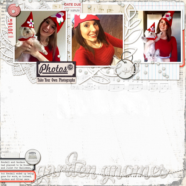
Garden Gnomes by Kelly Prang| Supplies: Karla Dudley- Dad’s Day- Cardstock (white);Just Jaimee- Storyteller March 2014- Paint, Gesso Styles, INSD 2013 CU Page Edges, FB freebie- painted border:;3 Paper Peonies- Tagit- tag; Mommyish- Schooled- Confetti; Tracy Martin- Sugar Town- border; K Hartley- Our LIfe- Music Sheet; SGD- Ecletctic Ellies- Vintage Music Rub-on; One Little Bird- These Walls- pain, Busy Week- labels; Sugar Plum Paparie- Mango Tango File Car; Megs C- Lace Doily; Allison Pennington- More Smarter- tag
[hr]
Sian Fair says, “This is a page about a proud dad taking photos of his daughter’s preparations for Formal Night.”
“If you love the look of white space, but never feel you achieve it; then a top-heavy design has to become a go-to design for you. I’ve spread items going below the top third because I didn’t want to make my photo too small. Still, I found it easy to gather the things I wanted to use and simply bunch them together at the top. It’s a flexible design because you can always go back and add extra journaling in all that space you have created, or give it a little energy with some sprinkles or ink splotches as I have here, or leave a big beautiful breathing space.”
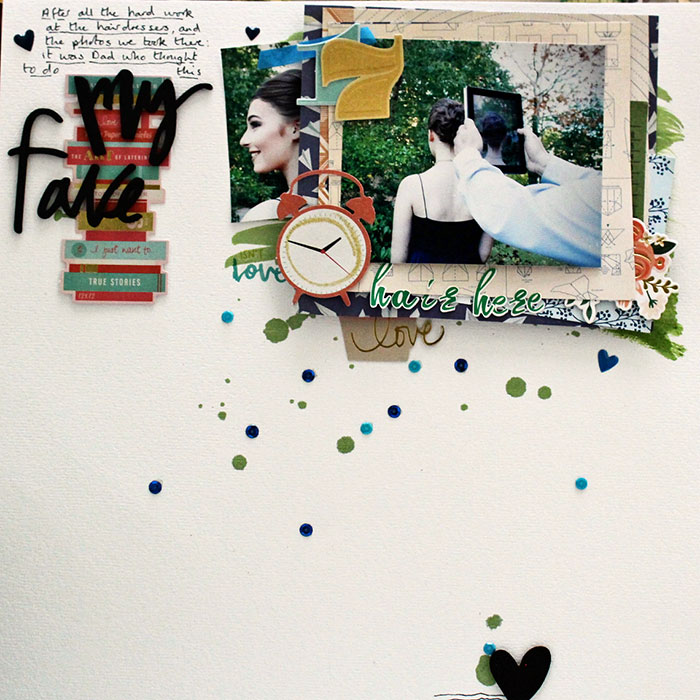
Hair Here by Sian Fair. Supplies: Patterned Paper: Crate Paper; Diecuts: Shimelle Collection for American Crafts; Foam Words: Dear Lizzy for American Crafts; Journaling card(tucked behind photo): Gossamer Blue
[hr]
Ronnie Crowley says, “Recently for school my son had to take care of the class baby for the weekend. I created this page to record the task and results. When I scrap a top-heavy page my go-to method is to build my cluster of elements on a shelf or band to ground them to the page.”
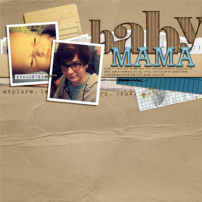
Baby Mama by Ronnie Crowley | Supplies – Allison Pennington – Breeze, NSD Labels, Storytellers; Amy Wolff – October Edges; Connie Prince – Fruit of the Spirit; Karla Dudley – Jumbo Cards; Sahlin Studio – Explore Learn Grow
[hr]
Gretchen Henninger says, “One of my oldest and dearest friends lives hundreds of miles away, and I treasure being able to spend a weekend with her every fall at the New York Sheep and Wool Festival.”
“When I design a top-heavy page, I start with a strip of patterned paper across the top quarter of the page. This provides me with an anchor point to build up my photo cluster. I also put a thin strip of paper along the bottom to frame the bottom edge of the layout.”
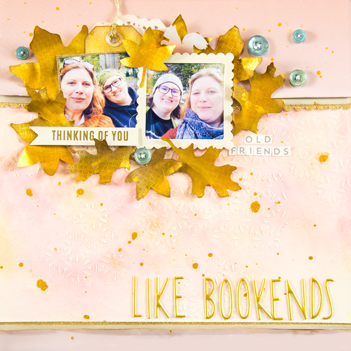
Like Bookends by Gretchen Henninger | Supplies: Paper: Pebbles (DIY Home), Authentique (Spectrum II), American Crafts (gold glitter), Canson (watercolor paper); Alphas: Dear Lizzy (Desktop), October Afternoon (Daily Flash); Ephemera: Pebbles (DIY Home); Doily: Recollections; Die Cuts: Silhouette Design Studio; Punch: Stampin’ Up! (scallop border); Stencil: The Crafter’s Workshop; Ink: Tim Holtz Distress Ink (vintage photo, wild honey), Liquitex India Ink (gold); Other: gelatos, modeling paste.
[hr]
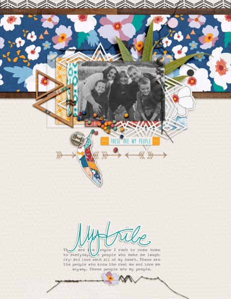
Amy Kingsford says, “This page features a recent family photo that I just love, but also lets our true colors shine through just a little.”
“I use top-heavy designs quite a bit in my scrapbooking. I find they work well with my preference for single-photo pages and white/light backgrounds. When creating this type of a design I like to nestle most of my patterns, colors and embellishments, along with my photo, in the top half of my page. I find that a white background does wonders to counter all of that visual weight. I usually include my text in the lower half of my page so that I have room for everything on my 8.5 x 11 canvas, with a sprinkling of minimal embellishments to tie the two areas together.”

