 This lesson from Jana Morton first appeared as a part of the membership class “Texture & Dimension.” For that class and over 60 more, join us.
by Jana Morton
As a photographer, I am very conscious of light. I am always trying to figure out my best position to capture an event based on where light is coming from. As a digital scrapbooker, I have also discovered the importance of light. I like to use brushwork to create the illusion of light. I would like to show you some examples of how your pages could benefit by adding a little light on the subject.
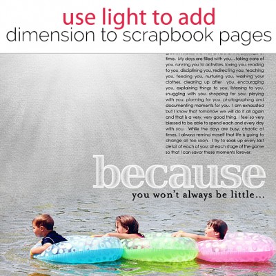
Create Depth by adding Sunshine to Your Layout
The image below is a great example of how one click of the mouse can change the whole perspective of your page. I used a simple white brush to create sunshine. This burst of light not only adds sunshine to the page, it gives the page depth. The photo of the children appears like it is in the foreground as the light shines in from behind them.
Digital brushes you could use to get the effects Jana shares here include:
Create Space between Your Layers
I love to create layers on my pages. I think the layers of photos and elements help give a page dimension and add interest to the page. I also like to add “breathing room” in between my layers by adding a burst of white brushwork. In the layout below, I used a large white brush and added brushwork behind the focal photo. I believe that this simple addition created space between the layers and added dimension to the page.
Highlight Focal Areas of Your Page
When creating a page, there are certain areas of the page that I hope standout more than others. Focal photos, extractions, and titles immediately come to mind as important pieces of a page. I use lighting to draw the viewer’s eye to these portions of the page. As you can see in the layout below, I placed light behind the main extraction as well as the title. This allowed both elements to become the focal point of the page.
Add light and shadow work to your framing
I like to frame the focal area of my images. I think it helps bring the page together and also allows me to incorporate another layer of color in the background paper. On “My Little Man,” I framed the image and then added a ray of sunshine behind the main portion of the page. I also included a simple shadow that really adds depth to the page and brings the focal area to the front of the page.
Light is such a wonderful resource. Next time you are creating a page, try to envision how you can use light to enhance your page. It is a simple technique that can add dimension, spacing and interest to a page.


