 One of the quickest ways to make a scrapbook page is to work with standard 4″ x 6″ photos. Read on for scrapbooking ideas and tips for designing layouts with these prints from the Get It Scrapped Creative Team.
[hr]
Marcia Fortunato says, “Now that we own a home in Minnesota, we’re only a little over an hour from my hometown, where my parents still live. Recently I drove between my new home and my parents’ home several times for family reunion events. It finally struck me just how beautiful the area is, and I stopped several times to take pictures. This layout shows a few favorites.”
“Fitting more than two 4″x 6″ photos onto one page can be difficult–especially when they are all the same orientation. There were corners of at least two prints I could overlap slightly without losing important detail. With the photos arranged, I filled in areas around them with title, journaling, and embellishments. Thin strips of patterned paper placed below each photo ground them. Since I used a patterned pager with flower printed in the lower corner I used those flowers as the base for a simple embellishment cluster.”
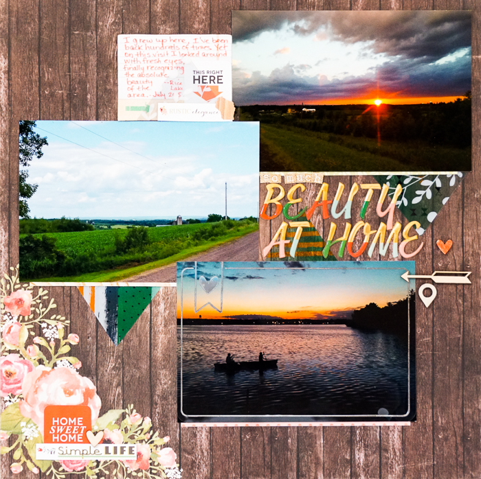
Beauty At Home by Marcia Fortunato | Supplies: Patterned Paper: Carta Bella, strips from Carta Bella, Webster’s Pages, Echo Park; Letter stickers: Pinkfresh Studio, Crate Paper; Photo overlay: Becky Higgins; Embellishments: Basic Grey, Hello Forever, Simple Stories, Pinkfresh Studio, Studio Calico; Pens: Distress Pen (Ranger/Tim Holtz).
[hr]
Devra Hunt says, “These photos were taken on Father’s Day. All we wanted was one decent picture, without smirks, or closed eyes and with everyone in the photo. We didn’t get any of it, and it’s a reminder to myself that sometimes I have to take what I can get.”
“This is a go-to design for me when I’m working with one portrait and one landscape photo. By adding a small amount of paper, I create a block. From there I can embellish minimally or boldly. In this case I chose minimally and made choices that reinforce the story.”
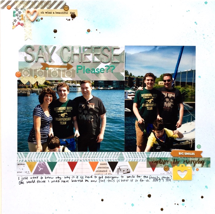
Say Cheese by Devra Hunt | Supplies: Cardstock-Bazzill, Patterned Paper & stickers-Pink Paislee, Washi-Freckled Fawn, My Minds Eye, epoxy and acrylic pieces-Freckled Fawn, Enamel Dots-Freckled Fawn, Studio Calico, arrow-Studio Calico, Alphas-American Crafts, Jellybean Soup, Mist-Tattered Angels, Heidi Swapp, pen-Sakura, adhesive-EK Success
[hr]
Audrey Tan says, “This page is about our trip to Hong Kong where we met up with my sister-in-law and her family. We are no longer living in the UK, and my boys have missed their cousins and were excited to see them.”
“Photos sized to 4″ x 6″ take up a lot of space. To get three of them onto this one page, I alternated them in a 2 by 3 grid–like checkerboard blocks–but with some overlap. I used a background that supports the photos well and kept embellishment to a minimum.”
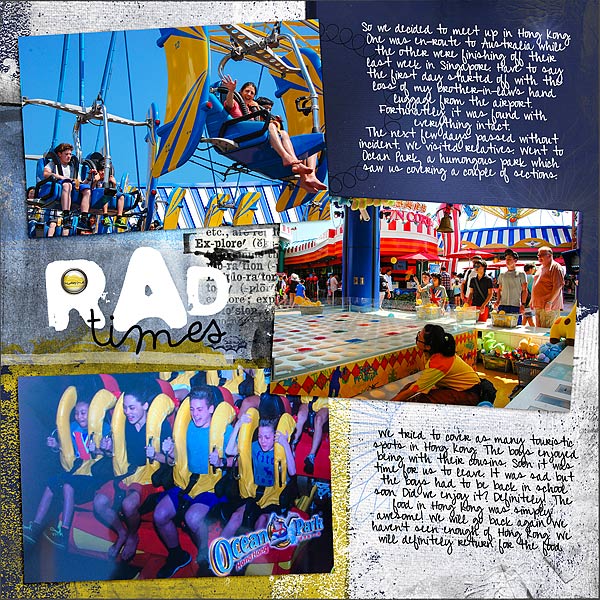
Rad Times by Audrey Tan |Supplies: ArtPlay Palette Twizzle, Journey Word Tranfers No1, Foto Glow Mix No1, Brushed Edge Overlays No1; Font: Pea Alicia Script
[hr]
Gretchen Henninger says, “This layout features the wonderful canals in Bruges, Belgium.”
“In order to include several 4×6 photographs on the page, I used a simple blocked design, keeping an even gutter between all page elements. I layered title, journaling, and embellishments over top of that foundation. In order to showcase the photographs, I kept the design simple and used neutral colors.”
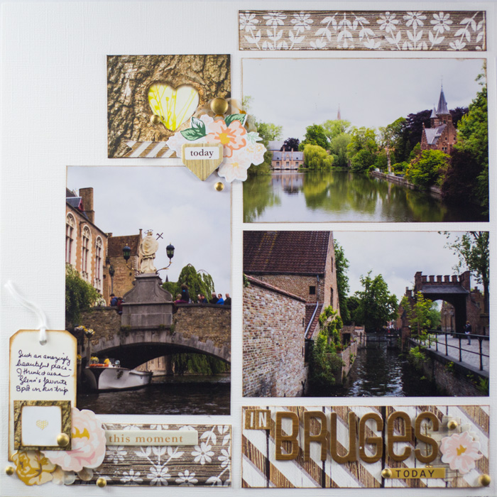
In Bruges by Gretchen Henninger | Supplies: Paper, Chipboard and Stickers: Teresa Collins (Life Emporium); Alphas: American Crafts Thickers; Ephemera: Crate Paper (Open Book), Webster’s Pages (Nest); Wooden Dots: My Mind’s Eye (Nine & Co.); Ink: Tim Holtz Distress Ink (vintage photo)
[hr]
Sue Althouse says, “This page is about the relationship between my sisters and me.”
“My favorite approach when working with 4″ x 6″ photos is to stack two landscape pictures and double mat them to create one substantial rectangle about 8 inches wide by 9.5 inches tall. The rest of the page is easy to complete: title and journaling fill the smaller column and a visual triangle of embellishments ties everything together.”
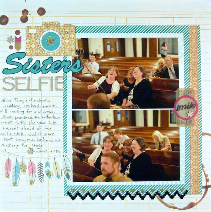
Sisters Selfie by Sue Althouse | Supplies: Cardstock, Alphabet: American Crafts; Patterned Paper: Cocoa Daisy, Basic Grey, Heidi Swapp; Silhouette Die Cuts: Lori Whitlock Camera & Arrows Set; Silhouette Title: Brush Script Font; Puffy Stickers, Die Cuts: Crate Paper; Pen: Micron
[hr]
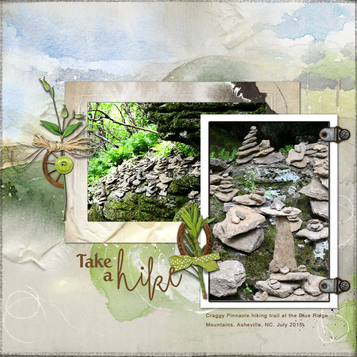
Terry Billman says, “I spotted these beautifully stacked rocks nestled under a huge rock on the Craggy Pinnacle Trail in the Blue Ridge Mountains.”
“I often use a landscape-orientated photo as a background since it’s wider and captures the entire view. Portrait orientation is great for making a subject the center of attention. Here, I layered a closely cropped portrait-oriented photo over a more contextual landscape-oriented shot: thus, there is the big scene and the close detail.”

