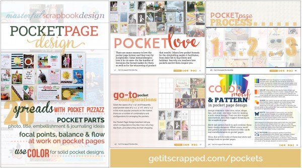
Pocket page design presents the challenge of working in a strict grid as well as opportunities for storytelling angles and efficient work. You can immerse yourself in pocket page design at the Get It scrapped membership with our class “Pocket Page Design.” And you can get some useful design insights in this article.
Design principles are the rules that help you put basic pieces of a visual design together, and we often write about their use on traditional scrapbook pages. Today we address two key principles–flow and focus (or emphasis)–and its application on pocket pages.
Focus (or emphasis) refers to making sure that elements have different levels of importance visually. If a viewer looks at your page and nothing stands out, they don’t know where to start viewing your page and taking in your story.
Flow refers to arranging elements (especially with contrast, repetition,t and leading lines) so that the eye moves from one point to another in a way that tours your page well.
See how our Creative Team incorporates focus and flow into their pocket pages.
[hr]
Carrie Arick says, “Over the summer, my son tested positive for strep throat about every two weeks, making summer rather miserable for him (and not fun for his parents, either).”
“For focus, I used an interesting photo treatment and white space to push your eye to the photo. I also left out some of the photo and used a brush to suggest his shoulder in the neighboring block. This creates a strong point of interest.”
“I created flow three ways: Visual triangles of color, arrows, stripes and chevrons positioned to lead the eye, and edge boundaries on pocket cards to keep the eye on the page.”

Summer of Strep by Carrie Arick | Supplies: Pockets No. 3 by Valorie Wibbens; Kenner: Semptember Storyteller Collection by Just Jaimee; Fonts: Albertsthal Typewriter, Manhattan Darling
[hr]
Margareta Carlsson say, “This pages tells one story from a recent visit to the zoo and outdoor museum Skansen in Stockholm.”
“A current scrapbooking trend is to use oversized alphas for scrapbook page title work–an approach I’ve used here that makes the title the focal point of the page. I put the letters in the four 3″ x 4″ pockets on a classic Project Life® Design A page. I added acetate shapes behind the letters. Pocket pages like these are easy for creating flow because the eye will follow lines. I accentuated the flow through the embellishment with pointing triangles, hearts (that can work as well as any arrows), and actual arrows.”

Wool by Margareta Carlsson | Supplies: Big title letters: Studio Calico kit exclusives; Alpha: Pinkfresh Studio July kit; All other scrapbooking supplies: Happy Things collection from Pinkfresh Studio.
[hr]
Kristy T say, “This page documents our visit to Wray Castle in the Lake District, UK and the fun we had with the activities there.”
“When incorporating focus and flow I like to have either a title card or a significant photo at the top left side of the page, as this is the first place we look when starting to read a page. I used color to guide the eye and repetition of elements (like the hearts) to create visual triangles. Arrows also guide the eye. When creating two page layouts I look to ensure balance between the colors on each side of the page and use filler cards to give the eye somewhere to rest.”

Today at Wray Castle by Kristy TSupplies: Pockets – Becky Higgins; Cards: Simple Stories, Kaisercraft; Cardstock: Bazzill; Chipboard: October Afternoon; Die Cut: Simple Stories: Alpha Stickers: Becky Higgins; Clear Stickers : Simple Stories
[hr]
Kelly Prang say, “This page is about a funny story my son told me yesterday after school. His health class was making Public Service Announcements for teens as a project, and his was supposed to be about the dangers of texting and driving. He came home, I asked how his day went, and he said ‘I was birthed!’ I said, ‘um, I know, I was there and all!’ The story he told me is on the page below. Josh even showed me some of his facial expressions, in the retelling, and it was SO funny I had to scrapbook the story immediately!”
“Because the story was a short one, I used a 6″ x 12” pocket page template. The journaling that tells the story is the focus, placed at vertical center, rendered in two colors, multiple larger-than-usual font sizes, and even a banner.”
“To get flow up and down through all the pieces of this tall vertical page, I placed the colors green, navy and aqua to flow down it, with small bits of red and white as accents. I used a photo at the top right, and another at the bottom left, with the story on a 4″ x 6″ card in the middle of the page. Since the story was the most important part, it got the largest space.”

I Was Birthed by Kelly Prang | Supplies: Amy Martin- Project Grids SixtyTwelve; Memory Pockets Monthly- March-Charmed-with add-ons from Allison Pennington, Valorie Wibbens, Sara Gleason, Amber Labau and Sahlin Studios; Valorie Wibbens- Pockets no.3 (plastic page protector), Sprinkles #23- wordart, Pocket Stuffers- camera stamp, ribbon and glitter; Memory Pocket Monthly April-Create- Amber Labau-4×4 card, Allison Pennington- Woodgrain paper; Becky Higgins- journaling card grid (on story card), Heidi Swapp- Project Life Overlay 4×6 card (the story); Font: Bebas
[hr]
Marie-Pierre Capistran says, “This is the first page of the month of May in my Project Life® album. Since I don’t scrapbook by period of time but, rather, by event, my layout documents: a field trip at the botanical garden with my daughter’s class, a trip to the fair, a baseball game, artsy activities at home, and a lost tooth.”
“When I make a page like this one, highlighting several events, I don’t have one single focal point but, instead, several focal points: one per event. I use vibrant colors, fun embellishments, big titles, and beautiful pictures to create eye-catching focal points.
“Each event is grouped, and I use similar colors and embellishments within each group as you can see here.”
“To create flow within the groupings, I use visual triangles. To create flow on the overall page, I use patterns and shapes (like chevrons) that lead the eye as well as larger visual triangles of color and material.”

Mai 2015 by Marie-Pierre Capistran | Supplies: Cardstock: Canson Watercolor; Journaling cards: Becky Higgins, We R Memory Keepers; Die Cuts: American Crafts, my own design; Alphas: Freckled Fawn, Authentique Paper; Labels: Pretty Little Studio; Paperclips: Freckled Fawn; Flair: Freckled Fawn, Pretty Little Studio; Wood Veneer: Freckled Fawn, Cosmo Cricket; Sun Embellishment: Doodlebug Design; Stamps: Ali Edwards; Sequins: Studio Calico; Spray Paint: Shimmerz; Others: Sewing machine, Silhouette Cameo, date stamp.
[hr]
Stefanie Semple says, “We spent a wonderful day out at a local botanical gardens, I loved watching my two younger children interacting and actually getting along.”
“The title block serves as a eye catching focal point. It is bright and colorful, and the word art about laughter makes one want to take in the photos and read about what was going on: what the fun and laughter were about. For flow, the photos can be taken in from left to right in three bands or vertically in two bands.”

Life is Better When You’re Laughing by Stefanie Semple | Supplies: KimB Designs: Best Medicine; Amanda Yi Designs: This month – June; Studio Romy: Journaling Life Templates 1-4. One Little Bird Design’s Shadow Styles.
[hr]
Looking for more instruction and ideas for putting together pocket pages and Project Life® projects? One of the 60+ classes in the Get It Scrapped membership is Pocket Page Design with teachers Adrienne Alvis, Tracie Claiborne, Amy Mallory, Amber Ries, and Doris Sander. A 100+ page illustrated eBook is accompanied by 5 interviews and 5 office hours sessions. Get it today.