Check out the story angles and page designs our creative team has for scrapbook pages about taking a walk–alone or with someone else, for fun or for purpose, in the country or in the city.
[hr]
Marcia Fortunato says, “This layout is about a nature hike I took with two of my sons, one of whom is a Naturalist for a local metropark system.”
“The focus of the page is definitely the photos. Since we were searching for slime molds, the easiest way to tell the story was with photos of those we found. I chose a background paper that I thought looked similar to some of the slime molds we saw, then added word bits to emphasize how interesting we found the hike.”
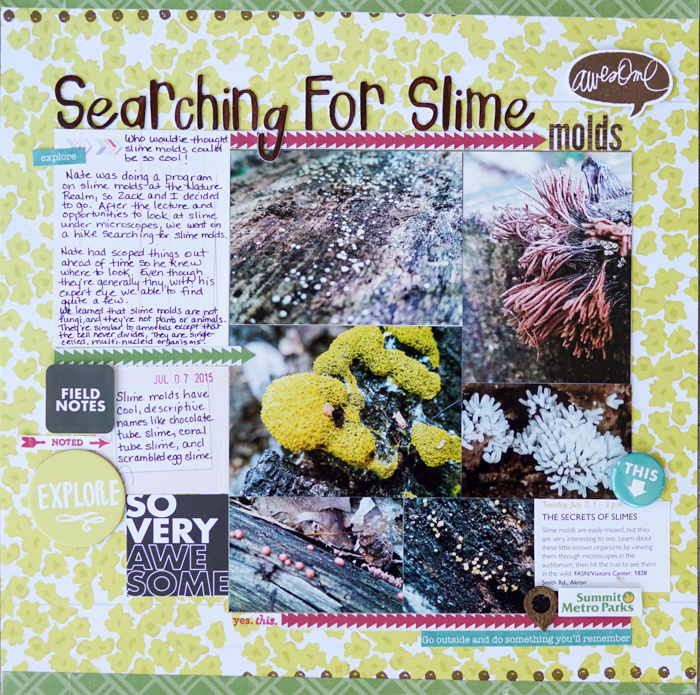
Searching For Slime molds by Marcia Fortunato | Supplies: Patterned Paper: Pink Paislee, Crate Paper, Echo Park; Letter stickers: Thickers, Bo Bunny; Embellishments: Hello Forever, Authentique, Studio Calico, Echo Park; Stamps: Studio Calico, One Little Bird, Heidi Swapp; Ink: Hero Arts, Stampabilities; Die: Heidi Swapp; Pens: Le Pen (Marvy).
[hr]
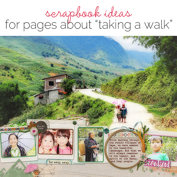
Deborah Wagner says, “While vacationing in Vietnam, we visited the lovely town of Sapa. One of the the highlights of our time in the northern highlands was a six-mile walk through the villages and terraced rice fields.”
“The large photo here showcases the remarkable landscape, and the supporting photos give the reader a glimpse of the fascinating people we met. To give everything in my layout the same tone, I created a merged copy; and ran the Posterize Filter in Photoshop. To soften and finish, I used a ivory colored fill layer set to 39% opacity.”
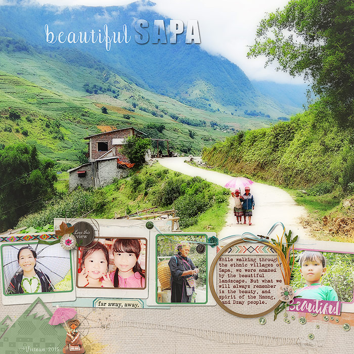
Beautiful Sapa by Deborah Wagner|Supplies: Kim B Deisgns – Under the African Sky, Field of Dreams, Handmade With Love; Cottage Arts – Nature’s Sketch; Katie Pertiet – Pine Creek; My Tribe – Gennifer Bursett; Anita Designs – Travel Time.
[hr]
Margareta Carlsson says, “Taking walks in my home town is my favorite form of exercise. Usually I rush straight on, focusing on the workout. For 2015, one of my New Year’s resolutions was to look for pretty details during my walks and to document them. Here are some of those for January through June: street art, sculptures, architecture, flowers, pretty ships, and more.”
“A grid design holds lots of photos. I didn’t want to overpower them with patterns, so I simply put them on a white background and added nothing but a title and small, colorful embellishments.”
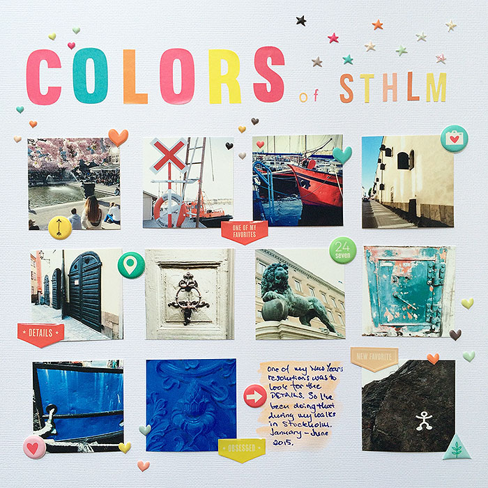
Colors of Stockholm by Margareta Carlsson | Supplies: Cardstock: American Crafts; Alphas: Studio Calico kit exclusives; Puffy stickers: Seven Paper Amelia, Freckled Fawn; Epoxy stickers: Freckled Fawn.
[hr]
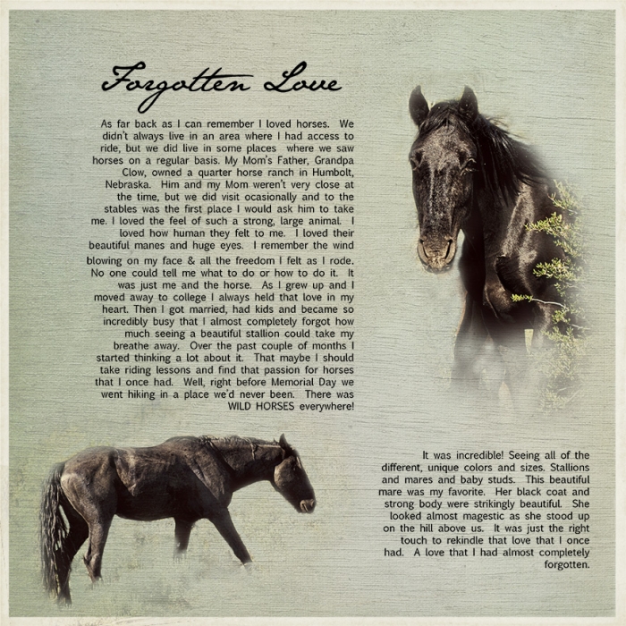
Summer Christiansen says, “This is the story of my forgotten love of horses and how I was reminded of it during a walk. My family and I often take walks on Saturday mornings. We find places we haven’t explored before and document them by taking intentional pictures that tell the story of our adventures. Sometimes the photo is a simple selfie of our feet–but this time it we had a great subject: the wild horses we saw. Detailed journaling and blended photos tell the story.”
[hr]
Kristy T says, “This page is about a hike we walked recently in the Lake District. It’s a hike my father-in-law used to do when he was a young man. He shared stories about his youth with the kids and a traditional treat at the top of the climb. He was very pleased with how the kids managed and it was a highlight of the trip.”
“I selected photographs that showed the amazing scenery and the height of the climb. To ensure the photographs were prominent, I used a white background and black elements to add detail and contrast that moves the eye around the page. I arranged the elements and the photographs to create a feeling of moving up the page which supports a story about climbing.”
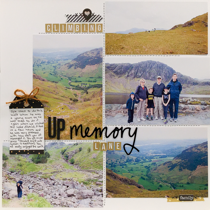
Climbing Up Memory Lane by Kristy T| Supplies: Card – Artee; Alphas – Teresa Collins, American Crafts, Kaisercraft; Twine: Tim Holtz; Wooden tag: Freckled Fawn; Tag: Kaisercraft; Washi Tape: Teresa Collins; Ephemera – Pink Paisley.
[hr]
Ronnie Crowley says, “When my son when was younger loved walks with National Park Rangers and always wore his official hat to be like the real Ranger. I made this page to record this love.”
“My son is now 16, and a lot of time has passed. On this page, I didn’t want to reflect about time passed, so I used list-style journaling that could have been written back when th photo was taken. I used the picture in conjunction with the title to set the theme of the page. The addition of short journaling around the title finishes the story of the page by providing a setting and more details.”
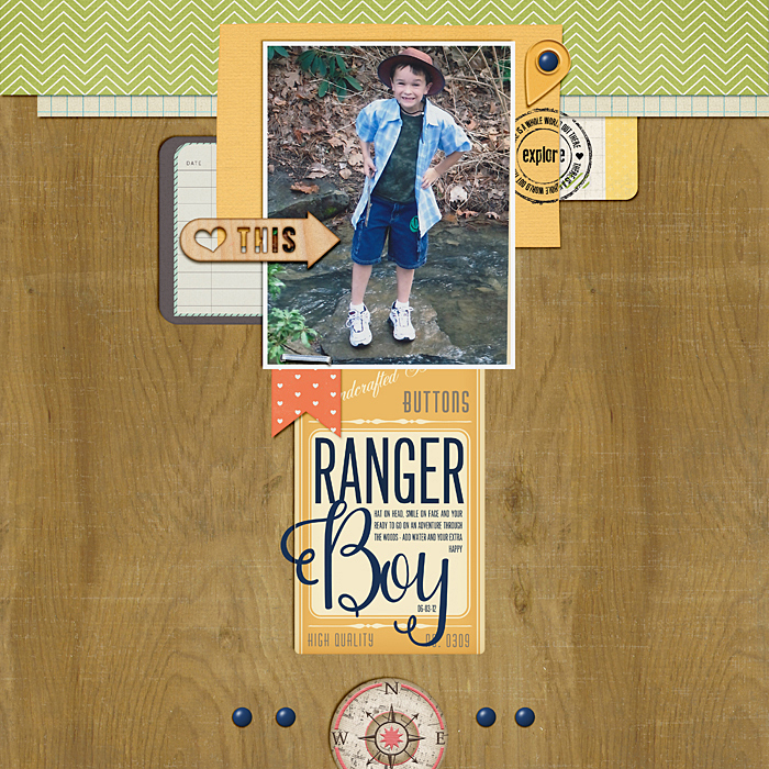
About Taking a Walk by Ronnie Crowley | Supplies: Get it Scrapped – Scrapbook Coach 17 Single N Pretty 03 Template; Pixel & Company – Curated Wander; Tracey Martin – Sugar Town Veneer; Studio Blagovesta – Captured;Wild Blueberry Ink – Wanderlust;
[hr]
Katie Scott says, “Our family vacations are plagued with rain, and a cruise followed suit. This page is about a disappointing substitute excursion to Key West. I used the stickers Oh, what a day!, So Lucky and This Is Perfect a little sarcastically to represent our attitude that day as we were trying to make the best of it. I added mist drops to represent the rain. The big number 3 represents the fact that my son boycotted this excursion so it was just my husband, my daughter, and I.”
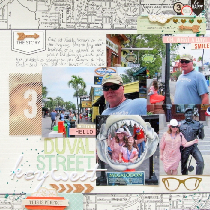
Duval Street, Key West by Katie Scott | Supplies: Patterned paper and embellishments by Teresa Collins; cork and gold foil embellishments by Crate Paper; letter stickers by American Crafts.
[hr]
Debbie Hodge says, “This page is one of a series from a short trip to Bar Harbor and focuses on just one hour of the visit: an hour walking the shore after dinner. The photos dominate, the journaling is short and factual, and embellishments are minimal.”
“The large photos here give a sense of the walk. Smaller photos show more details of the walk, including close up items like flowers and a cairn as well as scenes of my family on the walk. I’ve gone big with size contrasts, and the large landscape-oriented photo provides a home for the title–which is also big. The color of the title is taken from the pink blossom in the photos.”
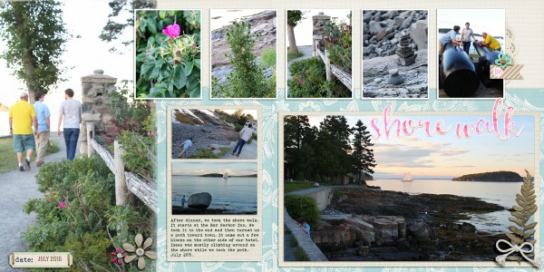
Shore Walk by Debbie Hodge | Fresh Air by Amy Wolff, Colbie Solids by Maplewood Studios; Stringbats 10 by Kim Jensen; Doily Edgers, Coastal Elements by Katie Pertiet; Labely Bits by Amber LaBau; Textured FotoMat by Anna Aspnes; Paintshop Styles by Just Jaimee; Kiln, Bohemian Typewriter, Heart and Soul fonts

