What’s your approach to titlework on Pocket Pages?
Do you make a title for the page or do you let a journaling card with text do the work? Is your title an important aspect of the visual design’s focus and flow or is it a low-key element? The GIS Creative Team shares their approach to titling Pocket Pages.
[hr]
Celeste Smith says, “I decided to document the TV shows we’re watching this summer. As I was gathering images it occurred to me how much junk we are watching!”
“Since my images all had text on them. I kept my design simple. I created a large card in the middle of the page with a title I made by combining a word art sticker and a serif font. I wanted a longer word than ‘junk’ so I settled on ‘junque.’ I tightened up the kerning on the letters, and I separated the shadow on its own layer and warped it. For texture, I dotted the j with a enamel dot. I layered the title in front of a TV.”
“The title is the focal point of the design. The colors in the title are repeated throughout the page. The serif font is shown on two other cards tying the text together throughout the page.”

watching junque by Celeste Smith | Gennifer Bursett: Pocket Pages Back to Basic Templates; One Little Bird: Stay Tuned kit; Crystal Wilkerson: Labels 02, Fonts: Trixie Plain, Adobe Caslon
[hr]
Karen Poirier-Brode says, “The story of the page is a visit my husband and I made to the State Fair.”
“I used pages from a piece of ephemera–the booklet guide one gets on arrival at the fair–to render my title and to add additional information. The booklet was designed by a graphic designer and the pieces from it all have consistency. I like how that strengthens my design. The excerpts are placed in a visual triangle on the two-page spread.”

Best 17 Days of Summer by Karen Poirier-Brode | Supplies: Papers – American crafts “Do IT Yourself”, epoxies – Me and My Big Ideas “mambi Sticks”, brads & baker’s twine – stash, wood veneers – Studio Calico, Basic Grey
[hr]
Christy Strickler says, “I live in a tourist area but often travel off of the beaten path. I have wanted to make sure that my pocket pages document the areas that most tourists don’t see, many of which are quirky and no where near what is advertised in the brochures.”
“I think of the top two pockets together as the title block. I placed a map which outlines our route in one pocket with the second pocket telling the main story. The title is bolder and larger than the journaling on any of the other cards. The bottom pockets hold supporting images and journaling. The journaling is a mix of typed and handwritten words. All of the typed journaling uses the same font as the title block, but in a smaller size, with a few font exceptions. Some of the word art used has a handwritten feel which helps my handwritten journaling feel as though it belongs on the page.”

Nassau: Off the Beaten path by Christy Strickler |Supplies Digital Kit: Pocket Life ’15 March by Traci Reed Designs; Letters: Jillibean Soup; Stickers:Freckled Fawn
[hr]
Stefanie Semple says, “I gathered a few photos from June for a monthly roundup on this layout. My title is an acrylic alpha against a dark mini print. I added 2 filler cards that house the calendar for June and a great quote. Word strips act as subtitles and my journaling contains the who, what, where, and when details. The title serves as the entry point into the double page. It’s not overwhelming, but adds dimension and texture. There are a variety of places within the design that a similar font is used and so it also plays a unifying role.”

June Highlights by Stefanie Semple | Supplies: NBK Designs: Pocket Pages; Digilicious: Kraft Solids {Hues of Autumn}; The Lilypad Designer’s : Memory Pockets Monthly: Viewpoint; Sara Gleason: Viewpoint add-on papers.
[hr]
Marie-Pierre Capistran says, “This is a layout about what I think is important to keep in mind while participating in swim meets.”
“I used a divided pocket page on one side of this layout with a portrait-oriented photo on the other. To connect the two sides, I used photos that have comment colors and elements. I also used embellishments that are similar in color, size and material.
“There are many text elements that could serve as a title, but I think of the ephemera with “heat winner” on it as the title, and placed that first. I added the other pieces (‘Go Arielle Go’ and ‘Enjoy the Little Things’) to support the idea of fun, family bonding, relationship, and friendship. Embellishments containing words (the ‘wow’ clip, small stickers, and chipboard words) add even more information to the story.”

Heat Winner by Marie-Pierre Capistran | Supplies: Cardstock: Stampin’UP!; Embellishments: Gossamer Blue, Freckled Fawn, Citrus Twist Kits/Pinkfresh, Ali Edwards, October Afternoon, Pretty Little Studio, Heidi Swapp, Studio Calico.
[hr]
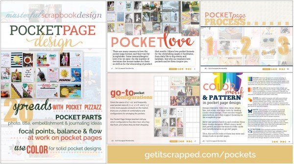
Looking for more instruction and ideas for putting together pocket pages and Project Life® projects? One of the 60+ classes in the Get It Scrapped membership is Pocket Page Design with teachers Adrienne Alvis, Tracie Claiborne, Amy Mallory, Amber Ries, and Doris Sander. A 100+ page illustrated eBook is accompanied by 5 interviews and 5 office hours sessions. Get it today.