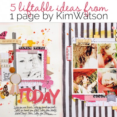
 It’s the accumulation of well-chosen and carefully crafted details that create a masterful scrapbook page. Check out 5 details on “Today” by Kim Watson and see if one or two of them can provide scrapbook page ideas to inspire your next layout.
Kim says, “March 2015 was an important month for my best friend. Having endured incredible loss and life changes over the past couple of years meant she had walked a long road of recovery toward wholeness. I was so proud of her achievement and inspired by her courage, I wanted to create something beautiful to commemorate the date, making sure to capture the essence of Lisa and focus on motifs that best describe her.”
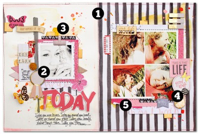
1. Use contrasting and different backgrounds on each side of a two-page layout.
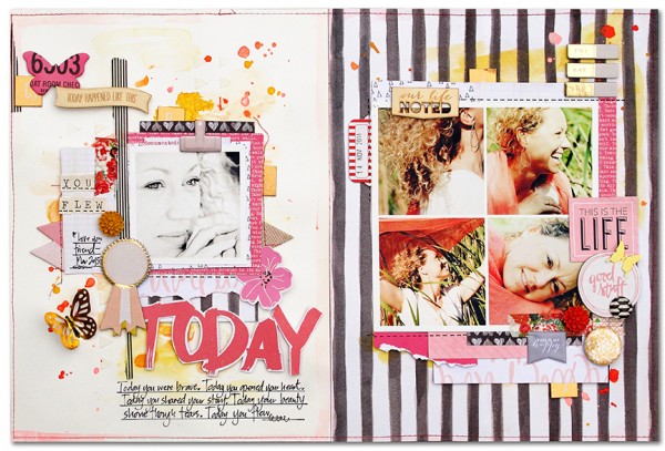
 Kim says, “I like using very different patterned papers on each side of a two-page layout. Ensuring the page is cohesive in an unpredictable way is fun and creates visual drama.” Here she’s used a brush-striped print on the right and a solid white on the left. The two sides are united with repetitions of color, pattern, and mixed media foundations.
2. Feature a single photo on one side of the layout and arrange supporting photos in a grid on the other side.
Kim says, “I selected five photos that let my friend’s personality shine though. On the left, a black-and-white photo is juxtaposed against a sea of color, which draws the eye into this main photo. The photo collage on the right includes all full color photos against black-and-white striped paper and is also striking.”
3. Add a mixed media foundation below photos on both sides.
Kim says, “Start with two different backgrounds and then unite them with mixed media foundational layers. Inspired by the paint-stroke black stripes (from Webster’s Pages) on the right side, I felt a mixed media background would work beautifully here. Layers of gel gesso, texture paste, water color washes and splatters not only create wonderful texture but contribute to the overall color balance of both sides of the page. They also unite the two pages with these repetitions.”
4. Use obvious visual triangles to connect the two sides of a double-page layout.
Kim says, “Let’s talk about anchors, those pieces that connect or ground elements to each other and to the canvas while, at the same time creating flow through the canvas. There are many within this page: some are obvious like the gold foil accents and butterflies, and others are not so obvious like the flowers, the dark orange color, and the bronze tiles. Each of these small item contributes in to the cohesion of the page.”
5. Mix one bold patterned paper with several low-key patterns.
Kim says, “The mix of bold patterns with small and subtle patterns works well because of the limited color palette of pinks and golds with the neutrals black and white. You can achieve pretty layering without overwhelming when you combine small pieces of a variety of patterned papers.“

Today by Kim Watson | Supplies: Cardstock: Bazzill Basics; Patterned paper: Webster’s Pages, Pebbles, American Crafts; Gold Foil Paper, Resin Flowers: Fancy Pants Designs; Alpha’s, Chipboard: Crate Paper; Washi Tape: Heidi Swapp; Die-Cut Ephemera: My Mind’s Eye; Wood Veneer, Puffy Stickers: Evalicious; Flair: American Crafts; Gesso, Texture Paste, Paint, Mist: Ranger Ink; Adhesive: Thermoweb, Scrapbook Adhesives by 3L, Tombow; Punch: Martha Stewart; Pen: Uniball; Other: Sewing machine

