Blurred background are currently trendy in web and graphic design. She how our team has used this inspiration for their scrapbook pages. As you look at these pages, think about what stories you have to tell that would benefit from a blurred foundational piece.
[hr]
Kelly Prang says, “I struggle with extreme nearsightedness and have worn glasses for the past 33 years. Without my glasses, I cannot see much at all. I wanted to evoke a sense of how things look without my corrective lenses. I wanted to show the funny side effects of being a pet parent with a dog who matches our floor so well- sometimes I can’t see exactly where he is at all, if I am not wearing my glasses or contacts. I actually don’t usually attempt to do anything without my corrective lenses.”
“When I started to take photographs for this page I realized it’s difficult to capture how bad my vision really is; as my camera is not able to be as unfocused as my eyes. To get the photo, I turned off the auto-focus, then put my hand in front of the lens and focused on that, then I moved my hand out of the way to capture my dog resting on the wood floor of our entryway. This is still a bit better than the way my eyes focus without correction, but I wasn’t able to get any further back without hitting the wall of the room I was standing in to take this image.”
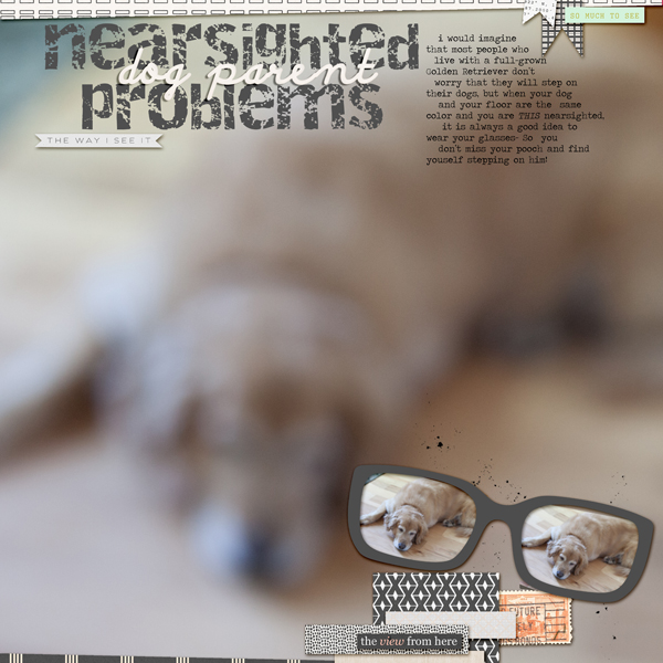
Nearsighted (dog-parent) Problems by Kelly Prang | Supplies: Memory Pocket Monthly June 2015 kit- Viewpoint, with add-ons from Sara Gleason, Sahlin Studio and Valorie Wibbens. Fonts: Discipuli Britannica Bold, Destroy and Traveling Typewriter
[hr]
Margareta Carlsson says, “The layout is about the spring blossoms in one of Stockholm’s city parks.”
“Blurred backgrounds are easy to create on a digital page, but how about a paper page? Use vellum!”
“The semitransparent paper softens a busy background and gives the photos room to breathe and shine. In this case, I used vellum only on a part of the background–behind the photos–to highlight the photos as well as the beautiful but busy background pattern.”
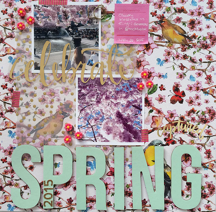
Celebrate Spring by Margareta Carlsson| Supplies: Patterned paper: The Nest from The Nest collection by Webster’s Pages; Vellum: Amelia Vellum Dots by Seven Paper/Studio Calico; Big title letters: Studio Calico kit exclusives; Numbers: Heidi Swapp Glitter Letter Stickers by American Crafts; Word transparency: Maggie Holmes by Crate Paper; Washi tape: Freckled Fawn; Word sticker: Amelia by Seven Paper/Studio Calico; Sticky note: Clearly Kelly by Hero Arts; Paper clip: Amy Tangerine by American Crafts; Resin flowers: unknown.
[hr]
Stefanie Semple says, “Friends invited us out for High Tea at a fancy hotel and it was a super way to spend the afternoon. I wanted to showcase the hotel, as well as the food and the friends, all on one page without the background photo stealing all the attention. Thus, I layered vellum over the background then added photos and embellishments on top of the vellum. For fun and a spot of colour I layered magic lights behind the vellum. The hotel can still be seen, and the eye completes the background image even though some of it is blurred and less clear. The detail shots contrast well with the background and are easy to appreciate.”
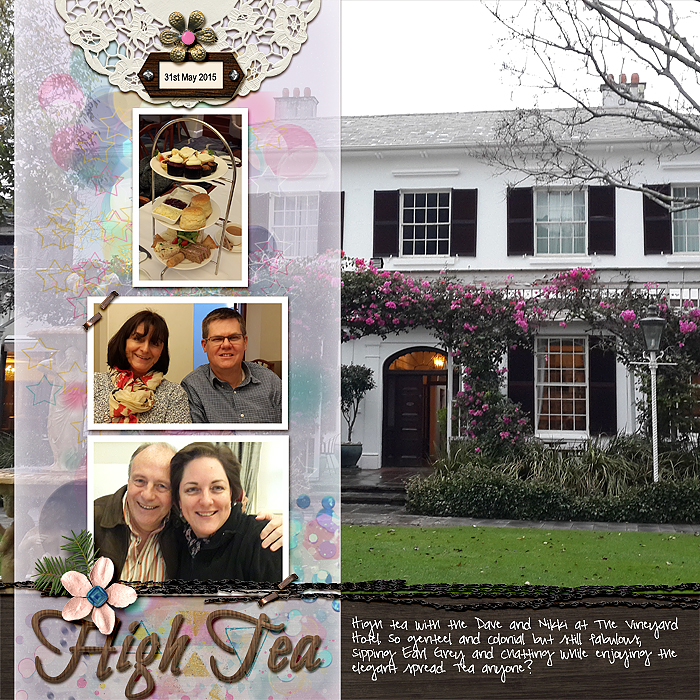
High Tea by Stefanie Semple | Supplies: Amanda Yi Designs and Karla Dudley: Limitless (kit), Vellum is from Debbie Hodge’s Scrapbook Coach class Single and pretty templates (I just changed the dimensions of that), Just Jaimee: Wood veneer styles (title) and NBK Design: Magic lights.
[hr]
Amy Kingsford says, “On our way out of Yellowstone, I insisted we stop and look at the falls even though it was pouring outside. The boys indulged me and posed for a few photos even though they were cold and wet. Because it was so rainy and I was using my camera’s zoom, the quality of most of the photos was not very good, but, thankfully, this one photo turned out well.”
“I decided to play around with the unusable photos that I got of the Upper Falls by adding a gaussian blur filter and a water droplet overlay. I finished off my blurred background mat by creating a vellum effect and sandwiching a few leaves between the blurred scenery and my canvas. It adds both softness and depth to my page.”
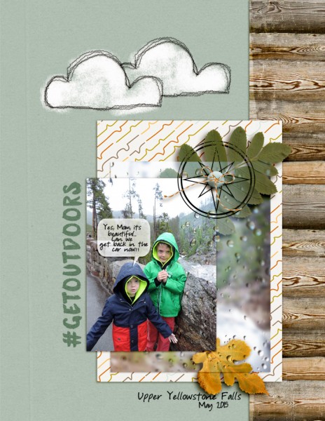
#getoudoors by Amy Kingsford | Supplies: Amber Labau Designs: Have Coordinate, Will Cache; Aja Abney: Stitched Cloud; Other: Water Droplet Overlay
[hr]
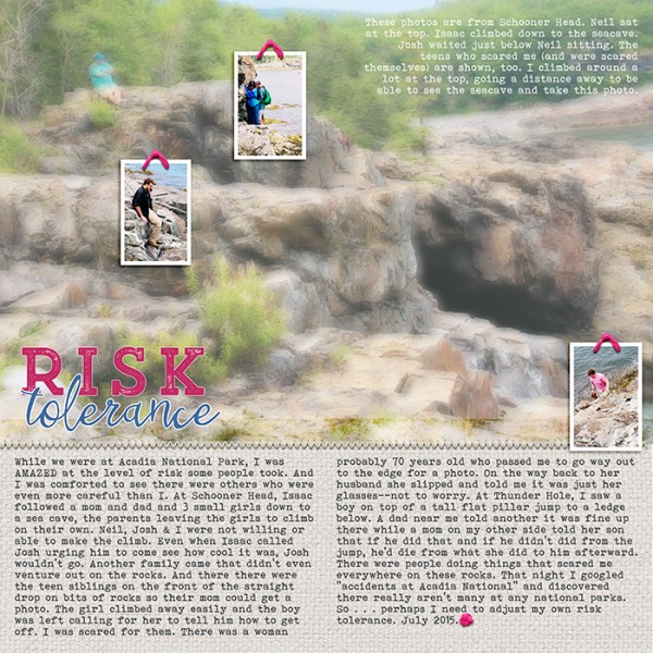
Debbie Hodge says, “Since a recent trip to Acadia National Park, I’ve been thinking on the widely varying tolerances for risk different people have. I saw so many people doing what I thought were dangerous moves, and then there were people who were even more risk averse than I. That’s the story I’m telling here.”
“My backdrop is a photo of a spot at which I first started thinking about risk–as my youngest son climbed down to a sea cave with another family while my husband, older son, and I stayed up higher. A blurred background photo represents the feeling of dizziness that came over me climbing these rocks and watching others take bigger risks. The small, sharp and in-focus photos show my sons and other climbers, and they’re layered just about where I saw them. My husband is the blue blur in the background photo.”
“I initially thought it would be easy to get my blurred effect with a gaussian blur filter on the photo but it was either TOO blurry or not blurry enough. I solved the problem by using two copies of the photo layered over a white background. The lower photo is in focus but with a lowered opacity. The upper photo has a slight gaussian blur along with lowered opacity. I moved the top photo just a bit off from the lower photo so that the original showing through–but not lined up–creates another kind of blur. I also pumped up the saturation and light on all of these photos for a vivid effect.”


