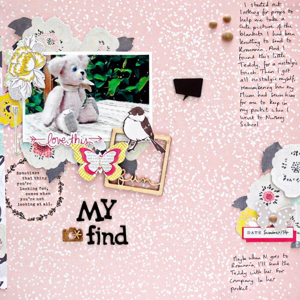
 It’s the accumulation of well-chosen and carefully crafted details that create a masterful scrapbook page. Check out 5 details on “My Find” by Sian Fair, and see if one or two of them can inspire your next page.
Sian made this page as a part of her work for the Get It Scrapped membership class “Single and Pretty.”[hr]
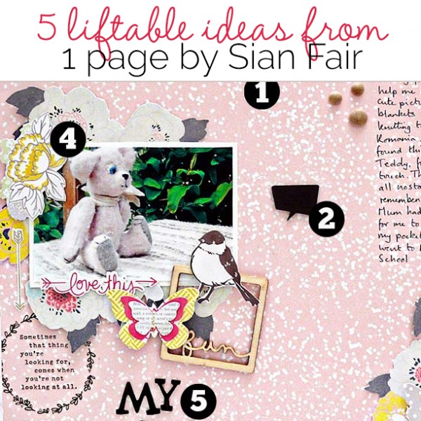
1. Use patterned paper with a small motif to invite a closer look.
S ian says: I use a lot of paper with tiny patterns, often ones from 6×6 pads which are reduced in scale. If something is little, I think, it pulls you in and makes you look more closely. A big pattern can push you away.
2. Use talk bubbles to convey that you’re telling a story.
Sian says: I’ve got to mention the chalkboard speech bubble here – one of the most useful embellishments I have in my stash right now. A speech bubble says Listen! I’m telling you a story. Because it’s dark it will ground and draw attention to whatever you place it beside.
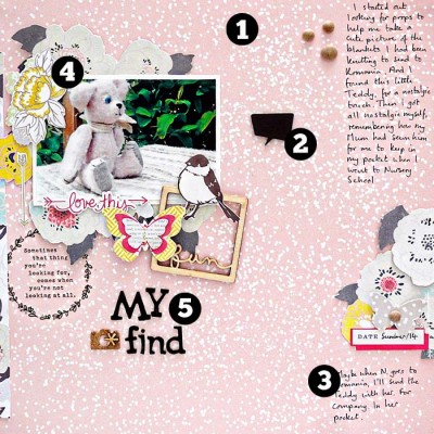
3. Break your journaling into smaller blocks for a pretty and light design.
Sian says: One of the stumbling blocks I come up against when making pretty pages is finding room for a big chunk of journaling. Too many words and a pretty, light look is gone. But the words are often the best bit, so one of the ways I get them in is to break the journaling into smaller blocks and use the shape and number of those blocks as design elements themselves.
4. Use a small and surrounded photo.
Sian says: The first design I used on pages that got gallery comments included one photo surrounded by a cluster of hand-cut details or premade diecuts. When I started scrapbooking I wasn’t confident enough to use papers with very large patterns on them so I started cutting round them – handcutting- to make them easier to use.
If I don’t have papers I can cut up I use my Slice machine, or open a packet of diecuts or stickers. With stickers I like to mount them on card and trim round them so I can shuffle them about on my page as much as I like. Usually I decide first where I want to place my photo on the page, depending on the length of my journaling and title, and then I start tucking bits and pieces underneath and around the picture. I’ll walk away and come back several times because a fresh pair of eyes helps me see if I need to add more or if I have used too much and “lost” the photo.
5. If it looks insipid, add black.
Sian says: Make it pretty; and if you think it looks insipid when you’re finished, rough it up a bit with distressed edges, mount it on a bolder border paper, or add black elements which can have a dramatic anchoring effect.

My Find by Sian Fair | Patterned Paper by Shimelle for American Crafts and by Crate Paper; Alpha by American Crafts; Wood Veneer by Freckled Fawn and by Citrus Twist; Stickers by Crate Paper; Cork Camera by Studio Calico; rub on by Crate Paper
Sian says, “I currently write for Jot magazine, Australia; and I am delighted to be a member of Debbie Hodge’s Get It Scrapped Creative Team. In the past I have guest designed for scrapbook kit cubs including Jenni Bowlin and Quirky Kits and I contributed to the UK scrapbook magazine Scrap365. You’ll find her blogging at High In The Sky.”

