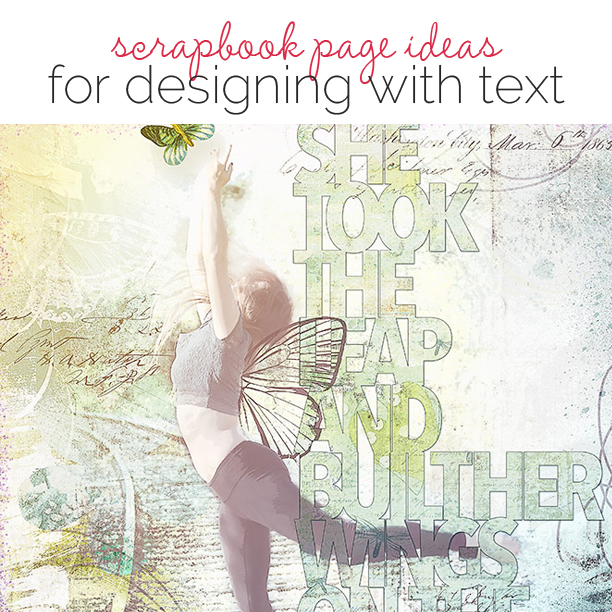
 There are a variety of ways you can use text in addition to title or journaling on your scrapbook page for design and storytelling purposes. In a membership webinar with Doris Sander, she shared four ways she uses textual elements in her designs: 1) words around a theme, 2) wordfetti, 3) sentence-long journaling, and 4) prominent journaling. See what our team has done with her inspiration and advice on their pages here.
[hr]
Sue Althouse says, “This page is about how my husband and I are best friends. A sentence-long title defines the theme and serves as journaling. Word stickers line up as part of the left-hand border, while labels and negative space die cuts are layered on top of hexagons in a visual triangle along with other bits and pieces of embellishing. Three simple word tabs surround the photo.”
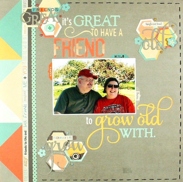
Great to Have a Friend by Sue Althouse | Supplies: Cardstock: Bazzill; Patterned Paper, Stickers, Die Cuts, Buttons: Fancy Pants; Hexagon Punch: Creative Memories; Silhouette Title: Friend Grow Old With layered Phrase; Floss: We R Memory Keepers; Enamel Dots: Doodlebug
[hr]
Heather Awsumb says, “The page is about a trip I took with my sisters early this year in Cape Town, South Africa.”
“I’ve used two of the approaches discussed in the interview with Doris: words around a theme and wordfetti. As a result, I used a lot more word elements than I would normally. Although my journaling is a snapshot of the trip that we took, the use of word elements around the theme of happiness emphasises the underlying feeling of my layout.”
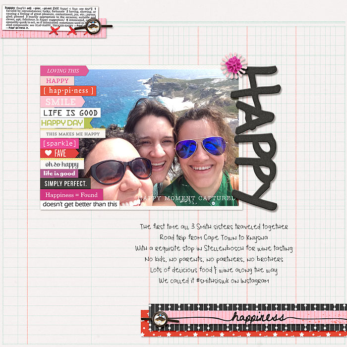
Happy by Heather Awsumb | Supplies: Hello Paper Pack, What Fun by Sara Gleason; Thick Awesome Words by Ali Edwards; Pure Happiness, Worth a Thousand Words, Shine Bright by Sahlin Studio; Flossy Stitches Red, Cutups Springtime, Astro Addo On Paper Pack, So Fine Element Pack by Katie Pertiet; Everyday Essentials Fasteners by DSI; Loverly by Shirley Polk; Lemon Drop, Hopscotch,Stay Tuned, Positive Spin by One Little Bird; Mad Crush by Digital Design Essentials
[hr]
Marcia Fortunato says, “My scrapbook page is about how cute my 18-month-old grandson is when he mimics taking selfies with a cell phone.”
“I used text in several ways, incorporating patterned paper with text, embellishments with text, and small little word stickers or word-fetti. Some of the words support the story about taking photos, while others are words that express my thoughts and feelings about my grandson. Finally, I used Hello in several places, since that is one of the words he currently says quite often: the way he says it is just so cute.”
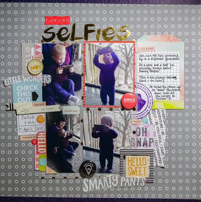
Taking Selfies by Marcia Fortunato | Supplies: Patterned Paper: Studio Calico, Seven Paper; Vellum: Studio Calico, DCWV; Journal card: Life.Love.Paper.; Letter stickers: Studio Calico; Embellishments: Hello Forever, Crate Paper, Heidi Swapp (frame), Life.Love.Paper., Studio Calico, Seven Paper, In a Creative Bubble; Stamps: Cocoa Daisy, Studio g; Embossing powder: Zing! (American Crafts); Ink pads: Memento (Tsukineko), Pens: Staedtler.
[hr]
Deborah Wagner says, “My best friend’s daughter is a dancer; and I love to take photos of her in action. I was inspired by Doris Sander’s layouts with long titles. For my page, I wanted my title to be significant, but sill have a light and airy feel. To achieve this, I used the Photoshop Horizontal Type Mask Tool so the words would appear translucent. I added a stroke and drop shadow to give it dimension and separate it from the background. To reinforce my theme, I clipped a few butterflies to the title and let it span the full length of the page, bleeding off the top and bottom.”
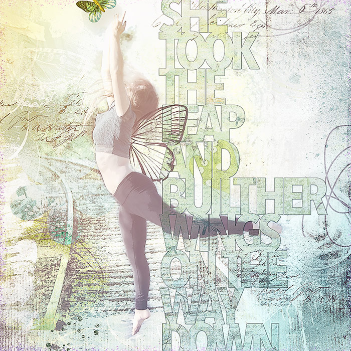
She Leaped by Deborah Wagner|Supplies: Kim Broedelet – heARTSY Papers Tranquility; Amy Wolff – Pixie Dust, Sunny Morning; With Wings – Katie Pertiet – With Wings
[hr]
Jennifer Kellogg says, “This page conveys how crazy a day at work can be. Monday at work is the busiest day of the week.”
“I chose a kit with many text elements and journal cards. The viewer’s eye should jump from element to element and back again. Even the photo conveys a sense of chaos. There is always something new when you look at this page. ”
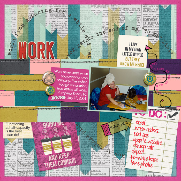
Work by Jennifer Kellogg | Supplies: Laura Passage: Stitched Down Templates Vol 2; Amy Wolf & Lynne-Marie: Manic Monday Kit; Libby Pritchett: Drive Me Crazy Alpha; Font: Avenir
[hr]
Devra Hunt says, “My husband was absolutely smitten with our new puppy Snickers. My son and I teased him that he treated Snickers more like a baby than a dog.”
“I used a selection of baby-themed product to add humor and play on the idea that the dog is a baby. The text around the page is all sayings that are associated with a new baby, but that, in this case, double as things people say about puppies.”
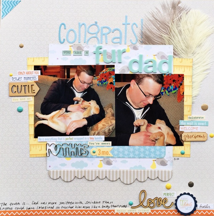
Congrats You’re a Fur Dad by Devra Hunt Supplies-Patterned Paper, feathers-Bella Blvd, Stickers-Bela Blvd, Cosmo Cricket, clip-Freckled Fawn, Wood Pieces-Elle’s Studio, Freckled Fawn, Alphas-Bella Blvd, My Minds Eye, American Crafts, enamel dots-My Minds Eye, Theresa Collins, ink-Memento, pen-EK Success, adhesive-EK Success, Scotch.

