
 Designing with fonts gets less expensive when you use designer bundles like those at The Hungry Jpeg. They offer up a big selection of fonts and digital art at a heavy discount for a short time (usually a month). Over the last year, many of the scrapbookers spending time at the Get It Scrapped forums have linked up bundles they love and gotten more of us on board with this approach to gathering supplies.
In this post, paper/hybrid scrapbooker Marie-Pierre Capistran and digital scrapbookers Amy Kingsford and Carrie Arick worked together to bring you more ideas for using these bundles in your scrapbooking . The Hungry Jpeg gave them the latest offering, The Fontastic Font Bundle, and they went to work.
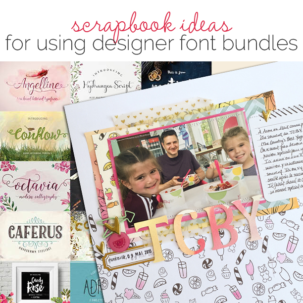
The bundle
The Fontastic Font Bundle from The Hungry Jpeg includes 45 fonts with bonus illustrations, dingbats and ligatures created by nearly 20 designers.


Carrie Arick on working with designer font bundles
I use fonts regularly in my scrapbooking, at least for journaling and more typically for combining with alphas to create interesting, unique titles. I am a font collector, amassing a considerable number of them, one-by-one, until this year. Lately I prefer bundles over individual fonts because of the guides and key included with a bundle. I always learn something new by reading the documentation and I know exactly what’s included in every font. The information is presented clearly and is the same regardless of the font. That save me time when searching for just the right font to use on my pages.
mix serif, sans serif and script fonts
When you are combining typefaces, using a mix of different types of fonts is usually a good rule of thumb – especially if you want to get more of your favorite fonts on the page.
utilize variations and special ligatures included with your fonts
When you buy a font or font pack, often included are special ligatures or fancy variations of letters. Many font users don’t realize how easy they are to use. In Photoshop, change the style of your letters in the Characters palette accessed through the Window menu. If your font comes with ligatures and you don’t see them in the Characters Palette, click on the three lined icon on the top right hand corner and then select OpenType. Select the options that are grayed out (these are the ones included in your font). For more information, the Hungry JPEG May bundle includes a tutorial on how to use your fonts, including the special ligatures, in the “Documentation” folder.
Here I’ve used a script, a sans serif and typewriter (serif) font and a swashy “g” for “grandmom.” I then used the text warp tool to curve it slightly and added a stroke around the outside of the text at a reduced opactiy. I added a light drop shadow to give it dimension. The result is word art that fits the page perfectly.

Despite being teenagers, my son and nephew never complain about having to take part in traditions of childhood with their grandmother because they know it’s important to her. |Grandmom Rocks by Carrie Arick | Supplies: Limitless Collaboration by Amanda Yi Designs & Karla Dudley; Blanc Stitches vol. 2 by Amy Martin; Fonts: Lemonade Script; Lemonade Regular; Papercute Regular. 1942 Report
use layer styles to customize titles
Layer styles are a quick and easy way to style your titles and text elements. Styles range from glitter, to wood grain, to epoxy and more. The possibilities really are numerous.
Here, I used several layer styles to quickly create a one of a kind look. I type title and subtitle each on their own layer. I then duplicated the title layer twice and the subtitle once. I off-set the bottom most layers of the title and subtitle. To those layers, I applied a pink stamped style. To finish the title, I first applied a kraft paper style to the next title layer and then a stamped outline style to the top most title layer. For the subtitle, I applied a glitter style to the top most layer.

My mother in law’s dining room table is always seasonally festive, which is the story I’m telling here. |Table Setting by Carrie Arick | Serendipity Papers & Elements by One Little Bird; Storyteller Styles August 2014 by Just Jaimee; Fonts: Amethyst Regular, Stand By Slab, Arick
fill an image with text
This can be a fun way to bring a bold graphic look to your pages. Try using the steps in Blue Lightening TV’s How to Make a Text Poster of Someone video tutorial.
I wanted to go beyond just text filling my son’s face, so I used a tutorial to create text that wraps around the contours of the photo. I started with an extracted photo of his face, and followed the instructions in the tutorial listed above. I then played with masking and blending to give the effect a more artsy look.

My son struggles often to make sense of the world, but when he’s happy, it’s obvious and infectious. This page celebrates those qualities. |Grandmom Rocks by Carrie Arick | Supplies: Limitless Collaboration by Amanda Yi Designs & Karla Dudley; Blanc Stitches vol. 2 by Amy Martin; Fonts: Lemonade Script; Lemonade Regular; Papercute Regular. 1942 Report
[hr]
Marie-Pierre Capistran on working with designer font bundles
This was my first time using a bundle like this, and I loved it because it was so complete! I usually use fonts for titles and subtitles on my layouts and, depending on the theme and style I’m going for, I often need fonts that I don’t already own. I usually look for free fonts on the web and it can take a good amount of time to find what I want and to install the fonts.
I was happy to be able to simply scroll through the fonts included in the bundle. I loved the variety. What I liked most was looking through the images showing the fonts styled in sample text. I found them inspiring. The typeface, the words used in the illustration, and the colors in which they were presented all spoke to and inspired me.
create elegant die titles with your die cutting machine
Swoopy script fonts, as well as special ligatures often included with premium fonts make for elegant die-cut titles. This can elevate the sophistication of more formal pages.
use your die cutting machine to cut out watercolor illustrations
Try using your Silhouette’s “print to cut” feature to turn watercolor images like those included as bonus features with some fonts into beautiful stickers and ephemera for your scrapbook pages.
On this page the title is a die cut that I made with my Silhouette and the font “Angelline” on white cardstock. For the flower bouquet I used the illustrations that came with the Mira font. With Photoshop I created a white contour around the illustrations and I cut them out using my Silhouette. I adhered them with hot glue to give it a little dimension.

This page is about the story behind my wedding dress. | The dress by Marie-Pierre Capistran | Supplies: Cardstock: Watercolor paper, Stampin’UP!; Paperclip: Rangers; Flair: Two Peas In A Bucket; Label: Seven Gypsies; Sequins: Pretty Little Studios; Fonts: Angelline, Mira.
Create a template for an embroidered title
By rendering a title in your favorite outline font or by creating a stroke around other fonts, you can create what can easily be printed out and used as a template for a hand-stitched title.
Here I used the font Boldilicious. I loved that this font was a contour font. I printed the words in a very pale grey and embroidered on the lines. With a piercing tool I pierced holes all around the letters. To make the change of colors, I traced some very pale diagonal lines.

This page is about my daughter’s first soccer season. I loved to see her play even though we were out in the cold and rain most of the time. | Cheetas by Marie-Pierre Capistran | Products: Cardstock: Bazzill; Paper: Echo Park; Vellum: Dear Lizzy; Mini file folder: Heidi Swapp; Paperclip: Rangers; Sticker: Heidi Swapp; Arrow Die Cut: Pretty Little Studio; Label: Pretty Little Studio; Stamps: Citrus Twist Kits; Font: Boldilicious; Other: embroidery floss, paper piercer.
create a die-cut title to watercolor wash
Using your die cutting machine, watercolor paper and your favorite font you have all you need to create a one-of-a-kind watercolor-washed title.
create patterned papers using dingbats and/or digital icons
The dingbat fonts and digital icons that are included in this bundle as bonuses are just what you need to design your own home-made papers.
On this page I used the illustrations that came with the Hellous font to create a one of a kind patterned paper. To do so, I placed my favorite drawings randomly on the bottom of a 12×12 canvas in Photoshop. When my page was all done I figured that it was lacking a little something so I used pink ink and a paintbrush with very little water to color in some of the illustrations. You’ll also noticed a full-color piece of home-made patterned paper tucked behind the photo as well.
For the title I used watercolor paper on which I applied a quick wash of four different colors. Once it was dry, I ran that cardstock through my Silhouette. Using thick cardstock like watercolor paper makes gorgeous embellishments! I could have painted them afterwards but I really wanted the continuity of the color running through the word.

This page is about one of our favorite family activity: eating frozen yogurt at TCBY. | TCBY by Marie-Pierre Capistran | Supplies: Cardstock: Bazzill; Paper: Amy Tangerine; Vellum: Cosmo Cricket; Project Life Card: Becky Higgins Midnight edition; Label: Pretty Little Studio; Paperclip: Allison Kreft; Stamps: Studio Calico; Pick plastic embellishment: Doodlebug; Puffy Stickers: Twine and Ink; Others: Silhouette, Fonts (Realist, Hellous), Watercolor paper and paint.
Amy Kingsford on working with designer font bundles
I love fonts and use them frequently in my digital pages. Up until recently I searched for specific types of fonts or happened upon fonts that I liked and used them. Once I discovered the existence of designer font bundles, though, I was hooked. Not only do they offer many great fonts and bonuses for a good price, but the extra illustrations, dingbats and ligatures present many more design possibilities and get my creativity flowing.
create an over-sized collage style title
The right font(s) and a good variety of patterned papers are all you need to create your own custom, oversized collage-style title. And, best of all, with a fun mix of colors and prints, you can keep the rest of your page relatively simple.
I wanted everything in this page to center around this silly little quote by my son, so I went for a collage-style oversized title and paired it with this recent snapshot of my son. It’s a simple page but the fun fonts and the patterns create a lot of interest.
To complete this hodge-podge look I combined a hand drawn outline font (Boldilicious) and a wonky block font (Papercute) in my title. I used the linear burn blending mode and the blending options available in Photoshop’s layer style box to keep my hand-drawn outline font from floating on the page and then I used drop shadows and clipping masks to create the hand-cut effect.

This page is about my youngest son’s struggle with growing up and was inspired by something he said just the other day. | Medium Sized by Amy Kingsford | Supplies: Paislee Press: Heirloom Kit; Digital Design Essentials: XoXo Papers, Grateful Papers; Karla Dudley: Thankful and Fated Cardstock; Jen Allyson: Wood Dots; Sahlin Studio: Stitching; Fonts: Boldilicious, Papercute (Hungry JPG) and Remington Noiseless.
create a text-filled patterned paper
Using Photoshop’s pattern adjustment layer you can make your very own text-filled patterned papers, customizing everything down to the colors, fonts, and phrasing. Check out this video tutorial by Blue Lightening TV to learn more about creating your own seamless patterns.
I was looking for the perfect gold paper to go behind my photo on this page when I finally settled on making my own using a brush script font (Dreamboat) and a pattern adjustment layer. Creating a text patterned paper turned out to be a great choice because not only did I get to pick the color and font but I also got to choose a phrase that was relevant to my page.
I also rendered my title with a die-cut word and a stamped word in complimentary fonts. Both techniques are easily achieved with the right shadowing and blending.

This page features photos I took of my niece greeting her soon to be sister. | Hello Sister by Amy Kingsford | Supplies: Digital Design Essentials: Grateful Collection; Creashens: In My Bag; Simple Scrapper: Membership Template; Fonts: Dream Boat and Flycatcher.
get a mixed-media look with digital illustrations and textures
A textured background and some subtle blending can help you turn some of the included digital watercolor illustrations and painted textures into a beautifully layered mixed media masterpiece. Amy’s go-to blending mode when working to recreate the look of wet mediums on her pages is Linear Burn.
create the look of vellum with stamped and painted title styles
Pairing fonts with the right drop shadows, layer styles, filters and blending modes allows you to create realistic looking materials and techniques in your digital pages. There are great tutorials out there about creating vellum, stamped and painted titles. Here are a few of my favorites:
- Photoshop: Rubber Stamp Effect – Blue Lightening TV
- Adding Drop Shadows to Vellum – Designer Digitals
- Create Watercolor Text Effect – BlueFAQs
I started this page knowing I want to create a mixed media background using the root illustration included with the Grootland font and the watercolor leaves from the Octavia Script watercolor bonus. So I began by placing my favorite textured white cardstock from Karla Dudley down as my canvas. Its texture makes for a great effect when paired with watercolor and stamped images that are ever so slightly blended into the background. And a few random splatters complete the look.
The I used a variety of different styles throughout my title in an effort to add to the overall soft and whimsical feel of the page. The vellum style paired with the swoopy Brayden Script font was a perfect match in my opinion. Then I combined the Brayden block font with my go-to stamp action by Mommyish and the linear burn blending mode before clipping the title to each of the overlapping layers for a realistic look.

This page is about how fast my boys seem to be growing up. I keep thinking to myself, ‘Wow, one day they’ll be all grown up! ‘ and this thought is a little bittersweet. | Grown Up by Amy Kingsford | Supplies: One Little Bird: Magic Moment; Fontastic Bundle: Grootland (Bonus Illustrations), Octavia Script (Watercolor Illustrations); Karla Dudley: Cardstock; Fonts: Lemonade Regular and Script, Brayden Regular and Script and Flycatcher.
So that’s how Amy, Carrie and Marie-Pierre used a bundle of designer fonts on their scrapbook pages. This bundle, and others in the series, are usually available for a month at a super-steep discount, and then if you want the pieces you need to buy them individually from the designers. Check out The Hungry Jpeg here for a closer look–and to purchase yourself.
