Working with threes is a great way to make a solid looking design — and to make it efficiently. They eye likes things that come in threes. When you work with 3 items, you have the options for both symmetrical arrangements and asymmetrical. Line ’em up and you’ve got symmetry — pull two of them apart from one and you’ve got asymmmetry.
In the Scrapbook Coach class “Three Acts” we work through four very different compositions that are built on arrangements of three elements — from 3 photos to 3 columns, 3 blocks, and 3 clusters. See how the Get It Scrapped Creative Team uses these compositions.
[hr]
Deborah Wagner says, “My kids usually groan when I get out my camera; but they had fun posing for our recent Christmas card photo shoot. I used both a three-column and a three-in-a-row approach when scrapping this page. I wanted to create a strong contrast between my silly photos and the page design so I used a clean, modern composition with strong, vertical lines. The three-acts composition is a great starting point to building a classic, grid-structured page.”
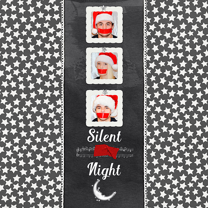
Silent Night by Deborah Wagner|Supplies: Anita Designs – Heart Dreams Wishes; Just Jaime – Son; Laura Passage – Daily Slice of Life; Gennifer Bursett – Miss Molly, My tribe; Kim Broedelet – Handmade With Love; Studio Basic – All That is ok; Digiital Scrapbook Ingredients – Summer Night
[hr]
Kelly Prang says, “I wanted to record the memories I have of three different experiences faith growing up, moving from a more liturgical and esoteric experience to a traditional but still warm and welcoming one, and on to a very charismatic type of faith. I used a three-column design, but my columns are not even as I need more space for the middle section and less for the other two. I downloaded denominational logos from the internet and used them instead of photos to visually tell my story.”
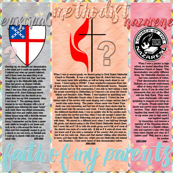
Faith of My Parents by Kelly Prang | All papers and elements-Clueless kit from Anita Designs, Fonts: Amelia Script and Attic, All photoshop styles from Mommyish- vellum and chipboard on script font.
[hr]
Kiki Kougioumitzi says, “A friend of mine was surprised by the mess when she saw photos of my daughter painting with finger paints. Here, I talk about that and about how I find it more important to let my child express herself freely than avoid an extra load of laundry.”
“I used three clusters to tell the story. I made sure to repeat elements in each of the clusters for unity. I repeated background papers and Washi tape, hearts and circles, but I also varied size, color and texture of these repetitions for interest.”
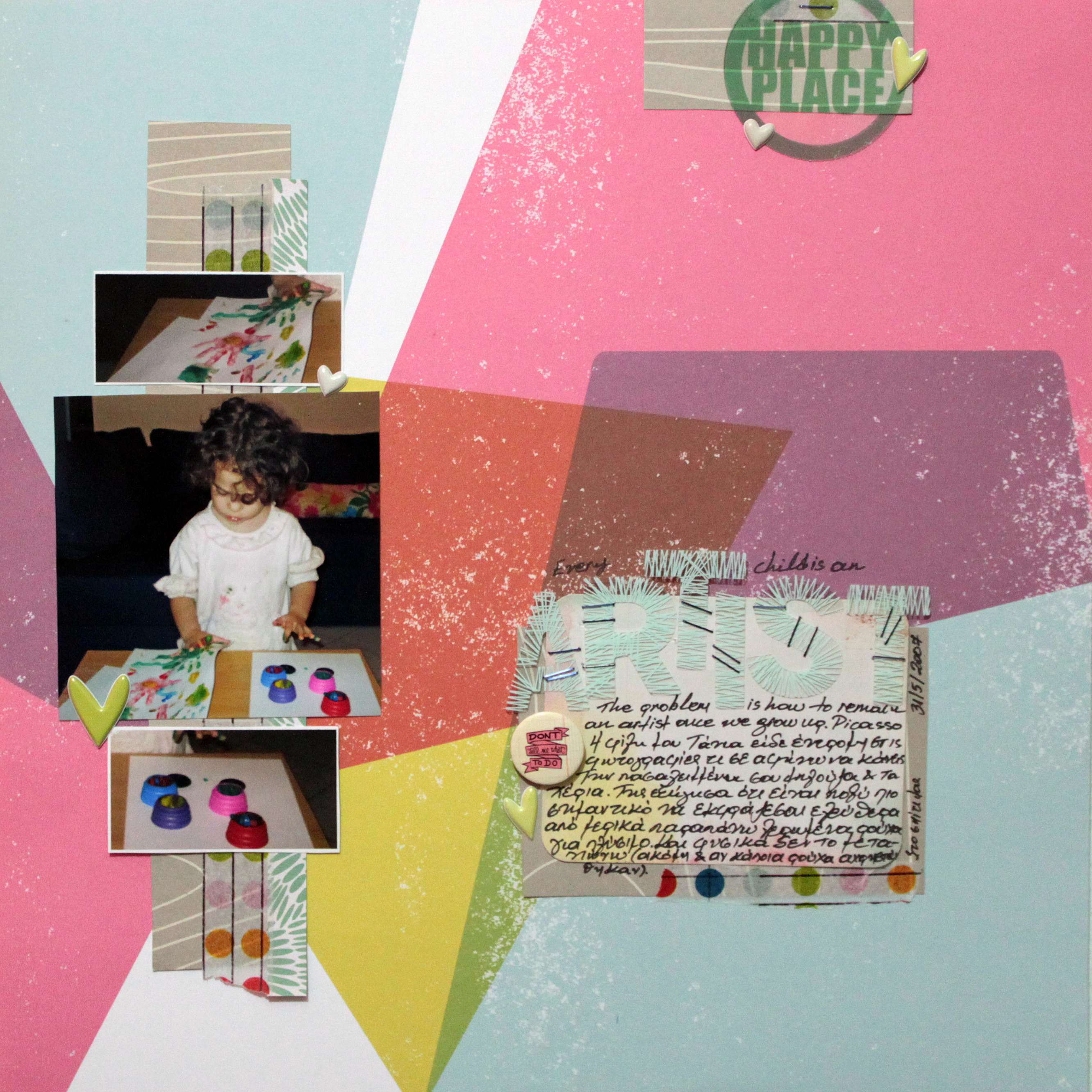
Artist by Kiki Kougioumtzi | Supplies: Pattern paper, washi tape, flair, alpha: Studio Calico; Puffy stickers: Twine+Ink; Clear die cut: Chic Tags; Journaling card: Becky Higgins; Other: staple.
[hr]
Sue Althouse says, “This page is about our first summer living in a new town. I designed it with three clusters approach. The clusters are united by repetitions of color, the butterfly motif and pieces of flair.”
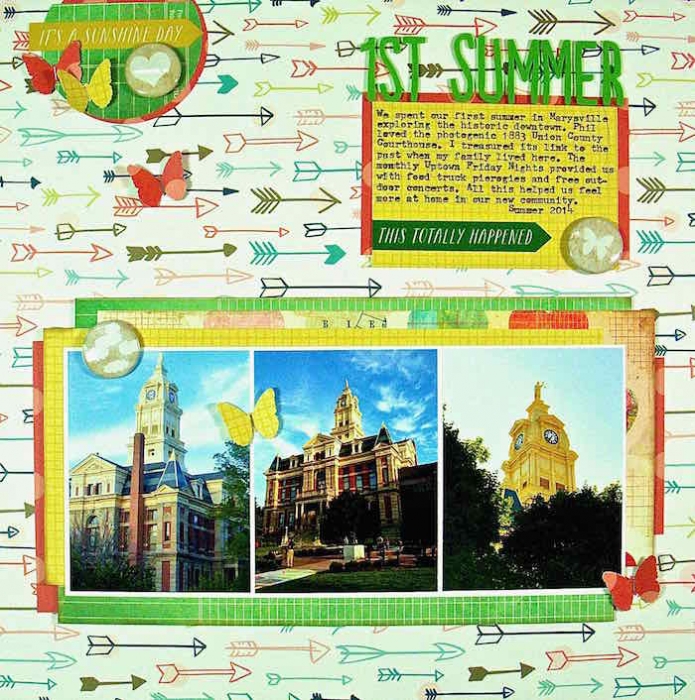
1st Summer by Sue Althouse | Supplies: Patterned Paper: Crate Paper, My Mind’s Eye, Simple Stories; Ink, Staples: Tim Holtz; Punches: Martha Stewart, Paper Punches; Alphabets: American Crafts; Stickers: My Mind’s Eye; Flair: A Flair for Button
[hr]
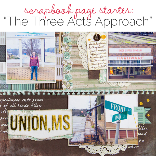
Gretchen Henninger says, “This layout captures a road trip I recently took with my husband to search for his grandparents’ hometown. I blocked out three sections of teh canvas for my composition. This design was great for getting a lot of photographs onto one page. I built each block separately, but used the same paper line and repeated elements between the blocks for continuity.”
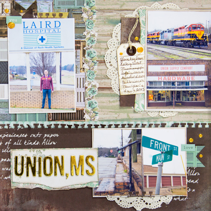
Union, MS by Gretchen Henninger | Supplies: Papers and Stickers: Kaisercraft (Blue Bay); Alphas: American Craft Thickers; Punches: EK Success (notebook, banner); Die: Die-namics (tag); Doily: BoBunny; Twine: Lawn Fawn; Stamps: Technique Tuesday (journaling lines), Memory Box (flowers); Ink: Tim Holtz Distress Ink (walnut stain); Enamel Dots: Viva Decor Pearl Pen; Washi: Simon Says Stamp
[hr]
Debbie Hodge says, “This is the story of holding onto the memory of lovely days even when they aren’t hugely eventful. I used two compositional ‘threes’ here.” First, my photos are all the same size and arrange ‘three-in-a-column’ down the left half of the page. While I started with them in a tidy, series, I jiggled that arrangement in the end for a more casual look. The second compositional three here is the blocked background. The canvas is divided into the three blocks. The largest vertical block holds title and journaling. The two blocks behind the photos hold patterned paper and exist simply to give the page interest and to set mood with color and pattern motif.”
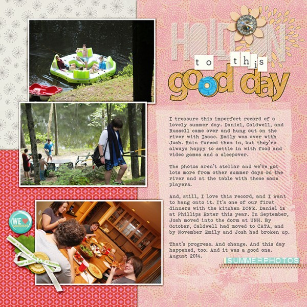
Hold On To This Good Day by Debbie Hodge | Supplies: Every Little Bit by Deena Rutter; Sunshine Summber by Pattie Knox; Mod Grunge Foto Blendz by Anna Aspnes; Between the Lines Alpha by Katie Pertiet; Stitched Vellum Alpha by Zoe Pearn; More or Less Alpha by Gennifer Bursett; Hellow Summer by Mye De Leon; Sizzling Summer by Little Butterfly Wings; Summer Flair by Mommyih; Bohemian Typewriter font

