The Oxford art dictionary defines kitsch as: art, objects, or design considered to be in poor taste because of excessive garishness or sentimentality, but sometimes appreciated in an ironic or knowing way.
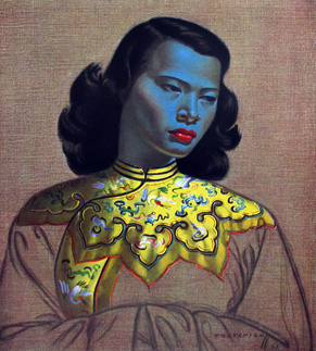
Some of the world’s greatest artworks are kitsch. The Chinese Girl by Vladimir Tretchikoff was made into prints in the 1950s and 60s. It is one of the best-selling art reproductions in the world.
So what can you do with this knowledge on your scrapbook pages? Put some kitsch to work! Make a page that has a look of excessive garishness or gaudy style AND that also includes an iconic image or motif–something that lets you excuse the gaudy look because it’s for your story.[hr]
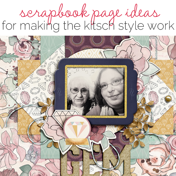
Carrie Arick says, “My mom, who hates to have her photo taken, surprisingly agreed to take this one with me.”
“The gem motif clues you into the story, the title supports the motif and the gaudy elements of the page invoke curiosity. You have to read the story to discover why this visual story not only makes sense, but why you don’t hate the page.”
“My advice would be to pick the motif that will save your page from being tasteless and carry that motif throughout the elements of your page. For example, my gem motif isn’t just in pattern paper or embellishments, it’s also found in the way I’ve layered my papers.”
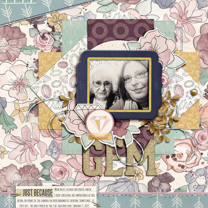
Gem by Carrie Arick | Supplies: Winter Wish- January Subscription by Pixels & Company; Font: Alexis Marie.
[hr]
Debbie Hodge says, “This page shows my son and a friend trying to coax wild kittens to play. My younger son makes a photo-bomber appearance here.”
“The setting is one of my childhood in the 70s and the characters make the situation fun and even edgy: my son’s friend dresses in a style often inspired by anime and the Japanese fashion center of Harajuku and she looked both adorable and jarringly juxtaposed with the farm. Then there is my younger son clowning around.”
“Thus, three things: memories of my childhood, the girls’ clothes here, and the fun spirt of these teens influenced my choice of retro-kitsch kitten images in the design. Embellishing with old style plastic bows and crewel embroidery add additional retro elements.”
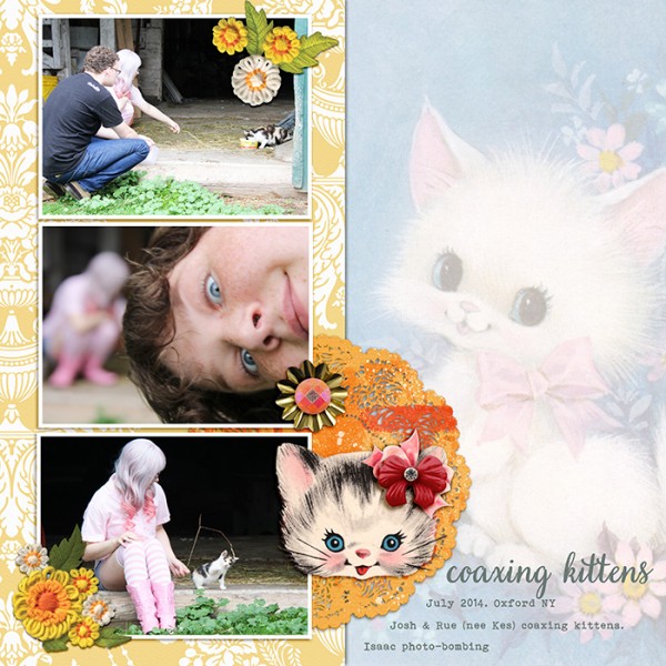
Coaxing Kittens by Debbie Hodge | Supplies: Rhinestone Buttons & Bows by Jenni Bowlin; Vintage Printables in Public Domain; You and Me by Laurie Ann; Homespun Stitches by Kitschy Digitals; Vintage Light Reflectors by Sahlin Studio; Faux Gemstones by Rachel Scraps; Doily by Sissy Sparrows/M3 February; Very Berry Pro, Bohemian Typewriter fonts
[hr]
Christy Strickler says, “I wanted to create a page about my cat that highlights how she has always been a little diva.”
“I like that the kitsch style has a bold, feminine feel with a bit of glamour. The unique feel of this style really played to my story. I mixed a variety of vintage patterns together, then added bold flowers, a queen and a small cat to my page. The queen shows that my cat is female and it also hints at the story. I made sure to pull all of the colors from the canvas into the other layers. I also started my design with a classic bracket foundation. This allowed me to mix bold and crazy items together while still making it feel united.”
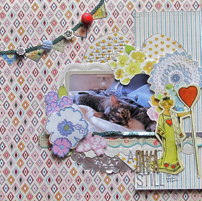
A Diva Still by Christy Strickler |Supplies Patterned Paper: Sassafrass; Die Cuts: Sassafrass, Glitz Designs; Letters: Pink Paislee, American Crafts; Stickers: Webster’s Pages; Ink: Tsukineko; Other: Doily, Buttons, Sequin Trim
[hr]
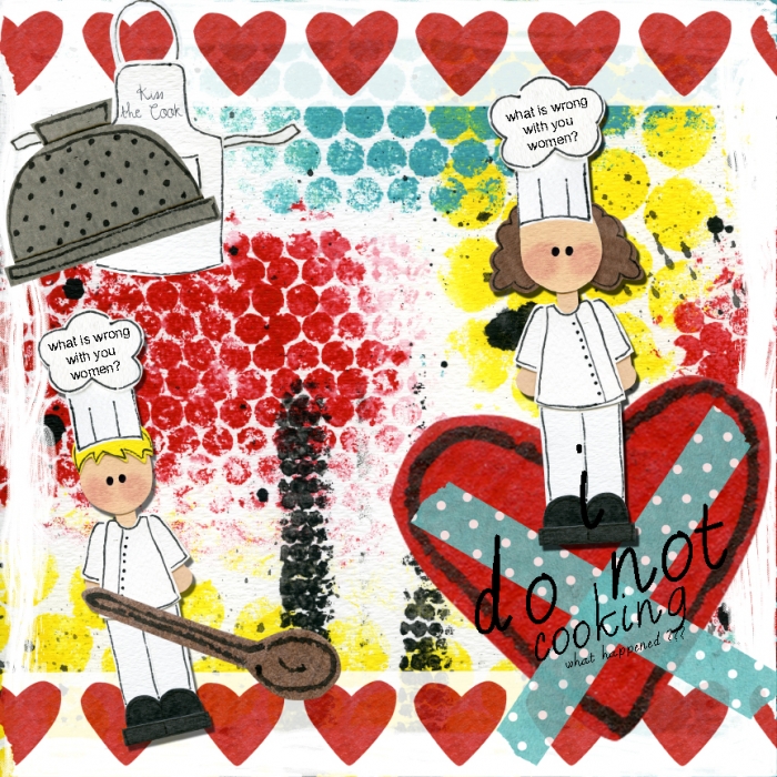
Summer Christiansen says, “I use to love to cook but now I kind of hate it.”
“For me, the girl chef embellishment here justifies the gaudy style of the page. It’s cute and because it isn’t an acutal picture of a person, it can be interpreted however your eye may catch it.”
[hr]
Michelle Houghton says, “This is a selfie photo I took of my husband and myself while hiking in Colorado last summer. A few years back my mother-in-law gifted me with old cards found at a relative’s home. I am not a user or lover of kitsch imagery, but thought I would hold onto a few in case I found the perfect spot for them.”
“I used several of the Valentines Day post cards here to frame a photo that has become a favorite of mine, showing us at our best. If you want to use a kitsch image on your work try sticking very close to the theme or feel of your photo, it will enhance the story rather then distract from it.”
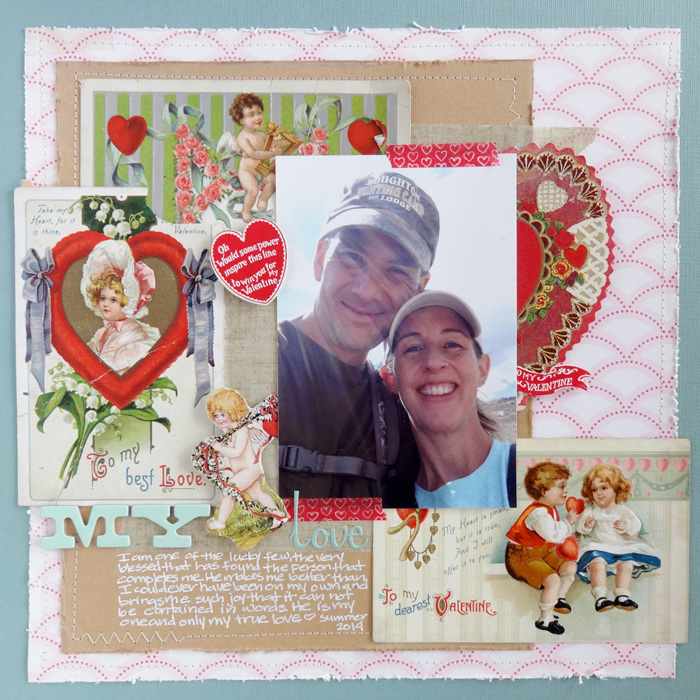
My Love by Michelle Houghton | Supplies: cardstock; Bazzil and Core’dination, patterned paper; Crate Paper, washi tape; Little B and Lawn Fawn, letters; October Afternoon and American Crafts, ink; Sharpie.
[hr]
Amy Kingsford says, “This page is about my son’s uncanny ability to find the extraordinary in the most ordinary of things. Buttons, leaves, glitter–they are all treasure to him.”
“Here I’ve created a kitschy cluster of treasures–some shiny and luxurious and others, simple everyday items. In both my design and my story the idea of treasure is highly interpretative, so I chose the gold key as my iconic image to tie everything together. Skeleton keys like these are often associated with hidden treasure. I liked that the key was big and bulky and stood out but I feel like its very symbolic as well. I positioned it so that the overall shape echoed that of my son’s play fishing pole–which is his current method of “treasure hunting.”
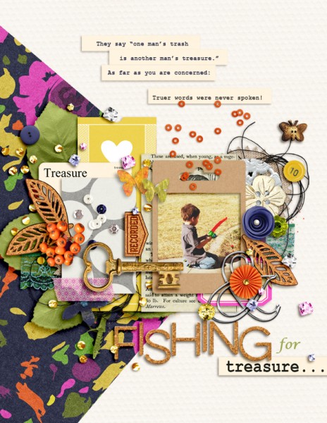
Fishing for Treasure by Amy Kingsford | Supplies: Sahin Designs: Buried Treasure Collection, Cast a Spell Elements; Amber LaBau Designs: Corkabet Alpha; Karla Dudley: Cardstock; Two Tiny Turtles: Circles Template; Other: Gold Key; Font: Courier New.
[hr]
Audrey Tan says, “I love playing with art journaling brushes and when I saw these particular images from a new kit that I had bought, I knew I wanted to find a way to use them. I combined the images and the brushes to create a background to use on this page about spending time with a good friend from Singapore. The butterfly images are rather symbolic to my story as I always feel that time flies by when I am with my friends and the vibrant colors are reminiscent of our good time.”
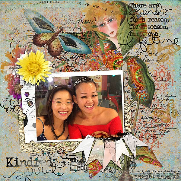
Kindred Spirit by Audrey Tan | Supplies: Anna Aspnes: Multi Media Flowers No2, Multi Media Banners No1, Friends Word Art No3, Punched Frames No1; Julianna Kniepp: Keep The Faith; Rebecca McMeen: Em
Font: KG Drops Of Jupiter
[hr]

