 Scrapbook page titles are a great tool for making a meaningful scrapbook page.
Use your title to elaborate on the parts we don’t understand just from photos. Use both title content and rendering to cue story and evoke tone or mood.
[hr]
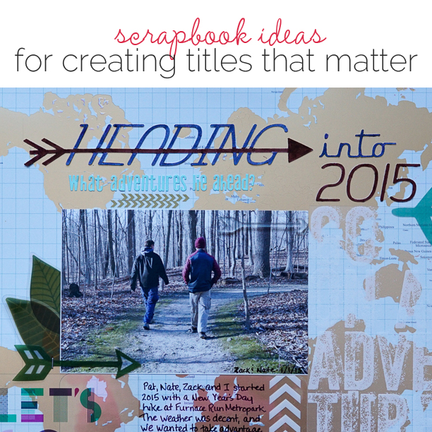
Marcia Fortunato says, “On the surface this is a layout about a family hike, but it’s also about the adventures that lie ahead this year for my two younger sons. When I looked at this photo from our hike, I couldn’t help but think about my youngest son’s upcoming trip, first for study abroad in Cairo, followed by an internship in Tunisia. I feel like this photo represents the road ahead for him and for his brother, who recently graduated from college and started two new jobs. Because the hike was on New Year’s Day, this lead me to the title, Heading into 2015.”
“I wanted to use letters that implied forward movement. I knew I didn’t have any letter stickers that would work, so I created the title with my Silhouette software using the Rocket Script font. I also wanted to incorporate an arrow, so rather than layering the letters over or under the arrow, I welded the two together. I then cut it with my Silhouette Cameo from a heavy art paper and custom colored it with markers.”

Heading into 2015 by Marcia Fortunato | Supplies: Patterned Paper: Studio Calico; Mixed Media paper: Strathmore 140lb.; Title font: Rocket Script; Title arrow: adapted from “8 thin arrows” by Kolette Hall (silhouettedesignstore.com); Letter stickers: Studio Calico; Acetate sheets: Studio Calico, Becky Higgins Project Life, Basic Grey; Die Cuts: Studio Calico, Basic Grey, We R Memory Keepers; Rub-on: Jenni Bowlin; Pens: Zig Photo Signature (EK Success), Distress Markers (Tim Holtz); Other: American Crafts mini stapler.
[hr]
Ashley Calder says, “This page is about my daughter Ruby Sky, and her crazy, wonderful, big, huge, adorable, self-centered, but very sweet and far too charming personality. One day she coined the phrase and that’s why I’m Ruby Sky! and it stuck–because it is so incredibly true. I tried to capture a little of that truth in this page.”
Ashley’s title fills the bottom half of her page in bright colors and whimsical cutout letters. The colors, the expansiveness of the title, and the loopy shapes set a tone that goes with her story.
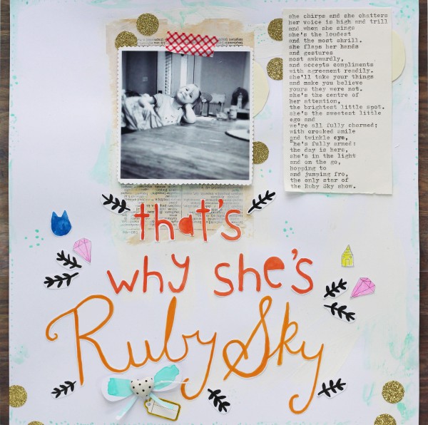
That’s Why She’s Ruby Sky by Ashley Calder | cardstock by American Crafts; patterned paper by Gossamer Blue; gold glitter tape by American Crafts; bow embellishment by Things That Shine; black ink by Winsor and Newton; watercolour by Winsor and Newton; gold foil tag by Things That Shine; vintage book page; gesso by Liquitex; fonts Don’t Panic and Like, by Things That Shine.
[hr]
Stefanie Semple says, “One day back in March we were at the beach and watching a man try to balance rocks. As I look back over the year and ponder my thoughts from then, I realized that balance can be overrated when living day-to-day with three children. I love using titles to hook the viewer of my layouts. Here, the title appears straight forward, but when the journaling is read, the depth and duality of the title becomes apparent.”
“I love mixing two different alphas in my title. Here, I’ve used a font with a sticker style along with a glittery alpha. I played with the placement of the words to act out the meaning of the title.”
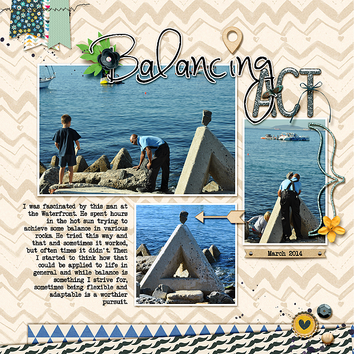
Balancing Act by Stefanie Semple | Supplies: Amanda Yi Designs and Gennifer Bursett: Now Trending (kit), Mommyish and Just Jaimee Day 11 freebie black stitching.
[hr]
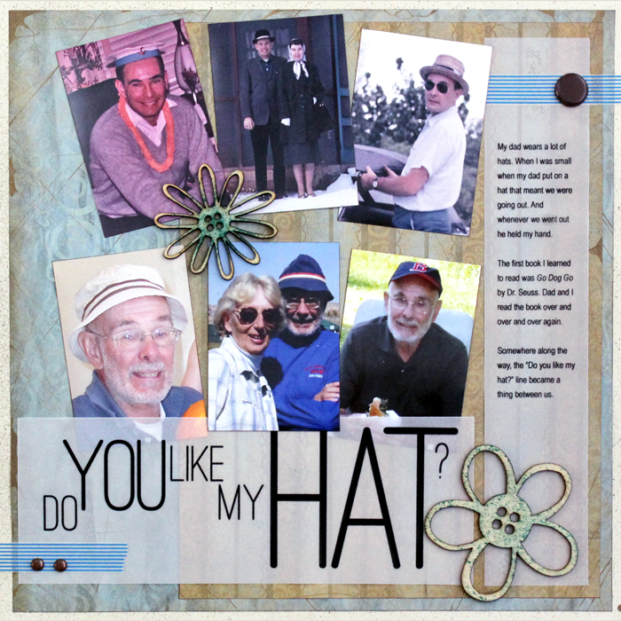
Jennifer Kellogg says, “When I was little my dad and I would read, “Go, Dog, Go!” all the time. “Do you like my hat?” became a special little joke between us. The title is the heart of this page. It represents hats of all shapes and sizes. I put each word in its own text box, placed them in a staggered arrangement, and printed it out on vellum.”
[hr]
Terry Billman says, “The large title ‘Goals’ placed in the center of the page defines the subject of this layout: my goals for 2015. This photo reminded me that goals can seem like mountains and be hard to attain. Yet, they can be achieved with desire and discipline. The colors of the sky were enhanced and intensified with the technique applied to the title.”
Terry’s steps to replicate this effect:
- Duplicate your photo and clip it to the alpha.
- Change the blending mode of the alpha to vivid light and reduce the opacity to 59%.
- Duplicate the photo, add a copper gradient overlay, hard light, 34% opacity, and angle 94 degrees.
- Add drop shadow to the alpha.

Goals: Dreams with Deadlines by Terry Billman|Supplies: Maplebrook Studios: Just Linens 31, Linnea; Anna Aspnes: Alpha Number Set 4
[hr]
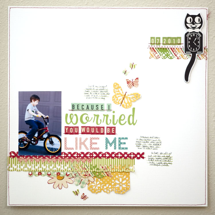
Karen Grunberg says, “I often use my titles to highlight the true sentiment of my page so in this page, even though it’s about my son learning to ride, it’s really about how i am always worried he’ll never learn because I never did. Longer titles like this one also offer a great opportunity to add color and focus to my page.”
[hr]
Debbie Hodge says, “This page is about getting ready for a big snowstorm. One of the things we do is bring in lots and lots of wood–in case we lose power and because it’ll be hard to get to the woodpile once it snows.”
“My title describes the very specific aspect of a storm I’m recording and does it with big chunky alphas for the word STORM to represent the storm’s power. The title sits at top left of the page and is the guide into the story. It’s backed up with snow-like gesso splatters and a delicate gold-stamped snowflake.”
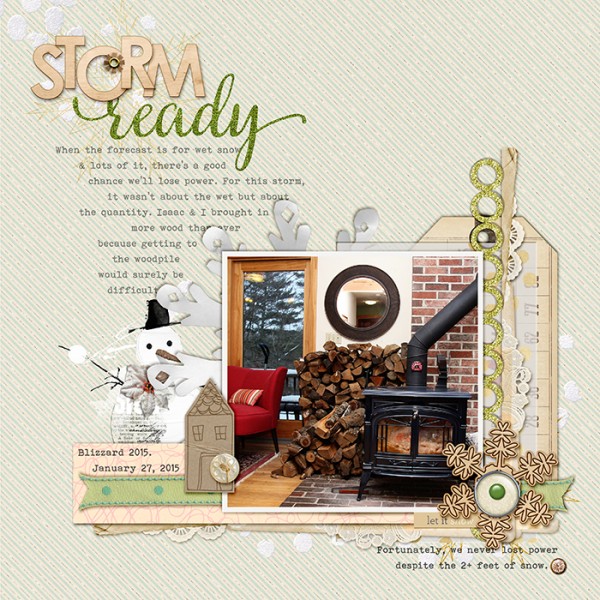
Storm Ready by Debbie Hodge | Handcut Snowflakes by Valerie Wibbens; Loverly by Pixels & Co; ViFi Tags by Jen Allyson; Hello Friend by Amber LaBau; Multimedia Snowman, Artplay SnowFun by Anna Aspnes; Doily Edgeres by Katie Pertiet; Peppermint Winter by Mye de Leon; Hometown by Lauren Reid; Cozy Up by Forever Joy; Winter Sont by One Little Bird; Very Berry, Bohemian Typewriter fonts
[hr]
Noell Hyman says, “This page is about the similarities between my husband and me in terms of our interests, our personalities, and our pasts.”
Noell used a familiar idiom that represents this commonality: “birds of a feather.” She gave her rendering punch by using two diecut birds instead of the word “bird” along with glittered alphas. White feathers accent this eye-catching title and support her story well.
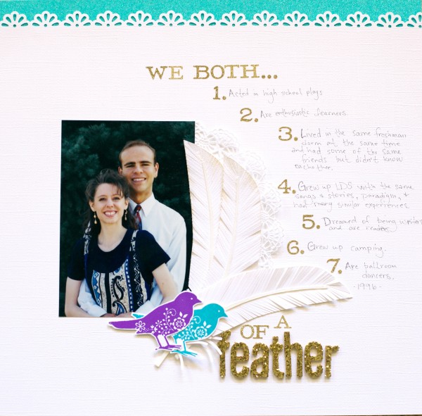
Of a Feather by Noell Hyman | Supplies: Bazzill Basics Cardstock; Feathers Design ID #55447 by Silhouette; American Crafts Glitter Tape; doily from a restaraunt; Versamark Ink; Ranger Peacock Feather Distress Ink and purple embossing powder; Martha Stewart edge punch; Stampin’ Up bird stamp; gold glitter Thickers by American Crafts; Making Memories small glitter letters.
[hr]
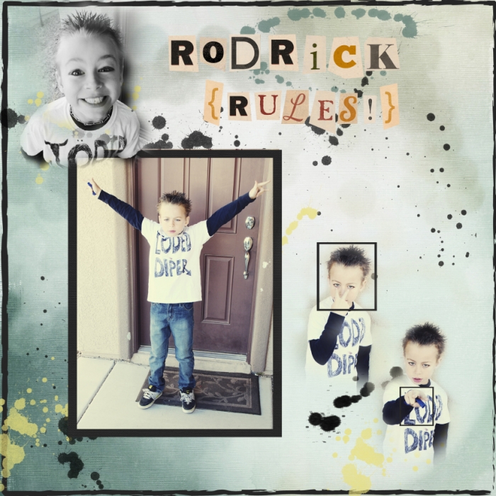
Summer Christiansen says, “For reading day at school my son dressed as Rodrick from the Diary of a Wimpy Kid books. I used a title that cues the viewer to the subject–my son dressed up as a character–and that evokes a feeling of a fun and crazy little man.”

