This lesson originally appeared in the Get It Scrapped Membership class Old Photos. Click here to get all the lessons on this topic with an all access pass.
by Doris Sander
When I first began scrapbooking, about ten years ago, scrapbooking heritage photos was done with shades of brown.
Any touches of color that were added were treated with a wash of walnut ink to give them a brown tint.
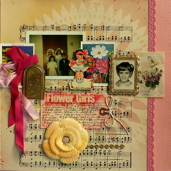
Layout by Doris Sander | Originally appeared in lesson by Doris Sander for Masterful Scrapbook Design Old Photos.
As I’ve grown to love both scrapbooking and telling the stories of my past, I have found that vintage photos are enhanced by color, just as with any modern-day photos, their stories are better told with color.
Try these three tips for working color into your scrapbook pages with old photos.
1. use a soft palette
While I no longer limit myself to browns, I do most often look to a soft color palette for my vintage photos.
I’ve found that these subtler hues, like the ones Briana Johnson used on “Take Me Back to Old Kentucky,” are easier to work with when using vintage photos as they don’t overpower the tinier focal points that result from small photos.
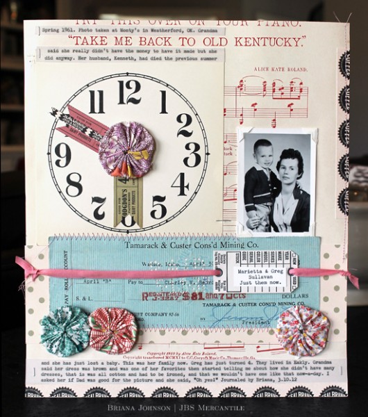
Layout by Brianna Johnson. Originally appeared in lesson by Doris Sander for Masterful Scrapbook Design Old Photos.
On “Before You Were Mom,” Jill Sprott uses the pinks, oranges, yellows, and aquas of a teenage girl to help tell her story. These colors add energy to the page, but are muted just enough to still let the photo of her mom in the 60’s really shine.
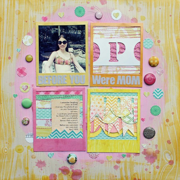
Layout by Jill Sprott | Originally appeared in lesson by Doris Sander for Masterful Scrapbook Design Old Photos.
2. create focus with added color
Vintage photos tend to have a soft focus and small subjects, so they do not make strong focal points on their own. Another useful trick then is to make color your focal point as I did on my layout “Dumbo.” The bold red title here extends directly from my brothers red t-shirt and effectively draws the eye immediately to the photo.
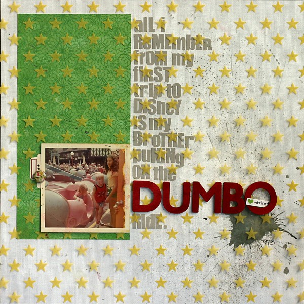
Layout by Doris Sander | Originally appeared in lesson by Doris Sander for Masterful Scrapbook Design Old Photos.
Dina Wakley made her tiny grade school photo take center stage by scrapbooking it with completely contrasting colors. The aqua and purple are not in evidence in her photo and thus make the photo much more obvious than it would be if the red and blue from the photo were used instead.
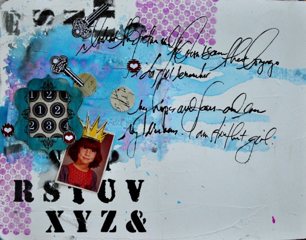
Layout by Dina Wakley. | Originally appeared in lesson by Doris Sander for Masterful Scrapbook Design Old Photos.
Betsy Sammarco used red in a similar way on “Chester Fair.” Here red is an unexpected addition to her softer color scheme. The eye is immediately drawn to this small splash of red. By effectively placing it under her first photo she pulls your attention there where it should be.
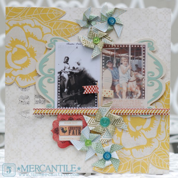
Layout by Betsy Sammarco | Originally appeared in lesson by Doris Sander for Masterful Scrapbook Design Old Photos.
3. add black
Leah Farquharson managed to get away with red and blue from the primary spectrum on “Keep This.” She was careful to use smaller concentrations of these bold colors, however, and she paired them with a striking black and white photo of her grandmother that could stand up to this stronger color treatment. Black paint strokes behind the photo cluster add to the vintage feeling.
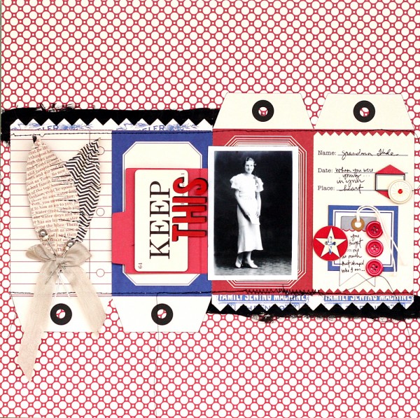
Layout by Leah Farquharson | Originally appeared in lesson by Doris Sander for Masterful Scrapbook Design Old Photos.
Color is a great way to help tell your story, so be sure to reach for it the next time you scrapbook your own vintage photos. Just remember to go lightly to not overpower them and use contrast to enhance your focal point.

