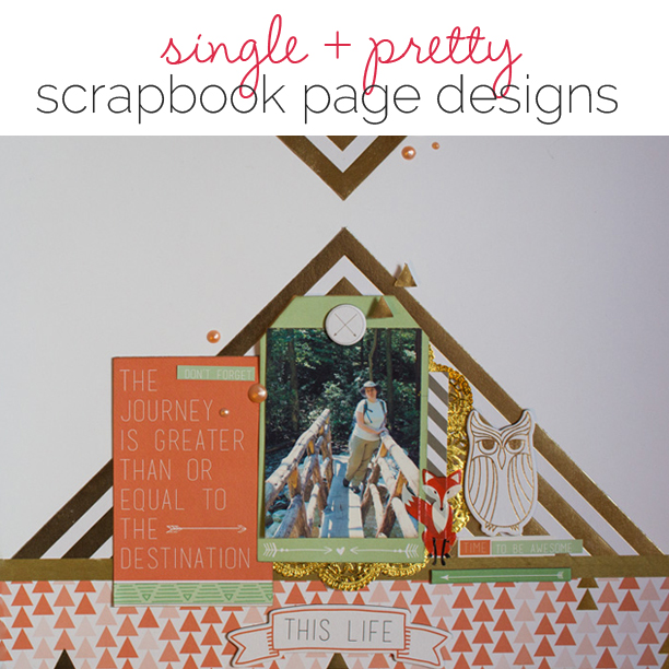
 Scrapbooker Ashley Calder says, “I scrapbook to recall and document moments, the little things that might normally be forgotten over time. Because it’s moments I want to remember, most often a single photo is enough to record that moment.”
“Single & Pretty” is the newest class in the Get It Scrapped membership, and it’s a focused study of one-photo scrapbook pages with rich design. Teachers are Ashley Calder, Lisa Dickinson, Kayleigh Wiles, Amy Kingsford, and Sian Fair.
Here, the Get It Scrapped team shows you their “single and pretty pages” and tells you why a single photo and rich design work for these scrapbook layouts.
[hr]
Amy Kingsford says, “My son loves tracking the deer at our local nature center and he’s gotten pretty good at sneaking up on them. This page captures a moment in which my son and one of the deer locked eyes.”
“I only had enough time to snap one photo with my phone, but it captured the moment beautifully. Then I piled on a variety of woodsy themed papers and embellishments in an effort to support my photo and to scatter meaningful details from my story throughout the layers of my page.”
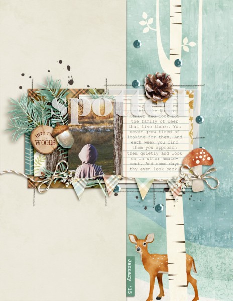
Spotted by Amy Kingsford | Supplies: Flergs: Woodland Winter; Sara Gleason: November Challenge Template.
[hr]
Sian Fair says, “When my children were little almost every afternoon at the same time I used to gather them onto my knee and read out loud from our big collection of books. I’d do it now if they’d let me!”
“I didn’t have any pictures of us reading (in the days before selfies!) so I found one photo that illustrated the story. That picture also gave me my title. I also used heavy embellishment in a retro style to show details I was missing in a photo. The photo tells one part of the story and the embellishments tell another.”

Same Time Tomorrow by Sian Fair | Supplies: Patterned paper, stickers, washi tape, button, lace and journaling card all by October Afternoon; chipboard: Cosmo Cricket; Alpha: Studio Calico
[hr]
Stefanie Semple says, “This page documents life at home right now, my kitchen counter, and my daughter’s art. I struggle a little with the mess, but want to celebrate my daughter’s creativity.”
“Working with just one photo allowed me to add lots of embellishments that represent the debris that my daughter both collects and spreads out while she works. If, instead, I’d included multiple photographs of her, her art and her working, that would tell a different type of story. Sometimes I need to remember that life was like this and will be different again in a few years once she has finished school and maybe left home. A single photo also leaves white space and room for detailed journaling.”
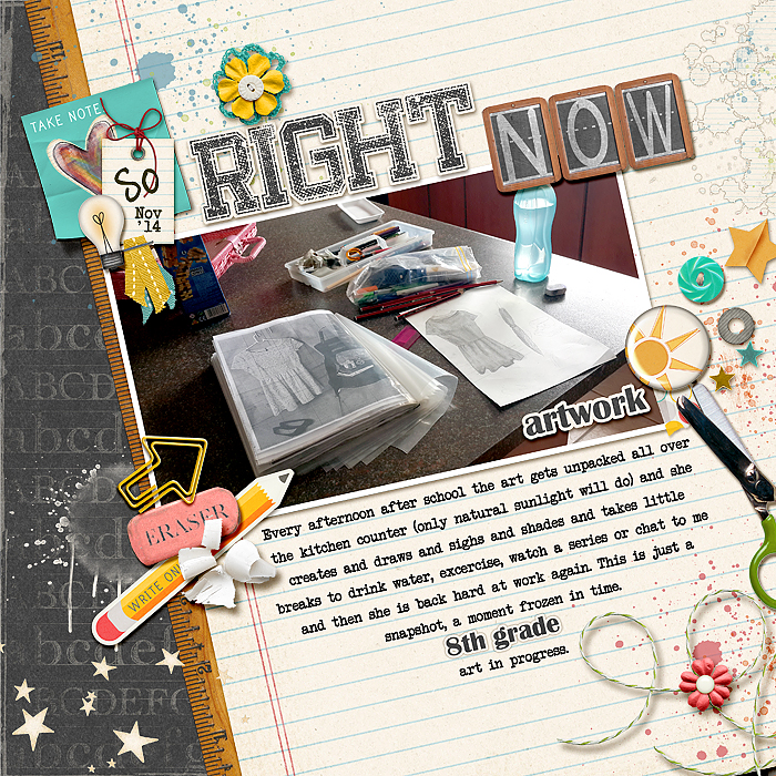
So Right Now by Stefanie Semple | Supplies: Kimeric Kreation’s School Daze (kit) ; Mommyish’s Scholastic Elements.
[hr]
Gretchen Henninger says, “This layout is about my love of exploring, especially hiking.”
“The single photo I chose has a strong central line, showing the trail I am heading down. I wanted to play on the motif of direction and used a lot of arrow-type embellishments to reinforce this theme. Balancing my photo is a journaling card with a fitting quote. I also used animal embellishments, which tie in with my love for the outdoors. ”
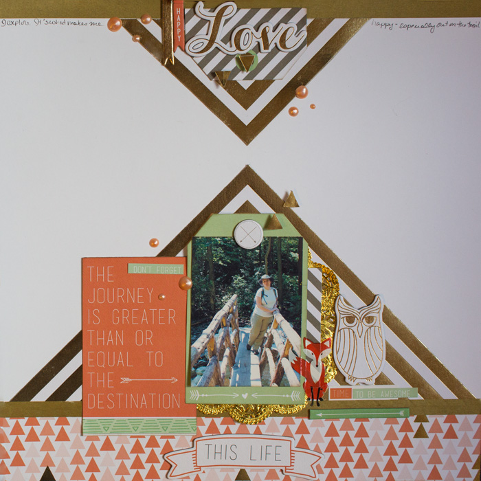
Love this Life by Gretchen Henninger l Supplies: Paper, Chipboard, Stickers, Rubon: Teresa Collins (9 & Co.); Enamel Dots: Viva Decor Pearl Pen; Ink: Tim Holtz Distress Ink (pumice stone); Washi: Little B
[hr]
Deborah Wagner says, “Lindsay is a senior this year, and she says shopping is her sport.”
“Since she is doing what she loves to do here, I wanted to make her shine. To accomplish that I used just 1 photo and enlarged it to fill the canvas. I extracted her from the background of the photo, and duplicated the extraction twice: the first layer is set to Normal Blend Mode, and the 2nd layer is set to Soft Light. I changed the background of the photo to Soft Light and blended it into the pink chevron paper using a Layer Mask and the Gradient Tool. She is definitely the star ‘athlete’ in this page.”
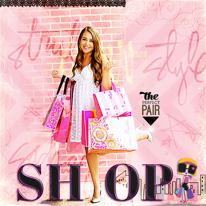
SHOP by Deborah Wagner|Supplies: – Pixels & Co -Kate & Co.; Karla Dudley – Bestie Collection; Katie Pertiet – Lucy Lou Collection, Away We Go Kit; Pattie Knox – Cityscapes TrimAnna Aspnes – Artist Edge Overlays No. 9, Magic Sparklers No. 7; Alison Pennington & Jen Barrette – Once Upon an Imagination; Mommyish Designs – Essential Styles
[hr]
Debbie Hodge says, “Good friends traveled to upstate NY and my mom’s farm with us in the fall. Early Sunday morning, Isaac and Lily toured the fields and buildings with another friend on facetime chat. Isaac was showing Lily things and they were both showing Anna the place. This shot captures them from a distance to get a sense of the place (and my mom’s new barn quilt on the old garage.)”
“I made this page after editing the Single and Pretty eBook for Get It Scrapped members. While I’m typically a multi-photo scrapbooker, I wanted to put suggestions from a couple of the teachers to work and here’s what I took from them.”
Making this page took me out of my comfort zone. I kept wanting to return to a blocky design with a second photo. I turned again and again to the teachers’ pages here in order to do something new designwise. I began with my photo, its edits and crop and placement.
- Amy and Sian use photo treatments to create a mood. I used a golden filter on this fall photo. I also vignetted it as Lisa did with her pool photo.
- Sian places her photo and then builds out from it with embellishments. I’ve done that, continually resisting the urge to put a block foundation beneath. Instead I added the circular piece, and that’s when the design started working.
- Amy likes to use patterned papers to extend the scene in the photo out to the canvas, and I’ve done that with two pieces that create a horizon: the clouds above and the green (like grass below). The papers are matched up to the photo’s horizon.
- While I refrained from using a second photo, I did use an image–from patterned paper–of a boy and girl in a fall scene. The leaves also speak to the fall setting.
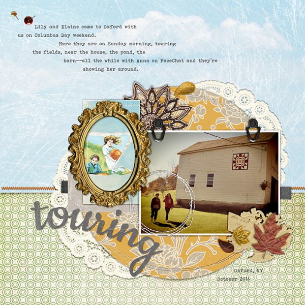
Touring by Debbie Hodge | Supplies: Stapled Sequins by Kim Jensen; Hayrides & Fun by Allison Pennington; Autumn Frost, Autumn Moon by Sahlin Studio; Cloudscapes 2 by Katie Pertiet; Petite Patterns, Totally Trashed Fall by Lynn Grieveson; TaDah by Pink Reptile Designs; Layered Tissue, Stitched Circles, Stitched Orange by Anna Aspnes; Pacifico, Bohemian Typewriter fonts

