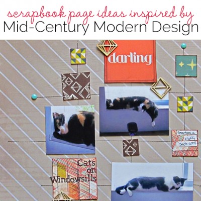
 When you want new scrapbooking ideas, home decor is a great source. Recently, mid-century modern styling has made a comeback. From Houzz.com: “Just as the name implies, it spanned a period of roughly two and a half decades in the middle of the 20th century, from the mid-1940s to 1970. Its uncomplicated, fresh aesthetic arose from a desire to propel postwar America into the modern era and recast design through a bold new lens.”
Are you ready to get mid-century modern’s influence onto your pages? Aspects include: clean and simple lines, natural hues, wood details, graphic patterns, and bridging of the indoor and outdoor.
See how the Get It Scrapped Creative Team put mid-century modern looks to work on their scrapbook layouts.
[hr]
Susanne Brauer says, “Whether or not we go onto college, we all remember our high school years. On this layout I paired my high-school senior picture with just a few of the things I remember about those times.”
“I embraced the graphic modern nature of this mid-century modern style – picking up on its use of iconic shapes, such as the bursts on the tag, as well as iconic patterns, like the TV test pattern paper. For color, I mixed muted shades with contrasting black and a touch of bright colors: while my high school days are long past and perhaps muted by time, my happy memories of them remain bright.”
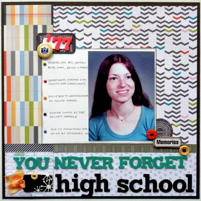
You Never Forget High School by Susanne Brauer | Supplies: Paper: Studio Calico; Alphabets, American Crafts; Flair, Scrapbook Customs; Brads, Stampin Up; Buttons, SEI; Diecuts, Studio Calico.
[hr]
Katie Scott says, “I took these photos of my son when he was 6 and it was easy to make him laugh.”
“Mid-century modern style is optimistic, happy, and full of ideas: just like my son when he was six years old. I used the geometric starburst design because it made me think of a creative and happy brain. I placed the starbursts as though they were bubbling up from his head.”
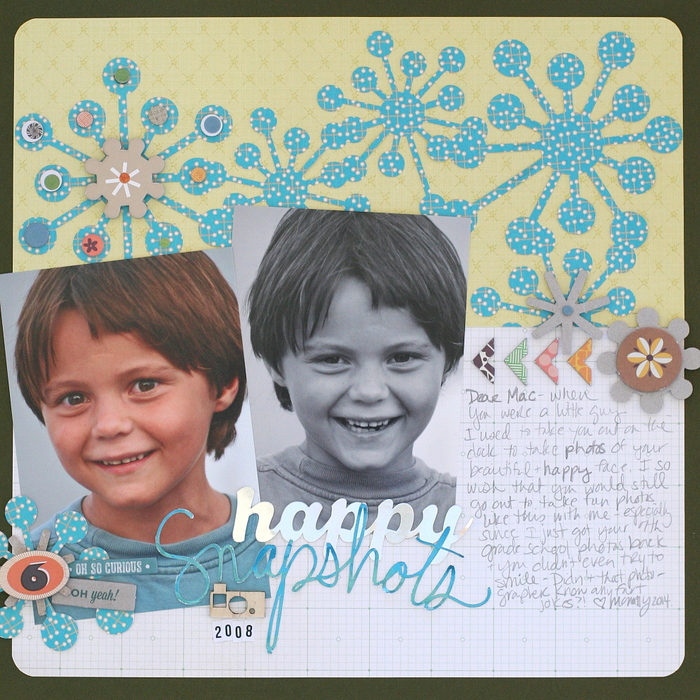
Happy Snapshots by Katie Scott | Supplies: Patterned paper by Studio Calico and Cosmo Cricket; cardstock; chipboard embellishments by Cosmo Cricket; wood veneer camera by Studio Calico; Silhouette Cameo; Retro Pattern Background cut file by Sophie Gallo; Snapshots cut file by Lori Whitlock; Happy cut file by Amy Tan.
[hr]
Carrie Arick says, “This page is really about how much I enjoy being aunt.”
I’ve used strong, simple lines and geometric patterns paired with complex lines and soft, organic feeling patterns and embellishments. The textures of the pairing have strong contrast. The trick for achieving the mid-century modern look overall was contrasting the scale: the clean lines, smooth texture and geometric patterns dominate the composition, while the softer, textured and complex elements of the page play a small supporting role.”
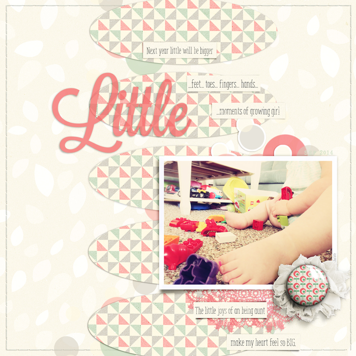
Little by Carrie Arick | Supplies: Anthologie- Vintage Lovers by Just the Two of Us Designs; Flair Builder by Mommyish; May Storyteller Layer Styles by Just Jaimee; Fonts: ENYO Serif Light Light; Lavanderia Sturdy
[hr]
Christy Strickler says, “I snapped several photos of my cats napping on windowsills.”
“My layout composition was inspired by the geometric designs I noted in mid century modern art.The canvas has a wood grain print inspired by nature. I chose bold geometric patterns with a bright pop of color. I chose to keep the embellishments minimal to replicate the simple feel of the mid-century modern style.”
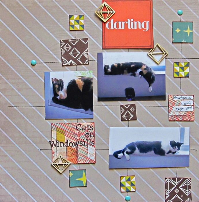
Cats on Windowsills by Christy Strickler |Supplies Patterned Paper, Wood Veneer: Studio Calico; Letters: Basic Grey; Enamel Dots: Twine and Ink
[hr]
Devra Hunt says, “We had a rough summer and decided we had a reason to appreciate as well as celebrate my husband’s birthday.”
“I combined the ideas of clean lines, graphic patters and bridging the outdoors in this layout. The design of the page is simple with straight edges. I used graphic patterned papers in colors inspired by both wallpaper and artwork. The woodgrain background paper, and burlap give the page texture as well as an outdoor feeling. The embellishments are neutral, but continue the theme in both outdoor feeling and their graphic nature.”

Birthday Celebration by Devra Hunt | Supplies: PP-Echo Park, Basic Grey, Reminisce, wood pieces & sequins-Studio Calico, enamel dots-Queen & Co, burlap-Craft Decor, Cork-Freckled Fawn, Ink-Colorbox, pen-EK Success, journal tag-Paper Issues
[hr]
Deborah Wagner says, “These photos are from a photo shoot with some friends’ daughters. I love the warm and earthy colors, especially the natural woods, paired with a few strokes of rich saturated color that is predominant in the style of mid-century modern. The sensuous curves and whimsical motifs also inspired me, and provided a strong graphic punch to my page.”
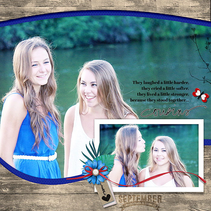
Cousins by Deborah Wagner|Supplies: Jana Morton – JM Designs No. 14, Love Notes, Millie’s Cottage; Ali Edwards – Family Words, Studio Emeto Designs – Discovering Love; Katie Pertiet – Burlap Elements No. 1, Elastic Strung Tags No. 1; Anna Aspnes – ArtPlay Palette Beach; Kristin Cornin-Barrow – Adjust Your Sails; Mommyish Designs – Free September Stamp
.

