This lesson originally appeared in the Get It Scrapped Membership class Make it Mean. Click here to get all the lessons on this topic with an all access pass.
Scrapbooking events can be a challenge–but family and friends love seeing the photos from special events in scrapbook page albums.
When I look back at all of the layouts I’ve created, my favorites are ones are events scrapbook pages — those with photos of family outings, holidays, and vacations.
Though layouts with one or two everyday photos may be more fun to create, event layouts are my favorites to look back on. And I’ll argue that with all the project life products now available, event layouts have become more fun to make.
Event layouts are important because they show the big picture of your life without going into teeny detail. They allow people to get a glimpse of your traditions. They record traditions for future generations who can connect to you through the shared traditions and the details that help them continue these celebrations.
Now that we’ve established how important Event-themed layouts are, what can you do to make them even more meaningful? Lots of things!
1. use non-themed product on events scrapbook pages
Doing something unexpected, using a kit with a theme that has no apparent relation to your themed page, can add the perfect element of surprise.
On this page about my mother-in-law’s 70th Birthday Gift, I used a non-birthday themed kit to tell the story of the present we gave her. It’s a birthday layout, but with a fresh twist.
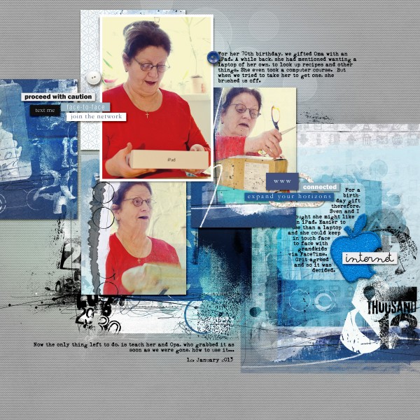
iPad by Amber Ries | Supplies: Anna Aspnes: 2013 WordART; SocialNetwork No. 1; CoolGlows 2; LabeledWords SocialNetwork; Artplay Palette SocialNetwork; 4×6 ArtsyKardz Social Network; ArtsyKardz Social Network; Fonts: Heather Joyce: The Bold Beauty
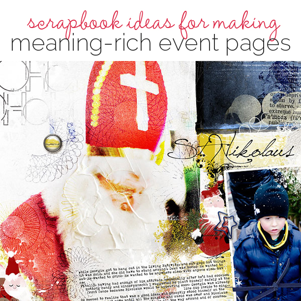
On St. Nikolaus, I used a boy-themed kit for papers and brushes and topped things off with embellishments from a Christmas themed kit.
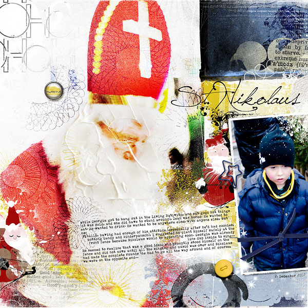
St. Nikolaus by Amber Ries | Supplies: Anna Aspnes: Artplay Palette Twizzle; Artplay Palette Santa Nicholas; ArtPlay Palette Santa Nicholas Add-on No. 1; Santa Christmas No. 01; 12×12 ScriptTease Winter Overlays; White Paint; Multimedia Santa Claus; Fotoglows Snow; Crocheted Snow 2; Fonts: Heather Joyce: The Dry Ribbon
2. get a new perspective on the events you’re scrapbooking
use different eyes. If you are always the photographer, turn the camera over to someone else or supply an additional camera for the event. The result will be a record of events told through the eyes of someone new, someone who does not normally tell the stories on your pages.
This fall, we went to the zoo. My son was armed with my iTouch and took almost 100 photos before the battery gave out. Some of the photos were terrible, and some of them were enlightening. Creating a layout of our trip with his photos tells a different story than a layout using my photos or those of his sister. It’s a look inside his head, a record of what he thought important and meaningful.
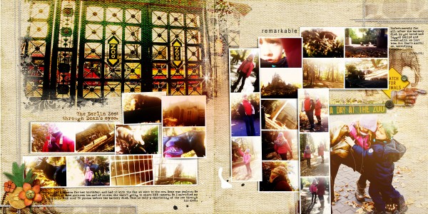
The Berlin Zoo: Through Dean’s Eyes by Amber Ries | Supplies: Anna Aspnes: Foto Wallet Album Template F; Michelle Godin & Paula Kesselring: Wild Thing Collab; Fonts: Heather Joyce: The Dirty Dame
use a different voice. In albums full of layouts depicting photos you have taken, and stories YOU have told, let someone else tell the story. Have them write down their memories, tell you their memories so YOU can write them down, or give them the layout and have them write directly on it (then you’ll even have their handwriting).
Debbie’s “Joshua Reviews Broadway Spring Break” has photos from a day on Broadway. She asked the one person who didn’t adore the day–her oldest son–to write the journaling for this. “Write it as if you were keeping this scrapbook,” she said.
His desire to be funny, his cultural influences, and his voice come through in the journaling. He’s trying to be provocative, and, what’s more, it’s clear he’s no longer the little boy happy to go on vacation — he’s 17 and getting ready to choose his own entertainments.
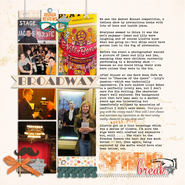
Josh Reviews Broadway by Debbie Hodge | Supplies: Rise and Shine by One Little Bird; Wesley, Photo Booth by Ardent Sparrow; Retro Mod, Innovation by Sahlin Studio; Messy Stamped ALpha by Just Jaimee; Word Label Templates, Spiced Jewel Elements by AnnaAspnes; Banners by Amy Martin; Rise and Shine by One Little Bird; Rhinestone Stars by Jenni Bowlin; Broadway, Bohemian Typewriter, Mercury Script fonts
3. work in pop culture and current events references on your events scrapbook pages
Event-themed layouts need to be dated. They are events that occur at a certain time and place. Weaving in references to current events and/or pop culture dates the layout in a fresh and interesting way and adds another layer of meaning.
To make the Easter theme immediately recognizable despite the non-Eastery photos, I used themed elements and papers.
The reference to ‘Tommy Thumb,’ which is the British version of ‘Where is Thumbkin’ gives the layout a reference to modern culture, and records that this was an English Preschool group–not an American or German group.
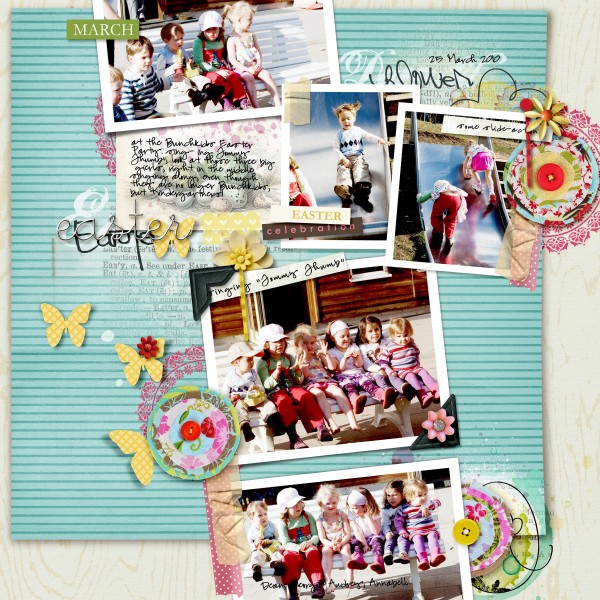
Easter by Amber Ries | Supplies: Sahlin Studio: kitsch papers ; fabric scrap stitched flowers ; washi tape 2 ; sunshine & daffodils; Sunshine & Daffodils (elements) ; Snipettes: Easter ; Snipettes: Springtime; Modern Words: Springtime; Vintage Vogue (bundle) ; colorful bobby pins: sorbet ; Anna Aspnes: Easter WordTransfers; Kitty Designs: Life Tale Sketches 3; Fonts: Pea Melody Shay
4. incorporate relevant motifs and colors to set the stage on your events pages
Using colors and motifs having to do with the theme of your layout immediately deepens meaning and deepens the draw of the reader into your story.
On this St. Patrick’s Day layout, I included themed colors and motifs (green and shamrocks) to support the page’s meaning. The reader’s eyes are caught and held by the POPS of green, in the photos, as well as the themed motifs and papers, all of which let you know what the layout is about before reading the journaling.
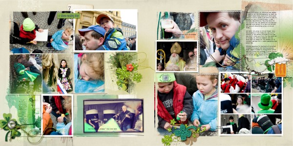
St Patrick’s Day Parade by Amber Ries | Supplies: Anna Aspnes:ArtPlayPalette Savor; StainedGlows 1; FotoInspired Frames No.2 ; FotoInspired Double Templates 3; FotoInspired Frames No.2 ; ArtPlay Lucky FotoInspired Frames No.2 ; Pattie Knox: ShimmerMeTidbits Shamrocks; kaye winiecki: shamrocking; pink reptile designs: lucky in love; Fonts: Heather Joyce: The Wood
5. include facts about the places and celebrations you’re recording
In addition to your own memories of an event, include actual facts about the event, or the place. This works especially well with vacation destinations, zoos, or other outings. Facts can easily be found on the website of the place in question, or even taken from travel books or informational pamphlets acquired on the trip.
I included facts from the Avenue of the Giants website to fill in holes where my memory failed on the details of this destination. In addition to giving the reader more information, this helped make the layout even more meaningful, and real.
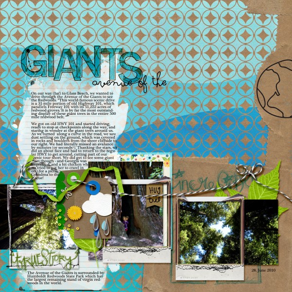
Avenue of the Giants by Amber Ries | Supplies: Amy Wolff: Baggy Papers; Offset Alpha; Valorie Wibbens: Project Care; Karah Fredericks: Good Day Sunshine; CD Muckosky: Lookie Here; Jacque Larsen: Hello Sunshine; Amy Martin: Messy Stitched Polaroids | Betwined Baker’s Twine; Anna Aspnes: Journal Transfers No. 1; Fonts: Plantagenet Cherokee; Soymilk
6. throw your reader/viewer off-kilter with an unexpected design approach to events pages
Because event layouts often have a lot of photos, they tend to be linear and predictable. Here are two ways to mix up the design and surprise your viewers:
Create a completely non-linear, artsy layout. Layer things in unexpected ways. Enlarge photos. Tilt and blend. Make the reader search for photos, elements, quotes, and other surprises.
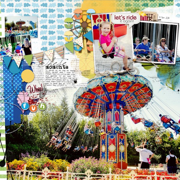
Whee! By Amber Ries | Supplies: Pattie Knox: Amuse Me Kit; Brandon’s Dragon; Classified Clippings 2; In The Swim; Over The Rainbow; Shimmer Me Tidbits; String-a-Lings; Sunshine Summertime; Anna Aspnes: ArtsyLayered Template No. 41 | Textured Frames No. 1; Fonts: Heather Joyce: The Short Caps
Add unexpected elements within a linear layout. Create an “out-of-bounds” photo, mix up your photos and journaling cards, add blend modes, include at least one enlarged photo.
There is nothing linear or expected about “Whee!,” an event themed layout about a visit to an amusement park. None of the (five!) photos are linear, the patterned papers have no obvious angles and the layering over the 3D elements is unexpected and surprising. The tilt-a-Whirl feel of the layout matches the photos and the fun of the event.
“Happy Visit” was created in an artsy Project Life Style, so from the very beginning, it veers toward the unexpected, using blending modes for some of the photos, frames for others, and nothing perfectly packaged. The typical PL-Style Journaling Cards are clipped to Layer Masks and become design elements much as a patterned paper, there is an out of bounds photo, and unexpected layering.
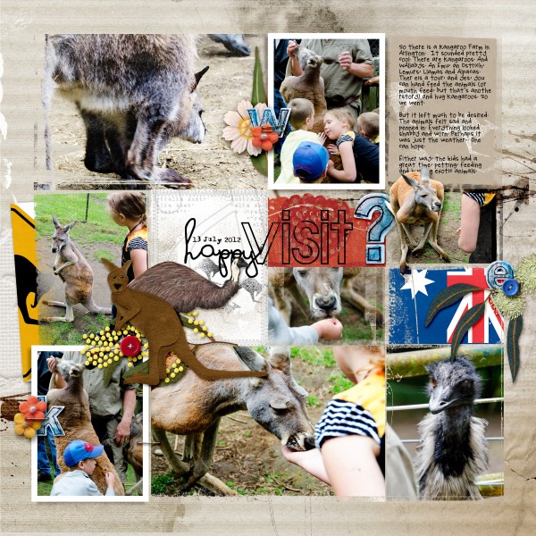
A Happy Visit ? by Amber Ries | Supplies: Kaye Winiecki: blue illusion; downunder bundle; downunder cards ; Anna Aspnes: FotoInspired Album Part 2; ArtPlayPalette Wild; Fonts: Heather Joyce: The Hillary & The Lost Reports
7. Mix it up: don’t stop with just one of those approaches!
Don’t stop at just one method of making a layout meaningful, feel free to combine two, three or all within one layout.
The following methods were used in Feldkircher Montfortspektakel:
- Cultural References: Shakespeare, & clichés (Knight in shining armor)
- Motifs: Brushes of knights on horses, swords & castle walls
- Facts: Information on the yearly festival as taken from their website
- Unexpected Design Elements: Out of Bounds photos, tilted photos, blending
- New Perspective: (some) Photos taken by someone other than myself or my husband!
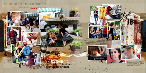
Happy Times at Feldkircher Montfortspektakel by Amber Ries | Supplies: Anna Aspnes: Artplay Palette Heraldry; FotoBlendz Album Template No. 5N; Heraldry WordART No. 1; Heraldry No. 1; WarmGlows No. 04; Fonts: Plantagenet Cherokee; Mom’s Typewriter
Employ any number of these methods to lend extra meaning to your event-themed layouts and remember, no matter which method you use, make sure you enjoy the process, because your enjoyment will show through in the final layout and that is where the true meaning lies.

