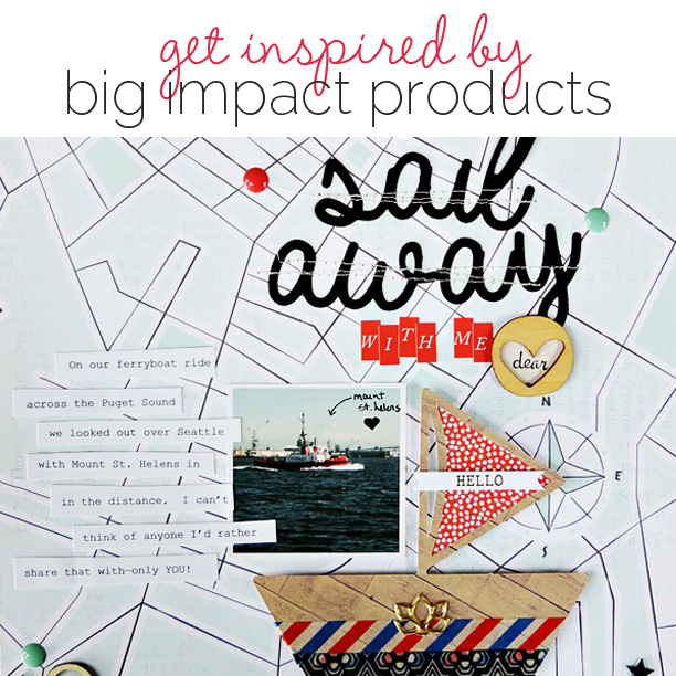
 What do you do with those big stand-out scrapbooking products that you can’t resist in the store or that come with a kit? We’re talking that big applique of a bug, the oversized veneer frame, or the bejeweled and dimensional flower–items that draw your eye on their own but then present design and visual storytelling challenges when it comes time to use them on a scrapbook page. Our creative team shows you their pages built around stand-out scrapbooking elements.
[hr]
Christy Strickler used a big 12″ square wood veneer mat of welded hearts as the foundation for a page about how her cat likes to hang out on her son’s desk while he does his schoolwork.
Christy says, “The most obvious use for this mat was to include it as a layered element. I felt like the heart pattern would get lost in the layers, though, so my first step was to find patterned paper that contrasted well with the wood veneer and that would show through the openings nicely. My next step was to pull the wood veneer into the top layers. I started with a large wood circle then layered wood pieces in a variety of sizes through the layout.”

K and Boo by Christy Strickler |Supplies Patterned Paper: Studio Calico; Letters: American Crafts; Die Cuts, Flair, Acrylic,Stickers: Basic Grey; Wood Veneer: Crate Paper, Studio Calico, Basic Grey; Stickers: Crate Paper; Enamel Dots: Twine and Ink; Other: Sequins
[hr]
Ronnie Crowley scrapbooked her daughter’s high school graduation with a full-page digital shadow box.
She says, “I’ve seen paper scrapbookers use shadowboxes to create great memory items for their home decor. I have even been tempted to purchase one and dust off my paper supplies, so when I saw this digital shadowbox frame I decided I had to try my hand at recreating the look digitally.”
“The hardest part was to create the depth of shadows and layering interest that can be created in paper with pop dots. The “strut-your-stuff” card included in the lower right compartyment was one-dimensional. To add dimension, I added another peacock on top and re-sized to match the one of the card. I then added a deep shadow to make it look like I had used deep pop dots.”
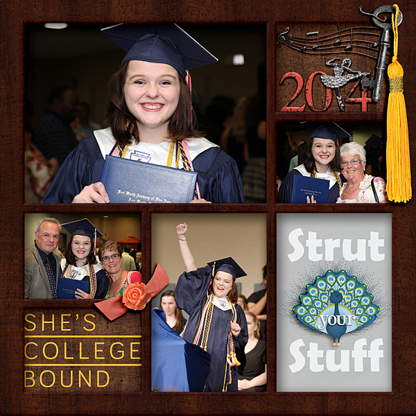
Graduation by Ronnie Crowley | Supplies: Anna Aspnes – Dance Sampler 1; Cathy Zielske- BTGrad; Flergs- HelterSkelter; LaurieAnnHGD – Todays Story; MegsC- Open Wide; Chelle’s Creations – Grad; Creashens – EggShell Alpha; H Roselli – Strut your stuff; Kristin Cronin Barrow – Shadow Boxes; One Story Down – Inspire Your Heart
WM Squared Designs- School Days – graduation
[hr]
Rosann Santos-Elliott used a wood veneer frame on her page about a fun summer spot — her local park opened a sprinkler area called the splash pad in an area that’s an outdoor ice skating rink in the winter.
She says, “I wanted to highlight the photo, and I’d received a wood veneer frame in a kit club packages. The geometric patterned paper here along with the frame were so visually strong, I used minimal additional product. I colored it with blue paint for highlights and to connect to the patterned paper’s blues.”

Summer Bklyn Style by Rosann Santos-Elliott | Supplies: Studio Calico: Venn diagram patterned paper; Simple Stories: Good Day Sunshine Stickers; Color Theory acrylic paint in Something Blue; Wood Veneer.
[hr]
Summer Christiansen used an oversized graphic sun brush on a page about how her husband is her sunshine and makes her happy.
She says, “I usually prefer subtle, lower-impact elements but I used this big, thick sun because i loved its colors. I made it work by using an Anna Aspnes’ template that had a clipping mask that grunged the edges around the sun. I also changed the opacity and added a sketched sun from a different kit on top of it. I tucked them both under my pictures and title to soften the look, but kept the size large so the viewer could enjoy the colors and sketchiness of it.”
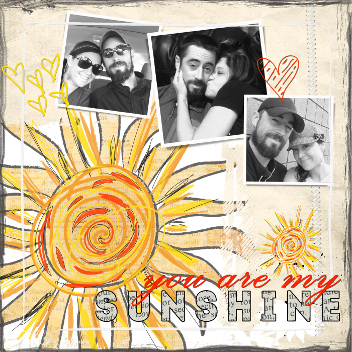
You Are My Sunshine by Summer Christiansen | Supplies: SuLu Digital Designs: Heart You Forever Brushes, Grundged Edges, & Sweet Sunshine Elements; The Thinking Creative: Gratitude; Heather Ann Designs: Americana Kit; Anna Aspnes: Holiday Template Pack 1C .
[hr]
Karen Poirier-Brode says, “I had this standout Hello Sunshine element from a recent Freckled Fawn kit. I liked it because the song I’ve been singing, since I was just a wee bit older than my grandson is You Are My Sunshine. This page is about this photo of my grandson, Donovan, taken by my son, Chris, and the story his mother, Laurel, told me about the photo. Donovan loves books and loves video screens. He also likes to relate what he learns to the real world. He was deliriously happy to come across this herd of goats on a recent outing with his folks. He had just read a book about goats and knows what the goat says from the app I hear Ewe.”
“I colored the veneer with a Distress Marker and found sunburst paper to work with it. I found placing it in the center of the page and above my photo and using it as my title works to bring you in, with the bright yellow, then lets your eyes wander around the page because of the rays, the repetition of the radial and parallel lines from the veneer (tall skinny fonts make me think parallel lines), in the papers, photos and embellishments unify the page.”
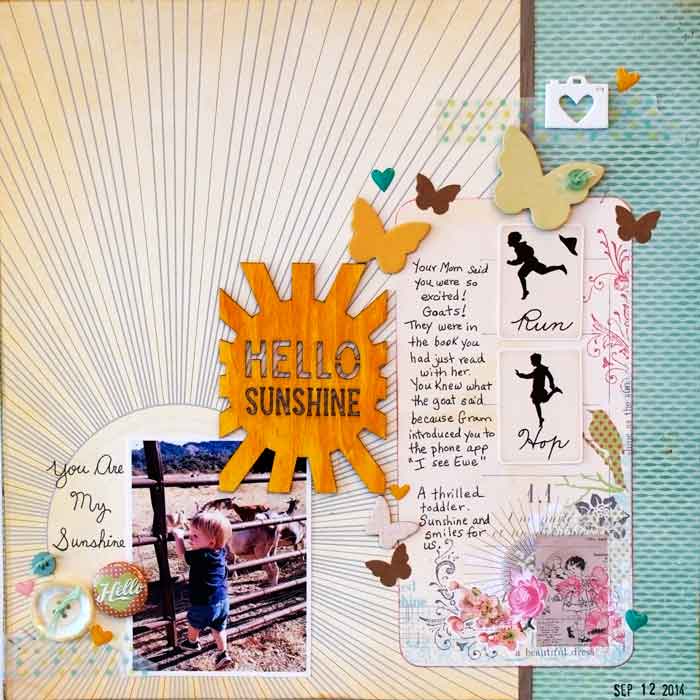
Hello Sunshine by Karen Poirier-Brode | Supplies: Studio Calico – chip shapes butterflies, crate paper woodgrain paper, Sassafras – sunburst paper, Pink Paisley – collage card, Freckled Fawn July 2014 kit – large wood veneer, resin camera, washi tape, enamel hearts, JBS -Vintage MiniDeck Silhouettes digi, Tim Holtz -Idea-ology Tiny Attacher staples, Distress Marker, stash – paper, butterfly stickers, buttons, floss, flair, subtitle inspired by font 5th Grade Cursive
[hr]
Carrie Arick was fascinated by the uncommon motif of pineapples in the digital kit she used here and used it to scrapbook a selfie taken on her 38th birthday after treating herself to a haircut.
She says, “I didn’t know exactly what to do with a pineapple-themed kit, so I researched the meaning of pineapples. I learned ship captains would stake a pineapple outside their home to let people know they were ashore and receiving guests thus making pineapples the symbol of hospitality. That meaning parallels the journey I’m currently on–of welcoming new adventures–which gave me a direction for my page. I enlarged the pineapple brush in the kit and clipped a paper to it to drive home the dominant theme of my 38th year.”
[hr]
Amy Kingsford use a large sailboat diecut by Amanda Robinson Studio to scrapbook sharing a first ferry boat ride with her husband. She says, “We had just missed the prior ferry so we had front row seats on this ride!”
“I loved this sailboat die cut by Amanda Robinson Studio the minute I saw it and even though I’d never been sailing in my life I was really inspired to use it. So I started to search my photo backlog and found this photo from my honeymoon taken from the ferry with Mt. St. Helen’s in the background.”
“I do realize there is a vast difference between a sailboat and a ferry boat but I decided to use it here anyway. I nestled my small photo inside of the die cut’s frame and embellished it with colors and textures that would make it appear more at home on my page. In the end, I liked the idea of using the sailboat because our view and the fact that we were sharing this experience with each other for the first time made the ride feel more cozy and intimate–more like that of a private sailboat ride.”
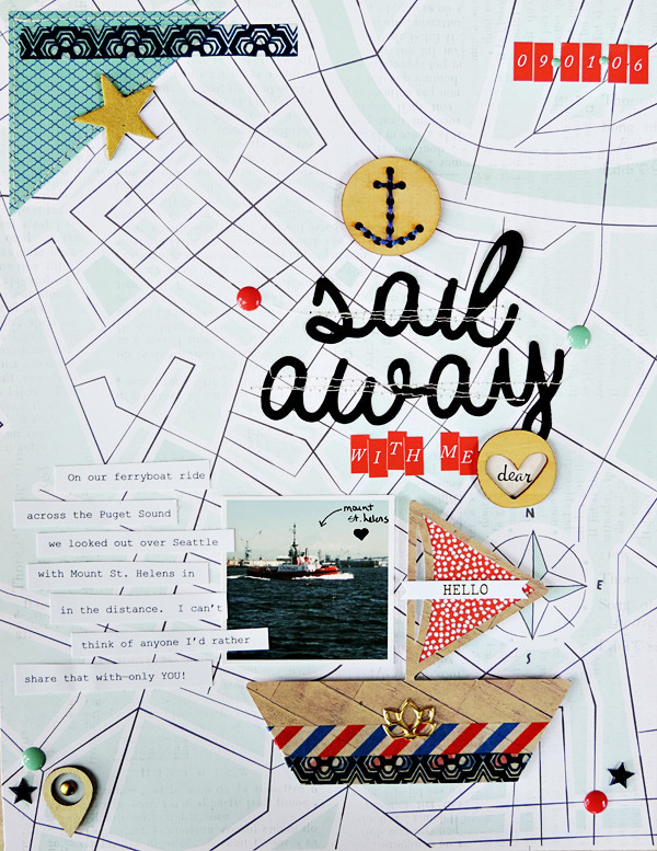
Sail Away With Me Dear by Amy Kingsford | Supplies: Studio Calico: patterned paper, banners, wood veneer, enamel dots, alpha stickers; Webster’s Pages: 6 x 6 Recorded Pad; Recollections: Washi Tape; Amanda Robinson Studio: Sail Away Die Cut Set


