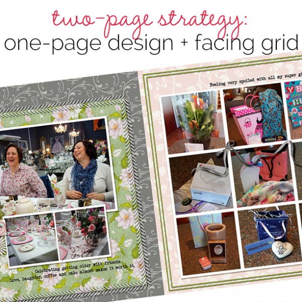
 When your story is best told with lots of photos, you need to make a two-page scrapbook layout. Consider mixing a grid design on one half of the page with a design you typically use your for your one-pagers on the facing page to tell your story efficiently.
[hr]
Marcia Fortunato says, “This layout is about the new lake home in Minnesota that we bought this past spring. I featured a full-on photo of the house and a picture of the lake, which played a huge role in choosing this home, on the left side of the two-page layout. On the right side I made a grid of photos taken the day we finalized the purchase, as we celebrated by having our entire family for dinner.”
“I united the two pages by using the same base of kraft cardstock on both sides. I began with the Minnesota patterned paper that I’ve had for several years. I had only one piece of this paper, so before mounting it on the kraft, I trimmed about a half inch off one edge. I flipped this strip over to the back side, which had navy words on light blue, then placed that along the right side of the grid to pull the blues to that side. I kept the strip of kraft along the top of both pages to lead the viewer’s eye all the way across.”
“The photos themselves work to unify the two pages, since there are photos of the house and the lake on both sides. I used embellishments to reinforce the connection by adding silver elements and arrows on both sides.”
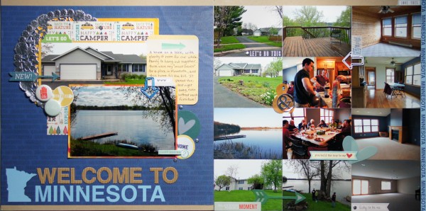
Welcome To Minnesota by Marcia Fortunato | Supplies: Cardstock: American Crafts, Royal Langnickel (watercolor paper); Patterned Paper: Reminisce; Journal card: Project Life; Letter stickers: Recollections; Embellishments: Studio Calico, Jillibean Soup, October Afternoon, Life Love Paper, My Mind’s Eye, Lawn Fawn, Mark Richards; Pen: Marvy (Le Pen); Watercolors: Prang.
[hr]
Stefanie Semple says, “This layout celebrates my recent 48th birthday party. I chose my favorite candid photo of us laughing as the focal photo, with supporting photos of the venue details on the left, while the right page features some of my gifts.”
“I used color to unite the two sides of my layout. Instead of my default of using the same background paper for both, I chose a brighter floral on a grey back ground for the left, picking the pink as a back ground paper for the right. While both sides use stitching, the green stitching on the right picks up the green paper on the left. The grey bow from the right draws the eye back to the grey background paper on the left.”
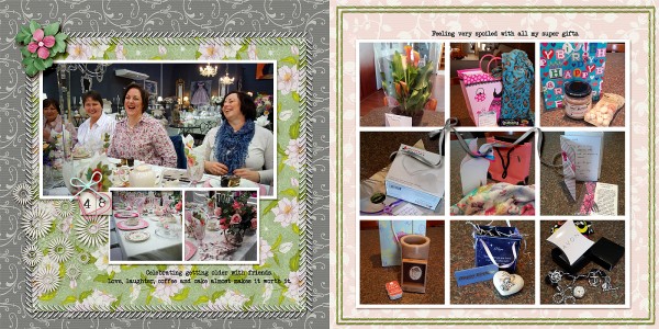
48 by Stefanie Semple. | Supplies: MScraps collab: Pretty Pastels (kit); Mommyish: One Fine Day…To Love (mini kit); Libby Wiefenbach: Border Basics – Squares (stitching)
[hr]
Terry Billman says, “This layout is about Brenna’s love for edamame and her refusal to share it with anyone. ”
“I used the large photo on the left as the focal photo because it shows her excited expression and her plate full of edamame. I grouped a couple of close up shots, embellisments and the journaling around the focal photo. The grid of photos on the right are a series of shots of Brenna attempting to use chopsticks and a photo of the sushi buffet. The two pages are united by using paint colors on the left that match the solid background on right. Also, to minimize the background colors of the photos on the right, I converted the photos of Brenna to black and white and used selective coloring to highlight her, her purple shirt, and the edamame.”
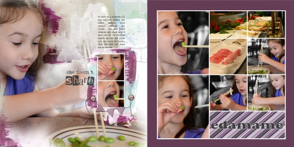
She Doesn’t Share Edamame created by Terry Billman| Anna Aspnes: Art Play Palette Radiant, 12 x 12 MultiFoto Frames 1; MMartin: Just Linens No. 1; Katie Pertiet: Black, White, and Plum, Classic Curled Photo Frames No. 1
[hr]
Devra Hunt says, “It’s time to sing Happy Birthday before cutting and eating the cake and I’ve captured all that here.”
“I featured the photo of my son with his cousins on the left. I grouped the individual photos of him with his cake on the right. The two sides are united by the background strips of paper and stitching that span the entire layout.”
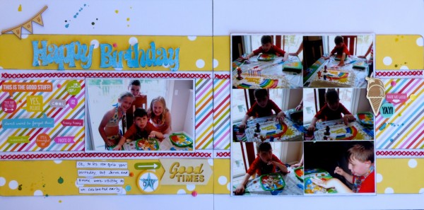
Happy Birthday by Devra Hunt | Supplies: CS-American Crafts, PP-Bella Blvd, stickers-Bella Blvd, Simple Stories, Wood Chips-Freckled Dawn, Basic Grey, American Crafts, Sequins & Mist-Studio Calico, Enamel Dots-My Minds Eye, Die Cut by Brenshevia Baker, Sew Easy by WRMK, Thread-DMC, Ink-Colorbox, Pen & Adhesive-EK Success, Sketch by Scrapbook Generation
[hr]
Jennifer Kellogg says, “I’m feeling nostalgic because my daughter is going off to college and I wanted to capture a layout of her smiles.”
“I happened to snap the primary photo the other day. Although it may not be the best photography, I feel in love with it and Sam’s smile. It inspired me to create a collage of smiles through the years. I used the same template for both pages, customizing it for the primary photo. I created continuity by using the same colored background paper and same cover paper strip that runs across both pages. One of the elements in the kit was a paint splatter. I used it and it’s mirror image on both pages. It gives the entire layout a frame.”
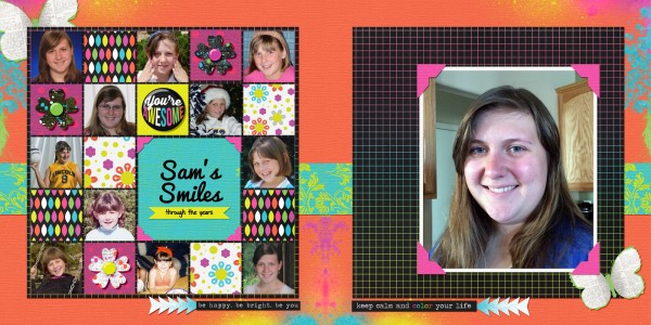
Sam’s Smiles by Jennifer Kellogg | Supplies: Scotty Girl Design: Layered Template 01; Traci Reed & Juliana Kneipp: A Future So Bright Kit.
[hr]
Vicki Hibbins says, “This is a layout about our trip to the zoo.”
“I often do double page spreads that have a grid on one side so that I can include lots of photos that help tell the story. The first page has two photos that sum up the whole day – Briony feeding the animals and family together – and the grid has the supporting photos. I also chose a single page template that had rectangles and a ‘blocky’ feel so that the two pages would marry together. I kept the pages clean and simple so that it would not become too busy.”
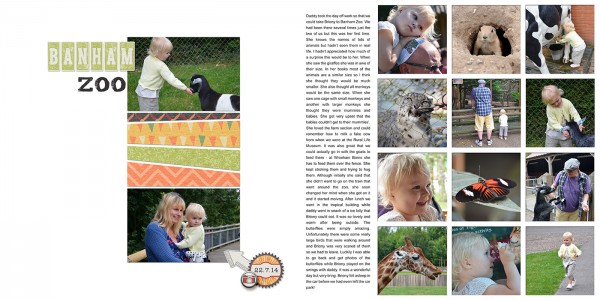
Banham Zoo by Vicki Hibbins| Supplies: Kimeric: Picture Perfect; Shannon McNab: Paper Stacks template
[hr]
Sue Althouse says, “This page is about our youngest nephew’s high school graduation party.”
“The two portrait-style photos of him serve as the focal point, supported by a grid of candid shots from the party on the opposite page. I united the two sides of the layout by running strips of patterned paper along the top and bottom border of both pages, and repeating embellishments on both pages. (flair, enamel triangles, wood flags).”
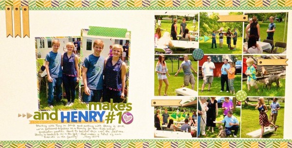
And Henry Makes 10 by Sue Althouse | Supplies: Cardstock: Bazzill; Patterned Paper, Letters, Wood Flags: Jillibean Soup; Alphabets, Black Pen: American Crafts; Flair: A Flair for Buttons; Enamel Triangles: We R Memory Keepers; Washi Tape: Bella Blvd.
[hr]

