 Eating outdoors is often an outing of note and one that has a place on your scrapbook page. Here we’ve got ideas for telling those stories.
Susanne Brauer says, “When we were little we went on lots of fishing trips, but the best bites of the day, in my opinion, were at lunch. I remember our standard fare included bologna and beans.”
“Without consciously thinking about it when I chose the papers, the colors on this page represent bologna, cheese, beans and applesauce pretty well, with a little green thrown in for the great outdoors. The picture is a very old one but it sparks the memory very clearly.”
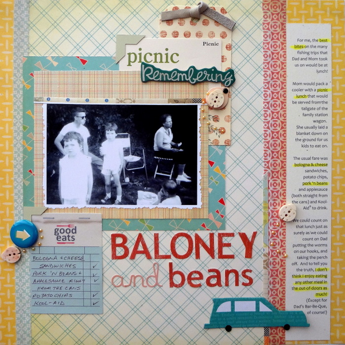
Baloney and Beans by Susanne Brauer | Supplies: Patterned papers, Cosmo Cricket; Cardstock, Stampin Up; Alphabets, October Afternoon and Studio Calico; Fabric ribbon and flair, Studio Calico; Cards, Jenni Bowlin; chipboard, Little Yellow Bicylcle; bits from stash.
[hr]
Debbie Hodge says, “My brother makes a day of pulling trees out of the woods and cutting and splitting wood–and we were happy to join him with a hot dog roasting break right alongside the work area. I used photos of the general area and of the kids as they roasted their hotdogs on sticks along with product in autumny outdoor colors. I embellished with dressed up woodsy motif: owls on a piece of flair, a flower rendered in woodgrain, and a leaf of gems: all perfect juxtopositions to represent a meal had out of doors.”
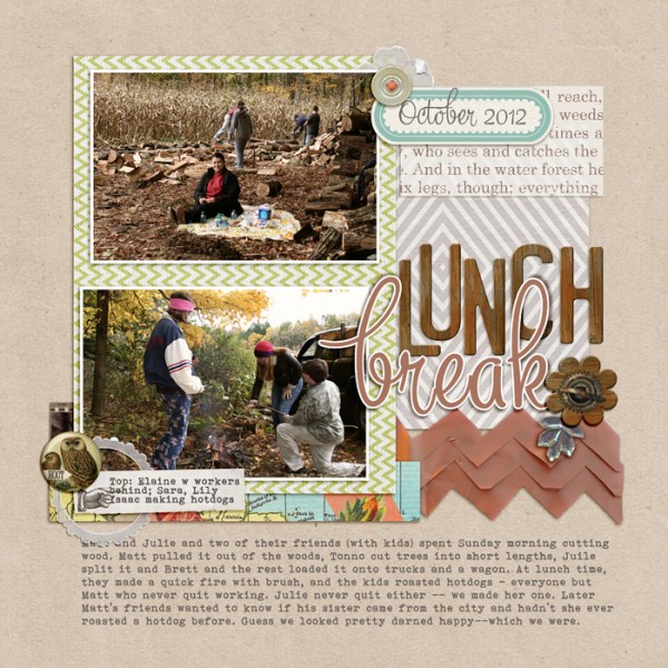
Lunch Break by Debbie Hodge | Supplies: PageKraft by One Little Bird; Dashing, You are here by Allison Pennington; Petals 3 by Sara Gleason; Autum Moon by Sahlin Studio; Vellum Ellies by Snips and Snails; Fall Festival by Lynn Grieveson; Brown Transferware by Jenni Bowlin; Star on Top by One Little Bird; Wood Alpha, Color Study Fall Flair, Wood Flowers by Katie Pertit; Mercury font.
[hr]
Terry Billman says “One of the highlights of our trip to Hawaii was eating on the veranda at Gordon Biersch Restaurant. The weather was gorgeous for eating outside. Cami, (our grand daughter) got a kick out of the birds landing on the table and nibbling on our food. The photos highlight the entire family, Cami taking a bite of her chicken nugget, and the birds walking on the table. I liked the idea of using the yellow sunburst paper behind the photos to represent the sun/outdoors.”
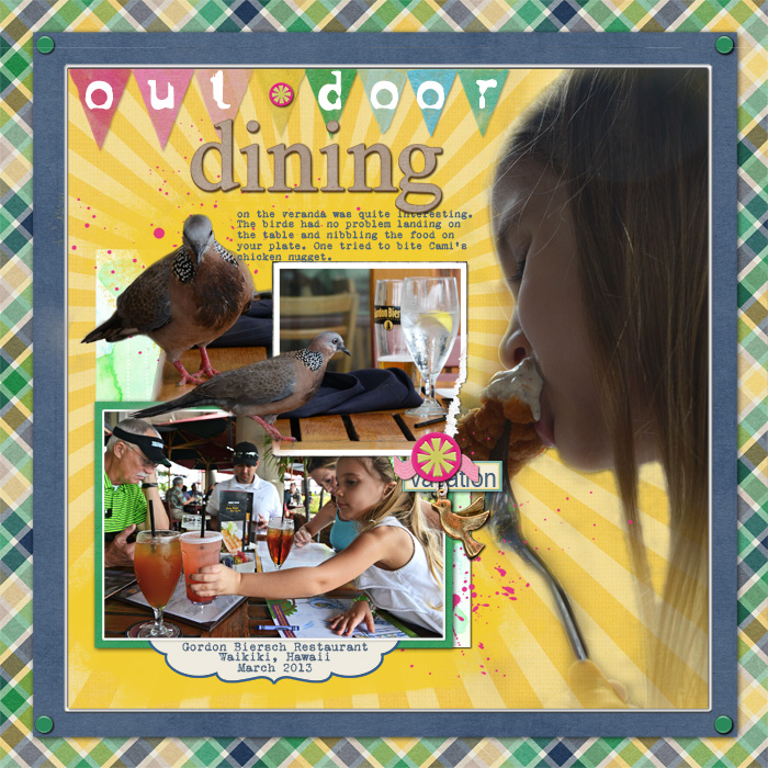
Outdoor Dining created by Terry Billman| Amber Shaw: Hello Sunshine; Anna Aspnes: Artsy Layered Template 74, Art Play Palette Remember; Just Jaimee: Ice Cream; Katie Pertiet: Buttoned Up: AWolff: I’ll Be There Collab: Valorie Wibbens: I’ll Be There Collab Sprinkles
[hr]
Christy Strickler says, “Every weekend, we eat on the harbor at an outdoor restaurant. The restaurant is called the Green Parrot. I chose my color scheme and motif based upon the name of the restaurant. I chose to photograph my son with one of his favorite dishes while capturing our typical view in the background.”
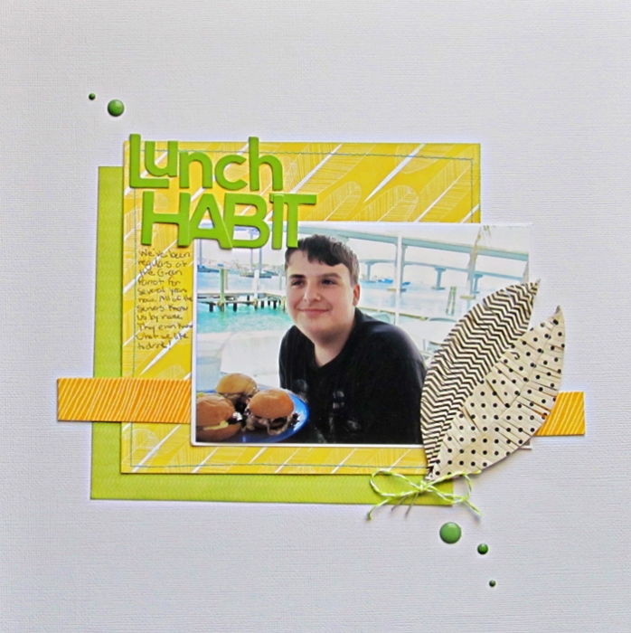
Lunch Habit by Christy Strickler |Supplies Cardstock: Bazzill; Patterned Paper: Echo Park: Letters: Jillibean Soup; Tape: Freckled Fawn; Feathers: Jenni Bowlin; Enamel Dots; Studio Calico
[hr]
Ronnie Crowley says, “I love eating outside, and I love that the fact we live in Texas means we get to do this in January! Instaweather is a great app for adding details to a picture and your layout. The skins they offer give you a variety of information and do all the work for you. This app’s output is a great addition to any outdoor page, and it’s available for both android and iphone.”
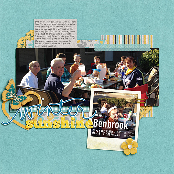
Winter Sunshine by Ronnie Crowley | Supplies: Ali Edwards – WinterSticker; Down this Road Designs – Star Quality; Kimbroedelet – Time Out Layered Frames; Anita Designs – Childhood;Blagovesta Gosheva – Things I love About You; Designs by Dawn – Challenge Me1;Studio Memory Clips – Simply; Tickle Pinked Studio – Graffitino1
[hr]
Stefanie Semple says, “I snapped some photos at lunch, after helping hubby move offices, the location was beautiful tranquil, just very hot.”
“I love taking loads of photos of outings: the location, the food and the people. Getting these all showcased eases the storytelling burden and helps me recall all the details. I kept the embellishment to a minimum, because of the variety of colorful photos. I love neutral backgrounds that let my photos to take center stage. This one has gorgeous texture and pattern–reminiscent of a patterned tablecloth mixed with newsprint.”
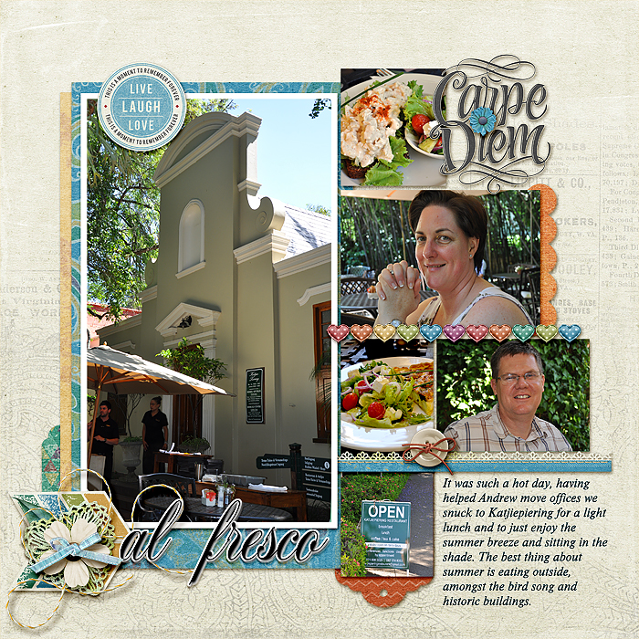
Al Fresco by Stefanie Semple. Supplies: Kimeric Kreations: Embrace the Day (kit); Debbie Hodge: Clustered Template #4 from ScrapBook Coach Class Clustered.
[hr]
Debbie Hodge says, “Eating on the beach is both a joy and a difficulty, and I wanted to convey that feeling of the hot sun and the sandy fingers on this page–especially since my oldest son is actually putting a chip into my younger son’s mouth in one photo. I used a photo glow and blown-out photos to begin that sense of the brightness. I continued this sense of a beach lunch with the sandy layers behind the photos. It’s a digital page, so it’s actually possible to include that texture of the beach.”
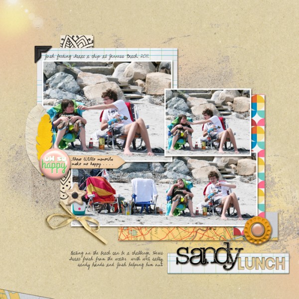
Sandy Lunch by Debbie Hodge | Patterned Paper: Sketchbook by Amy Tangerine, Life’s a Ride, Little Calicos by Valerie Wibbins, Be Happy by Lauren Grier; Cardstock: Naturally Krafty; Buttons, Bows, Feathers, Etc: Going Places by Rebecca Wagler, Life’s a Ride by Valerie Wibbins, Brad Bonanza by Pattie Knox, Moments and Memories by Sabrina Dupre, Lemon Squeezy Flair by Creashens, Paper Feathers by Jacque Larsen; Chipboard Alpha Black by Katie Pertiet; Brushes: SeasTheDay by Ju Kneipp (sand); WarmGlows 1 by Anna Aspnes; Pea XoXo, Blackout font
[hr]
Gretchen Henninger says, “This is a layout of a hike my husband and I took in the Catskill Mountains where our lunch stop overlooked the beautiful Katterskill Clove. The supplies–including tone-on-tone paint strokes and cork hearts–reflect the colors and textures in the photos.”
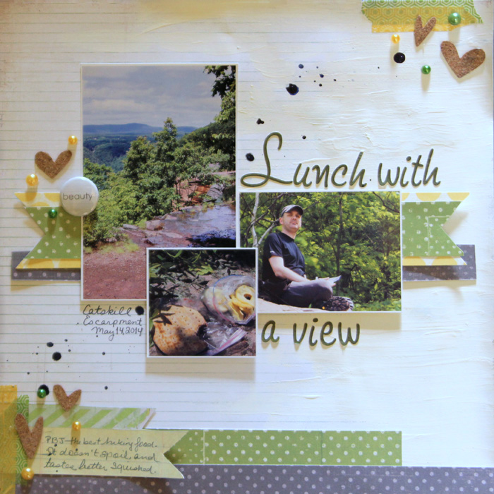
Lunch with a View by Gretchen Henninger | Supplies: Paper: Studio Calico (Lime Light), American Crafts (Dear Lizzy Daydreamer), BasicGrey (Basics); Alphas: BasicGrey (Marjolaine); Paint: Folkart (warm white); Spray Ink: Mister Huey’s (navy); Enamel Dots: Freckled Fawn; Washi: We R Memory Keepers, My Mind’s Eye; Other: Studio Calico (cork hearts), A Flair for Buttons (flair)
[hr]
Andrea says, “As a Girl Scout leader, I did a lot of outdoor cooking with the girls in our troop. It was fun teaching them and learning these skills.”
“I knew that I wanted to blend some of the scenic tree photos into the background, but my other photos did not blend well. I converted the focal photo to black and white. And then with the remaining photos I reduced the opacity so the colors would blend better. Then to blend in the background photo I used a layer mask and reduced the opacity. It was fun looking at these older photos and remembering.”
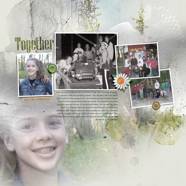
Together by Andrea | Anna Aspnes, Layered Template 149, Art Play Wilderness Kit.
[hr]
Debbie Hodge says, “I love parties, and I love the idea of creating a pretty dining setup outside. These photos are from my oldest son’s last day (afternoon) kindergarten. His busmates came over for lunch and they all got on the bus together. We set up low tables with pretty tablecloths and dishes–and even brought out the punch cups. I took lots and lots of photos of them eating and toasting each other and playing with the favors–and of Josh bringing out the frosted alphabet cookies. Because I took and wanted to include so many photos, I used a basic grid layout on the right side–and even in the column on the left side and then added my zhush with a big title and shelf for the focal point photo.”
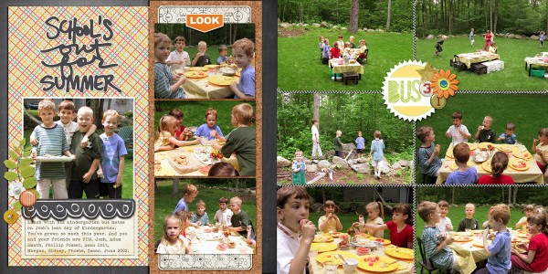
School’s Out by Debbie Hodge; Randomness, Ordinary Special by Kaye Winiecki; IQ by Lynne-Marie; Summer Rocks Word Art by Ali Edwards; Bermuda Triangle by Pixels & Co; Freckles by Valerie Wibbens; Snail Mail by Valerie Wibbens; Fleetwood by Sahlin Studio; Stitched by Anna by Anna Aspnes; Awanui by Lynn Grieveson; Pronuncial Alpha by Just Jaimie; December Woods Alpha/Nos by Katie Pertiet; Bohemian Typewriter font

