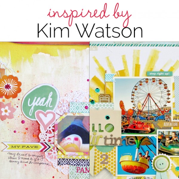
 Studying scrapbook pages by others is a great way to get scrapbooking ideas for growing your own style. In this “study” look at how a scrapbooker has used product and design principles and how she’s handled the 5 parts of a scrapbook page (canvas, photos, title, journaling, embellishments).
Our creative team studied pages by Kim Watson and made their own pages incorporating aspects of those pages. This is not a LIFT of one page. Rather they made pages inspired and instructed by what you they saw in a collection of her work.
see some of Kim’s pages.
[toggle title_open=”Hide” title_closed=”See Kim’s pages yourself” hide=”yes” border=”yes” ]
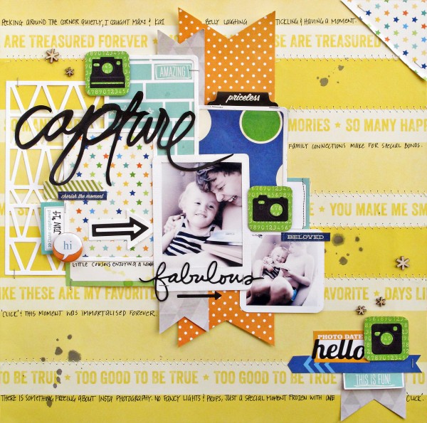
Capture by Kim Watson | Supplies: Cardstock by American Crafts; Patterned paper, Labels, Journal spots by Elle’s Design Studio; Stickers by Jillibean Soup; Wood Veneer by Studio Calico; Tabs by Heidi Swapp; Flair by Bossy Joscie; Spray ink by Tattered Angels; Pen: Sakura; Adhesive by Tombow, Thermo web & 3L; Metal Dies by Simon Says, My Favorite Things, Technique Tuesdays; Die cutting machine by Fiskars.
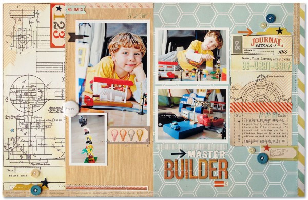
Master Builder by Kim Watson | Supplies: Patterned paper: Heidi Swapp, Studio Calico, Simple Stories, Cosmo Cricket; Die Cuts & Woograin Alphas: Studio Calico, Buttons: October Afternoon, My Minds Eye; Arrows & Stamp: Smash; Ink: Close to my Heart; Stickers: Cosmo Cricket; Other: Sewing machine.
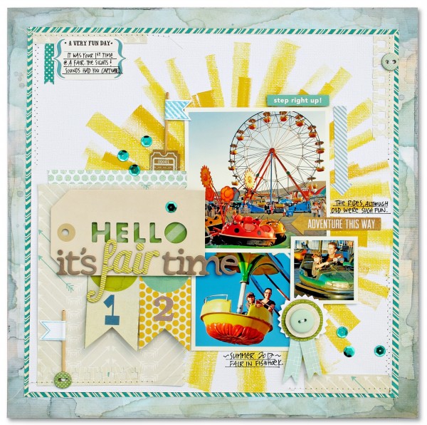
Hello It’s Fair Time by Kim Watson- Supplies: Cardstock: Carta Bella papers; Patterned paper: Cosmo Cricket, Jillibean Soup, American Crafts; Die cuts accents, Alpha Stickers, Alpha stickers: American Crafts; Stickers: Echo Park; Tags: Sassafras; Tickets: Maya Road; Chipboard: Fancy Pants Designs; Ink & Brayer: Close to My Heart; Stamps: Cocoa Daisy Kits; Pen: Zig; Adhesives: 3L, Tombow; Tools: Trimmer, mat & Scissors: Fiskars; Xacto knife: Elmer’s; Printer & paper: HP; Other: Sewing machine, Sequins. NOTE: All supplies from Cocoa Daisy kit.
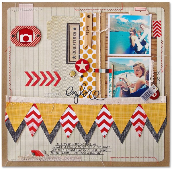
Good Times by Kim Watson | Supply list: Patterned paper: Echo Park, My Minds Eye, Lily bee, Basic Grey, Simple Stories; Wood accent: Jillibean Soup; Brads & tiny labels: Basic Grey; Stickers: Jenni Bowlin; Die cut
title: Heidi Swapp; Chipboard frame & tabs: American Crafts; Printed labels: Ormolu; Washi
Tape: Smash; Other: Fabric, Sewing machine, Yarn. Note: All Supplies from Cocoa Daisy kits.
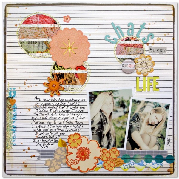
Chats about Life by Kim Watson | Supplies: Patterned paper: Sassafras, Basic Grey; Stickers: Sassafras; Alpha stickers: Glitz Designs, Basic Grey; Die Cuts: Sassafras; Metal accent & Ribbon: American Crafts; Mist: Studio Calico; Stamp: Jenni Bowlin; Pen: Zig
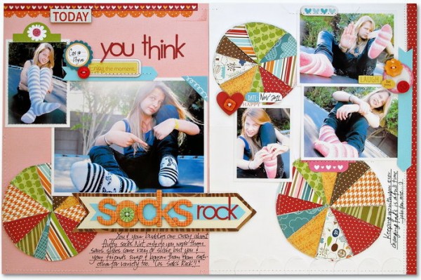
Socks Rock by Kim Watson | Supply list: Cardstock: American Crafts; Patterned paper, Chipboard, Die Cuts, Stickers, Alpha Stickers: Bella Boulevard; Buttons: Doodle Bug Designs, Punch: EK Success; Pen: American Crafts
[/toggle]
a layered up canvas
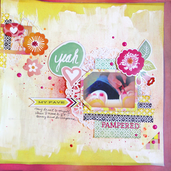
Pampered by Gretchen Henninger | Supplies: Papers, Alphas, Stickers, Chipboard: BasicGrey Highline; Paint: Liquitex; Spray Ink: Mister Huey’s (Pretty Pink), Heidi Swapp Color Shine (Mustard); Enamel Dots: Doodlebug; Other: Royal Lace doily
Gretchen Henninger says, “I snapped this picture one day when I was getting a pedicure because I loved the vibrant pink of the nail polish. I thought this was the perfect color to celebrate the end of winter.”
“I love how Kim Watson creates dynamic pages full of energy and movement. She makes use of the whole canvas, including multiple colors and patterns. She also builds layers, starting with misting or stenciling on the background and built up through the papers and embellishments. I tried to establish flow in this layout from the upper left to the bottom right, mixing a variety of embellishments and working in layers.”
complex visual triangles
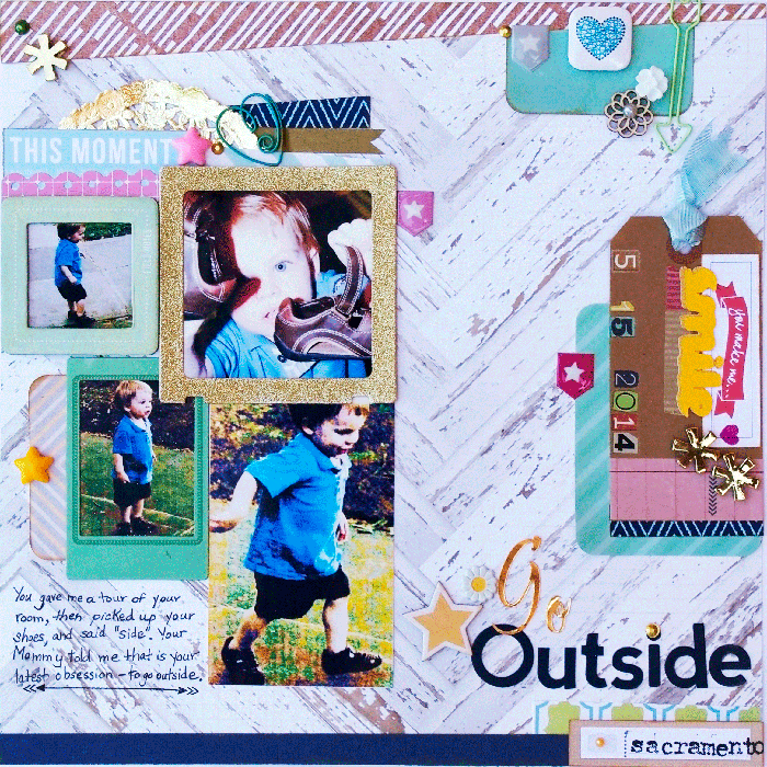
Go Outside by Kim Poirier-Brode | Supplies: Cocoa Daisy Kits: May: Evalicious – tags; Crate Paper, Maggie Holmes, style board – vintage frames; kraft shipping tag; Colorbox, Cats Eye – yellow ocher, ink pad; My Mind’s Eye,Today – accent stickers (packaging); Ki Memories – self adhesive metal accents, gold; Crate Paper, Maggie Holmes, Style board – patterned paper, picket fence. April: navy card stock; Heidi Swapp, favorite things – patterned paper, lovely lattice; Jillibean, bean board – thin chip alphas, navy; Little B – metallic gold tape; May Arts – two tone blue ribbon; Cocoa Dasiy, Stephanie Wheeler – patterned paper, sidewalk. Freckled Fawn Kits, May: wood flowers, chipboard stickers, number rub ons, pearl stickers, arrow paper clip, resin flowers, daisy brad; April: washi tape, heart paper clip, gold resin asterisks, puffy stickers, gold doily; Freckled Fawn + Hero Arts – stamp. Studio Calico, NSD kit: washi tape, epoxy stars. EK Success, Sticko, Brush stroke gold script – letter stickers, EK Success, Image Tree – rubber stamps, antique typewriter, lower abc; Pilot G2 – pen, Slice, Basics – word art; Fiskars, Threading Water – punch; American Crafts, Project Life, Amy Tangerine, Cut and Paste – journal cards; Staz On – ink, black, fuchsia; Stash – paper scraps
Karen Poirier-Brode says, “The story is about my grandson’s joy at being outdoors and his ability to communicate this to us. I studied Kim’s work and had the following impressions.”
- Kim uses multiple color photos, often smaller like 2 x 3″ or 3.5 x 5″.
- She often clusters photos, sometimes linearly, sometimes in center of page, on occasion doublets or singles in a visual triangle.
- She uses clustered embellishments in complex visual triangles with layering and dimension, often including tags or envelopes in designs.
- She favors mixing several patterned papers and muted colors with saturated colors.
- Her pages often include techniques like paper piecing or elements altered with paint techniques, stitching, and cut files.
- Her titles are rendered with multiple fonts or word art.
- She often softens or breaks up straight lines in her designs with hand drawing, stitches, wavy or torn edges, added washi or embellishments.
- Her journaling is usually hand printed, often on ruled lines or sometimes typed on journal strips.
I thought with my love of layering that making a page inspired by Kim Watson’s design approach would be easy. It was, in fact, extraordinarily difficult. I was trying to use only recent product, but that wasn’t the problem. Those complex visual triangles in separate clusters of elements were hard. I do visual triangles with several elements but using a lot of them in complex ways, in many different clusters was difficult. It must come naturally to Kim, as it’s part of her style.”
photo grid, chevron, and yellow
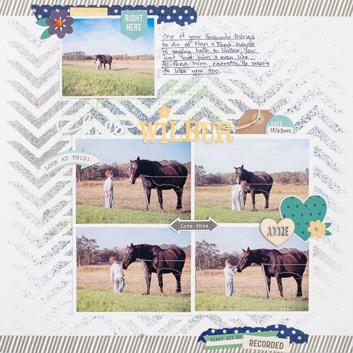
Hello Wilbur by Kristy T| Supplies: Card: Artee; Spray Inks: Mister Hueys Mists; Washi tape: My Minds Eye; Stickers: Simple Stories, Alphas: Jillibean Soup, Simple Stories; Tag: Simple Stories; Wooden Shape: Freckled Fawn; Marker: American Crafts; Embellishment: October Afternoon; Brad: Simple Stories; Template: The Crafters Workshop.
Kristy T says, “Kim Watson has a bright and fun style that suited this story about my son’s love of going to see the horse when we visit my parents.”
“The elements of Kim’s style that I included are the use of a grid of photos, photographs with white borders, washi tape strips, handwritten journaling, tag, multiple embellishment clusters and mist on my background. Kim’s layouts often incorporate chevron patterns and a touch of yellow.”
multiple photo spots and borders
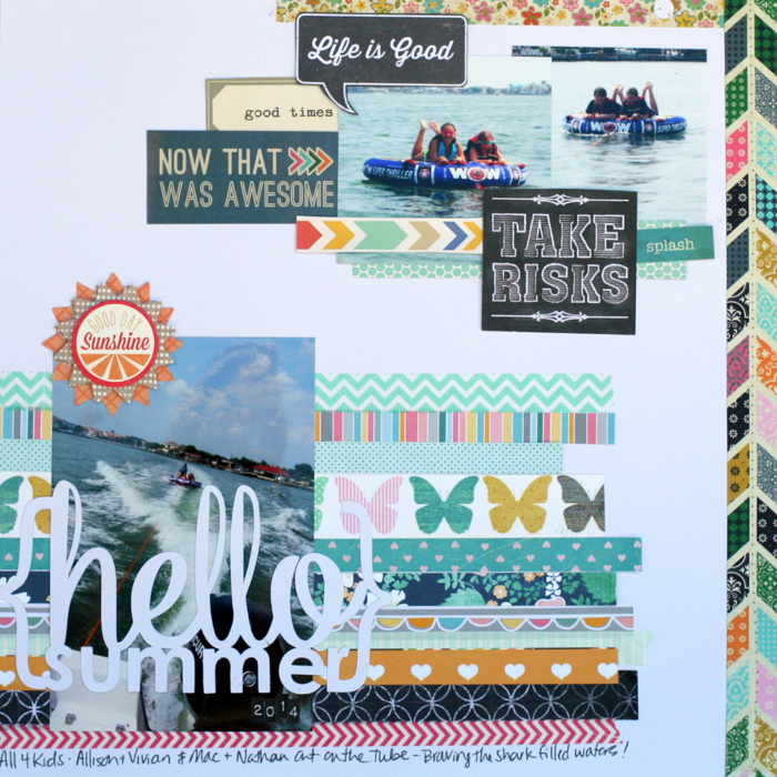
Hello Summer by Katie Scott | Supplies: American Crafts, Crate Paper, Fancy Pants, Carta Bella, My Mind’s Eye and Cosmo Cricket patterned papers; We R Memory Keepers white cardstock, Basic Grey embellishment sticker; Silhouette cut file Hello Summer; Tim Holtz letter stickers; machine stitching, Sharpie
Katie Scott says, “We bought a boat and a tube attachment for summer 2014. This was the first time getting both of our kids and their best friends out on the water.”
“I like the way Kim’s pages do not seem formulated in terms of photo arrangement, so I tried placing photos in an unusual way. I also find Kim’s border treatments interesting so I added a top and right border treatment on a white background.
full canvas united by color

This is Strong by Summer Christiansen | Supplies: Captivated Visions: You Are Strong Kit. Liv.edesigns: Needs+Wants Frame Basics.
Summer Christiansen says, “This layout is about how my strength comes from my husband.”
“Kim Watson’ style includes little to no white space, loose clusters spread over the page, and similar colors or color patterns within each cluster to tie it all together. I used one kit to get similar colors within each cluster. Using the same kit also made grouping each cluster easier. I have always loved the no-white-space look, but I could never figure out how to make it work. It is KEY to use the same colors through out your layout!”
attention to color
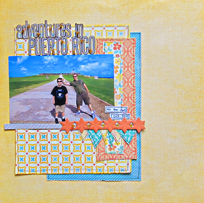
Adventures in Puerto Rico by Christy Strickler |Supplies Patterned Paper; Fancy Pants, My Mind’s Eye; Letters: Jillibean Soup; German Foil: Jenni Bowlin; Other: DMC floss, glass beads
Christy Strickler says, “This is my introductory page for an album documenting our trip to Puerto Rico.”
“I love the way Kim works with a specific set of colors. She then incorporates them repetitively but in different patterns and tones. I worked with yellow, orange and teal, repeating the colors in various patterns as I layered upwards.”
photos framed by embellishments
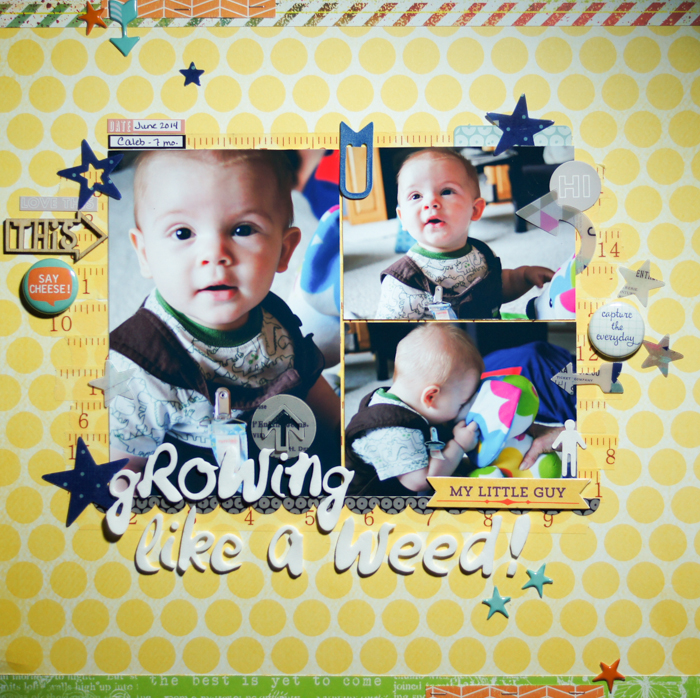
Growing Like a Weed by Marcia Fortunato | Supplies: Patterned Papers: American Crafts (Dear Lizzy “Daydreamer”); Strips of paper: Studio Calico (Lemon Lush), Tim & Beck, October Afternoon; Letters: American Crafts Thickers; Stars and arrows: Heidi Swapp; Word & other stickers: Life.Love.Paper, My Mind’s Eye, Jillibean Soup; Flair: October Afternoon; Wood veneer: Cocoa Daisy; Flag clip: Studio Calico; Pen: Sharpie.
Marcia Fortunato says, “This layout is about my grandson, Caleb, and how fast he is growing and developing.”
“In studying Kim’s beautiful work, several tendencies jumped out at me that I tried to incorporate into my page.”
- Kim’s focal point is almost framed by multiple clusters of embellishments, with additional small bits scattered around the page to balance the page and lead the viewer’s eye around. I tried to emulate this, using mainly stars, arrows, and circles in varying sizes.
- She used bright colors, especially yellow or orange. I chose a bright yellow background and added accents of green, orange, and blue.
- She uses some type of foundation under her photos, often stenciling, stamping, and/or misting, or using strips of patterned paper or washi tape. I chose to use washi tape and selected a measuring tape pattern to symbolize his growing.
- Kim generally used some type of border or element at both the top and bottom edges, which serves to keeper the viewer on the page. Using this idea I placed long border strips at the top and bottom and added small accents to each.
bright colors and handmade touches
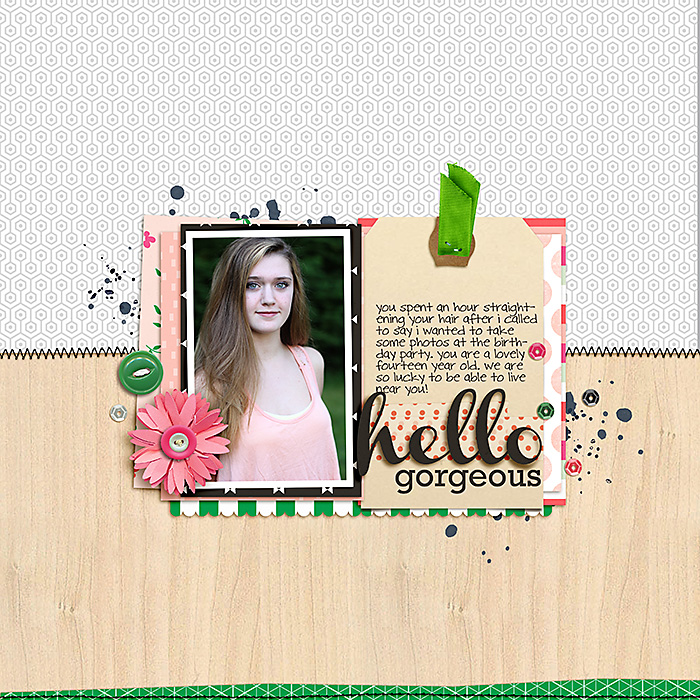
Hello Gorgeous by Celeste Smith | Supplies: Because I’m Happy papers by Digital Design Essentials, Washi Tags by Gennifer Bursett; Neutral Basics Stitching by Robyn Meierotto; Sprinkles by Valorie Wibbens; Channel, Rockwell, DJB Celeste fonts.
Celeste Smith says, “My gorgeous niece Lila is always willing to pose for the camera. So thankful we have her in our lives.”
“Kim’s style is bright and bold with handmade touches. She uses die cuts, border punches and makes her own flowers. She is a master at mixing pattern. She finishes her pages with stitching and usually adds a bit of splatter, mist or paint. I love that she uses her own handwriting.”
“On my page, I tried to use bright colors and a handmade looking flower. As well, I added a die cut title, a border punch, stitching, my handwriting and some paint. It’s still my page, but I tried to incorporate some elements that she would appreciate!”

