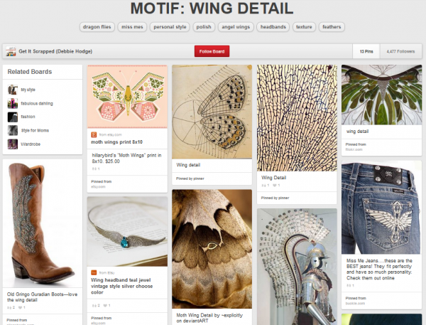
 Scrapbook page inspiration can come from many sources including both nature and art.
For this piece, our team is taking inspiration from something that occurs readily in both stylized and natural forms: wing detail (see our pinboard). What’s more this motif is something that can trigger meaning both from its concrete connections (think: butterflies in flight) and from its abstract associations (think: beauty and freedom) and is, thus, a good tool for visual storytelling.
Starting with an unexpected inspiration source is a way to have fun, play with technique, and push your style. See the fun our team had with this.
journal in the “compartments” of a wing detail
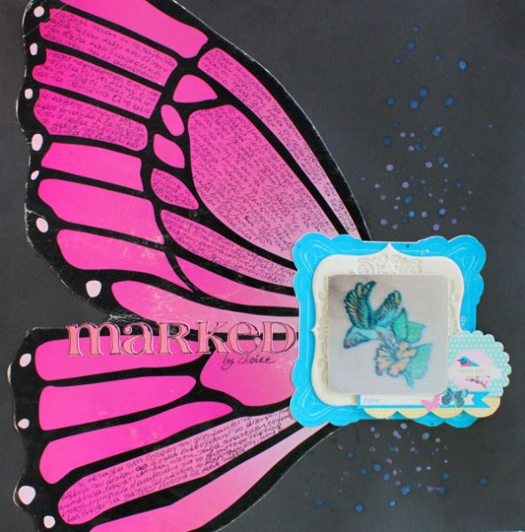
Marked by Kiki Kougioumtzi Supplies | Cardstock: DCWV; Other: Tattered Angels glimmer mist, Pink Paislee artisan frames, American Crafts digitals Maggie Holmes for Crate Paper.
Kiki Kougioumtzi says, “This layout is the story of my first tattoo: when and how I decided to do it and its meaning.”
“I made a simple page incorporating a butterfly wing I salvaged from a toy packaging. Because all the story has to do with wings, I decided to use wings in my design in a bold way. The wing leads you to my photo and embellishment clustering, where I have more butterflies and a bird but in a smaller scale.Also, the sections of the wing made the perfect spots for my journaling.”[hr]
present an unexpected visual situation with a photo layered on a wing
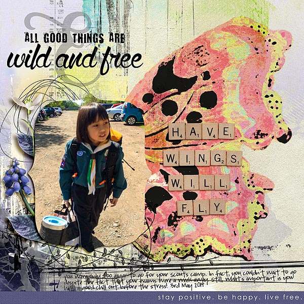
Have Wings Will Fly by Audrey Tan | Supplies: Jen Maddox Designs: Free To Be; Beth Rimmer: Junque; Font: Pea Court
Audrey Tan says, “This page is about my boy going off to camp. He couldn’t wait to go despite having exams in two weeks time. My wing detail creates a visual analogy of him taking flight. He was ever so eager to go to camp! I’ve enlarged the wing and digitally blended it into the background. I desaturated the colour to blend in with the paper used. My title was placed on the wing detail to further emphasize his ‘flight’.”[hr]
mix doodles, stencils and misting for the complexity of wing detail
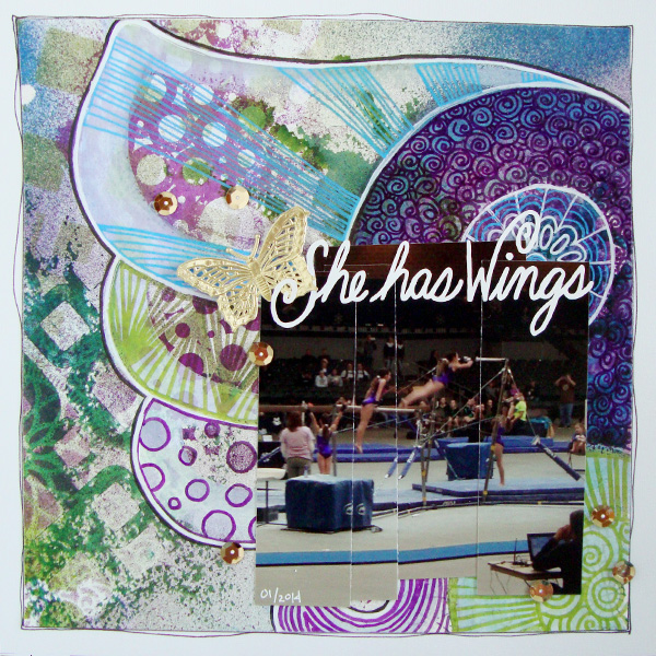
She Has Wings by Michelle Houghton | supplies: cardstock; Colorbok, watercolor paper; Strathmore, spray ink; Ranger, ink pens; Sharpie and Faber-Castell, lettering; hand drawn cut with Brother Scan and Cut, sequins and butterfly; Jenni Bowlin
Michelle Houghton says, “I made this layout to highlight a photo I caught of my daughter jumping to high bar in her very first gymnastics meet. Sara blows me away when she is on bars flying fearlessly up to the high bar. She makes the jump look effortless and I wanted the layout to support that feeling of flight. “
“Creating the detailed butterfly wing that filled the entire background added to the theme of flight. I created my wing by using stencils and mists on a sheet of watercolor paper then doodling with various pens to create the look of a detailed, fanciful wing.”[hr]
build up a digital wing shape with clipped and layered elements
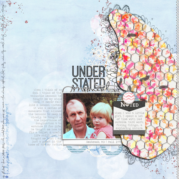
Understated Moments by Carrie Arick | Supplies: Just Jaimee: Merriment Papers; Kaye Winecki: A Little Message; HGD by Laurie Ann: Stardust Basics; Creashens: Pillow Talk Elements, Keen Elements; Karla Dudley & Sabrina’s Creations: Understated; CD Muckosky: Free; Font: Traveling _Typewriter
Carrie Arick says, “This page is about the valuable lessons my dad taught me when I was a child.”
“The wing detail allowed me to visually represent how childhood moments can shape us as adults. Butterflies symbolize transformation, hence my choice to use a butterfly wing. The detail on the wing layers doodles, a sturdy foundation, feathers, small, colorful butterflies and meshed wire. These items individually represent the lessons in my story. When combined, they create the bigger picture or the wing. To create the base for my wing, I searched my stash for a butterfly with a shape I liked, then used the pick tool to enlarge it on a 12 x 12 canvas. Since this enlargement process doesn’t create a print quality image, I used it as a clipping mask instead. It made the process of customizing my large wing a snap!”[hr]
tell a nature story with German foil butterfly wings
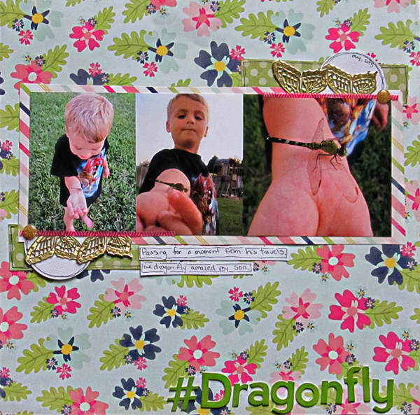
#Dragonfly by Christy Strickler |Supplies Patterned Paper: Echo Park; Letters: Jillibean Soup; German Foil: JBS Mercantile; Enamel Dots: Twine and Ink
Christy Strickler says, “By chance, a dragonfly landed on my son’s arm and perched there.”
“I like to use the butterfly motif on nature-themed pages. In this case, I used just the wings to create an unusual embellishment. I wanted something unique to help me highlight such an unusual situation.”[hr]
add pen-sketched fairy wings to a baby page
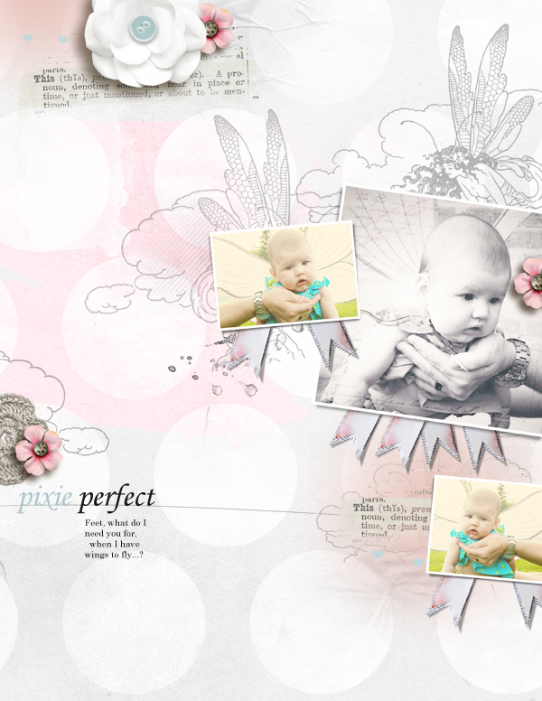
Pixie Perfect by Amy Kingsford | Supplies: Anna Aspnes Designs: ArtPlay Palette This Is Life, ArtPlay Palette Fairy, Love Glows No. 2, ScriptTease Life Frames, Artsy Layered Template 102.
Amy Kingsford says, “These are photos taken of my niece at 3 months old.”
“I used a vintage fairy brush by Anna Aspnes to add the wing details to my page, because it was a good fit with my photos and a great way to set the scene for my page. I also loved the intricate yet soft details that this brush brought to my page. To achieve this look I’ve simply used the same brush multiple times throughout the page, using a variety of opacities and blending modes and positioning each of them to create this perfect little scene on the page.”

