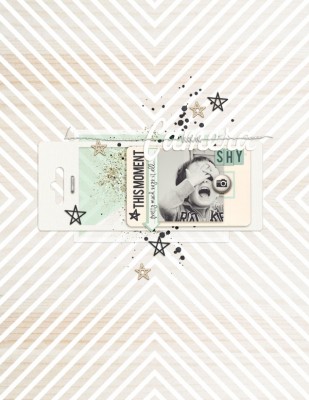
 Studying scrapbook pages by others is a great way to get scrapbooking ideas for growing your own style. In this “study” look at how a scrapbooker has used product and design principles and how she’s handled the 5 parts of a scrapbook page (canvas, photos, title, journaling, embellishments).
Our creative team studied pages by Amy Kingsford and made their own pages incorpating aspects of those pages. This is not a LIFT of one page. Rather they made pages inspired and instructed by what you they saw in a collection of her work.
see some of Amy’s pages.
[toggle title_open=”Hide” title_closed=”See Amy’s pages yourself” hide=”yes” border=”yes” ]
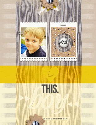
Unconditionally by Amy Kingsford | Supplies: Sahlin Studio: P.S. I Love You; Splendid Fiins: Brilliant Background Brushes.
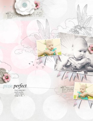
Pixie Perfect by Amy Kingsford | Supplies: Anna Aspnes Designs: ArtPlay Palette This Is Life, ArtPlay Palette Fairy, Love Glows No. 2, ScriptTease Life Frames, Artsy Layered Template 102.

Happy Easter 2012 by Amy Kingsford | Supplies: Karla Dudley: Hop Happy Collab (with Ange Design); Deena Rutter: Layered Layouts V. 11; Font: KD Everyday.
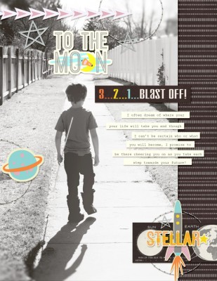
To the Moon by Amy Kingsford | Supplies: Audacious Designs: Universal Papers and Elements; Scotty Girl Designs: Walt’s Park – Tommorow.
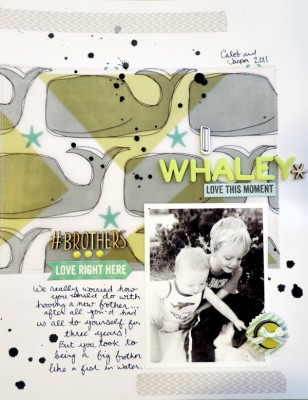
I Whaley Love This Moment by Amy Kingsford | Supplies: Cardstock: Bazzill; Patterned Paper (digital): Stickers: 3 Birds Design and Studio Calico; Valorie Wibbens; Alphas: Thickers by American Craft; Wood Veneer: Studio Calico; Ink: Studio Calico; Washi Tape: Jenni Bowlin Studio;
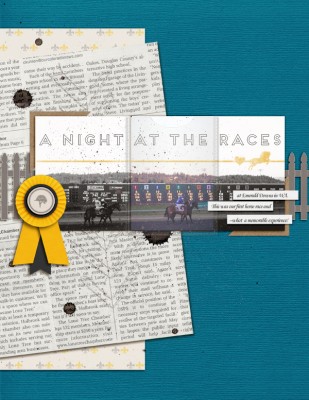
A Night at the Races by Amy Kingsford | Supplies: Mye De Leon: Hopscotch Solids; Anita Designs: Happy Horse; Audrey Neal: Pennant Pieces; Vinnie Pearce: Make It Meaningful; Valorie Wibbens: Eat Cake; Allison Pennington: Sieze; Amy Martin: Blanc Stitches.
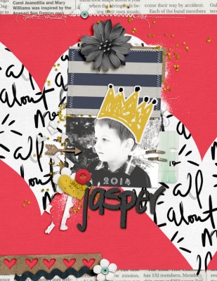
Jasper 2014 by Amy Kingsford | Supplies: Valorie Wibbens: Eat Cake, Make Believe Collab (with Paislee Press) Krafty Foam Alphas; Allison Pennington: Seize; Amy Martin: Two of Each V. 2 and Blanc Stitches.
[/toggle]
light touches and a love of neutrals
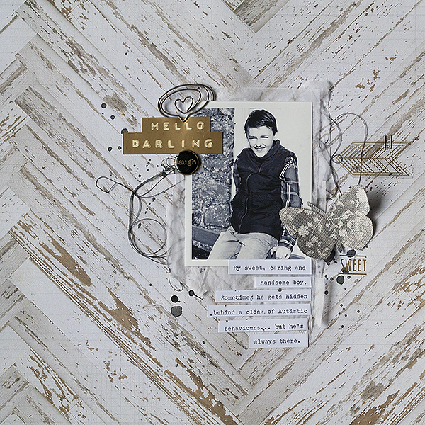
Hello Darling by Amanda Robinson | Supplies: Patterned paper, stickers, rub-ons – Maggie Holmes for Crate Paper; Mist – Studio Calico; Transparent die cut – Basic Grey; Metal charm – 7 Gypsies; Canvas Butterfly – Prima; Other – Tissue paper, heart paperclip, black thread, vintage typewriter for journaling.
Amanda Robinson says, “I wanted to document my son’s special qualities–qualities I like to remind myself of when we’re going through a challenging time.”
“Amy has a great way of adding lots of light touches to her pages – transparent elements like vellum and transparencies, tiny details and light layers whilst maintaining white space. I especially love her monochromatic layouts and share her apparent love of gray. I took all of these elements and combined them in my own way to make my page. I also added my typewritten journaling on strips, as it is on many of Amy’s pages.”[hr]
repeating shapes, bold colors with creams, and quotes or known phrases for title content
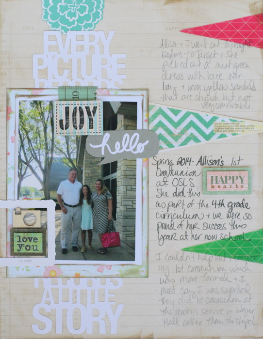
Every Picture Records a Little Story by Katie Scott | Supplies: Crate Paper and Dear Lizzy patterned papers; Heidi Swapp and Basic Grey flags; Silhouette die cut; Dear Lizzy, Studio Calico and other various older embellishments, washi tape, Tim Holtz distress ink.
Katie Scott says, “My daughter’s first communion was understated and not as formal as I expected, it made me remember my own first communion which was more traditional.”
Katie pulled several aspects of Amy’s pages for her own:
- Amy uses repeating shapes and bursts – I tried to mimic her look with the flags on the right.
- Amy mixes white, creams and bright colors so I used that color combination as inspiration for this page.
- Amy’s layouts include lots of 8.5 x 11 layouts. I like that size and chose to use it for this page.
- I also used what I called Amy’s understated title – in that there isn’t really a recognizable title here, but the Silhouette cut file serves as the title “Every Picture Records a Little Story.[hr]
bold titles, shape, color and dimensional treatments
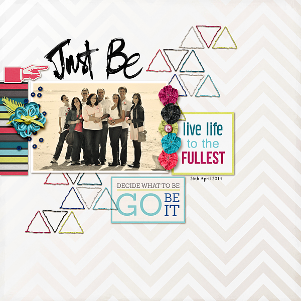
Just be by Stefanie Semple. Supplies: Go bold or go home part 1 from Pixels and Company, Colorize photo action from Pioneer Woman.
Stefanie Semple says, “One of my best friends just turned 50 and asked me to take photos of her family on the beach. It was mid day and the photos were blown out so, I exaggerated that aspect with Photoshop to make it look intentional.”
“I noticed that Amy often: scrapbooks a single photo on a page, uses a light back ground paired with bold colors, adds visually strong titles, includes stripes and dimensional elements, and repeats shapes. Inspired by these things, I used a trendy brush-script title and striped paper in bold colors on a light background. I added stitched triangles for a pop of color and textural interest.” [hr]
repeated shapes, bold colors on pale background, stitching and splatters
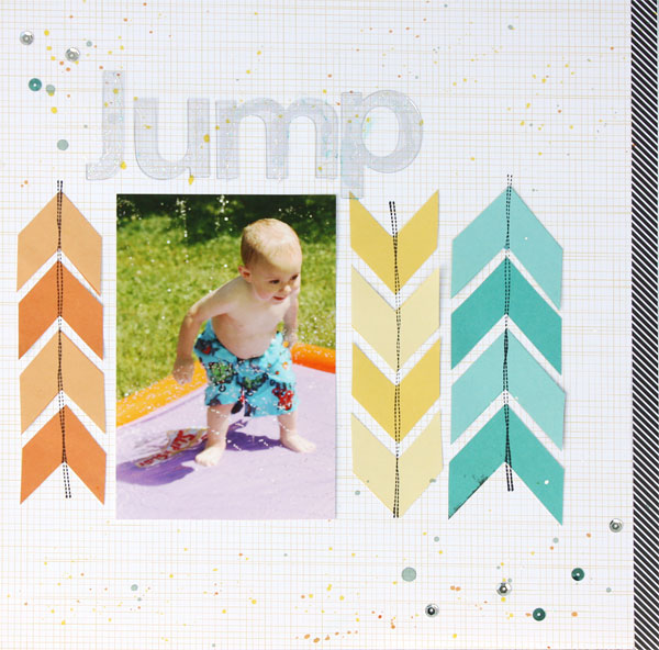
Jump by Brenda Becknell | Supplies: Paper: Studio Calico, Bella Blvd; Paint: Studio Calico, October Afternoon; Stitch stamp: Paper Studio; Sequins: Darice; Acrylic letters: Making Memories
Brenda Becknell says, “The first time my grandson played on a slip and slide, he was just as happy to stand at the bottom and jump into the water as he was to slide down it.”
“Amy has a wonderful knack for combining neutral backgrounds with bright pops of color, and touches of black to accent the page. She also uses bold shapes, like chevrons, and often adds paint splatters and stitching to her page. I tried to include several of those elements on my page, although I cheated a little bit and used a stitch stamp instead of actual stitching!”[hr]
generous white space yet interesting backgrounds
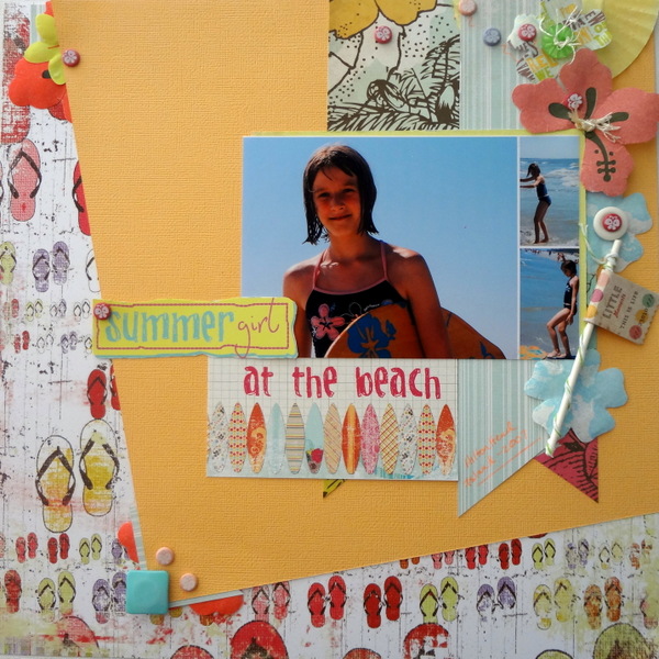
Summer Girl by Susanne Brauer | Supplies: Cardstock, American Crafts; Pattern papers, My Mind’s Eye and Fancy Pants; Flowers, Making Memories; Sucker stick, Gyli Co., Bakers’ twine, Whispers Graphics; Cupcake liner, Webstaurant Store.
Susanne Brauer says, “This page is about my daughter, around age 11, enjoying the beach at Hilton Head island with her boogie board.”
“Many of Amy’s layouts include generous white space and yet have interesting backgrounds, often with bold color and big patterns. I also noticed that Amy clusters elements close to the photo. To make my background interesting I divided it into two parts – a colorful printed paper and a bright piece of cardstock at an angle. Then I tucked my collage of photos in the upper right quadrant with banners running down behind and an embellishment trail along the right side. I tried to think like a digital scrapper and kept my elements loose in the cluster and adding a few sprinkled around the page too.”[hr]
layered cluster with generous white space and journaling strips
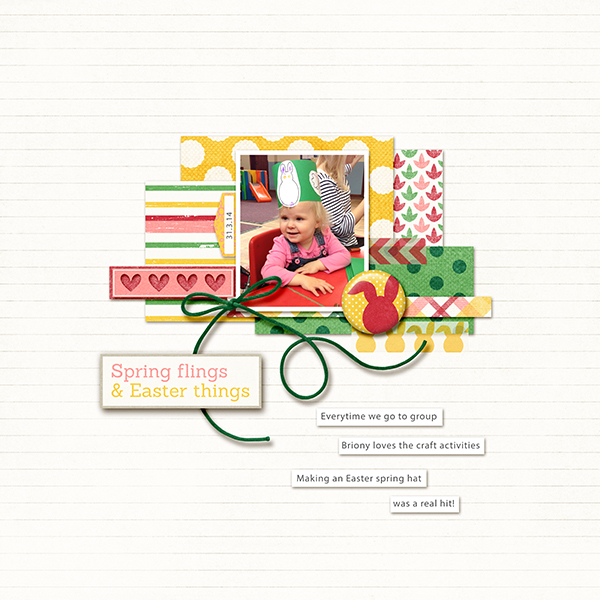
Vicki Hibbins says, “This page is about my daughter making a spring hat at her playgroup.”
“Amy often uses a neutral background, a single rectangular or square photo, a central cluster of layered pattern papers, embellishing, shapes,and journaling strips. These are the aspects of her style that I’ve included here.” [hr]
patterned background + clustered embellishments

A & K by Marcia Fortunato | Supplies: Patterned paper: Studio Calico, Bella Blvd; Letters: Heidi Swapp; Washi tape: Studio Calico; Flair: Paislee Press; Enamel dots: Twine & Ink; Vellum and other embellishments: Studio Calico.
Marcia Fortunato says, “This layout shows the relationship between my oldest son and his fiancé – I used one of my favorite photos from their engagement photo shoot.”
“One of the first things that jumps out at me on Amy’s pages is her beautiful photography. She often scrapbooks moments and relationships rather than events and tends to use one or two outstanding photos layered over patterned papers and under clusters of embellishments. Her elements are usually tightly clustered on the page, with small embellishments sprinkled about more loosely. I translated these ideas in my own layout by using one large photo with Totally Rad retro filters applied. I chose a photo that communicated the carefree and fun relationship Aaron and Kylie have. I placed the photo on a narrow shelf of patterned papers and clustered several embellishments layered on top of and around the photo, then scattered little bits of embellishments about. I adapted Amy’s style to fit my own by using a bolder background paper, one that coordinates with the colors in my photo.” [hr]
single black-and-white photo with a border
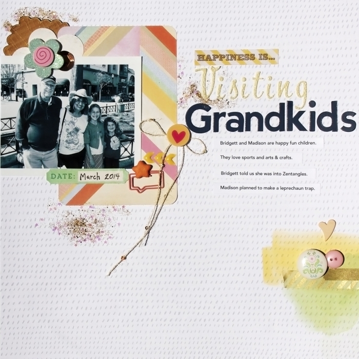
Grandkids by Karen Poirier-Brode | Cocoa Daisy April Kit; Amy Tangerine: Thickers Lovely; Soft Spoken Ellen Flowers: flower, heart circle; Webster’s Pages: Speech Bubble Paperclip, Fab Arts Fresh Cream Roses; Becky Higgins Project Life: Amy Tangerine Cut & Paste journal card; Uniball grip pen; Other – buttons and heart shape, gold/white diagonal strip washi-tape, sequin, flair.
Karen Poirier-Brode recorded a visit to the grandkids using a photo of herself and husband with them.
Karen says, “Amy usually uses one or or photos, often with a border or frame, frequently in black and white. She frequently use neutral backgrounds, saturated striped prints, pieced shapes, and clustered embellishments. I used a paper from my recent Cocoa Daisy kit that reminded me of Amy’s bases as my background, a black and white photo with a border, and embellishments placed as Amy might. The glitter in the kit had tiny stars which I thought worked perfectly with this challenge since Amy favors stars.”
[hr]

