 Most of us have a “color story,” colors that we’re drawn to and choose again and again. Here we show you how to PUSH that color story and do new things with looks you already love.
Your color story
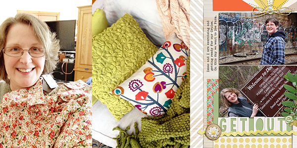
My color story is one of oranges and greens. Take a look at the pillows on my sofa right now, a blouse I recently purchased, and one of my scrapbook pages. It’s all there! It turns out I have a pattern story, too (one of florals). Take a look, now, at your own clothes, decor and pages and figure out what your color story is.
Push your color story
 Here’s how freshen up and “push” your color story.
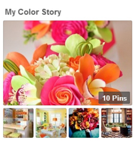
Go to Pinterest.com and in the search type your two most used colors. Look for those two colors used in different hue variations from your usual (i.e., mint instead of green or a very pale orange instead of your usual full color orange). Look for those two colors mixed with a third in a way you like. Pin the ones you like onto a MY COLOR STORY board.
When you next make a page and think: oh, I always use those colors and maybe I shouldn’t . . . turn to this inspiration to use those colors in new ways. My own “color story” Pinterest board is here — as a result of it, I realized I could add pinks and yellows to freshen up my color story. The page below is my first work with this new “push.”
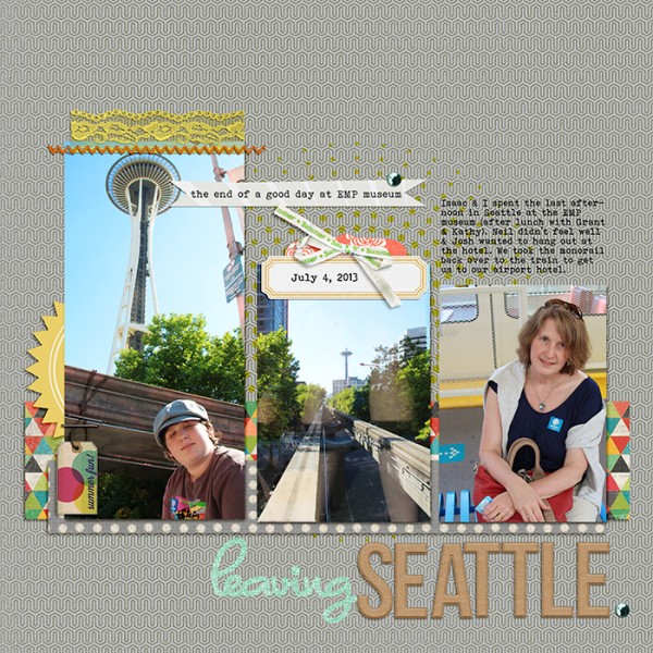
Leaving Seattle by Debbie Hodge | Supplies: Every Little Bit March by Deena Rutter; Lemonade Stand by Little Butterfly Wings; Sweet March, Rough Cuts by Allison Pennington; Storyteller Feb 2014 styles by Just Jaimee; Pillow Talk by Creashens; Straight-Line Stitched by Anna Aspnes; Dominique, Bohemian Typewriter fonts
[hr]
push a pastel color story with the addition of black
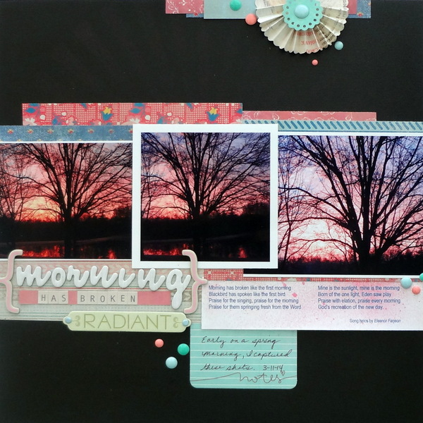
Morning Broken by Susanne Brauer | Supplies: Cardstock and brads, Stampin Up; Patterned paper, die-cuts and enamel dots, Basic Grey; Alphabets, Authentique and American Crafts; mist, Tattered Angels; chipboard, K & Company.
Susanne Brauer loves pastel colors and slightly deeper jewel tones. This photo, of the sun coming up in March, includes those pastels she loves and so she used it to push her color story.
Susanne says, “In order to complement the colors in the photos, I kept my use of pastel paper to a minimum and added a bold black background. I don’t often use black on my pages. Here it not only makes the dark elements of the photos pop, but it also is symbolic of night being in the background turning into day. It is amazing how much difference adding a single well-chosen color makes.”[hr]
push your preference for primary schemes with the addition of purple
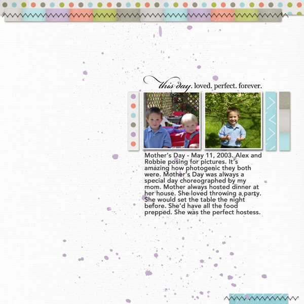
This Day by Jennifer Kellogg | Supplies: Sabrina’s Creations Day After Day Template; Karah Fredricks Mindless Papers; Little Butterfly Wings My Journey Paint; Kara Dudley Dad’s Day White Cardstock.
Jennifer Kellogg‘s favorite colors to scrapbook with are bright, primary colors. She says, “I enjoy using bold colors and almost always use red and blue on every layout.”
On this page about how her mother was the center of her family’s lives she pushed her color story. She says, “I chose this picture of my son and my nephew and could have easily gone with a blue/red layout to match my nephew’s denim overalls and red shirt, but I knew I had to get out of my color comfort zone. My use of blue and red made me think of purple. I rarely use purple and when I do it’s a deep violet. I expanded my color story in two ways. First, I challenged myself to use Pantone’s 2014 Color of the Year, Radiant Orchid. Radiant Orchid is a light purple. I used it sparingly, but it’s there. The second challenge was to use a white background. I never scrap a page using a white background. I was surprised how much I liked the final layout. It pays off to venture outside your comfort zone.”[hr]
are the colors you love complementary? look for a new complementary combo to try
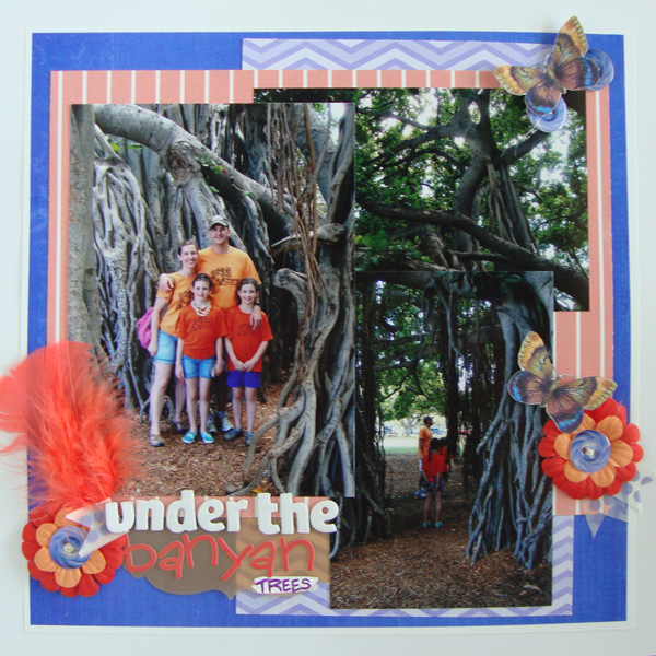
Under the Banyan Trees by Michelle Houghton | supplies: cardstock; The Paper Company, blue chevron and solid papers; Gina Miller – Seasalt, coral paper; Sara Gleason – The When, butterfly; Little Buterfly Wings – Do Not Disturb, button; Allison Pennington – I’ll Be There For You part 2, washi tape; Mainstays, twine and chipboard letters; American Crafts, feathers, flowers and vellum journaling tag; SEI
Michelle Houghton‘s color story is one of high-contrast colors. Michelle says, “I love to pair purple and green or blue and orange.”
She says, “This hybrid layout is about my family exploring underneath the amazing banyan trees in Hawaii. To push my color story, I explored Pinterest looking at purple/green and blue/orange images. I discovered a third set of colors just as striking: indigo with coral. I could not find those colors in my paper stash but found digital papers that fit the color combination with slight adjustments. I love the results and know this will be a color story I use again for layouts to come.”[hr]
try a new color scheme with your favorite color in it
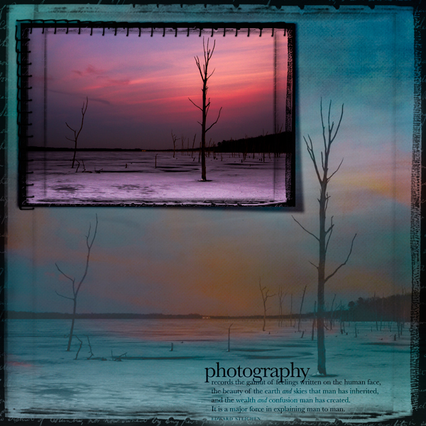
Photography by Andrea | Supplies: Cottage Arts Scrap Edge Photo Frame, Soul Paper 04; Allie Edwards Word Art Steichen quote; Ztamp stitches.
Andrea‘s favorite color is teal.
She says, “On this page, I wanted a way to showcase one of my favorite frozen winter photos. To push my color story I used a triadic color scheme with blue green, purple, and orange. The photo itself has shades of purple already in it. So I just needed the teal and orange and found paper with those colors. I blended a larger copy of the photo into the background and used luminosity blend mode to bring out the colors. The colors are saturated but I like the contrast between the original and the blended photo.”[hr]
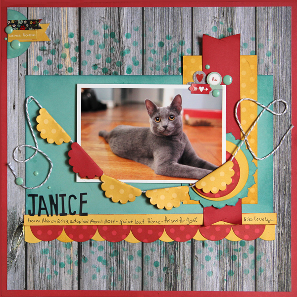
Janice by Gretchen Henninger | Supplies: Paper, Alphas, and Stickers: Simple Stories (Homespun); Ink: Tim Holtz Distress Ink (Scattered Straw, Fired Brick, Broken China), Studio Calico (Emerald City); Stencil: The Crafter’s Workshop; Die: Lawn Fawn (circle stackables), Papertrey Ink; Punches: EK Success (1 3/8″ circle), Stampin’ Up! (scallop circle); Enamel Dots: Twine & Ink; Fiber: Recollections twine
Gretchen Henninger says, “My tendency is to combine a cool and (non-complimentary) warm color, e.g. blue and red, yellow and green. For this page is about the newest member of our family, our new kitty, Janice, I pushed my color story, but using a split-complimentary color scheme. Instead of just using aqua and red, I added a dark yellow.”

